


Eindhoven-based Raw Color is a multi-disciplinary design studio specializing in color across objects, textiles, photography, graphic design, and installations. For Dutch Design Week 2023, co-founders Daniera ter Haar and Christoph Brach curated an appropriately vibrant exhibition called Multiply to celebrate winning the 2023 Limburg Design Award and showcased 15 years of self-initiated and collaborative projects. The Limburg Design Award is presented every two years to a well-known designer who focuses on contemporary interior design.
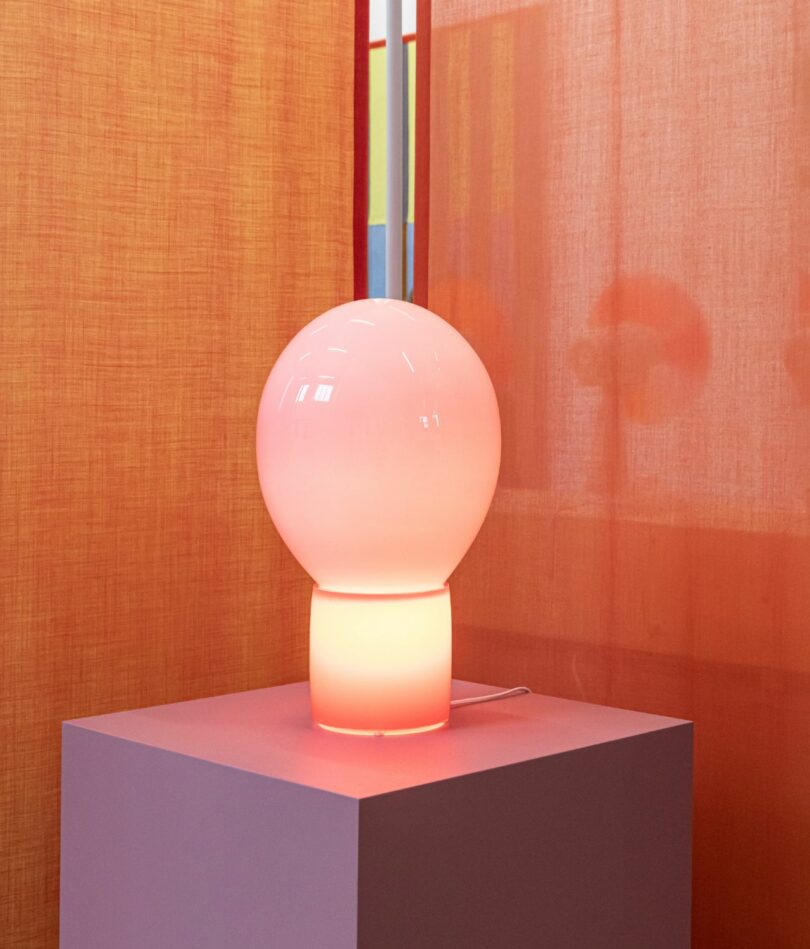
Photo: Katie Treggiden
The mouth-blown, balloon-like lamp Globo utilizes the beauty of opaque glass, generating different tones depending on whether it is switched off and lit from the outside only, switched on during daylight hours as above and lit from both inside and outside, or switched on in darker hours when it is mostly lit from the inside. “The balloon-like glass volume rests on a cylindrical base,’ says Christoph. “The high quality and heavy mouth-blown glass contrasts the seemingly lightweight appearance.”
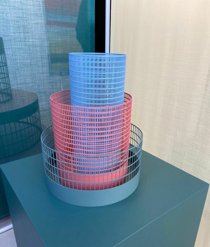
Photo: Katie Treggiden
Grid Objects explore different qualities of color, such as density, proportion, shade, translucency, and blending, through different interactions such as stacking, turning, nesting, and composing. They are produced locally in The Netherlands and are available in a limited edition of 10.
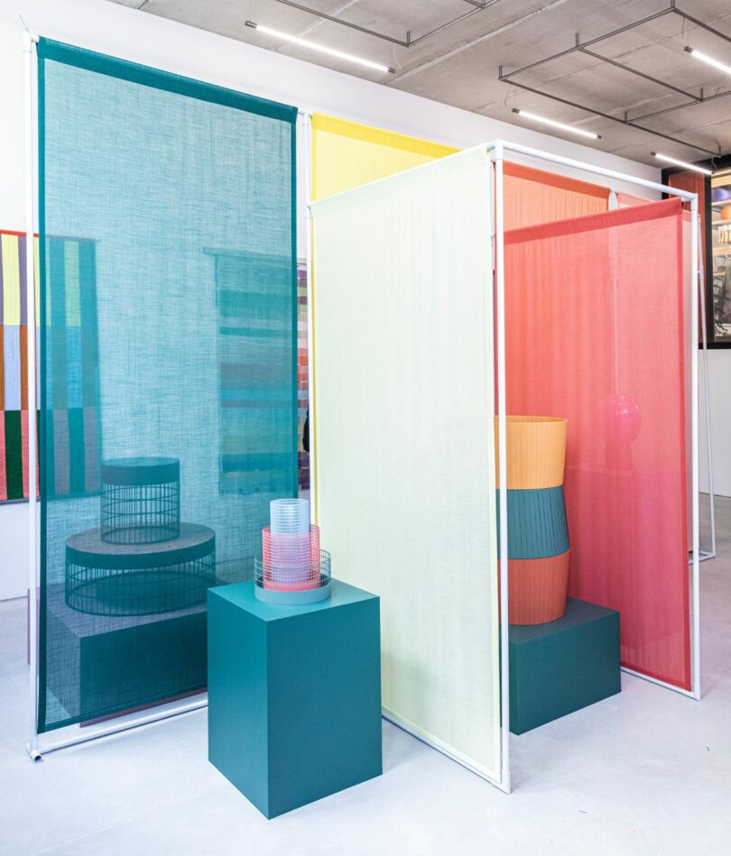
Photo: Raw Color
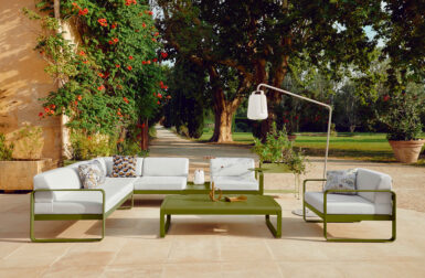
Raw Color was then approached by a furniture company called Pode to turn this idea into a set of coffee and occasional tables and Mesh was born (seen through the screen above) by inverting the forms and making the mesh strong enough to support the tabletop and anything that might be placed on it. “The graphic character of the Mesh coffee table and the Mesh occasional table create an interesting shadow effect on the floor,” says Christophe. “Open and closed alternate in the perforation grid. The design reflects our working method, in which the color effect of the volume forms the starting point, in this case for the interplay of densities and material combinations.”

Photo: Raw Color
Parts of the exhibition were interactive and these fans whizzed into action whenever somebody got close to them – showing three distinct colors when static, they blended into one color when spinning. The installation was originally created for an exhibition at LYNfabrikken Box in Aarhus, Denmark, in 2014.
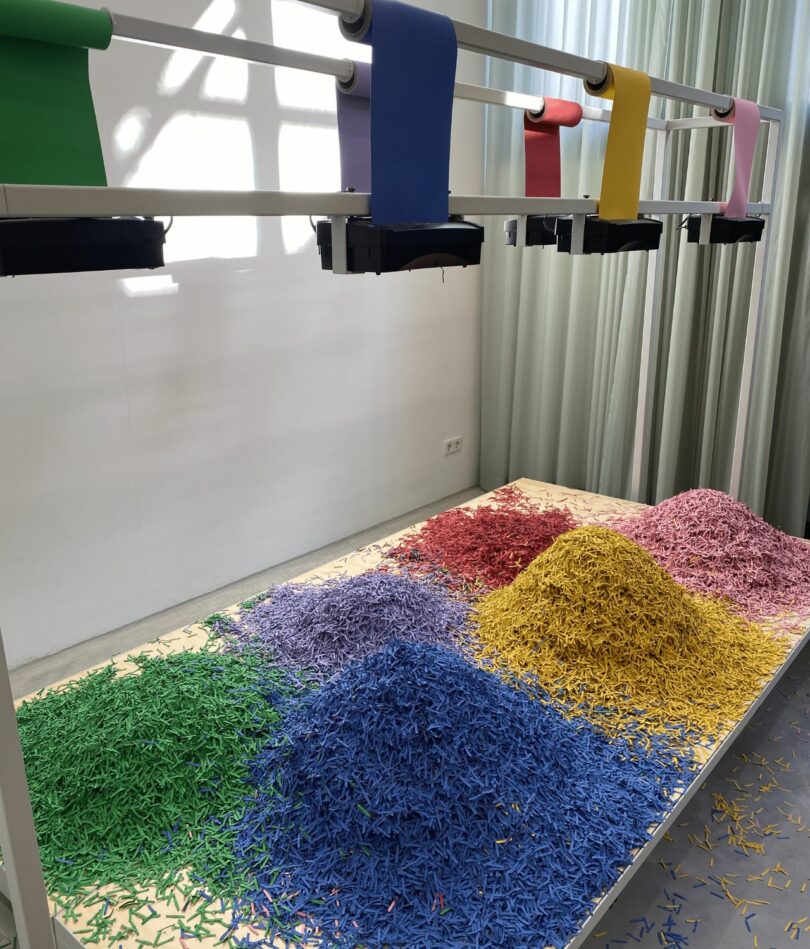
Photo: Katie Treggiden
Another interaction installation was Chromatology – an installation based on paper shredders, each connected with a motion sensor at ground level and fed by paper rolls in six different colors. The movement of people throughout the space therefore dictated the color mix beneath.
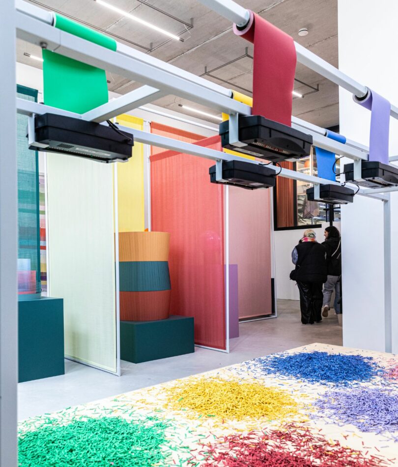
Photo: Raw Color
The installation was developed as part of an exhibition called The Vincent Affair (curated by Edhv and Wendy Plomp) and was intended as a contemporary counterpoint to represent aspects of Vincent van Gogh’s work – in this case. his experimental approach to mixing color in the field. The exhibition was located in the former house of Van Gogh’s lover Margot Begemann in Nuenen.
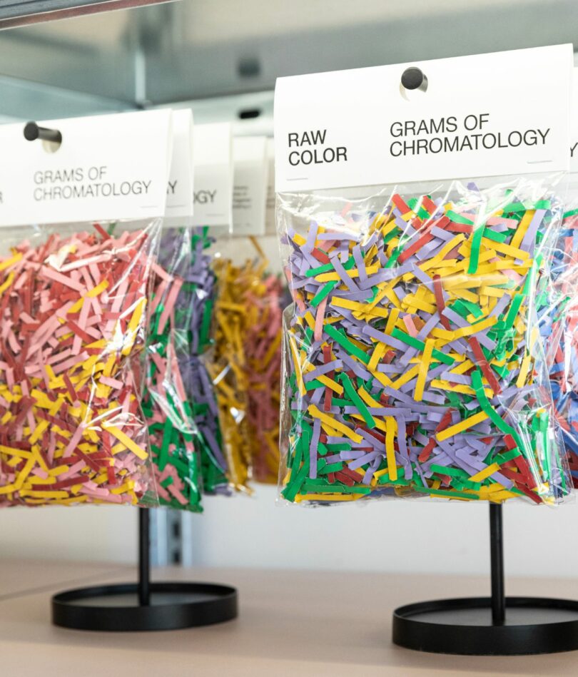
Photo: Raw Color
Not wanting to create unnecessary waste, the shredded paper is collected and sold for use as confetti in little bags in the Raw Color shop.
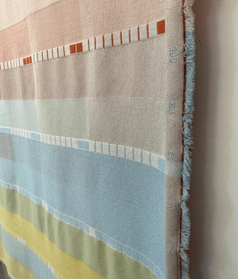
Photo: Katie Treggiden
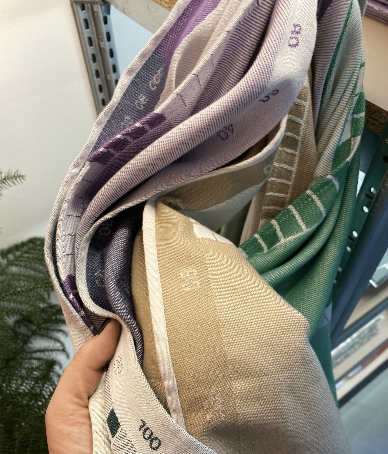
The Index Collection is a series of tea towels and blankets, made from merino wool and organic cotton, inspired by the weaving process – each series follows the same process as the “index” translates the amount of color within each surface, using squares representing 10% to 100%. The collection was developed at TextielLab in Tilburg and was made possible with support from the Eindhoven Municipality and Stichting Stokroos.

Photo: Katie Treggiden
The same principle has been translated into a series of tea towels available in three different colorways, each including monotone, duotone, and multi-tone options – the perfect holiday gift for the dish-drying data nerds in your life!
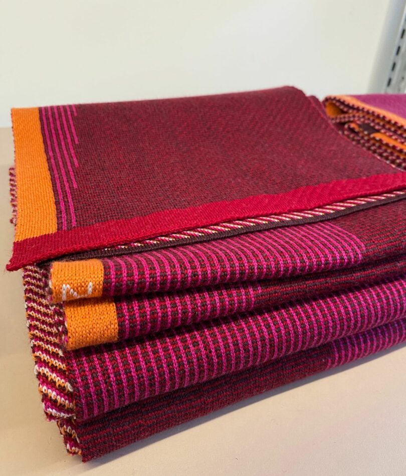
Photo: Katie Treggiden
A more serious application of the ability to visualize data through color, the Temperature Scarf is part of the Temperature Textiles Collection which uses weaving techniques and colored yarn to raise awareness of climate change. Using data from the climate report of IPCC (Intergovernmental Panel on Climate Change), the vertical pink lines represent the predicted surface temperature change in degrees Celsius of even years from 2000 until 2100. The orange surface indicates 0 – 4ºC. To help counter this prediction, 10% of sales are donated to Trees For All, a Dutch NGO that is planning trees in The Netherlands and abroad in a bid to counter CO2 emissions.
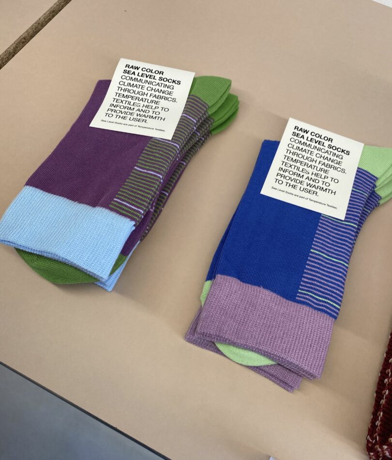
Photo: Katie Treggiden
In a similar vein, the Sea Level Socks, visualize predicted rising sea levels – the four pale green lines represent the predicted rise of 7 cm in 2020, 12 cm in 2030, 17 cm in 2040, and 22 cm in 2050 – as well as all the integers in between. These numbers are based on the most ideal emission scenario according to the Paris Climate Agreement – and again use the data from IPCC climate reports.
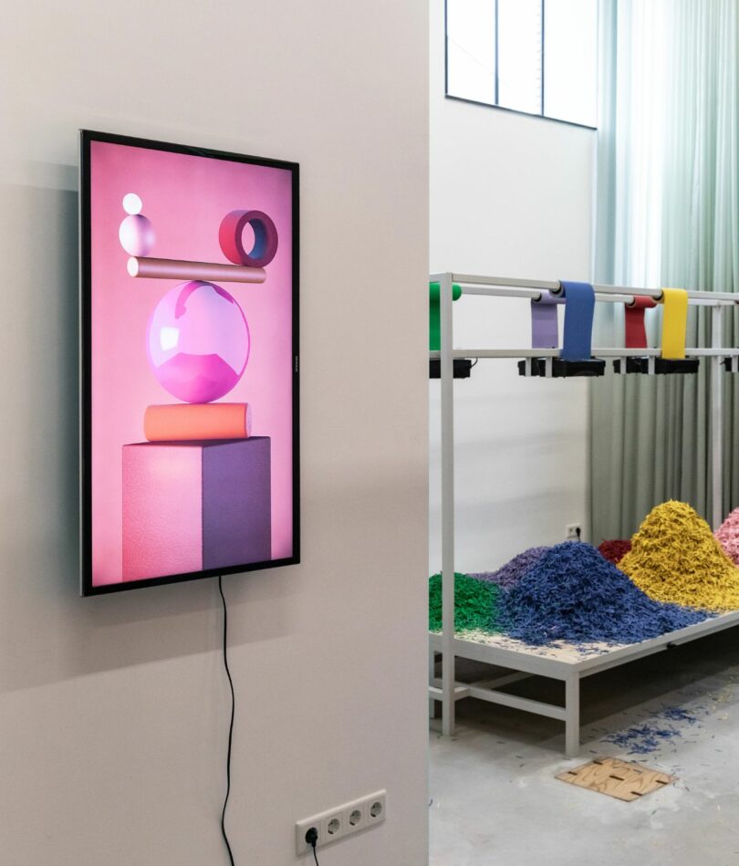
Photo: Raw Color
And finally, Red Stack is Raw Color’s first digital stack using animation software typically used in film production – the studio has created many “stacks” on physical photosets, and this was their first attempt to create that digitally. “It’s great to have the ability to let the stack balance and actually move,” says Christoph.