Leading in Typography: Enhancing Readability and Visual Appeal
Typography is an integral yet often overlooked element of visual communication. The arrangement of type on a page or screen remarkably influences the reading experience. As leaders and designers seeking to convey information effectively, it is essential that we thoughtfully consider typography.
This post will explore the principles of leading in typography and how they impact readability and aesthetic appeal. Careful typeface selection, strategic formatting, and hierarchical organisation contribute to typographic designs that attract readers rather than push them away. Subtle changes like line spacing, font size, and colour can dramatically improve comprehension and enjoyment. With the sea of fonts and formats at our disposal today, it can take time to identify best practices. However, applying core typographic concepts can elevate products, platforms, and communications.
Join me as we dive into the details of typography and its ability to enhance interfaces and content. Both form and function play critical roles in excellent typographic design. We can create inviting reading experiences that communicate information by leveraging typography's psychological and artistic aspects. From vintage posters to digital ads, type carries meaning. Let's uncover techniques for leading and designing with creative, readable, beautiful typography.
Table of Contents
What is Leading in Typography?

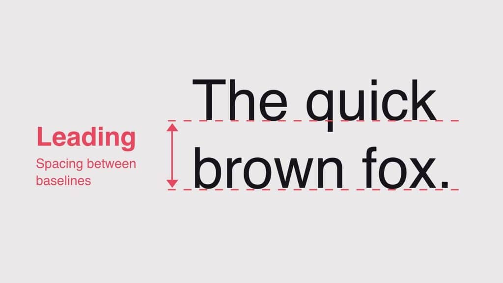
Leading, also known as line spacing, is one of typography's most important yet often overlooked elements. It refers to the vertical distance between the baselines of successive lines of type. Proper leading is essential for creating visually appealing and readable blocks of text.
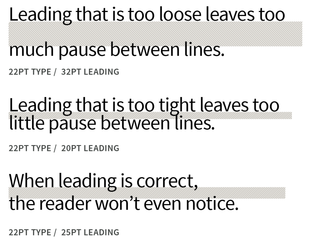
When lines of text are set too close together, it can make the text feel cramped and difficult to read. Conversely, the text loses continuity and cohesiveness when lines are too far apart. Finding the right amount of leading is critical for optimising readability. Generally, the leading should be around 120-150% of the font size. However, this can vary based on the typeface, font size, line length, and medium.
Leading not only impacts readability but also influences the aesthetic quality of typography. Tight leading gives a dense, economical feel, while loose leading creates an airy, spacious look. Designers adjust leading to create different tones and textures with text. For instance, more leading can make the text feel light and conversational. Reducing the leading gives the text a more serious, formal appearance.
When setting the leading, designers consider factors like the line length, font size, typeface characteristics, and amount of text. For example, longer line lengths require more leading for readability. Sans serif fonts are usually given more leading than serif fonts. Leading also depends on the medium – text meant to be read online typically needs looser leading than print text.
By mastering the subtle art of leading, designers can optimise text for readability and enhance its visual impact. Balancing aesthetics and function, leading ensures that typography looks as good as it reads. The space between lines allows the reader's eyes to move smoothly across the text, quickly taking in each word.
- Amazon Kindle Edition
- Lupton, Ellen (Author)
- English (Publication Language)
- 224 Pages – 04/15/2014 (Publication Date) – Princeton Architectural Press (Publisher)
Understanding Leading in Typography
Leading originated from adding lead strips between blocks of letters in typesetting and printing. In typography, leading refers to the space between lines of text, which can significantly impact the readability and appearance of a text block. It ensures that the text is appropriately spaced and easy to read.
Proper leading is crucial for the legibility of text. Insufficient leading can result in cramped text that is difficult to read, while excessive leading can create a disjointed and scattered appearance. By finding the right balance, designers can ensure that the text is visually appealing and easily comprehended.
In some software, the term line spacing is used interchangeably with leading. However, it's important to note that leading specifically refers to the vertical space between lines, while line spacing can also include additional spacing between characters and words.
Types of Leading in Typography

Three common approaches to setting the leading are normal, tight, and loose.
Normal leading represents a standard and balanced relationship between the font size and line spacing. For example, 10/12 leading would have a font size of 10 points and spacing of 12 points between each line. This 1-2 point difference is enough to keep ascenders and descenders from overlapping but close enough to create a consistent rhythm. Normal leading provides comfortable readability and is appropriate for body text across printed materials, websites, etc.
Tight leading has spacing that is only incrementally bigger than the font size. For example, 10/11 leading squeezes lines together, condensing the vertical space occupied by the text. This style can impart a sense of urgency, feel contemporary, and fit more words into a smaller area. Tight leading is effective when used minimally for slogans, captions, or short paragraphs. Dense blocks of text set this way can fatigue the eye.
Loose leading employs more generous line spacing, like 10/14, allowing white space between lines. This style promotes better legibility through improved word shape distinction and tracking space between lines. The openness also creates a more relaxed, casual effect appropriate for editorial design. But the added vertical space means text consumes area more quickly, so loose leading can reduce density.
Skilful designers deploy these leading styles strategically to control pace, space, and reader experience. Normal leading delivers foolproof readability. Tight leading packs punch. Loose leading facilitates easy scanning. Combined purposefully, they bring powerful typographic nuance and hierarchy to any text presentation.
- Hardcover Book
- English (Publication Language)
- 240 Pages – 09/01/2020 (Publication Date) – Hoaki (Publisher)
Examples of Leading in Typography
Let's consider visual examples to understand the impact of different leading styles in typography.
In a magazine layout, normal leading may be used for the body text to ensure readability. In contrast, tight leading can be applied to the headlines and subheadings to create a visual hierarchy and a compact look. This combination allows for an organised and visually pleasing design that effectively communicates the information to the reader.
In a website design, loose leading may be employed for long paragraphs of text to improve legibility and create a more spacious and inviting feel. Using loose leading, the designer can make the content more approachable and easily read, enhancing the overall user experience.

The choice of leading style can significantly affect the tone and mood of the text. For example, tight leading can convey a sense of urgency or professionalism, while loose leading can create a more relaxed and approachable atmosphere. By carefully selecting the appropriate leading style, designers can effectively communicate the intended message and evoke the desired emotional response from the audience.
Adjusting Leading in Typography
Adjusting leading is an essential skill for designers to create visually appealing and readable typography. Consider the text's font, size, and purpose to determine the appropriate leading. Experimentation may be required to find the right balance.
In design software like Adobe InDesign, leading can be adjusted using the Controls panel or Character panel. By changing the leading value, designers can create more or less space between lines, depending on the desired effect. This level of control allows for precise adjustments to be made, ensuring that the leading is optimised for the specific typography project.
It's important to note that leading can also be applied to individual lines of text to separate them from other elements visually. However, designers should be cautious not to make the leading too generous, as it can disrupt the text flow and make reading challenging. The key is to strike a balance that enhances the visual appeal while maintaining readability.
- Heller, Steven (Author)
- English (Publication Language)
- 128 Pages – 08/23/2016 (Publication Date) – Laurence King Publishing (Publisher)
Factors Affecting Leading in Typography
Several factors can influence the leading settings in typography. One important consideration is the type of font being used and its x-height. Different fonts may require different leading settings based on their x-heights, which can impact the overall spacing and readability of the text.
Fonts with a larger x-height, such as sans-serif typefaces, may require additional leading to ensure optimal legibility. The increased leading compensates for the larger x-height, providing enough space for the ascenders and descenders of the characters to avoid overlapping or crowding.
Other factors, such as bold face or small type sizes, may also require extra leading. Bold face or sans-serif typefaces tend to have a larger x-height, which may necessitate increased leading to ensure optimal legibility. Similarly, smaller type sizes may require additional leading to maintain readability, as the reduced size can make the text appear denser and harder to read without proper spacing.
Considering these factors and adjusting the leading accordingly can help ensure that the text is easily read and visually appealing, regardless of the font or size used.
Impact of Leading on Readability and Visual Appeal

Leading has a significant impact on the readability and visual appeal of text. Adjusting leading can make a page appear lighter or darker, depending on the spacing between lines. By finding the right balance, designers can ensure that the text is neither too cramped nor too spread out.
Appropriate leading settings are crucial for different types of text. For long lines of text, generous leading can enhance readability by providing enough space for the eyes to move comfortably from one line to the next. On the other hand, tight leading can be effective for bold face or sans-serif type, as it creates a more compact and professional look.
In addition to readability, leading also affects the overall visual appeal of the text. The right leading can enhance the aesthetics of the typography, making it more visually pleasing and engaging for the reader. Designers can create functional and visually appealing typography by carefully considering the leading and adjusting it as needed.
Best Practices for Leading in Typography
To achieve optimal leading in typography, consider the following best practices:
- Use the right software: Design software like Adobe InDesign provides precise controls for adjusting leading. These tools allow accurate adjustments, optimising the leading for the specific design project.
- Differentiate between header and body copy: Use different leading styles for headlines and body text to create a visual hierarchy and improve readability. By using tighter leading for headlines and looser leading for body text, designers can guide the reader's attention and make the content more scannable.
- Understand your audience: Consider the target audience and adjust leading accordingly. For example, older readers may require more considerable leading for improved legibility. By tailoring the leading to the audience's specific needs, designers can ensure that the typography is accessible and easy for the intended readership.
- Experiment with leading styles: Be bold and try different leading styles and see how they impact the overall design and readability. Projects may require different leading types, so experimentation is critical to finding the optimal setting.
- Consider the bigger picture of typography: Leading should be combined with other typographic elements to create a cohesive and visually appealing design. By considering the overall typography, including font choice, size, and spacing, designers can create a harmonious design that effectively communicates the intended message.
- Consider the connection between colour and leading: Understand how leading interacts with colour and ensure appropriate contrast for readability. Proper contrast between the text and the background is crucial for legibility, and leading plays a role in achieving this contrast. By considering the colour and leading together, designers can create typography that is both visually appealing and easy to read.
- Design for different screens: Adjust leading for different screen sizes and resolutions to maintain readability across various devices. With the rise of digital media and varying screen sizes, it's essential to consider how leading may need to be adjusted to ensure optimal legibility on different devices. By designing with responsiveness in mind, designers can create typography that is accessible and visually appealing across a range of screens.
By following these best practices and considering the specific needs of each design project, designers can achieve optimal leading in typography. By carefully considering the font, size, purpose, and other factors, designers can create visually appealing and optimised typography for readability.
Conclusion
The spacing between lines of type is a crucial element in typography. It enhances the readability, visual appeal, and overall aesthetics of text. By adjusting leading, designers can create the right amount of space between lines, ensuring optimal legibility and an attractive design. Experimentation and consideration of specific project requirements are crucial to achieving the best leading settings in typography. By following the best practices and considering the various factors that affect leading, designers can create visually appealing typography optimised for readability and effectively communicate the intended message to the audience.
Last update on 2024-05-15 / Affiliate links / Images from Amazon Product Advertising API


