
Reveri, a self-hypnosis app, has unveiled a new brand identity designed by creative agency Mother Design. This rebranding signifies reveri’s rapid global expansion.
In 2020, Reveri was founded by renowned psychiatrist Dr. David Spiegel and esteemed Silicon Valley investor and technology expert Ariel Poler in the United States. Since then, the company has garnered a growing following of supporters and ambassadors, and is now aiming for swift expansion in the United Kingdom and throughout the world.
Reveri enlisted the help of Mother Design to craft a fresh brand identity that defied the standard norms of the wellness industry, and effectively conveyed their unique brand message – showcasing self-hypnosis as a powerful new category. The resulting visual identity effectively showcases the benefits and positive effects of the discipline with clear and direct messaging, while also aiding the functionality and user experience of the brand’s core product.
Mother Design’s strategic approach recognizes that self-hypnosis is a state of heightened focus, not a loss of control. The reveri’s strategic positioning aims to reshape the narrative around self-hypnosis, encouraging a fresh perspective that acknowledges its inherent value and power as a tool for personal empowerment and growth. By challenging stereotypes, reveri aims to break free from societal stigmas and negative connotations associated with self-hypnosis and the perception of it as a last resort.
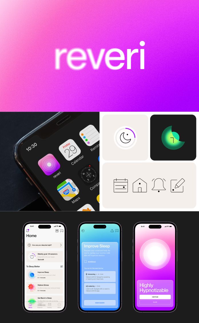
The idea of clarity and focus is at the core of the visual design, which defines the brand world and all user experiences. This concept is reflected in all aspects of the app’s interface, as well as reveri’s website and social media channels. The design incorporates blur treatments in the logotype, gradients in the color system, and extreme depth of field in art direction.
The logo of reveri is created to inspire a feeling of progress and development, representing the essence of personal growth and transformation. It symbolizes that every member of the reveri community is constantly evolving and changing their lives in significant and meaningful ways. The logo is designed in lowercase letters, with the ‘i’ being the focal point, highlighted by its blur effect. The ‘reveri beacon’ complements the logo, portraying a sense of hope and optimism, symbolizing the light at the end of the tunnel.
All images © by Mother Design. Do not hesitate to find more trending graphic design, branding, and web design projects on WE AND THE COLOR.
Subscribe to our newsletter!


