History of the Volkswagen Logo Design
Every logo tells a story, encapsulating a brand's soul, values, and journey, but few are as fascinating and multi-layered as that of Volkswagen. Let's get into our time machine and embark on a thrilling ride through the history of Volkswagen's emblematic logo design.
The Volkswagen logo, an instantly recognisable icon worldwide, has a backstory deeply rooted in innovation, controversy, resilience, and rebranding. As we all know, the best narratives aren't always straightforward. They contain plot twists, turns, and surprises that make the journey all the more intriguing. And the Volkswagen logo has its fair share.
From its inception in the heart of World War II, the ‘people's car' emblem has witnessed transformations that align with the company's growth, changes in leadership, socio-political shifts, and the evolving taste of the global market. Its evolution is much more than a mere design story; it's a testament to the brand's legacy, mirroring Volkswagen's history and its vision for the future.
So, buckle up, folks! It's time to explore the fascinating chapters of Volkswagen's logo design history, where each evolution paints a picture of the brand's resilience and its commitment to its audience. This journey promises a blend of design, history, and branding to keep you gripped. Enjoy the ride!
Table of Contents
The History of the Volkswagen Company

Volkswagen, a name now synonymous with automobiles, has a rich history that traces back to its birth on May 28, 1937, in Germany. However, at that time, it was known as ‘Gesellschaft Zur Vorbereitung des Deutschen Volkswagens mbH.' Interestingly, the company is believed to have been started even earlier, around 1933.
The idea behind Volkswagen was conceived in an auto shop in Berlin, where Adolf Hitler envisioned a car that would be affordable for the majority of people. This concept aligned with his plans to construct a superhighway called the Autobahn. The Autobahn and the production of a cheap car aimed to promote leisure and mobility among the German population. The envisioned price of the vehicle at that time was around $140.
Once Hitler rose to power as the leader of Germany, he approached Ferdinand Porsche, an automobile engineer working in Austria, to design a car that would meet the requirements of being budget-friendly for the German people. However, since Porsche was an Austrian citizen, Hitler requested that he change his nationality. As a result, Porsche changed his citizenship from Czechoslovak to that of the National Socialist German Worker's Party.
The distinct round shape of the Volkswagen was born out of a sketch created by Bela Barenyi in 1934. Barenyi, who worked for a French car magazine, contributed to the design of the car and its iconic shape. In 1938, the company changed its name to ‘Volkswagenwerk GmbH' and adopted a logo incorporating the Nazi flag. The design of the logo was inspired by the shape of a swastika, which was also reminiscent of an old Nordic symbol called Ginfaxi. This symbol was believed to have brought victory to those who wielded it in battle.
During this period, Volkswagen's early advertisements were aligned with the mission of ‘Kraft Durch Freude,' which translates to ‘strength through joy.' These ads depicted peaceful individuals enjoying their holidays while using the car. However, as World War II approached, the VW logo underwent slight alterations as it resembled a picture of a pedestal fan.
From its inception to the present, Volkswagen's journey is a testament to its enduring legacy in the automobile industry. It started with a vision to create an affordable car for the masses. Despite the historical context and changes that have taken place over the years, Volkswagen has become a household name recognised globally for its innovation and engineering prowess.
The First Volkswagen Logo Design

Now that we have a better understanding of how Volkswagen came to be let's dive into the origin of their iconic logo. The first logo design for Volkswagen was created during the company's early years, specifically in 1938. The plan was simple yet striking: a circle with the letters “V” and “W” interlocked inside, with the company name “Volkswagen” written above.
The logo was designed by Franz Xaver Reimspiess, an employee of the company's advertising department at the time. The interlocking letters were meant to represent the unity between the company and its customers, while the circle was meant to symbolise the wheel. The logo perfectly fits Volkswagen, expressing its commitment to producing reliable and affordable cars for the masses.
Interestingly, the first logo design wasn't just used for Volkswagen cars – it was also used for other products made by the company, such as bicycles and generators. This helped to establish the logo as a recognisable symbol of quality and reliability, not just for cars but for all Volkswagen products.
Logo Redesigns over Time

Now that we've learned about the origins of the Volkswagen company and its first logo design let's delve into the changes that have been made to their iconic emblem over the years.
The first redesign of the Volkswagen logo took place in 1960, only 13 years after the company was founded. This new version featured a more minimalist design, with the letters “V” and “W” placed inside a circle. The font used for the letters was also changed to a more modern sans-serif typeface. This redesign reflected the changing design trends of the era and helped the brand keep up with the times.

In 1978, the Volkswagen logo was redesigned once again. This time, the circle was thicker, and the letters inside were bolder, more prominent. The font used for the letters was also changed again to a more rounded typeface, giving the logo a more approachable, friendly appearance. This redesign helped Volkswagen solidify its image as a reliable, efficient, warm, and welcoming brand.

Finally, in 2019, Volkswagen announced another redesign of its logo. This time, the circle was flattened and simplified, and the letters inside were given a sleek, modern appearance. The new design was meant to reflect the company's renewed focus on electric and autonomous vehicles and its commitment to sustainability. The new logo reflects Volkswagen's continued evolution as a brand and its ability to stay relevant in an ever-changing world.

In conclusion, the Volkswagen logo has undergone several redesigns over the years, each reflecting the era's changing design trends and the brand's commitment to staying relevant and modern. From a simple, hand-drawn emblem to a sleek and futuristic icon, the Volkswagen logo has come a long way since the company's early years and continues to evolve.
The Logo in Pop Culture
Let's discuss how Volkswagen has made its way into pop culture through different mediums. First, let's dive into their iconic advertising campaigns that have become a staple in the industry. Then, we'll explore how Volkswagen has been portrayed in art and the unique ways it's been interpreted by different artists.
Volkswagen in Advertising Campaigns

Now that we understand the deep meaning behind Volkswagen's logo, let's delve into how it has been utilised in pop culture. From advertising campaigns to literature, the iconic VW emblem has transcended beyond the automobile industry.
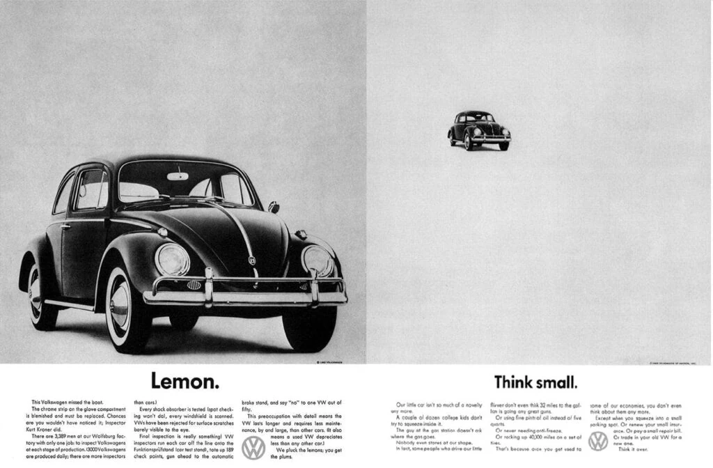
In advertising campaigns, Volkswagen has always stood out from the rest. Their commercials are not your typical car commercials. They create stories that resonate with their audience. One of their most memorable campaigns was the “Think Small” campaign in the 1960s, where they embraced the idea of compact cars when bigger cars were the norm. The campaign was a huge success and is still talked about today. The VW logo was prominently displayed in these ads, and it became synonymous with the brand's message of being unconventional and innovative.
Volkswagen has also been featured in various art pieces, with the logo as a statement piece. Renowned artists like Andy Warhol and Roy Lichtenstein have incorporated the VW logo into their work, further cementing its place in pop culture. The logo's simplicity and boldness make it a perfect subject for artists to play around with and create interpretations.
The VW logo has even made an appearance in literature. In the classic novel “The Girl with the Dragon Tattoo” by Stieg Larsson, Mikael Blomkvist drives a vintage Volkswagen Beetle, which becomes a significant part of the story. The VW logo is mentioned several times throughout the book, giving readers a sense of nostalgia and familiarity.
Overall, Volkswagen's logo has become more than just a symbol for a car brand. It has become a statement of innovation, simplicity, and quirkiness. Its appearance in various advertising campaigns, art pieces, and literature shows how ubiquitous it has become in pop culture.
Maintaining Brand Recognition and Loyalty

Now that we've explored the modern interpretations of the VW logo let's talk about the future of this iconic design. One of the most important aspects of any logo is its ability to maintain brand recognition and loyalty. This is especially true for a company like Volkswagen, which has been around for over 80 years and has built a strong reputation worldwide.
Over the years, the VW logo has undergone several design changes. Still, it has always maintained its core elements – the circular shape and the letters “V” and “W”. This consistency has allowed the logo easily recognisable by people of all ages and cultures. However, in today's fast-paced world, brands must constantly adapt to changing trends and consumer preferences to stay relevant.
Volkswagen has adapted to changing market trends by incorporating digital elements into its logo design. For example, they have created digital versions of their logo optimised for social media platforms. This allows them to connect with younger audiences who are more likely to engage with brands on social media.
Another way Volkswagen has maintained brand recognition and loyalty is by staying true to its core values and beliefs. They have always been known for their commitment to quality and innovation, reflected in their logo design. By remaining true to their brand identity, they have built a loyal customer base that trusts and values their products.
In conclusion, maintaining brand recognition and loyalty is essential for the long-term success of any company, and Volkswagen is no exception. By staying true to their core values and adapting to changing market trends, they have maintained their position as one of the world's leading automotive brands. As we look to the future, we can expect the VW logo to evolve and adapt to new technologies and consumer preferences while always staying true to its iconic design.
Conclusion
Wow, learning about the history of the Volkswagen logo was genuinely fascinating! I had no idea the logo had such a rich and diverse past. The logo has undergone numerous changes, from its origins in Nazi Germany to its modern interpretations. Seeing how a simple symbol can evolve and become so iconic is incredible.
As someone who appreciates unique design and branding, I was particularly impressed by the designers behind the logo. Their creativity and attention to detail shine through in the various iterations of the logo. A lot of thought and effort went into creating this timeless symbol. I have a newfound appreciation for the Volkswagen logo and its place in history.

Was there ever a time in Volkswagen’s history that the ‘V’ and the ‘W’ were connected without the gap in the middle? Any earlier models at all?
Throughout Volkswagen’s entire history since the original 1937 logo, the V and W have always had a gap and have never been connected. The split letters are part of the company’s brand identity. Even on early Beetle models and other vehicles, the badges and logos have featured this separated VW lettering.