The Ferrari Logo Design: Speed, Prestige and Passion
The logo of the Italian sports car manufacturer Ferrari is one of the most iconic and recognisable logos in the world. The distinctive prancing horse symbol has been closely associated with Ferrari for over 75 years. But what is the story behind this famous emblem? Why was a horse chosen to represent Ferrari? And how has the logo evolved over the decades while retaining its core DNA?
Table of Contents
A Stallion Rampant – The Origins of Ferrari's Horse Logo
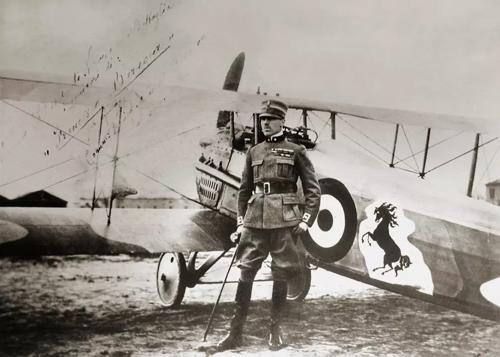
The origin of Ferrari's horse logo dates back to the personal history of the company's founder, Enzo Ferrari. As a young man in the 1920s, Enzo raced under the symbol of a prancing horse. This iconic emblem was painted on the fuselage of an Italian WWI fighter plane flown by Francesco Baracca, Italy's top war ace.
When Enzo started his racing team and eventually his car company, he adopted Baracca's prancing horse as a good luck symbol. The black horse on a yellow background represented courage and audacity. For Enzo, the rampant stallion symbolised the spirit of the competitive, high-performance automobiles he planned to build.
So, the Ferrari horse logo has its roots in Enzo's racing career, aviation history, and personal superstitions. The horse is rampant (reared up on hind legs) to denote speed, power and readiness for action. Over decades, it has come to embody the Ferrari brand.
Evolving Stylistic Elements of the Logo
While the Ferrari logo has always featured a black prancing stallion on a yellow background, the specific graphic treatment has evolved. The pose and anatomy of the horse have been modified several times. The font and typography of the Ferrari name have also changed periodically.
In the earliest versions in the late 1940s, the horse was long-bodied with a relatively small head. It had a very naturalistic, literal treatment. By the 1960s, the logo took on a more powerful, iconic look with a larger head, shorter body and more upright stance of the stallion. The letters also became bold and modern, befitting the cutting-edge sports cars of the era.
In the 1970s, the Ferrari letters took on a simple, san serif italic font. The lines of the horse became quite sleek and stylised. In 1988, the logo was updated again with softer curves and more powerful hindquarters on the horse. The oval surround also became slightly elongated.
The most recent logo evolution took place in 2004. The pose was adjusted so the horse was more at a 45-degree angle. The lines are bolder, the tail is longer, and the letters have strong serifs. Overall, the current Ferrari stallion conveys agility, strength and dynamism fitting for 21st-century supercars.
Symbolic Meaning of Colours in the Logo
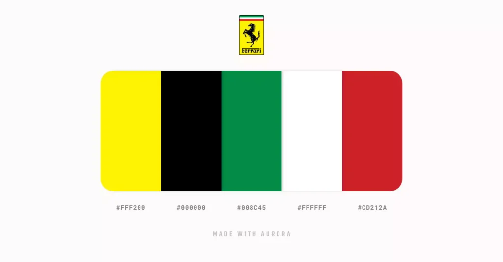
The distinctive colour palette of the Ferrari logo also communicates significant brand associations. The black horse set against the bright yellow background delivers a visually high-impact image that conveys excitement.
The black horse itself represents mystery and elegance. Black is seen as the colour of luxury and sophistication. The black stallion in the logo speaks to the exclusivity of Ferrari's models. It also relates to the formal, upscale environment of Formula 1 racing.
The vibrant yellow background colour expresses the energy and vitality of Ferrari's spirit. Yellow evokes ideas like speed, performance, cheerfulness and fun. For a high-end sports car brand like Ferrari, yellow effectively captures the emotions of driving pleasure. The striking black and yellow colour pairing has become inextricably linked to the Ferrari brand DNA.
Typography and Font Evolution

In addition to the iconic stallion, the stylised Ferrari name is an integral part of the logo. The typography used for the company name also communicates core brand values. Over the decades, the fonts used on Ferrari logos have evolved to keep pace with changing aesthetics.
On early versions of the logo, the name was hand-painted in delicate, flowing script lettering. This conveyed heritage and Italian artisanship. Later, in the 1950s and 60s, the style shifted to a bold, blocky San serif font, reflecting a more technologically advanced, modernist ethos.
During the 1980s and 90s, softer serif fonts were used to bridge tradition with contemporary luxury. The most recent 2004 logo reverted to a bold, sans-serif look but with sleek lines related to speed. Overall, the typography balances elegance and edginess, much like Ferrari's cars.
The Ferrari Shield Badge
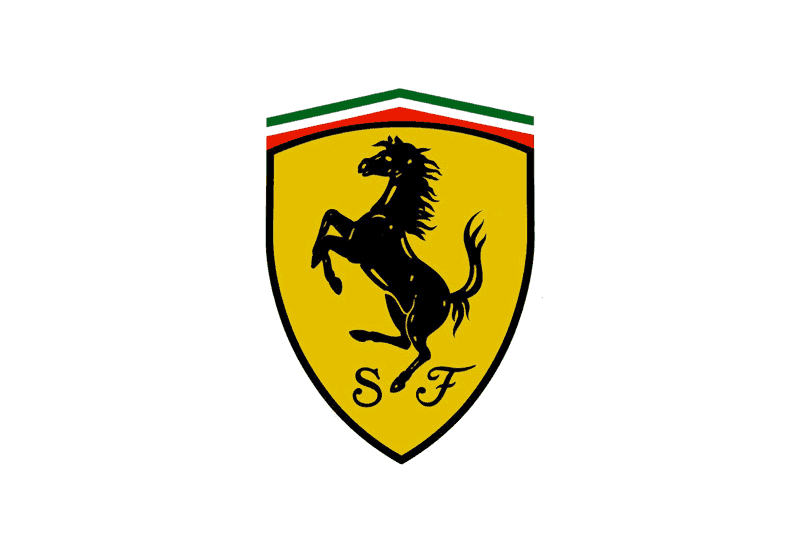
In addition to the prancing horse logo, Ferrari employs a prominent shield badge on the nose of their cars. Introduced in 1950, the Ferrari shield features the company name at the top, the rampant stallion in the middle, and the Italian tricolour stripes across the bottom.
The shield shape is, of course, a classic symbol of quality, strength and protection. For Ferrari, it projects exclusivity and pedigree. The inclusion of the national tricolour flag expresses Italian pride and heritage.
Like the primary Ferrari logo, the shield has been updated over the decades regarding materials and finishes. However, the basic form and elements have remained consistent. The Ferrari shield is now recognisable globally as the traditional prancing horse logo.
Consistent Brand Messaging Across Decades
Interestingly, while the Ferrari logo has evolved visually across many decades, the core brand messaging it conveys has stayed remarkably consistent. The original symbols of the 1940s and the modernised versions of today communicate fundamental notions like speed, prestige, performance and Italian passion.
This shows the inherent power and flexibility of the Ferrari horse symbol. By adapting visual treatments but retaining core DNA, the prancing stallion continues to capture the imagination. For over 75 years, a crouching black horse has vividly expressed the values, emotions and aspirations at the heart of the Ferrari brand mystique.
- Officially Licensed Product
- Hardcover Book
- Adler, Dennis (Author)
- English (Publication Language)
- 336 Pages – 01/11/2022 (Publication Date) – Motorbooks (Publisher)
Why the Ferrari Logo Works
There are several vital reasons why Ferrari's logo has been so successful over many decades:
- Instantly recognisable and identifiable with the brand
- The visual impact of the black horse on a yellow background
- Mythic story and meaning behind the rampant Stallion
- Communicates speed, luxury and Italian heritage
- Simple, bold and conveys emotions around driving
- Distinctive from competing luxury car brands
- Strong association with Formula 1 excitement and prestige
- Reinforced by brand heritage and consistent messaging
- Flexibility to adapt to changing aesthetics over time
Unlike logos that become dated, Ferrari's prancing stallion retains a timeless quality—for Ferrari fans, seeing that cavorting black horse never fails to stir passion and draw attention.
How Ferrari Uses Its Famous Logo
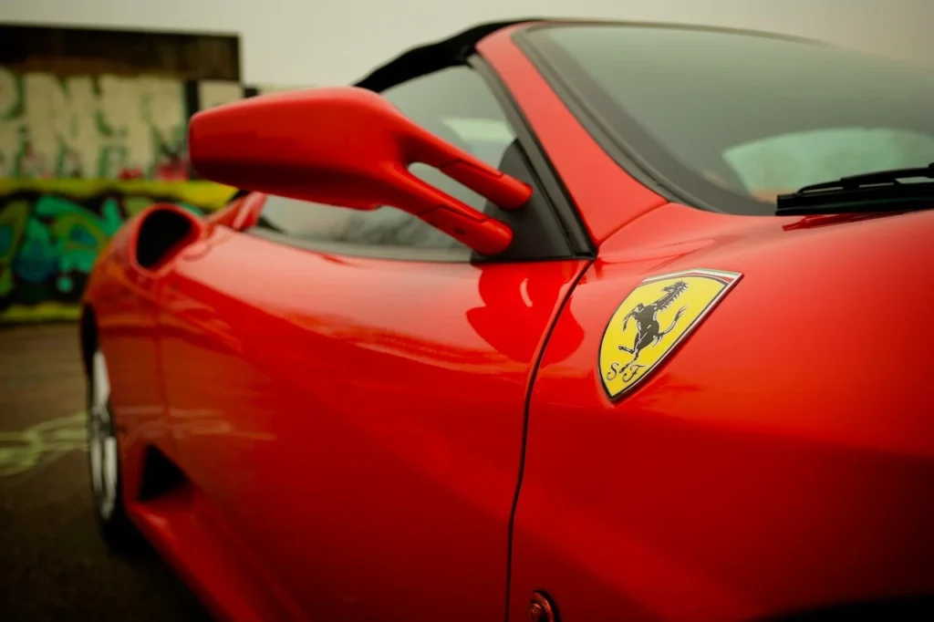
The iconic Ferrari logo appears prominently on Ferrari automobiles in several locations, most notably on the nose shield badge. The prancing horse also features front and centre on:
- Ferrari dealerships and authorised retailer displays
- All Ferrari merchandising and lifestyle products
- Ferrari Formula 1 and racing team uniforms and equipment
- Advertising campaigns across media platforms
- Point of sale marketing materials and brochures
- The Ferrari website and social media channels
- Clothing/merch of the exclusive Ferrari Owners Club
In motor racing and pop culture, the Ferrari logo is an instant visual shorthand, indicating excitement, prestige and the Italian racing tradition. The shield badge and stallion emblem provide endless branding opportunities.
Interestingly, because of its fame, the logo is often applied to non-authorized products like t-shirts, posters and scale model cars. Ferrari actively protects its trademarks from such counterfeiting to maintain exclusivity.
Notable Variations of the Logo
While the standard Ferrari stallion logo is used across all branding applications, there have been some notable variations:
Scuderia Ferrari – Used from 1929 to 1964 for the racing stable Enzo founded initially. More delicate horse outline and hand script font.
Ferrari Testarossa – Famous 1980s supercar model with a side-view horse against a red background.
Scuderia Ferrari F1 – Shield with a yellow background instead of red for the Formula 1 team.
Ferrari FXX – Bold font and the Italian flag colours on racing models.
Prancing Horse Magazine – Ferrari's official print publication for customers and fans.
60 Years of Prancing Horse – Special retro-style logos were used in 2007 to celebrate the 60th anniversary.
These variations show how the primary logo can be adapted for particular uses while retaining brand identity. The flexibility keeps the logo current and exciting.
Controversies and Counterfeiting
The fame and allure of the Ferrari brand has also attracted controversy and counterfeiting of the Prancing Horse logo:
- Legal disputes with other carmakers over using horse logos or names with “stallion” or “colt”.
- Racing teams or drivers using Ferrari horse themes without permission.
- Non-licensed merchandise with the Ferrari logo is widely sold as memorabilia.
- German clothing firm Armani sold t-shirts with a modified Ferrari shield in 2013.
To protect exclusivity, Ferrari actively polices unauthorised or modified uses of its logos and trademarks. Maintaining strict control preserves brand integrity. But it also stokes public fascination with the iconic horse symbol.
Parodies and Pop Culture Uses
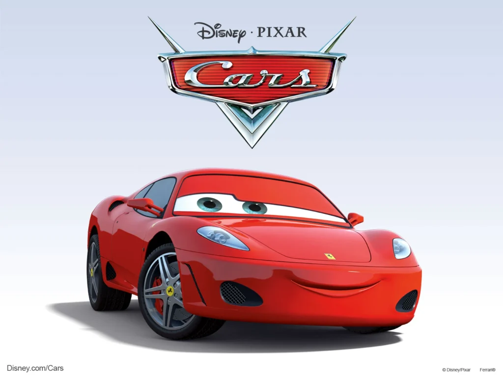
The ubiquity and recognisability of the Ferrari logo have also led to parody versions and pop culture adaptations:
- T-shirts with the horse changed to a donkey or unicorn.
- Walmart uses a “Ferrari” font and shield badge on a go-kart.
- “Fat Stallion” images with the slender horse changed to a chubby Clydesdale.
- Cartoons or jokes with the horse in sunglasses or a jester's hat.
- The stallion was driving an actual sports car or racing a cheetah.
- Mashups combine the Ferrari logo with Disney characters or other brands.
The parodies pay homage to the legendary status of the Ferrari brand in mainstream culture. They capitalise on public familiarity and positive associations with the famous emblem.
Preserving an Iconic Brand
As we've seen, the Ferrari logo of the prancing black stallion on a yellow shield is one of the most iconic and famous emblems in the automotive world and popular culture. The company has carefully safeguarded this brand identity across many decades.
But Ferrari also understands the need to keep the logo fresh and relevant in the modern era. The periodic styling updates respect Ferrari's heritage while projecting a dynamic, contemporary image. Maintaining strict brand guidelines ensures visual consistency.
It seems likely the cavorting black horse will continue leading the Ferrari brand for decades. Like Ferrari's world-famous sports cars, this logo is so ingrained in cultural consciousness that it has achieved a rare timeless quality. For Ferrari fans worldwide, seeing that prancing stallion never fails to quicken the pulse and stir the passion.
Frequently Asked Questions About the Ferrari Logo
Here are answers to some common questions people have about the iconic Ferrari prancing horse logo:
What is the meaning behind the Ferrari horse logo?
The black prancing stallion against a yellow background was originally the symbol of Italian fighter pilot Francesco Baracca, whom Enzo Ferrari admired. To Enzo, it represented courage, competition, and the Italian spirit.
Why did Ferrari choose a horse as their logo?
Enzo Ferrari chose the horse as his racing team emblem long before starting his car company. It was a nod to Baracca's military aviation exploits and fit with Ferrari's desire to convey speed, power and mastery.
Has the Ferrari logo design changed over time?
Yes, the logo has gone through several stylistic changes over the decades. These tweaks modernised the font and made the horse more sleek and powerful while retaining core elements.
What does the black horse symbolise?
The black horse evokes luxury, prestige, mystery and style. The black stallion conveys the exclusivity and sophistication of the Ferrari brand.
Why is the Ferrari logo background yellow?
Yellow is seen as representing speed, emotion, and vibrancy. The vibrant yellow background balances the elegance of the black horse with feelings of excitement and fun associated with Ferrari's sports cars.
Who owns the Ferrari prancing horse logo?
The logo and Ferrari name are registered trademarks of Ferrari S.p.A. in Maranello, Italy. Ferrari strictly controls and protects against the unauthorised use of its brand logos.
Last update on 2024-05-11 / Affiliate links / Images from Amazon Product Advertising API

