7 Design Best Practices of a Winning Ecommerce Page
Consumers can buy products from anywhere with just a few clicks in this digital era. In 2020, more than two million people made online purchases — and this number is increasing each year.
eCommerce is here to stay. And, in fact, the days of traditional brick-and-mortar retail being our preference – even in rural areas and small towns – will soon be a distant memory.
Nearly 60% of buyers prefer this option because it allows them to shop 24/7, according to a 2017 KPMG survey. In addition, most respondents said they enjoy being able to compare prices, avoid crowds, and find what they need in one place.
Given these aspects, it's not surprising that retail eCommerce sales grow yearly. As an entrepreneur, you can leverage this trend to build a successful eCommerce business. Perhaps you already have a website selling products or services, but you're seeking ways to make it more profitable.
The right design can drive a massive Return on Investment (ROI) for your brand, which is particularly important when resources are tight, and you're trying to establish consistent cash flow in the early days of your business.
While you may not have the same budget as Amazon or eBay, there are steps you can take to grow your online store. First, it's essential to understand that having a great product is not enough to drive sales. Your brand image and marketing strategy, and commitment to customer service all come into play.
Focus on improving your website to deliver a superior customer experience. First impressions matter — it only takes 50 milliseconds, or 0.05 seconds, for consumers to form an opinion about your site.
Therefore, misplaced or unclear calls-to-action, irrelevant pop-ups, and other eCommerce website design mistakes can deter potential clients and reflect poorly on your brand.
With that in mind, here are some of our favourite design best practices for a winning eCommerce page. Let's dive in!
Table of Contents
Maintain Brand Consistency

First, make sure your website reflects your brand's identity and core values. Every site element should align with your brand, from landing pages and product descriptions to marketing messages. Otherwise, customers can get confused and lose interest in what you offer.
Start by displaying your logo on the homepage and product pages. Also, use colours and fonts that mirror your brand. Keep your website copy and blog similar to what's on your social media pages and other marketing materials. The point is to get people to recognise and remember your brand, so they become repeat buyers.
The Rule of Seven states that consumers need to see, hear or read a marketing message at least seven times before taking action. This rule applies to branding, too. The more often someone sees your brand, the more likely they will recall it.
It may seem – at times – that you're repeating yourself in your messaging, but so few people encounter your message each time it's shared that isn't the case. You aren't a broken record; you're being consistent.
Once you have a clear idea of your primary marketing message – and the ideal client persona you're looking to serve, it's easy to make your message powerful and consistent.
Think of famous brands like Apple, IBM, Starbucks, or Puma. Most consumers can easily recognise them through visual cues without even seeing or hearing the company's name. In a recent survey, 71% of respondents said they are more likely to buy from a familiar brand.
Therefore, brand recognition can drive customer loyalty and give you a competitive edge, increasing sales. In addition, it builds trust and may improve a company's bottom line in the long run.
Keep It Simple

The KPMG survey found that 40% of consumers shop online to save time. If your website is cluttered, customers may not be able to find what they need. After all, who wants to spend hours browsing through hundreds of products and web pages?
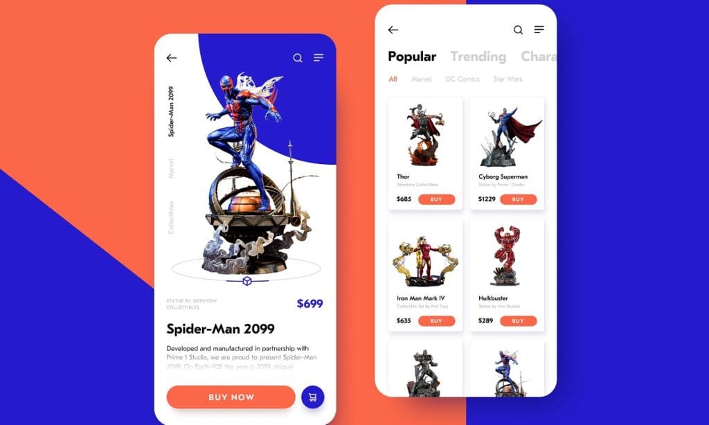
Remember, more isn't always better. To build a winning eCommerce page, remove unnecessary elements and keep your design clean. Make use of white space and add relevant images that draw attention to your brand messaging, products, or call-to-action.
You may also want to avoid the following:
- Animated banner ads
- Full-screen pop-ups
- Splash pages
- Click and scroll
- Meaningless section headers
- Vague headlines
For example, some online stores feature infinite scrolling on product pages, making it challenging to find the Buy button. Others have dozens of ads and pop-ups that show up in the middle of a purchase. These common mistakes can turn off customers and affect your brand image.
Other issues, such as vague or meaningless headers and product titles, can mislead visitors, leaving them wondering, “Am I in the right place?” Such practices will also hurt your SEO efforts and bury your website deep in the search results.
When in doubt, consider how to keep your site clean and easy on the eyes. “Clean” design is coming at a premium these days, as people are tired of cluttered sites that are hard to navigate and make it difficult for them to find what they're looking for in the time they have to spend.
Don't make potential customers have to do work to find what they need; make it as easy as possible, and you'll turn casual visitors into repeat customers.
Optimise Your Navigation Menu

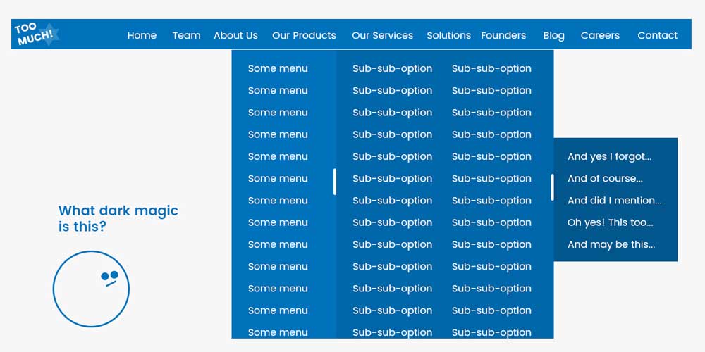
A “clean” navigation menu will allow customers to find what they need with just a few clicks.
Take Nike, for example. Its website features six main categories for its products: Men, Women, Kids, Sales, New Releases, and Collections. In addition, each section has multiple subcategories organised by sport or product type.
This organisational structure enables buyers to locate the items they're looking for without spending hours figuring out where to find what they want.
At the same time, it gives them more control over what they see when browsing your website. Plus, it allows you to make personalised recommendations within each category or subcategory based on user intent.
While you don't necessarily have to create a horizontal navigation bar, keeping it simple is essential. For example, your navigation should only display the main categories, subcategories, drop-down menus, and a search bar.
Maintain a Visual Hierarchy

Visual hierarchy is all about logically displaying the graphic elements on your website, starting with the most important ones.
Consumers tend to notice bright colours, large icons, and rich textures more easily. So, if you want to highlight specific information, it makes sense to use these elements to show visitors where to focus their attention. Likewise, you may use repeating styles, contrasting colours, or animations to help prospects navigate your online store.
You should apply this principle to the navigation menu, hero images, product photos, website copy, etc. Then, go one step further and use specific scanning patterns to create a visual hierarchy on your site.
The Z-shaped pattern, for instance, is based on the idea that most people will scan a web page from left to right and then top to bottom. This pattern is suitable for landing pages, homepages, and image-heavy websites. On the other hand, the F-pattern works best for text-heavy pages, such as blogs and online magazines.
Highlight Your Unique Value Proposition

Starting an eCommerce business comes with its share of challenges. You must address the legal aspects, have the right accounts payable tech stack, build relationships with vendors, secure customer data, etc. An often-overlooked factor is the branding process.
As an entrepreneur, you know what makes your business different. Perhaps you have better products than your competitors, or maybe your products are filling a gap in the market. That's your unique value proposition (UVP).
Your UVP defines what you stand for as a company and highlights your competitive advantage. It shows customers why they should choose your business over others. Yet, many eCommerce brands ignore this aspect, especially regarding web design.
It takes quite a bit of competitive analysis to determine what truly separates your brand from the competition. A great place to start is to ask yourself a few critical questions:
- What makes our brand different from our competitors?
- What opportunities are they leaving on the table upon which we can capitalise?
- What can we highlight about their brand that we disagree with?
- Where are they missing the mark in their marketing and messaging?
The answers to this question make your UVP even more evident.
Uber, Slack, Nike, and other popular brands have successfully integrated their UVPs into their web pages and marketing messages. Another example is Scentos, which displays its unique value proposition on the homepage.
Other companies, such as Apple and Glossier, reiterate their value proposition on all the main entry pages.
Streamline the Checkout Process

A 2022 Baymard Institute survey found that 17% of online shoppers abandoned their cart simply because the checkout process was either too long or complicated. A clunky checkout can affect the user experience and deter customers, leading to revenue loss.
This step of the customer journey should be as frictionless as possible. In this digital age, buyers expect to pay with the touch of a button without filling out lengthy forms. Nearly a quarter of shoppers would instead abandon their orders than create an account to purchase, reports the Baymard Institute.
According to Smashing Magazine, in 2012, some of the most popular eCommerce websites had a five-step checkout process. In addition, about 24% required users to sign up for an account before placing their orders. But things have changed over the past decade.
Nowadays, hundreds of apps, plugins and payment processors ensure a smooth checkout experience.
For example, PayPal makes it easy to accept and process online payments. Customers only need to click a “Buy Now” button and log in to their PayPal accounts to confirm the transaction.
Wise, Stripe, Square, and other platforms can all streamline the checkout process — you need to choose one that's right for your business.
You'll also want to use a wealth management app to track your revenue and see where your money goes. Then, if you realise you're paying too much in transaction fees, you can switch to a different payment gateway.
Have a Clear Call-to-Action

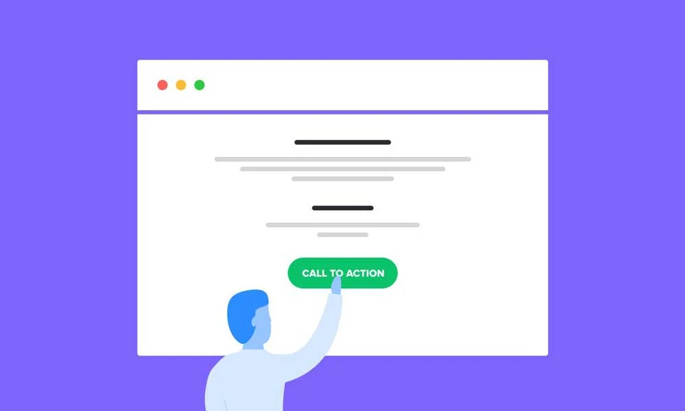
Without a strong call-to-action (CTA), customers may not understand what you expect them to do. Sometimes, they need a final push to buy your products or join your list.
For starters, use heatmaps to track visitor activity on your eCommerce site. Next, place simple yet powerful CTAs near the top of the page, in the sidebar, at the end of blog posts, etc. Depending on their location, CTA buttons may ask customers to buy a product, subscribe to your newsletter, sign up for a demo, or fill out a form.
A clear CTA can make it easier to build your customer base and generate leads. Plus, it will drive customers to your product or service, leading to more sales.
Depending on your goals, you can add clickable CTA buttons to blog posts, product guides, and how-to videos to redirect visitors to a specific page on your website.
Think Outside the Box and Keep Experimenting
Web design requires creativity, planning, and a strong understanding of customers' needs. For best results, choose function over fashion and focus on the user experience at every buying cycle stage. Make your content scannable, keep the design simple, and use high-quality images that resonate with your target audience.
While there are no set rules for building a winning eCommerce page, some strategies work better than others.
For example, optimising your site for mobile search and having a simple navigational structure makes sense. Next, personalise your homepage and run A/B tests to measure the impact of your CTAs, product descriptions, banners, and other elements.
Most importantly, step out of your comfort zone and keep experimenting. Think of it as an opportunity to differentiate your brand and create a more engaging user experience.
Satisfied customers are more likely to become repeat buyers and spread awareness about your business.
