The History of the Microsoft Logo: A Journey Through Time and Design
Think of the bold letters “M-I-C-R-O-S-O-F-T” standing tall beside four solid blocks of Red, Green, Blue, and Yellow. This iconic Microsoft logo has become inseparable from the essence of technological evolution and modernity. It's hard to fathom it being anything other than what we see today.
Yet, as we take a brief journey down memory lane, you'll rediscover the many faces the Microsoft logo has worn over time. These different identities reflect the company's ever-evolving image and the dynamic landscape of technology. This remarkable journey holds many lessons for marketers and designers today. In this comprehensive case study of the Microsoft logo, we'll be exploring the ins and outs of how their logo contributed to their enormous success. We'll also examine how a brand's visual assets, like logos, website design, billboards, product packaging, etc., can shape consumer perception.
Table of Contents
Microsoft: A Brief History of Going From Rags to Riches:
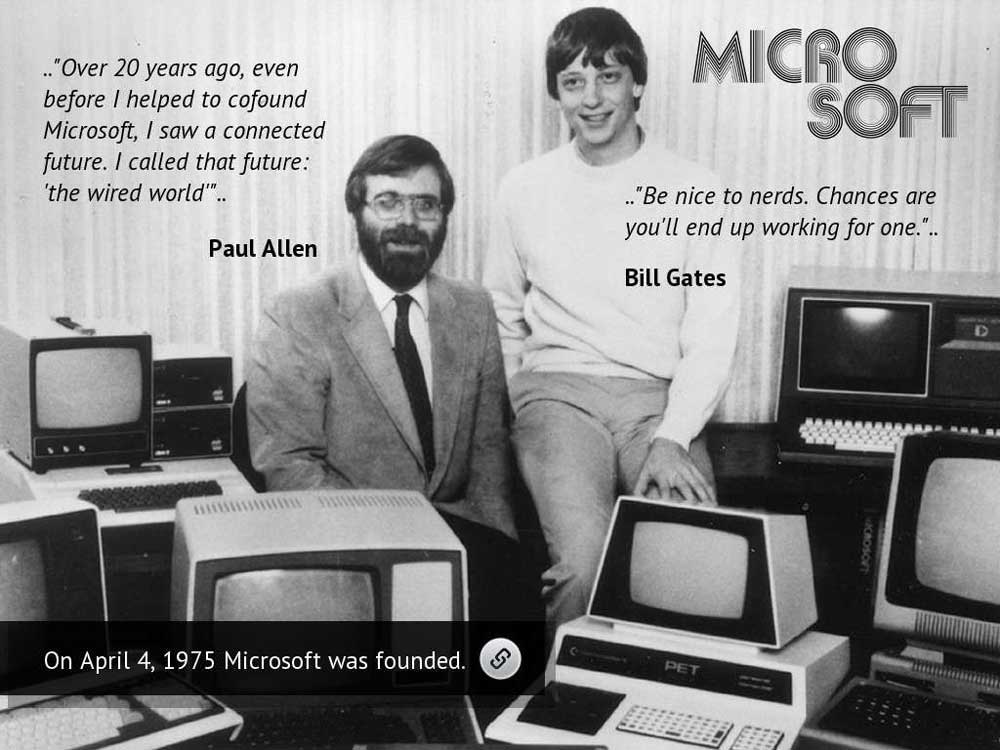
Microsoft, a tech behemoth with a global footprint, has its hands in numerous exciting tech ventures that have shaped our digital world. From Windows operating systems that powered personal computing to Xbox gaming consoles for immersive entertainment, Skype for convenient video calls, the professional network LinkedIn, and the boundlessly creative world of Minecraft – Microsoft has had an undeniable impact.
However, like most colossal enterprises that have stood the test of time, Microsoft has humble beginnings.
It all began in a garage in Albuquerque, New Mexico – a tale familiar to the genesis stories of many tech giants. A young Bill Gates and Paul Allen founded Microsoft in 1975, which has grown today into a company employing over 181,000 people globally and boasting a 20% market share in cloud computing with products like Azure.
The inspiration for Microsoft sparked while Gates and Allen were students at Harvard in 1975. This led an ambitious Gates to leave college prematurely to pursue his tech-driven, world-changing dream. While Gates possessed a clear vision and in-depth knowledge of personal computers, he faced a hurdle due to his lack of programming skills. However, adding a skilled programmer, Paul Allen, to their founding team proved to be the missing piece of the puzzle.
Together, they created an operating system that surpassed anything IBM, the reigning tech giant at that time, had to offer. This remarkable achievement paved the way for a groundbreaking partnership with IBM in 1980, where together they introduced MS-DOS 1.0 to the world – forever changing the landscape of personal computing.
Today, Microsoft's diversified product portfolio, including Surface devices, Xbox, Teams, LinkedIn, GitHub, and Skype, drives its consistent growth. In 2022, Microsoft reached a record revenue of $198.27 billion, demonstrating its ability to innovate and transform over decades.
Over its 47-year journey, Microsoft's design team has meticulously crafted a series of logos, encapsulating the brand and communicating its values and services through a single, iconic image. While the logo has undergone several transformations, it has consistently represented Microsoft's contemporary, forward-thinking ethos.
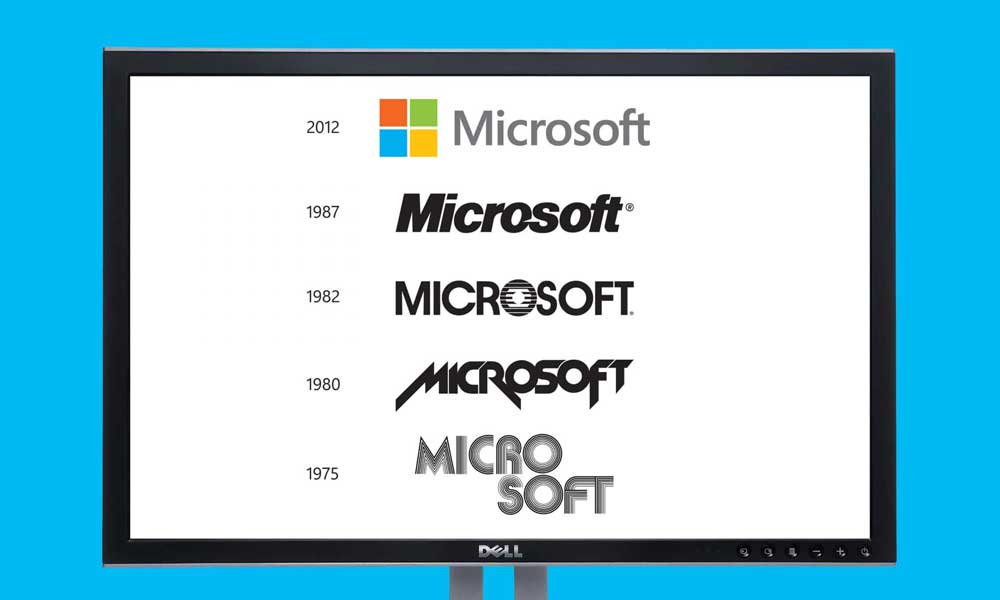
From the initial scribbled namesake to incorporating the Windows four-pane window to today's multicoloured square with the name spelt out – the Microsoft logo evolution encompasses the company's expanding universe of subsidiaries and offerings. Let's embark on a visual journey through the logo changes from its inception in 1975 to its current, globally recognised form in 2023.
Chapter 1: The Beginning of Microsoft (1975-1980)
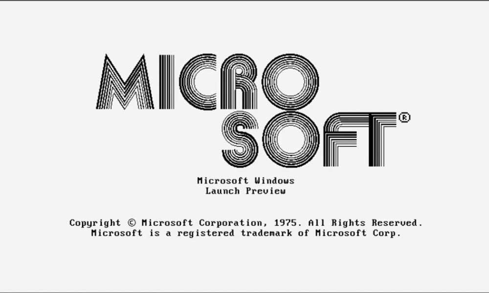
Let's kick off our journey by returning to the mid-1970s when Microsoft took its initial steps in the tech realm. During those formative years, logos followed a relatively straightforward design approach. However, even in those early days, the Microsoft logo captured attention with its distinctive features.
The logo of that era featured large, rounded, and slightly striped letters. It perfectly encapsulated the disco-era vibe that permeated the culture of that time. While this design had some noticeable quirks, such as slight irregularities in the lettering, like the “C” appearing a bit off-kilter and uneven spacing,” it served its primary purpose effectively.
Despite these imperfections, the logo successfully achieved its objective of establishing a unique identity for Microsoft when the company was starting its journey in the tech world.
Chapter 2: The Transition Phase (1980-1982)
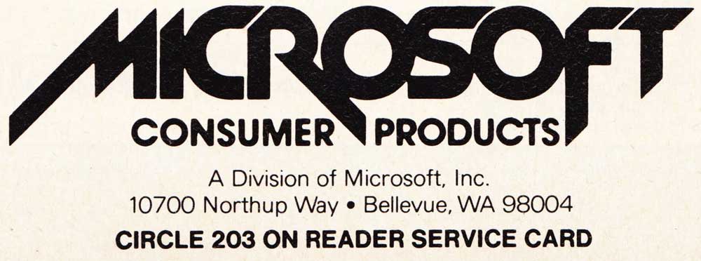
The early 1980s marked a radical transformation in the Microsoft logo, reflecting the company's growing confidence and evolving identity. This era introduced slanting lines with sharp edges, a departure from the previous smooth shapes and line detailing. It was undoubtedly a bold shift.
This period in Microsoft's history reflects a company that was gaining momentum and starting to assert itself. By 1978, Microsoft had achieved a significant milestone, generating its first $1 million in revenue.
During this time, In 1980, Bill Gates received a request from IBM. They asked him to develop an operating system for their line of consumer computers. This request marked the birth of MS-DOS, a groundbreaking operating system that would usher in a new era in computing. MS-DOS replaced IBM's OS 2 and emerged as a formidable competitor to other PC operating systems like LINUX and UNIX, solidifying Microsoft's position in the tech world.
Chapter 3: The Windows Era (1982-1985)
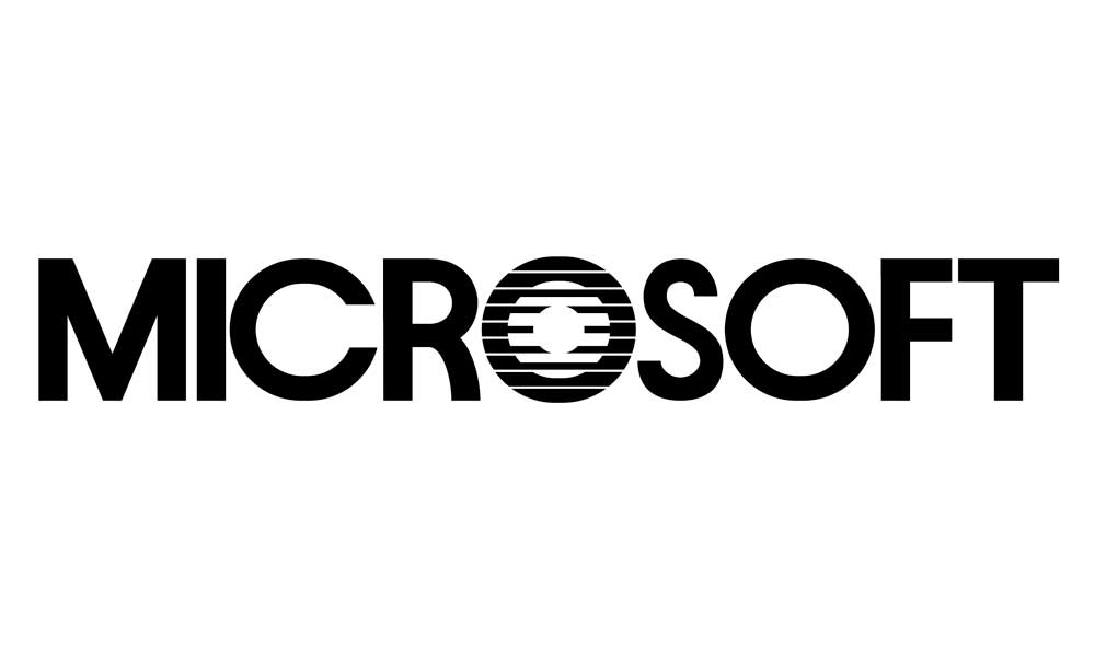
The 1982-1985 Microsoft logo departed from trendy designs, opting for a timeless and straightforward approach. The logo embraced a simple sans-serif typeface, conveying sensibility and maturity. It was a symbolic shift, signifying Microsoft's transition from its early, more rebellious image to a brand that presented itself as grown-up and authoritative.
The logo's “O” with its ringed lines, resembling a CD, became a beloved symbol known as the “Blibbet.” Such was its popularity that petitions in 1987 called for its return.
This era also coincided with the impending launch of Windows, necessitating a logo that captured the essence of this groundbreaking graphical user interface. The “o” with ringed lines subtly alludes to the visual windows that would redefine computing.
Chapter 4: The Pacman Era (1985-2011)
This logo, the fourth in the series, sported a slightly edgier look while maintaining a sense of familiarity. It was the brainchild of Microsoft designer Scott Baker and marked a new era in computing as Microsoft was preparing to release OS/2 to original equipment manufacturers (OEMs). It managed to spark both admiration and frustration from fans.
The logo featured the iconic Helvetica font with a distinctive touch—a small slash in the “O” that emphasised the “soft” aspect of the brand name. Baker explained that this slash symbolised “motion and speed,” which intrigued the employees, who affectionately referred to it as the “Pac-Man” logo.
This rebranding was a significant achievement for Microsoft, finding a balance between the edgier era logo of 1980 and the more buttoned-down logo of 1982. It had a remarkable run, being the face of Microsoft's brand identity for nearly a quarter-century.
Chapter 5: Microsoft Today (2011-Present)
2011, Microsoft significantly shifted its branding strategy by introducing a minimalist logo. The new logo featured a simple, monochromatic representation – a stylised four-pane window graphic with the company name, “Microsoft,” in the Segoe UI font.
This transformation was emblematic of Microsoft's desire for a fresh start, coinciding with the launch of Windows 8. The sleek and modern design was not just a cosmetic update; it conveyed Microsoft's unwavering commitment to innovation and adaptability in the ever-evolving tech landscape.
The four-colour panes in the logo have sparked various interpretations. Many speculate that they symbolise Microsoft's core software products, with blue representing Windows, green signifying Xbox, red denoting Office, and yellow standing for Bing. While these associations may not be officially confirmed, the logo's staying power is undeniable.
This logo's enduring presence signifies Microsoft's legacy and relentless pursuit of technological excellence. It serves as a visual testament to the company's commitment to shaping the future of technology and maintaining its position at the forefront of innovation.
The Future of Microsoft's Logo – A Glimpse into Tomorrow
As we peer into the future, we can only speculate on how Microsoft's logo might continue to evolve. With Microsoft's ever-expanding portfolio, which now encompasses cloud computing, artificial intelligence, gaming, and more, the logo will likely adapt to mirror the company's multifaceted identity.
The simplicity and versatility of the current design provide room for innovation, allowing the logo to adapt to new technologies and shifting consumer preferences.
The Ethical Considerations of Logo Evolution
Beyond the aesthetics and branding strategies, the evolution of Microsoft's logo brings to light the critical discourse surrounding ethical considerations that touch upon transparency, authenticity, and consumer trust.
With each transformation, the company subtly redefines its visual identity, which can significantly influence how consumers perceive its brand. This incredible power to shape such perceptions carries a profound responsibility to use it ethically.
For instance, when Microsoft shifted from its multicoloured squares to the sleek, minimalist design we see today, it was more than just a design update; it signalled a departure from its earlier image. While this change aligns with contemporary design trends, it can also be viewed as a strategic move to rebrand the company's image.
Ethical questions come to mind when companies employ logo changes for design enhancement and distance themselves from past controversies or negative associations. In such cases, transparency in branding becomes crucial. Companies should communicate the reasons behind logo changes openly and honestly and ensure they align with their core values and commitments.
Maintaining consistency between their visual identity and actions is equally important, as consumers today are more attentive to such things than ever. Authenticity and honesty in branding is not a choice anymore; it's an absolute necessity, and any perceived dishonesty can destroy consumer trust.
In an era where brand loyalty is increasingly intertwined with ethical values, the choices a company makes in its logo evolution can be a powerful reflection of its commitment to integrity and transparency in its brand identity. It's not just about design but the ethical foundation upon which a brand stands.
Key Takeaways for Aspiring Logo Designers

Embrace Change:
Just as Microsoft has evolved over the years, creating a logo that can adapt to changing times is essential. Consider how your logo will appear across various platforms and mediums. Ensure it looks equally striking on digital screens, mobile devices, website designing, and print materials. An adaptable logo ensures your brand remains relevant in a rapidly evolving technological landscape.
Simplicity is Powerful:
Microsoft's transition to a minimalist design emphasises the power of simplicity. A clutter-free logo has the potential to make a bold and lasting impression. When designing your logo, remember that less is more. Go for a clean, straightforward design and easy to recognise. A simple logo is visually appealing and more likely to be recognised by your audience.
Reflect Your Values:
Your logo should visually represent your brand's core values and mission. Microsoft's logos consistently communicated its dedication to innovation and progress. When crafting your logo, consider the message you want to convey. Whether it's trust, creativity, sustainability, or any other value, your logo should reflect it. A well-designed logo can evoke emotions and connect with your target audience meaningfully.
Versatility Matters:
A versatile logo is a valuable asset. It can be seamlessly integrated into various contexts without losing its impact. Ensure your logo is scalable, meaning it can be resized without distortion and works well in colour and monochrome. Versatility ensures that your logo remains effective in different applications, whether on a billboard, a business card, or a website design.
Consistency Builds Recognition:
Microsoft's logo consistency has played a significant role in building strong brand recognition over the years. To achieve the same, maintain consistency in your logo's elements. This includes keeping the same colours, typography, and design style throughout your branding materials. Consistency leads to familiarity, making it easier for your audience to identify and remember your brand.
Seek Professional Guidance:
Feel free to seek professional guidance if you need more expertise in design. Working with a skilled designer or design agency can help transform your vision into an effective logo. Design experts have the knowledge and experience to create superb logos that align with your brand's goals and values. Their expertise ensures that your logo stands out in a crowded market.
Incorporate these lessons from Microsoft's logo evolution into your design process. This way, you'll be well-equipped to craft a logo that authentically portrays your brand and stands the test of time, making a memorable impact on your audience.
Conclusion – The Microsoft Logo as a Mirror of Progress
The journey through the evolution of the Microsoft logo is far more than a visual retrospective; it's a profound reflection of the company's remarkable growth, exceptional adaptability, and unwavering dedication to innovation. Each logo transformation narrates a compelling story of Microsoft's evolving identity and its persistent commitment to shaping the future of technology.
In the ever-advancing landscape of the digital realm, Microsoft continues to pioneer new horizons and redefine the possibilities of technology. As it forges ahead, we can confidently anticipate that its logo will evolve harmoniously with its forward momentum.
It will perpetually serve as a symbol of progress and innovation and as a beacon guiding us toward the limitless potential of technology in our ever-changing world. The Microsoft logo is not only a mark of the company but a mirror reflecting the extraordinary journey of progress itself.
Author Bio: Sarah Iqbal, the CEO of KLEINBOTT., is a driving force in the software development sector. She is profoundly committed to technological innovation and leads KLEINBOTT. to new heights. Outside her corporate role, Sarah's devotion extends to her family, cultural exploration, neuroscience and AI, and a relentless pursuit of positive change.
