article thumbnail

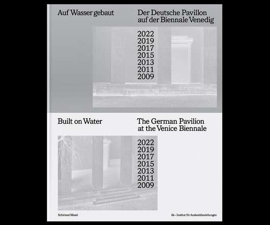
manystuff.org — Graphic Design daily selection » Blog Archive » The most beautiful Swiss books 2009 #cover #swiss #book

Designspiration

Discover more of the best Book Design, Print, Books, Publication Design, and Covers inspiration on Designspiration Saved by Kasper Pyndt (@kasperpsr).

article thumbnail

The German Pavilion at the Venice Biennale 2009-2022

Design Everywhere

The German Pavilion at the Venice Biennale 2009-2022.

Insiders

Sign Up for our Newsletter

This site is protected by reCAPTCHA and the Google Privacy Policy and Terms of Service apply.

Trending Sources

article thumbnail

“Books remain stubbornly, thrillingly relevant”: the enduring value of book design

Design Week

” And while there might not be one rule to good book design — Strelecki calls it a “process” between designers and clients — the jurors bring together a wealth of experience. Together and through that selection process, they might reveal answers to the secret of good book design Strelecki says.

article thumbnail

Michel Vrana on Designing Dante's Indiana

Spine Magazine

Michel Vrana is a graphic designer who ran his own boutique studio for ten years before deciding to go freelance in 2009 to concentrate on his passion: creating book covers. Here he talks us through his process for designing Dante’s Indiana.

Theme 98
article thumbnail

14 fonts to fall in love with: trending typefaces that designers adore

Creative Boom

The weights variation from Hairline to Super with corresponding italics form a coherent and versatile family, making it suitable for book design, poster design, branding, signage systems and more. The fonts are fully equipped with various stylistic sets, ligatures and case-sensitive forms, among other features.

Fonts 545
article thumbnail

10 Fresh Font Pairings for Editorial Design in 2020

Shillington

Copernicus Book is a much more traditional serif that exudes authority and a sense of formality, yet still with friendly and approachable letter-shapes. Designed by Village Type & Design in 2009, it’s a good option for body copy. Designed by Dutch designer Jos Buivenga, it was released in 2009 through exljbris.

Fonts 69
article thumbnail

Adam Pendleton’s Radical Typography as Protest

Eye on Design

It is also a visual experience asserting that Pendleton is as much a book designer as a painter and video maker. In a 2009 essay titled Adam, Why Arial? designer David Reinfurt criticizes Pendleton for using Arial, describing the font as hard to place and not firmly linked to history. Who Is Queen?