Captivating Circle Logos: A Showcase of Top 10 Brands
Logos are the visual anchors of a brand, encapsulating its essence into a memorable and distinct image. Circle logos have emerged as a popular choice of various logo designs due to their versatility, symbolic connotations, and ability to foster unity. Circle logos seamlessly blend aesthetics and meaning, creating strong associations in the minds of consumers.
The circle evokes ideas of community, relationships, and completion. The curved lines convey harmony, continuity, and wholeness. Circles also represent concepts like unity, infinity, and the cycle of life. By enclosing the logo mark within a circle, brands can imply inclusiveness, cooperation, and collaboration. The circular shape has no weak points, just as the company strives to be well-rounded and resilient.
Statistics underscore the popularity and effectiveness of circle logos. Research by Color Psychology found that brands with circle logos are more innovative, refreshing, and people-oriented. Per UK-based Signs Express, circular designs constituted over 10% of the top 150 symbols. Well-executed circle logos can boost brand image and consumer loyalty exponentially over time.
Now let's explore ten brilliant examples of iconic circle logos that have won over global audiences through their visual brilliance and strategic design.
Table of Contents
The Top 10 Circle Logos of All Time
1 – Apple Inc.
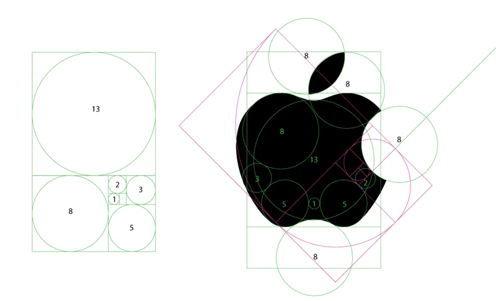
With its minimalist design of a bitten apple enclosed in a smooth circle, the famous Apple logo has become one of the world's most iconic and instantly recognisable corporate symbols. Created in 1977 by graphic designer Rob Janoff, the logo has undergone minor revisions over the decades but has largely retained its original clean and stylish aesthetic.
The genesis of the Apple logo dates back to when Steve Jobs and Steve Wozniak started Apple Computer in 1976. Jobs wanted a simple, eye-catching logo that embodied the company's values of creativity and innovation. After considering representations of Isaac Newton and famous apple varieties, Jobs settled on the image of an apple with a bite taken out of it. This evoked the moment of enlightenment and temptation symbolised by the Biblical story of Adam and Eve and the tech knowledge enabled by the new computer company. The chunk removed from the apple also helped make the logo more distinctive and memorable.
Janoff rendered Jobs' idea in a perfectly symmetrical, smooth-edged apple shape enclosed in a circular border—the resulting logo brilliantly balanced simplicity, symbolism and style. The monochromatic rainbow stripe logo, echoing the welcoming use of colour in Apple's early computer operating systems, was another stroke of visual branding genius. Apple retired the rainbow theme in 1998 in favour of monochrome designs.
Over the decades, Apple's logo has evolved with minor tweaks to the apple shape and some adjustments to the bite mark angle and size. But Janoff's original clean lines and minimalist aesthetic remain at the core of today's sleek silver, black and white versions. The logo has become synonymous with Apple's brand identity and its culture of design-focused innovation.
Now an iconic piece of corporate branding and pop culture symbolism, Janoff's Apple logo is a textbook example of how a thoughtfully crafted image can visually represent a company's values and make its brand instantly recognisable to millions worldwide. Its simple but evocative imagery cements Apple's logo as one of the all-time great symbols where form, function and meaning merge flawlessly.
Key Aspects:
- Simplicity: A clean and minimalist design that stands out.
- Universal Appeal: Easily understandable and memorable worldwide.
- Brand Association: Represents innovation, creativity, and technological prowess.
2 – Target Corporation
The iconic Target logo, with its bold red circle and centred white bullseye, has become one of the most recognisable symbols in the retail industry. Designed by graphic artist Allan Peters in 1968, the logo captures the essence of Target's brand identity in a clean, minimalist design that has stood the test of time.
The bold red circle immediately draws the eye and evokes excitement and vibrancy. Red is associated with concepts like passion, urgency, and impulse—apt associations for a retailer looking to build an emotional connection with customers. The white bullseye at the centre conveys notions of focus and accuracy. As Target aims to provide quality, on-trend merchandise at affordable prices, the bullseye symbolises the brand's mission to hit the mark with value-conscious shoppers.
The Target logo conveys critical components of the brand's personality and positioning in just two simple elements- the red circle and white bullseye. The pared-down, straightforward design is reminiscent of classic American pop art and helps differentiate Target from its competitors. While other big-box store logos may feature busy colour schemes or complex icons, Target's logo cuts through the clutter with an instantly recognisable graphic that has become beloved by generations of shoppers.
Since its inception over 50 years ago, the Target logo has undergone minor tweaks and updates. The red has become brighter, the bullseye a bit more boldly defined. But the essential spirit of the design remains unchanged. The logo's longevity is a testament to the power of minimalism and restraint in graphic design. Target understood the importance of a clean, memorable brand image. While trends and store offerings may evolve, the Bullseye logo remains timeless and on target.
Key Aspects:
- Visual Metaphor: The bullseye symbolises hitting the mark and achieving success.
- Consistency: The logo has undergone subtle modifications to maintain brand recognition.
- Colour Psychology: The bold red colour evokes a sense of urgency and excitement.
3 – Mercedes-Benz
The iconic Mercedes-Benz three-pointed star logo encapsulates the brand's storied history of luxury, innovation, and automotive mastery. First conceived in 1909 by Gottlieb Daimler, one of the pioneers of the automobile, the three-pointed star represents the brand's dominance on land, sea, and air. The emblem's origins trace back to a postcard that Daimler sent to his wife, where he drew a three-pointed star surrounded by the words “Mercedes 9.75 HP.” The star symbolised his hope that the Mercedes automobiles would one day shine down on the world from above.
In 1916, the three-pointed star was officially registered as a trademark, enclosed within a circle. The emblem took on new meaning – the three points stood for Mercedes' success on land, sea and in the air. In the land of automobiles, Mercedes stood for superior engineering, craftsmanship, performance and luxury. At sea, Mercedes excelled with marine engines. And in the air, the brand powered the first engine-driven aircraft and Zeppelins. Encircled by an unbroken circle, the star represented the brand's universal impact on mobility and innovation across all frontiers.
Over the decades, the iconic three-pointed star has stood as a beacon of prestige and distinction. Today it represents the Mercedes heritage of relentless passion for breakthrough technology, pioneering safety advancements, exquisite craftsmanship and an unwavering standard of excellence. The gleaming star gracing every Mercedes vehicle is more than a brand emblem – it symbolises the pursuit of automotive perfection. For over a century, Mercedes has shone its light on the future of driving, on land, at sea, and in the air. The three-pointed star logo will continue guiding the brand to new horizons, always reaching upward towards innovation and transformative mobility.
Key Aspects:
- Prestige: The logo exudes a sense of class and exclusivity.
- Heritage: It reflects the brand's rich history and tradition of excellence.
- Global Recognition: The logo is synonymous with luxury cars worldwide.
4 – Starbucks
The iconic green and white Starbucks logo is one of the most recognisable symbols in the world, representing a welcoming community space and high-quality coffee. When designing the logo in 1971, founders Gordon Bowker, Jerry Baldwin, and Zev Siegl chose a two-tailed mermaid or siren, evoking the maritime history of coffee trading routes. The warm, inviting image of the crowned siren with long flowing hair sends a message of comfort and refuge, beckoning customers into stores.
Unlike typical fast food logos, the hand-drawn illustration style creates a personal, human touch. The mermaid's naked lower half disappearing into a coffee cup illustrates the melding of mythological mystique with the modern coffeehouse experience. The green and white colour scheme elicits natural images of renewal, freshness, and peace. The circular shape encompasses the siren, reflecting unity and inclusivity.
This thoughtful logo has represented the Starbucks brand identity for over fifty years. It captures the company's mission to provide a welcoming “third place” outside work and home. Customers recognise it as an invitation to take a relaxing break, enjoy quality coffee drinks, unwind through music, and connect with others in the community. The original siren logo launched Starbucks into global fame, and its message continues to resonate with customers today.
Key Aspects:
- Emotional Connection: The siren embodies a sense of comfort and familiarity.
- Global Appeal: Starbucks' international presence has made this logo familiar in many countries.
- Brand Extension: The logo has been extended to various merchandise, reinforcing brand identity.
5 – BMW
The iconic BMW logo, laid out in a circle divided into four quadrants alternating between light blue and white, has an origin story steeped in aviation and engineering history. The design is meant to symbolise a spinning aircraft propeller as seen in motion, with the white quadrants representing the propeller blades and the blue symbolising the open sky.
This design was first used in 1929 when BMW started manufacturing aircraft engines and propellers, bringing their engineering expertise in high-performance engines from the automotive sector into aviation. The spinning propeller imagery effectively captured the spirit of aviation and speed. When BMW made its first automobiles in the 1930s, it retained the logo to signify its continued dedication to precision engineering and high-performance vehicles.
Over the decades, the BMW logo has undergone minor font, design, and shade tweaks but retains that iconic circular spinning propeller symbol at its core. The contrasting blue and white quadrants evoke a sense of speed and dynamic motion, matching BMW's focus on responsive handling and driver-oriented vehicles. Even as the company has diversified into new vehicle segments and technologies, the core identity embodied in its logo remains unchanged – BMW still aims to engineer vehicles that deliver powerful, efficient, and engaging driving experiences. The BMW emblem has stood for these values for over 90 years since its inception in aviation, making it one of the most instantly recognisable symbols in automotive history.
Key Aspects:
- Ingenious Symbolism: The historical connection enhances brand storytelling.
- Consistency and Adaptability: The logo has remained consistent while adapting to various marketing platforms.
- Premium Appeal: The logo reflects luxury, quality, and high performance.
6 – Mastercard
The iconic Mastercard logo, with its interlocking red and yellow circles, has become one of the most recognisable symbols in the world since its introduction in 1966. The overlapping circles depict global connectivity, demonstrating how Mastercard combines banks, businesses and cardholders into one unified payment network.
The choice of the circular shape conveys inclusivity, community and continuity without a beginning or end. The bright red and golden yellow combination is vibrant, complementary, and eye-catching. Red evokes excitement, speed, and passion, while yellow represents optimism, clarity, and joy. Together they create a bold, warm, and welcoming image.
This balanced dual-circle design is simple yet dynamic, encapsulating the spirit of Mastercard as a connector, facilitator and enabler. Its timeless minimalism enables effortless scalability and adaptability across languages and cultures. Over decades, Mastercard has retained its logo's foundational look and equity while periodically implementing subtle evolutions to keep it contemporary.
The enduring universality of the Mastercard logo has allowed it to become one of the most recognisable commercial symbols worldwide. Its pair of interlocked circles immediately conveys Mastercard's message of connectivity and acceptance wherever it is seen. The Mastercard logo has become an iconic emblem of global payments technology.
Key Aspects:
- Brand Association: The logo conveys trust, security, and seamless transactions.
- Cultural Relevance: The logo transcends language barriers, resonating with audiences worldwide.
- Evolution: The logo has evolved subtly, maintaining its core identity while staying contemporary.
7 – Volkswagen

The iconic Volkswagen logo has a fascinating history behind its simple yet memorable design. First unveiled in 1937, the logo was created by Franz Xaver Reimspiess, an automotive engineer tasked with designing a symbol representing the new Volkswagen company.
At the time, Volkswagen was founded as a car for the people of Germany. The company wanted a logo that would symbolise this accessible, reliable and high-quality vision. Reimspiess landed on overlapping the letters V and W inside a circle, with the exterior ring split into silver and blue halves.
The overlapping VW lettering was meant to symbolise the newly merged Volkswagen company, which had been formed by combining multiple car manufacturers. The silver and blue circle embodied engineering precision and reliability, two essential qualities Volkswagen hoped to communicate. The colours represent air and water – two essential elements surrounding us.
This straightforward but thoughtful design has stood the test of time. Now an internationally recognisable symbol of quality German engineering, the VW logo has remained unchanged since its inception over 80 years ago. Only minor modifications have been implemented over the decades, like tweaks to letter spacing and border thickness.
The VW logo's longevity and adaptability testify to its pared-down aesthetic's universal appeal. In a world where trends come and go, Volkswagen's commitment to its core philosophy of accessibility, durability and precision engineering continues to shine through in this uncomplicated yet impactful emblem. Its minimalist perfection reflects a brand's ethos of providing attractive, reliable transportation to the masses.
Key Aspects:
- Timelessness: The logo has retained its relevance for decades, emphasising the brand's consistency.
- Heritage: It represents the enduring legacy of the brand since its inception.
- Global Presence: The logo is synonymous with the brand's presence in various markets worldwide.
8 – Audi
The famous Audi logo, with its four interlocking rings, has an intriguing history going back to the early days of the automobile industry in Germany. In the 1930s, the country had numerous independent car manufacturers. Four firms – Audi, Horch, DKW, and Wanderer – were leaders in technological innovation and shared a vision for producing state-of-the-art vehicles.
Seeking to pool their engineering expertise and business resources, these four companies merged in 1932 to form Auto Union AG, based in Chemnitz. The new entity adopted a striking new logo to reflect the unity and synergy of the four brands. It featured four overlapping rings, each representing one of the original member companies. The rings were positioned to signify how they were technologically and strategically interconnected.
This interlocked ring design was selected after a public competition that attracted over 500 submissions. The winning entry was from Franz Xavier Reimspieß, a graphic artist and Lucian Bernhard, a renowned typographer. The minimalist, modernist logo perfectly captured the ethos of the new Auto Union – bringing together diverse strengths for innovation and progress.
Over the decades, as the Audi brand emerged to become the primary marque of Auto Union, the symbolic four-ring logo endured. It remains Audi's trademark to this day, still projecting attributes of excellence in engineering, coordinated teamwork, and visionary design – ideals as relevant today as back in the union's pioneering early days. The interlocking rings' firm, timeless visual identity continues to represent Audi's mission to push boundaries and shape the future of mobility.
Key Aspects:
- Symbolic Representation: Each ring represents one of the founding companies, making it a meaningful logo.
- Brand Recognition: The logo is easily identifiable, even from a distance.
- Evolutionary Success: The logo has evolved while preserving its essence.
9 – Chanel

Chanel's iconic interlocking C logo encapsulates the essence of the luxury fashion house. Designed by Coco Chanel herself in the 1920s, the double C logo is one of the most recognisable symbols in the world of high fashion.
The two Cs face each other in a mirror image, aligning their curves to form a rounded shape. The bold, black logo stands out with striking simplicity against Chanel's elegant white packaging and products. The interlocked Cs are always enclosed within a circle, representing the wholeness and continuity of the brand.
The paired Cs have a variety of symbolic meanings. They represent the initials of the founder, Coco Chanel, who transformed 20th-century fashion with her modern, liberating designs for women. The two Cs crossing over one another also signify the crossing of the feminine and masculine energies integral to Chanel's fashion philosophy. The curves of the Cs are said to be inspired by the intricate arches of the Abbaye de Westminster in Paris, where Coco Chanel lived as a young woman.
Beyond Coco Chanel herself, the logo represents important Chanel values like audacity, collaboration and connection. The crisp, interlocking Cs convey a sense of strength and boldness. Their symmetrical, interdependent shape expresses the partnerships and alliances within the House of Chanel. The bonded Cs symbolise the links between the brand's past and future as it continuously reinvented itself.
Instantly recognisable worldwide, Chanel's elegant double C logo represents the heritage, vision and sophistication that the iconic luxury brand is renowned for. The deceptively simple yet visually striking mark reflects the woman at the heart of the empire – Coco Chanel, who crafted an enduring symbol as timeless as her little black dress. The interlocking Cs communicate the very essence of Chanel.
Key Aspects:
- Legacy: The logo pays homage to the brand's founder, Coco Chanel.
- Exclusivity: The logo is synonymous with high-end fashion and luxury.
- Timelessness: It has remained unchanged, signifying the brand's enduring elegance.
10 – Google Chrome

The Google Chrome logo has become an iconic symbol since its introduction in 2008. The colourful design features the name “Chrome” in a clean, bold font surrounded by a circle divided into red, green, yellow, and blue segments. This simple yet vivid logo effectively captures the essence of Google's popular web browser.
The circle represents the globe, signifying the worldwide reach and accessibility of Chrome. The four colours of the segments encircling the name correspond to the colours present on the Google logo. This creates a visual connection, making it clear that Chrome is part of the Google product family.
The choice of the four colours is also symbolic. Red, green, and blue are the primary colours used on computer displays and represent all possible web colours together. The yellow segment complements these primary hues. The combination communicates the idea that Chrome provides access to the full spectrum of the web.
The minimalist, circular design gives the Chrome logo an approachable, friendly personality. It evokes concepts like connection, community, and exploration. There is a sense of fluidity and movement in the swirling segments, reflecting the dynamic nature of internet browsing.
The Chrome logo elegantly encapsulates the brand's vision by combining simplicity, meaningful colours, and suggestive shapes. It expresses the browser's aim to provide a fast, efficient web experience to everyone across borders and cultures. The logo's thoughtful design has contributed significantly to Chrome's identity as an accessible, user-friendly internet portal.
Fifteen years after its inception, the Chrome logo remains a distinctive symbol of the web's infinite possibilities. Its intelligent use of colour and shape perfectly encapsulates the exploratory spirit of Google's popular browser.
Key Aspects:
- Playful Design: The logo appeals to many users, from tech-savvy individuals to casual internet users.
- Modernity: The symbol aligns with Google's innovative and cutting-edge image.
- Brand Consistency: The logo integrates well with other Google products, creating a seamless brand experience.
Conclusion
Circle logos are an enduring and versatile brand asset across countless industries. Their appeal and memorability stem from simplicity, minimalism, and evocative symbolism. By paring logos down to their most essential geometric form, brands can create iconic designs that transcend cultural and generational boundaries.
The top 10 circle logos discussed here showcase this style's remarkable longevity and global reach. Brands like Starbucks, Audi, and Mastercard built their identities around these memorable emblems decades ago and remain pillars of their branding today. Other companies like AT&T and Firefox have also tapped into the power of the circle logo more recently, finding great success in adopting this timeless shape for the digital age.
For new companies looking to make their mark, circle logos represent a compelling visual strategy. Their bold simplicity enables versatility across mediums and environments. They also provide a symbolic canvas for brands to project core values like community, inclusivity, or innovation. With thoughtful execution, a circle logo can become the relatable face of a company, forging visceral and lasting connections with audiences worldwide.
Ultimately, simplicity means more impact. On the contrary, restraint in logo design requires great skill. At their best, circular logos showcase that memorable branding is independent of visual clutter and complexity. They prove that, when strategically employed, a single geometric shape can convey a brand's ethos instantly and powerfully. For this reason, circle logos will likely retain their dominance and appeal across all fields of business and culture for the foreseeable future.
