Iconic Logo Redesigns: Hits, Misses and Controversies
Logos are some of the most iconic symbols in our visual world. As brands evolve to meet changing consumer demands or culture shifts, iconic logos often get redesigned as part of more significant rebranding initiatives. Logo redesigns walk a fine line between maintaining brand recognition and signalling change. When done effectively, a redesigned logo encapsulates a company's history while setting the stage for an innovative future.
This comprehensive guide analyses what makes for iconic logo redesigns, pitfalls to avoid, and the psychology behind why humans cling to the familiar. We also chronicle and critique some of the most stunning logo redesign rollout campaigns and style guide evolutions from big-name brands over the past decades. From Pepsi to Starbucks to Uber, we explore the hits, the misses, and the controversy.
Table of Contents
Balancing Brand Heritage With Innovation Goals
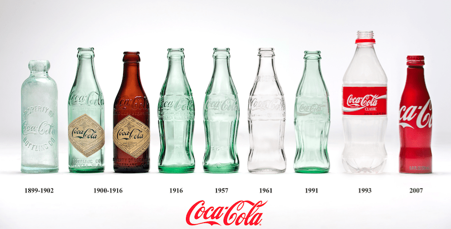
When embarking on a logo redesign, brands must balance celebrating existing equity built up in their visual identities over years or even decades while pushing towards a more modern, digitally friendly aesthetic.
We break down the reasons companies invest significant resources into reinventing their logos:
- Signal Brand Evolution: A new logo design relays internal culture shifts and externalities positioning to consumers. For example, Uber's recent “Moving Forward” minimalist rebrand signifies a pivot towards safety and sustainability.
- Attract New Demographics: Generational turnover means fresh logos can help brands better resonate with young people who prioritise transparency, diversity and inclusion.
- Adapt to Digital Environments: From tiny app icons to website banners, logos now exist in far more environments than they did decades ago. Flat, responsive and easily reproducible styles often test better across digital properties.
- Streamline the Style Guide: Tightening up colours, fonts, and graphic elements (ex, Apple's reductionist shift to a monochromatic palette in recent years) helps brands better control usage.
- Revitalise Stale Perceptions: Logo makeovers stir up publicity and help re-energise consumer impressions of tired or dated brands.
“Great logos use design elements that suggest the company’s value proposition and trigger a desired customer response…They are timeless expressions of the company’s core values.”
Lindon Leader.
Striking the optimal balance between heritage and innovation remains more art than science. Brand custodians must coax along loyal fans who favour the nostalgic cachet of legacy brands while enticing new demographic groups with a vision of the future.
The Psychological Pull of Familiar Logos
Humans strongly prefer familiar stimuli – a phenomenon called the “mere-exposure effect” in psychology. Researchers find people rate everyday items more positively than new ones, even without objective quality information.
This innate bias towards familiar logos creates a wrinkle for redesigns, which must compete against positive sentiments attached to nostalgic iconography. Brand custodians know reinventing a beloved visual identifier risks triggering fans emotionally tethered to an organisation's legacy identity.
“Emotion is the critical factor that determines logo preference and acceptance. It is not unusual for people to complain about logo redesigns since people form attachments to logos just like they do to people and places.”
Consumer Psychologist Dr. Louisa Selz.
Indeed, many logo overhaul attempts prompt intensely adverse reactions from subsets of brand devotees, who may circulate online petitions demanding a return to classic iconography.
Factors impacting reactions include:
- Brand Loyalty: Diehard fans often feel most upset when an iconic logo changes versus the average consumer. Lifelong Nike wearers famously protested when the brand ditched its swoosh tagline for the “Just Do It” 25th-anniversary campaign.
- Generation: Older demographics frequently view legacy brands as cultural institutions deserving of preservation and dislike major design overhauls. Younger groups tend to welcome change as signalling innovation.
- Logo Prominence: Logos enjoying near 100% recognition after decades of heavy use face the most significant hurdles for acceptance. Think Coca-Cola script, McDonald's golden arches or Apple's apple.
Brand custodians face tricky parenting decisions – when to listen to the boisterous super fans resisting change in favour of nostalgia and entice them to embrace a modernised aesthetic reflecting updated positioning? We next explore best practices to ease transitional friction.
Change Management Lessons for Smooth Logo Redesign Roll Outs
Logos may be simple iconography, but reinventing a brand's visual identity qualifies as significant change management. Leading organisations apply best practices for seamless transition planning, internal alignment and post-launch iteration.
Get Stakeholder Buy-In
Early support from essential internal constituencies paves an acceptance path when logo changes roll out externally. Analysts urge:
- Involve Leadership: Secure executive champion(s) to help communicate the business context and impact of a refreshed visual identity across the organisation.
- Designate Brand Stewards: Task influential managers from crucial divisions like Marketing, Communications and Customer Service to cascade logo style guides to their teams pre-launch.
- Educate Employees: People need help processing changes to the beloved iconography they sport on their mugs and t-shirts. Share positioning rationale and new guidelines widely.
“The most successful visual identity shifts come from companies that involved staff early on and helped them recognise how a refresh helps the organisation stay vibrant and tackle new challenges.”
Brand Strategist Rebecca Robins.
Phase In Transition
Big bang rebrands risk shocking system constituencies. Branded elements permeate digital interfaces, packaging, uniforms, fleet vehicles, signage and more. Phasing brand identity transitions across inventory minimises disruption:
- Digital First Roll Outs: Launch redesigned logos on websites, apps and social channels first. Iterating early with digital enables rapid refinements based on user feedback before committing resources to hard goods.
- Inventory Phase Out Only produces future merchandise, packaging, fleet paint jobs, etc., showcasing modernised aesthetics. Let legacy branded materials currently in the market play out.
- Style Guide Sunset Policies: Communicate timeframe expectations internally for when old versus new logo treatments apply as usage guidelines phase in.
Allow Post-Launch Iterations
Treating logo redesign launches as fixed one-and-done efforts risks backlash if reception skews negative. Savvy brand custodians designate phase two refinement periods, allowing tweaks responding to consumer reactions.
Recent examples of post-launch logo revisions include:
- Uber: Ditched the “atom” icon central to its 2018 rebrand just months after launch in favour of a simplified wordmark.
- Mailchimp: Quickly reverted to more recognisable visual branding following its failed “Freddie” redesign attempt.
Building iterative windows into initial rollout plans demonstrates customer centricity – especially powerful for the digital age.
Notable Rebrand Attempts: Hits, Misses and Controversies
How do industry leaders apply rebranding best practices when reinventing famous visual identities? We analyse recent efforts, spotlighting both stunning successes and cautionary tales.
Hits: Turbocharging Brand Positioning
1. Uber: Signaling Safety + Sustainability Commitments
Uber's app icon redesign compressed the company's digitised journey into a minimalist “U” against a safe green background. The pared-down branding visually encapsulates CEO Dara Khosrowshahi's shift towards safety and sustainability after years of cultural turmoil. Early simplicity drew critiques of boringness, but the bright green colour created a standout and aligned Uber with eco-friendly transport alternatives.
2. Dunkin’: Dropping “Donuts” To Attract Health-Conscious
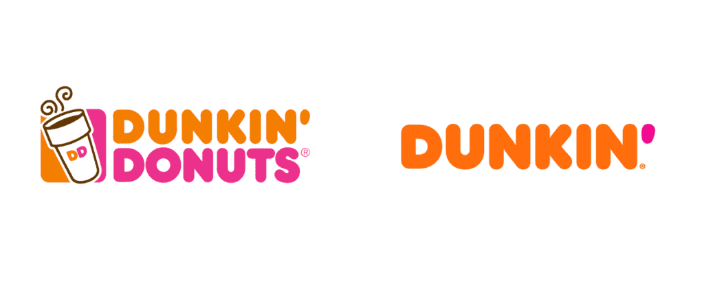
Ditching “Donuts” to become just Dunkin’ in 2018 signified a product mix migrating to appeal to health-conscious consumers via fresher sandwiches, flatbreads and plant-based proteins. The truncated branding successfully boosted perceptions of versatility beyond fried, sugary treats. Revenues jumped too – over $300m annually, according to 2016 analyst estimates.
3. Weight Watchers: Supporting Wellness Journey Evolution
Shedding nearly half its moniker to become “WW”, modernised branding is no longer centred on weight loss alone. The simplified logo better encapsulates parent WW International’s expanding wellness mission across fitness, nutrition and mindfulness.
4. YouTube's Minimalist Rebrand
When YouTube unveiled its dynamic new logo in 2017, it faced some criticism. The iconic red play button symbol was flatter and simpler – losing some of its 3D perspective. However, this more minimalist aesthetic fits YouTube's modern context within the Google brand family. It formed recognisable connections through a similar red subscribe button.

5. Mastercard Drops Name, Master Symbol
In 2019, Mastercard dropped its name from the logo, retaining only its intersecting red/yellow circles. Having secured iconic decodability, the name became redundant. This forceful embrace of confident symbolism demonstrates tremendous consumer connection. It conveys that Mastercard is now bigger than any label.
Misses: When Simplifying Goes Too Far
1. The Gap: Losing Brand Identity With a Blank Canvas
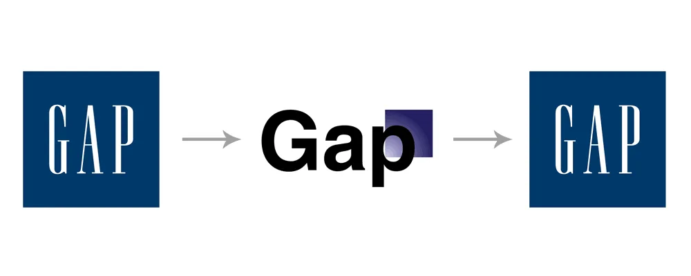
In 2010, Gap rolled out a stripped-down logo, ditching its longstanding navy blue box and font treatment for a simplistic Helvetica-type treatment on white. The anonymous branding drew instant scorn, making Gap unrecognisable and absent traditional markers. Critics lamented the interchangeable logo could belong to any generic clothing retailer. Gap quickly reverted to classic iconography just one week later.
2. Animal Planet: Dropping Critters Alienates Nature Fans
Discovery’s 2008 rebrand of its Animal Planet subsidiary aimed for broader viewer appeal by downplaying cute creature connotations. However, the new logo ditching the elephant, dolphin and other critters in favour of a simple wordmark prompted an outcry from nature fans. Critics felt eliminating animal imagery eroded Animal Planet’s core mission to spotlight wildlife. Discovery was forced to do an about-face, incorporating animals into a revised logo just months after launch.
3. JCPenney: Eliminating Customer Clarity and Connection
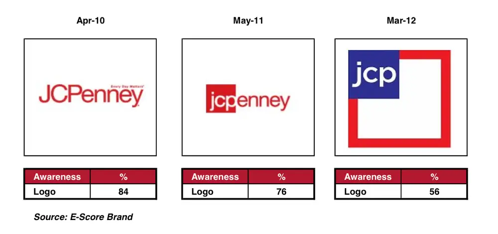
In 2012, the struggling department store adopted a modern identity, rebranding itself as simply “jcp” in lowercase—the pared-back logo choice intended to signal hip, youthful sensibilities. Instead, focus groups found the generic treatment forgettable and coldly corporate, absent emotional connections to the longstanding JCPenney script logo. After the revised branding introduction, sales tanked over 20%, exacerbating financial woes. JCPenney returned to its classic logo in 2013, admitting failure.
Controversies: Cultural Appropriation Critiques
1. Dunkin’ Donuts: Accused of Racist Stereotyping with “Rachael Ray” Ad
A 2008 Dunkin’ ad showcasing celebrity endorser Rachael Ray sporting a paisley black-and-white scarf ignited controversy over perceptions the patterned garb resembled Arab headdresses. Critics accused Dunkin’ of promoting racist cultural stereotypes. While offensive perceptions were unintentional, the backlash exemplified brand messaging risks when iconic labels expand globally.
2. Starbucks: Criticised Over Simplified Logo Evoking “Slave” Imagery
Starbucks stirred outrage when it rolled out streamlined branding in 2011 and focused solely on its iconic Siren character. Critics asserted the revised image concentrated strictly on the bare-chested Siren, which resembled visual slave and plantation imagery from centuries past. Starbucks quickly restored the “Starbucks Coffee” wordmark alongside the controversial logo update to clarify the brand context absent in the simplified design.
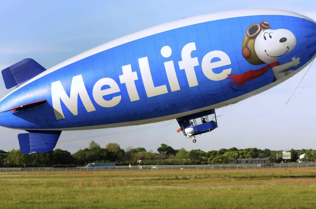
3. The MetLife Snoopy Retirement
In 2016, insurance juggernaut MetLife suddenly retired Snoopy as its logo mascot after over 30 years. This orientation towards a more “mature” image proved quite controversial.
However, MetLife's updated visual branding does convey industry leadership and trustworthiness. And the company hasn't entirely abandoned its Snoopy equity – still using the Peanuts character internally.
Key Takeaways
Reinventing iconic logos and qualifying as pop culture visual ambassadors walk a tightrope between celebrating the brand heritage and pioneering the future. As we’ve explored through hits, misses and controversies – change prompts complex consumer psychology responses. When brands nail elegant transitions aligning refreshed aesthetics with repositioning, they reap the rewards of re-energised perceptions and revenues. Yet, they fail to honour legacy equity or move too far beyond familiar iconography, and they risk alienating loyalists while eroding hard-won recognisability.
We close with core lessons for smoothly evolving the beloved brands people visually identify with:
- Involve internal stakeholders early, centring leadership direction-setting and cascading education.
- Phase in logo updates across inventory categories to allow adjustments responding to reactions.
- Spotlight visual updates as supporting product improvements and cultural initiatives core to company priorities.
- Treat initial redesign launches as betas – further, optimise if reception skews negative.
- Honour heritage equity and consumer emotions tied to nostalgic iconography.
Strike this delicate balance, and brands craft refreshed logos, propelling them forward while celebrating an immortal past.
Iconic Logo Redesigns (FAQs)
How often should companies redesign beloved logos?
On average, major visual identity overhauls happen every 5-10 years to remain contemporary. But brands must weigh equity dilution risks revamping ultra-recognizable legacy iconographies like the Nike swoosh or Coca-Cola script.
What are the leading reasons logo redesigns fail?
Deviating too far from familiar iconography that anchored prior brand strength leads redesigns astray. Also problematic – lack of internal buy-in and abrupt launches absent transition education fuel rejection.
Do logo rebrands boost sales and awareness?
Done effectively aligning to repositioning, refreshes reignite consideration, especially helpful for dated brands. Dunkin’ and Weight Watchers both saw revenue lifts from updated branding. However, failed attempts like JCPenney saw sharp sales drops absent visual equity transfer.
What role does digital play in logo design trends?
Mobile usage means logos exist in tiny social icons or app launcher formats. Expect ever-simpler, flatter, bolder logos that can be reproduced cleanly across digital dimensions.
How can companies honour brand heritage despite changing logos?
Retain classic logo access, educate employees on history, feature archival iconography on merchandising to ease transitional friction and balance contemporary stylings against legacy appreciation.
