5 Signs It's Time to Refresh Your Logo Design
Your logo is the visual anchor of your brand identity – it's often people's first impression of your company. A thoughtfully designed logo can spark recognition, build trust, and help customers feel connected to your brand. However, an outdated logo design can hold your brand back as your business grows and evolves.
As fashion and design trends change, a logo that felt fresh 5 or 10 years ago may now feel dated. The visual language we use to communicate evolves rapidly in the digital age. Customers expect brands to update their visual identity to feel current, not stuck in the past.
Redesigning a trusted, recognisable logo is a significant branding investment – but periodically refreshing your visual identity keeps your brand fresh, relevant and primed for the future. A thoughtful logo update retains equity while signalling evolution.
So stay attuned to how your logo design represents your brand as you grow. With strategic timing and purpose, reimagining your logo can re-energise your business and community.
Table of Contents
1 – Outdated Design Trends
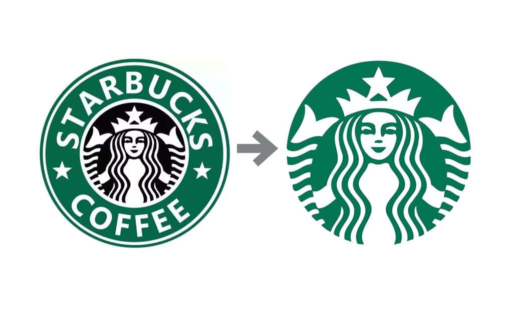
Design trends are constantly evolving to reflect consumers' changing tastes and preferences. What was once considered sleek and modern can quickly become dated and outmoded within a few years or even months. As a business, keeping your brand identity and design aesthetics up-to-date with current trends is crucial for appealing to your target demographic and avoiding an outdated or irrelevant appearance.
Recent surveys illuminate the impact of design on consumers' perceptions. According to an Adobe study, 47% of consumers say design is a significant factor in purchasing decisions. Additionally, 42% of consumers base judgments of a brand's credibility primarily on its logo design. With design playing a pivotal role in brand image and consumer choices, an outdated aesthetic can harm sales and marketing success.
A decade ago, design trends tended to feature flashy graphics, busy layouts, and bold colours. Minimalism, negative space, mobile-first design, and meaningful graphics over cluttered decorations are emphasised today. Simple, clean fonts have primarily replaced the elaborate script and serif fonts of the past. Bright neon palettes have given way to muted tones and sophisticated colour gradients.
Refreshing a brand's design to align with current aesthetics demonstrates that the company is modern, aware of industry and consumer shifts, and able to adapt accordingly. An updated, contemporary logo immediately gives the impression that the brand is forward-thinking, while an outdated image suggests the company is stuck in the past. As consumer demographics and preferences change, brands that fail to update their visual identities risk appearing irrelevant or out of touch.
The data highlights why design revitalisation needs to be an ongoing process, not just a one-time event. By continually monitoring trends and implementing logo and aesthetic updates every few years, brands can retain relevance, broaden their appeal, and communicate their alignment with consumer tastes. The visual refresh conveys that the company has its finger on the pulse of evolving industry norms and is responsive to the target audience's changing needs. With strategic design refreshes over time, businesses can leverage this vital branding component to maximum advantage.
2 – Business Evolution
As your business grows and evolves, ensuring that your brand identity continues to reflect who you are accurately is vital. The logo and branding that perfectly encapsulated your startup ten years ago may no longer suit the company you have built today.
Evolving your brand identity is crucial when your business expands into new product lines, targets new demographics, or adds new service offerings. Your old branding risks feeling outdated or no longer capturing your company's essence and values in its current form.
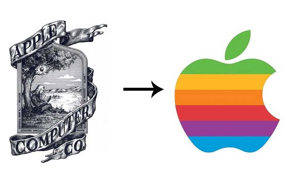
A great example of a brand that has successfully evolved its logo and branding over decades of change is Apple. Their original logo from 1976 featured Isaac Newton sitting under an apple tree – imagery meant to honour the gravity of discovery and innovation.
But as Apple grew beyond just computers into new frontiers like personal music players, smartphones, and tablets, its logo evolved to remain contemporary and reflect its design aesthetic. The branding remains recognisable while feeling current by gradually simplifying from the rainbow apple to today's minimalist monochromatic apple logo.
The company's branding communicates its commitment to sleek, intuitive design and user experience across its diverse product lines. Even the iconic shape of the apple pays homage to their first breakthrough product.
Revisiting your logo and branding as your business grows allows you to realign the visual identity with your current mission, vision and values. It helps you accurately represent what your company stands for today, not just what it stood for years or decades ago when you first launched. A logo refresh reassures customers that you are still relevant, innovative and invested in meeting their evolving needs.
3 – Incompatibility with Multiple Platforms
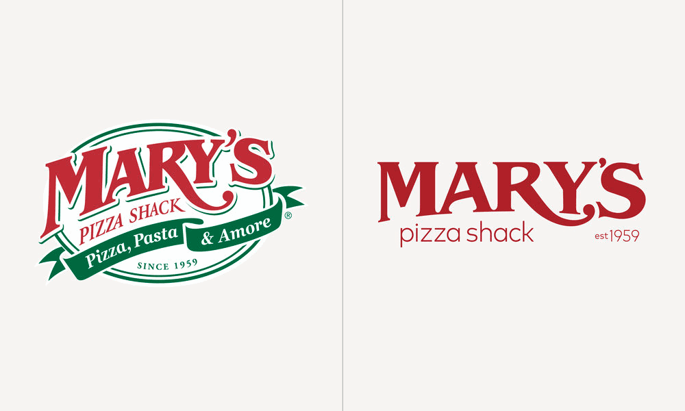
In today's digital age, a company's logo is no longer confined to letterhead and business cards. Instead, it appears across various platforms and devices – from websites and social media profiles to mobile apps and merchandise. Logos must be versatile enough to adapt to different sizes and resolutions without losing their impact.
An outdated, overly intricate logo may not scale well or retain clarity when minimised, which can negatively impact the user experience. According to a 2021 study conducted by researchers at Stanford University, 75% of users admit to making judgments about a company's credibility based on website design alone. With logo visibility being a key design component, having a logo that distorts or pixelates at smaller sizes could lead to negative perceptions of your brand.
A logo refresh can address these issues by optimising your design for digital media. The goal is to create a logo that looks crisp and visually appealing at large and small dimensions. Simplifying intricate graphic elements and refining the colour palette effectively enhance scalability. For instance, gradient colours may appear muddy or blend when reduced in size. Solid, complementary colours create a more readable and consistent logo across platforms.
Updating your company's logo improves flexibility in today's multi-device world. Ensuring your logo renders well on screens of all sizes reinforces brand recognition and trust among your target audience. With user judgments heavily influenced by visual design, having a modern, digitally-optimised logo can positively shape perceptions of your business.
4 – Mergers and Acquisitions
When two companies join forces through a merger, acquisition, or partnership, they combine their brand identities and logos. While maintaining both visual assets may seem like a way to preserve the legacy, it often dilutes messaging and causes consumer confusion. To present a unified front, newly combined entities frequently opt for logo redesigns that blend elements of the original brands.
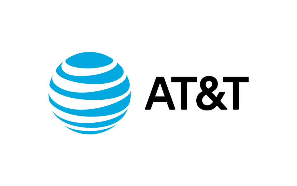
The 2006 merger between telecommunications giants AT&T and BellSouth is a case in point. Both companies had strong name recognition and established logo designs at the time. AT&T's iconic globe symbol has represented its global communications footprint since 1983. Meanwhile, BellSouth's flowing bell logo was familiar across its regional markets in the southeastern U.S.
Rather than keep two disparate brand marks, the merged entity worked with a design firm to create a new logo incorporating each aspect. The result was a refreshed design that combined AT&T's global shape with colours and stylistic elements from the BellSouth identity. This strategic logo redesign aimed to project unity, strength and innovation moving forward while still nodding to the legacy companies that came together to form the new AT&T.
The AT&T-BellSouth merger exemplifies how two well-known brands can thoughtfully fuse their visual identities into one that propels the combined company into the future. Executing a purposeful logo redesign is often a pivotal step in communicating a unified brand during major company transitions. It streamlines marketing and aligns the newly expanded organisation around a common identity and messaging.
5 – Declining Brand Recognition
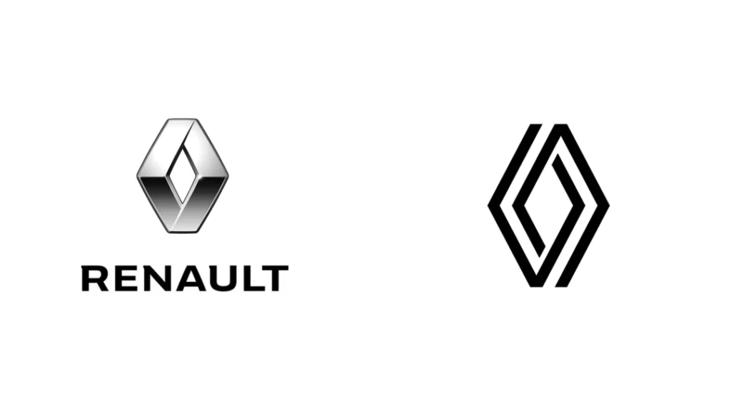
A company's logo serves as a visual shorthand that sparks recognition and recollection of the brand in consumers' minds. An effective logo becomes indelibly linked to the company it represents. However, if a logo fails to resonate with the target demographic or is too generic to stand out, it can falter brand recognition over time.
According to a recent survey conducted by the branding firm Siegel+Gale, distinctive and memorable logos are 13% more likely to aid consumers in identifying and recalling a brand. This finding highlights the importance of having a logo that makes an impression and sticks in people's minds.
Sometimes an existing logo that once worked well sheds its power to capture attention and form meaningful associations. A logo refresh that retains the most recognisable or beloved visual components while injecting new elements can reignite brand recognition.
Subtle updates to a logo can strengthen the emotional bonds between customers and the brand by signalling change, evolution and continued relevance. More dramatic redesigns that overhaul the logo can excite interest and signal a new era for a company. The most effective logo refreshes artfully and balances continuity with change.
No matter the extent of the redesign, a thoughtfully updated logo that clicks with target audiences can boost brand recognition, reinvigorate customer relationships and catalyse business growth. The refresh costs are often recouped manifold via expanded visibility and sales. For companies with declining brand identification, a logo renovation that speaks to contemporary consumers while respecting branding heritage can reignite recognition and loyalty.
Need to Refresh Your Logo?
When you refresh your logo, it's more than just a superficial facelift for a brand – it is a thoughtful and strategic decision that keeps a company relevant, engaging, and impactful in an ever-changing marketplace. Recognising when to update your logo is critical to positioning your organisation for continued success.
Though logos aim to be timeless brand representations, several signs indicate when a logo refresh is necessary. An outdated design style that no longer reflects current trends can make a brand seem stuck in the past. Companies that have gone through mergers, acquisitions, or rebranding may also require logo changes to match their new business strategy and identity. Additionally, a logo with poor visual quality or legibility can detract from brand recognition and should be updated.
When the time comes, the logo redesign process must be more than just creating a new icon. It requires carefully evaluating your brand's mission, values, persona, and target audience to develop a design that resonates both visually and conceptually. Research should examine industry trends and competitors and stay true to the brand's heart.
A thoughtfully refreshed logo can reinvigorate a company's legacy, making it even more memorable and meaningful to consumers. It shows that the brand is keeping pace with the times and providing value to current and future customers. This update helps forge emotional connections critical for success.
In today's dynamic marketplace, a brand's logo should evolve just as its business. By recognising the right moments to refresh your logo design, companies can keep their brands relevant, relatable, and remarkable for years. A logo change is not just a cosmetic fix but a profound opportunity to communicate your brand's enduring and adapting story.
