History of the Ford Logo Design Evolution
The Ford Motor Company has been one of the automotive industry's most recognisable and influential brands for over a century. With its reputation for high-quality, reliable vehicles, Ford has become a household name that evokes notions of American ingenuity and craftsmanship. However, just as iconic as its cars is Ford's legendary logo – the Blue Oval.
Instantly recognisable around the globe, Ford's logo encapsulates the spirit and ethos of the company. Its simple yet striking design reflects Ford's focus on functionality and dependability. The navy blue oval shape projects steadiness and consistency, while its clean lines and lack of embellishment speak to Ford's commitment to efficient, no-nonsense manufacturing.
Yet there is more to this celebrated emblem than meets the eye. The Blue Oval has an intriguing origin story intertwined with the company's evolution. Its visual properties and clever symbolism reveal critical insights into Ford's brand identity and values.
In this article, we will unpack the fascinating history and design evolution of the Ford logo. Tracing its different iterations over the decades, we can better understand the ingenuity and strategic vision behind this iconic brand mark. From its inception to its current globally-known form, the Blue Oval allows us to chart the growth of one of America's most cherished automakers.
Table of Contents
Ford Motor Company: A Brief Overview
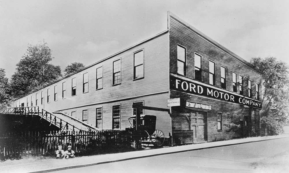
The history of the Ford Motor Company is intertwined with the evolution of its iconic logo design. Henry Ford founded Ford in 1903 in Detroit, Michigan, along with 11 other investors. In the early years, Ford's production capacity was limited, and the company could only manufacture a few vehicles daily.
This changed in 1913 when Henry Ford implemented the innovative assembly line method for automobile production. The assembly line enabled Ford to mass produce affordable cars at scale for the first time, revolutionising the auto industry. This allowed Ford to expand exponentially, selling vehicles in the United States and globally.
In 1929, Ford even signed an agreement with the Russian government to provide vehicles and technical assistance. By the late 1920s, the Ford Model A had become one of the most popular cars in America.
Ford continued its rapid growth throughout the 20th century, surviving economic upheavals like the Great Depression. During World War II, Ford devoted its production facilities to building military vehicles like the iconic Jeep to aid the Allied war effort.
After the war, Ford resumed automobile production and released classic models like the Thunderbird and Mustang. Ford constantly rivalled other Detroit automakers like General Motors and Chrysler as they vied for sales.
Today, the Ford Motor Company is the second largest U.S. automaker behind GM and the fifth largest in the world behind Toyota, Volkswagen, Hyundai, and GM. In 2022, Ford sold over 4 million vehicles globally, a testament to its staying power over 115 years after its founding. The Ford logo has remained an emblem of American manufacturing and innovation throughout the company's storied history.
Ford Logo – History, Meaning, and Design

The Ford Motor Company has a long and shiny history, as does its official logo.
Designers often call it the Blue Oval Logo due to its specific features. Still, this emblem's origin and history are packed with upgrades, redesign attempts, and interesting facts.
The description of the Blue Oval Logo
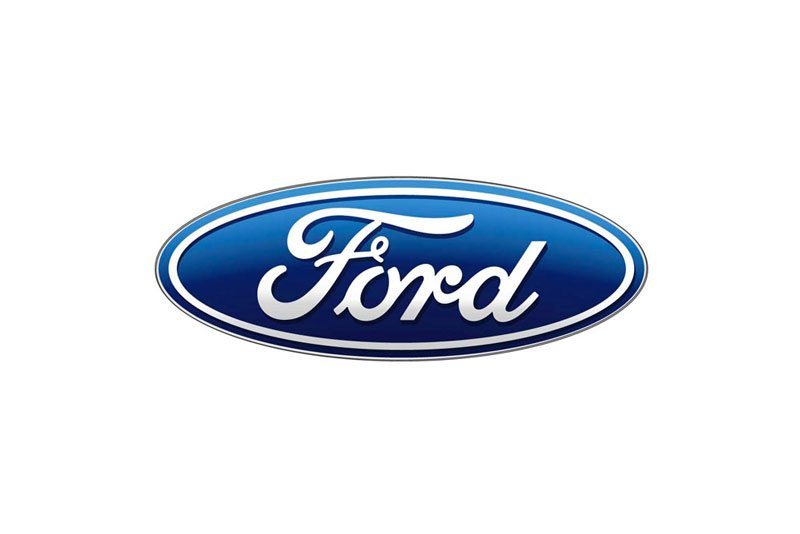
The Ford Motor Company has an oval-shaped logo in which different shades of blue dominate the background. The borders and wording are white.
The current version of the logo has been active since 2003. The shape is straightforward because the brand wants to clarify one thing: Ford does not play with car quality.
The history of the Blue Oval Ford Logo
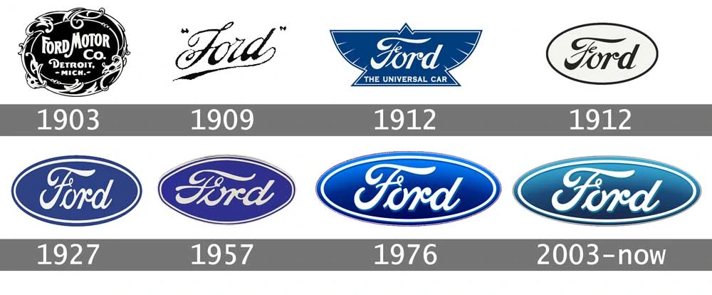
The iconic Blue Oval logo of Ford Motor Company is one of the world's most recognisable and valuable brand emblems today. However, this legendary logo has undergone numerous changes since Ford's beginnings in 1903.
The very first Ford car, the famous Model A, bore a completely different Ford logo. The inaugural 1903-1907 version of the Ford emblem was simply black and white and contained the full text “Ford Motor Co. Detroit, Mich.” This early logo had a delicate, artistic look, quite distinct from the bold Blue Oval we know today.
Henry Ford didn't take long to realise that a change was needed to represent his growing company. In 1907, the script lettering was removed, leaving only the words “Ford Motor Company” arranged in an oval shape. While still in black and white, this logo marked the debut of the iconic oval design that has defined the Ford brand for over a century.
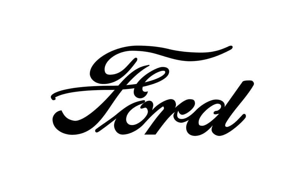
A team of designers came up with a new solution in 1907, but it barely lasted for two years.
Namely, the logo did emphasise the brand's name, but it had the shape of a football and did not match the expectations of Henry Ford and his closest associates.
Jake Gardner, a graphic design analyst, says the company experimented with multiple logo designs between 1909 and 1912, trying to figure out the finest solution:
“They realised that Ford needed unique typography and so they created the so-called script with wings. In its essence, it is Henry Ford’s signature with a slight touch of artistry – letters “F” and “D” are a bit longer and spread like the wings.”
By this time, the Ford Motor Company decided not to change the font, so the signature remained the same in the decades to come.
This period is also crucial because it gave birth to the first oval-shaped logo solution.
Namely, British entrepreneurs and designers proposed the oval shape because it symbolises professional authority, reliability, and affordability.

The idea was tested successfully in Great Britain, which helped Ford to decide to promote the oval-shaped logo universally.
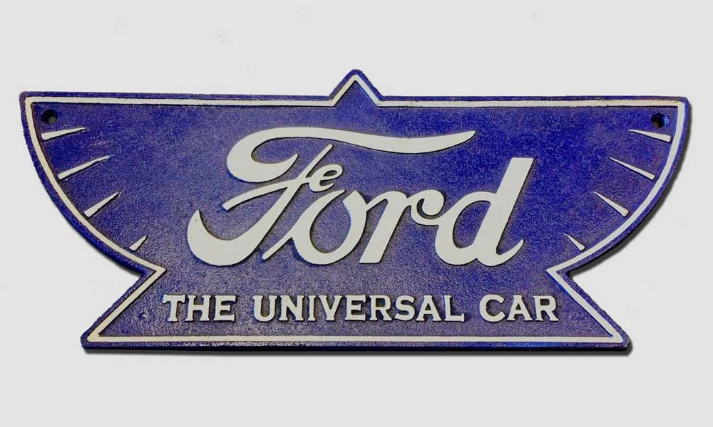
In the meantime, the US branch tested a brand new Ford logo, which combined a triangle with a pair of wings.
The emblem included the well-known Ford signature and the line: The Universal Car.
What they wanted to achieve was to point out the brand’s sharpness and speed, but Henry Ford never really liked the idea, so it was replaced with the oval-shaped version in 1917.
Ten years later, the company decided to put the Blue Oval Logo on the radiator grill of the Model A, also known as the most popular car of this era.

Ford's logo featured a deep royal blue, remaining the official logo solution for the next 30 years.
According to design professionals, the Blue Oval Logo underwent minor changes in 1957 when white was replaced with silver to create a new combination with the predominant colour blue.
The company underwent a more significant rebranding for its centennial anniversary in 2003. Ford rolled out a stylised version of the oval logo with a metallic texture and gradient shading. The font was updated to give a more contemporary look.
This rebranding reflected Ford's forward-thinking vision as it entered its second century in business. The refined gradient logo served as a symbol of Ford's innovation and evolution as an auto manufacturer.
In the 2000s and beyond, Ford continued adapting its branding while maintaining links to its heritage. The oval logo remains an iconic symbol of American manufacturing and design. The willingness to reimagine and reinvigorate its brand over the decades has allowed Ford to stay relevant and successful through major technological shifts and cultural changes in the auto industry.
Interesting Facts about the Ford Logo Design
The Ford logo obviously underwent many changes in the last century, but this is just one side of the story.
What is interesting to notice is that the Blue Oval Logo had significant ups and downs throughout history. We want to mention the most exciting stories here:
- What was there before the first logo?
The Ford Motor Company introduced its first logo early, but many cars were produced before the actual logo release. Now, the real question is what happened to those vehicles. Did they contain any kind of signature or emblem? Well, it looks like the car had a few wordings that served as inspiration for future logos. The thing you can notice instantly is the famous sign: The Universal Car.
- The history of the Blue Oval Logo
It seems like the phrase the Blue Oval Logo dates back to 1907. However, it is impossible to trace the origin and discover who created it. It is possible to guess that the phrase doesn’t come from the Ford Motor Company because their oval-shaped logo was not invented back then.
- It could have changed drastically in the 1960s
Henry Ford II wanted to change the Ford car symbol in the 1960s, so he asked the designer Paul Rand to create something completely different. The result was shocking, so Henry Ford II gave up the idea and decided to stick to the good old version of the Blue Oval Logo.

- Ford almost lost it in 2006
Do you know that the automotive industry in Detroit underwent a terrible crisis in 2006? This is precisely when the Ford Motor Company decided to put their logo down for a loan (among many other assets) to stop the consequences of the crisis. Luckily enough, the trick worked, and Ford successfully reclaimed the ownership of the Ford symbol in 2012.
- How many changes were there?
After everything we’ve seen so far, we have only one question left to answer: How many Ford emblems are there? According to our analysis, the Blue Oval changed 11 times since 1903. However, the fact remains that the last five iterations are very similar and bring only minor upgrades.
Conclusion
After over a century of evolution, Ford's legendary Blue Oval logo has cemented itself as one of the most iconic and impactful automotive emblems ever created. While the company and its vehicles have undergone countless changes since Henry Ford first unveiled his revolutionary Model T, the Blue Oval has remained a steadfast symbol of American ingenuity, resilience and vision.
Throughout the highs and lows of Ford's storied history, spanning economic booms and depressions, wartime triumphs, changing consumer tastes and massive internal restructurings, the classic Blue Oval has continually represented the pinnacle of American automotive excellence. It is a design that transcends time and trends, instantly recognisable around the globe as the mark of vehicles built with purpose, passion and pride.
Few logos in any industry have achieved such legendary status. The Ford Blue Oval brilliantly encapsulates the spirit of the company and its tremendous contributions to automotive history.
It symbolises forward-thinking innovation and the realisation of dreams. As Ford moves confidently into the future, leading the way in areas like electrification, autonomy and mobility, its iconic logo will continue opening new roads ahead while honouring a rich legacy.
The Blue Oval's simple, memorable elegance has inspired generations. It represents the realisation of big dreams and even bigger possibilities. The bold Ford Blue Oval will lead the way if visionaries continue pushing boundaries and drivers seek adventure on the open road. It is the mark of a true automotive icon.

In 2003, Ford celebrated its centennial anniversary with a new logo. This logo is a more stylized version of the previous logo, with a metallic texture and gradient shading. The font was also updated to give a more contemporary look