Helvetica: A Typeface That Shaped Modern Design
With its clean lines and perfect proportions, Helvetica has become one of the world's most ubiquitous and influential typefaces. Helvetica, created in 1957 by Swiss designers Max Miedinger and Eduard Hoffmann, embodied the post-war's minimalist, rational design ethos. Helvetica has permeated nearly every facet of visual culture as the typeface of choice for many of the world's most recognisable brands.
“Helvetica” comes from the Latin name for Switzerland, “Helvetia,” reflecting the font's Swiss heritage. From its inception, Helvetica was designed to be legible, neutral, and well-suited for various uses, from signage to advertising. Its default, upright posture exudes clarity and straightforwardness. Helvetica does away with excessive ornamentation, conveying information directly yet understatedly.
In the 1960s and 70s, Helvetica became synonymous with modernist, corporate graphic design. Its clean uniformity fit perfectly with the pared-down aesthetic of the time. Major corporations like BMW, American Airlines, Panasonic and many more adopted Helvetica as part of their visual branding. From New York's subway signage to brands like Jeep, Target and even The North Face, Helvetica achieved ubiquity throughout the 20th century.
Much of Helvetica's popularity stems from its versatility. With a wide range of weights and styles, it can be optimised for uses ranging from large-scale environmental graphics to digital interfaces. Helvetica also epitomises “timeless” design, transcending fleeting trends and retaining its appeal decade after decade. More than just a typeface, Helvetica has become a global emblem of modernist design principles and artistic minimalism. Its legacy persists today as new designers find inspiration in its rational purity.
Table of Contents
The Birth of Helvetica
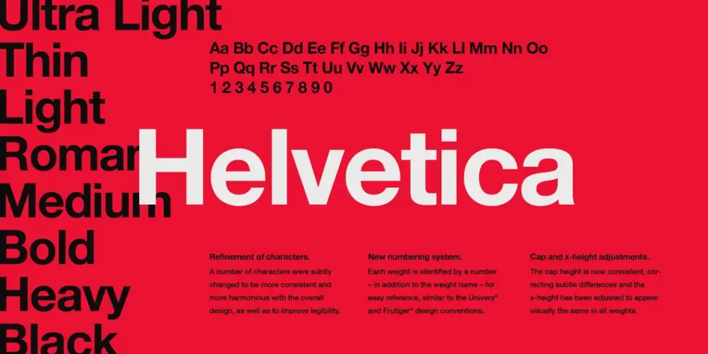
The ubiquitous sans-serif typeface Helvetica was born in 1957 in the small town of Münchenstein, Switzerland, just outside Basel. It was designed by Swiss typographers Max Miedinger and Eduard Hoffmann at the Haas Type Foundry.
At the time, Switzerland was at the epicentre of a significant shift in graphic design ideology known as the International Typographic Style, or Swiss Style. Pioneered by Swiss graphic designers in the 1950s and 60s, the Swiss Style heavily emphasised minimalism, objectivity, and cleanliness in design. Typography was a significant focus, prioritising sans-serif typefaces and asymmetric layouts with lots of white space. The goal was clarity and functionality above all else.
As the quintessential Swiss-style typeface, Helvetica embodied these ideals. Its simple, unadorned letterforms and monolinear construction create a neutral, objective mood. Helvetica shuns all superfluous ornamentation in favour of clarity and legibility. Its tall x-height and open counters allow letters to be clearly distinguished. The result is a highly readable and versatile typeface that conveys information without distractions.
Helvetica was an instant success when it debuted in 1957 and was soon licensed for widespread use. Over the following decades, it became one of the world's most ubiquitous and iconic typefaces. It is still a prime example of Swiss-style principles applied to typography, emphasising clarity, simplicity, and visual neutrality. More than a typeface, Helvetica is a testament to the lasting impact of the International Typographic Style on graphic design.
Swiss Style: A Design Revolution
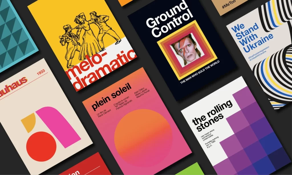
The Swiss Style was an influential modernist graphic design movement in Switzerland in the 1940s and 1950s. This clean, minimalist aesthetic significantly impacted typography, page layout, and the use of grid systems in graphic design. Several vital principles defined the Swiss Style:
Clean, Sans-Serif Typography
The Swiss Style favoured sans-serif typefaces like Akzidenz-Grotesk and Helvetica. These plain, unadorned fonts conveyed clarity and objectivity without stylistic distractions. This represented a dramatic shift away from the more ornate serif fonts that were popular then. The Swiss Style's preference for clean, rational typography set the stage for the later ubiquity of Helvetica.
Grid-Based Layouts
Swiss-style designs were structured around mathematically derived grid systems. These invisible grids governed the placement of text blocks, images, and other elements, creating orderly, asymmetric layouts. Grids lent Swiss-style works a crisp, organised appearance and helped achieve visual harmony. This grid-based approach became central to modern graphic design.
Minimalist Design Elements
Swiss Style designers embraced simplicity and rejected extraneous decorative elements. They focused on communicating the message in the most direct way possible. Designs featured plenty of white space and avoided excessive visual variety. This minimalist aesthetic resulted in posters and advertisements that were clear, understandable, and visually balanced.
High Contrast
Swiss-style designs often featured high contrast between text and background elements. The black type was set against white negative space. Photographs were likewise high contrast. This emphasis on tonal contrast added vibrancy to the page and reinforced the legibility of the type.
By emphasising principles like clean typography, grid-based layouts, minimalism, and high contrast, the Swiss Style aimed for maximum communication and clarity. This rational, objective aesthetic provided the ideal backdrop for the later dominance of Helvetica – the quintessential Swiss-style typeface. The movement showed how restraint and simplicity could achieve effective graphic communication. The Swiss Style's innovations pioneered the modern look and laid the groundwork for Helvetica's ascent in the coming decades.
Anatomy of Helvetica
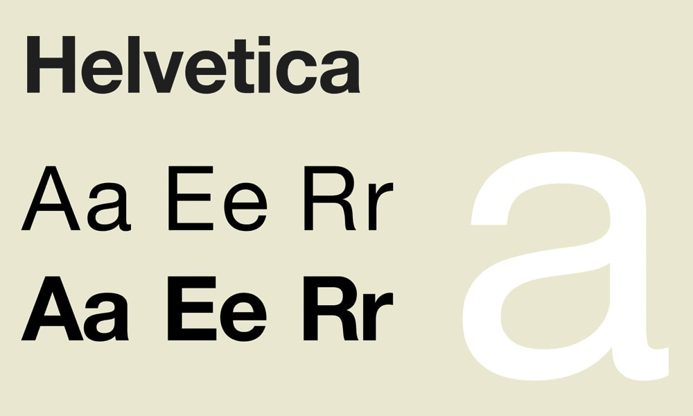
Let's dissect its anatomy before we delve deeper into Helvetica's impact. Understanding the structure of this typeface is crucial to appreciating its versatility and timeless appeal.
Characteristics of Helvetica
Helvetica possesses several key characteristics that contribute to its enduring ubiquity and popularity:
- Sans-Serif Elegance: Helvetica conveys a modern, minimalist elegance as a sans-serif typeface. Unlike serif typefaces, Helvetica has no decorative flourishes on the ends of strokes. This pared-down simplicity creates clarity and enhances legibility, making Helvetica ideal for signage, brochures, posters, and other applications requiring maximum readability.
- Perfect Geometry: Helvetica's letterforms adhere to near-perfect geometric proportions, with stroke widths, curves, and angles precisely balanced. This mathematical precision results in harmonious letter shapes and consistent spacing between characters and lines. The geometric purity of Helvetica confers a sense of order and rationality.
- Wide Range of Weights: Helvetica comes in a vast array of weights from ultra-light to black, enabling nuanced variation between thick and thin strokes within a single type family. The availability of so many weights makes Helvetica adaptable for dense, information-rich text settings and more extensive titling and display settings.
- Neutral and Universality: Helvetica possesses a visual neutrality that allows letterforms to convey information without imposing an overt emotional bias. This objectivity makes Helvetica highly versatile for corporate, creative, and publishing applications where a clear, impartial voice is desirable. Helvetica's ubiquity has also reinforced its universal familiarity across languages and cultures.
- English (Publication Language)
- 256 Pages – 01/14/2005 (Publication Date) – Lars Müller Publishers (Publisher)
The Helvetica Revolution
Helvetica quickly gained traction and became a designer favourite, finding its way into corporate branding, advertising, signage, and film titles. Several vital factors facilitated its rise to prominence.
Corporate Branding

In the 1960s and 1970s, corporations began to recognise the power of a strong, unified brand identity. As mass media grew and global competition intensified, companies realised they needed more than just a quality product – they needed a cohesive visual identity to connect with consumers emotionally. This marked the beginning of the corporate branding boom.
Helvetica Emerges as the Typeface of Choice
In this branding revolution, Helvetica emerged as the typeface of choice for major corporations. Its clean, modernist aesthetic conveyed notions of progress and innovation. Helvetica had an air of efficiency and neutrality compared to ornate, decorative typefaces of the past. This made it perfect for brands wanting to communicate reliability, professionalism, and a contemporary sensibility.
Big Brands Adopt Helvetica
Many prominent brands jumped on the Helvetica bandwagon. In the 1960s, American Airlines commissioned an updated, customised version of Helvetica for its brand identity. In the following decade, BMW transitioned to Helvetica for its logos and communications. Through the 70s and 80s, corporations like IBM, Toyota, Panasonic, and Target adopted Helvetica, often commissioning modified versions tailored to their brand.
The Legacy of Helvetica in Business
While some brands have moved away from Helvetica recently, it remains one of corporate history's most influential and iconic fonts. It helped establish unified visual branding as a critical business strategy. The Helvetica logo era shifted from industrialisation towards sleek, modernist aesthetics. Its ripples continue to be felt across corporate communication design to
Public Spaces and Signage

In the 1960s and 1970s, Helvetica became the standard typeface for signage in transportation systems, including airports, subways, and highways. Its legibility at a distance made it an ideal choice for guiding travellers.
New York City's Love Affair
New York City's embrace of Helvetica in the 1960s and 1970s was crucial in elevating the typeface to iconic status. The New York City Transit Authority adopted Helvetica as the official typeface for signage in the subway system in 1966. At the time, the subway's signs used various typefaces, creating visual inconsistency. Adopting Helvetica brought unity and clarity to the subway's wayfinding and information design.
The Helvetica font was selected for its legibility and modern, streamlined appearance that fit the ambitions of New York City in that era. Helvetica became an integral part of the NYC landscape as the sans-serif typeface appeared on thousands of subway signs across the city, from station names to informational signs. Helvetica represented the subway system and the city for locals and visitors alike.
Beyond the subway, Helvetica found widespread use in New York City's transportation infrastructure, corporations, media, and advertising. It became a typographic symbol of the city, like Broadway's lights or the Empire State Building. The sheer omnipresence of Helvetica reinforced its unique connection to New York City in the public imagination. Even today, the original signs using Helvetica are viewed with nostalgia and celebrated as design icons. For its role in visually defining 20th-century New York, Helvetica remains a fundamental piece of the city's identity and an enduring typographic legacy.
- Hardcover Book
- Shaw, Paul (Author)
- English (Publication Language)
- 144 Pages – 02/11/2011 (Publication Date) – The MIT Press (Publisher)
Helvetica in the Digital Age
As the digital age dawned in the late 20th century, the typeface Helvetica faced a significant test. Long the go-to font for printed designs from books to posters, could Helvetica leap the glowing pixels of computer screens?
At first, many designers doubted that Helvetica's clean, modernist aesthetic would translate well on primitive digital displays. They worried the low resolution of early screens would muddy Helvetica's graceful curves and precisely spaced characters.
But as screen technology rapidly improved in the 1990s, Helvetica proved its sceptics wrong. Its unfussy letters are rendered clearly on digital interfaces, even in small sizes. The consistency of its letterforms across a wide range of weights allowed designers flexibility for hierarchy and emphasis. Its professional but friendly vibe perfectly suited the nascent web, where companies wanted to establish new online identities.
By the 2000s, Helvetica had conquered the digital realm as fully as it had printed. It became the font of choice for the world's most iconic brands and designs, from Apple to American Apparel. Adobe and Microsoft licensed it as a system font, ensuring its presence across platforms and devices.
Today, in 2023, Helvetica remains the premier go-to font for interfacing with humans. It maximises legibility and clarity on screens, both large and small. Decades into the digital revolution, Helvetica's versatility, efficiency and visual neutrality continue to define the modern online experience. Helvetica becomes a universal signifier of communication in the digital age as technologies come and go.
Helvetica's Critics and Controversies
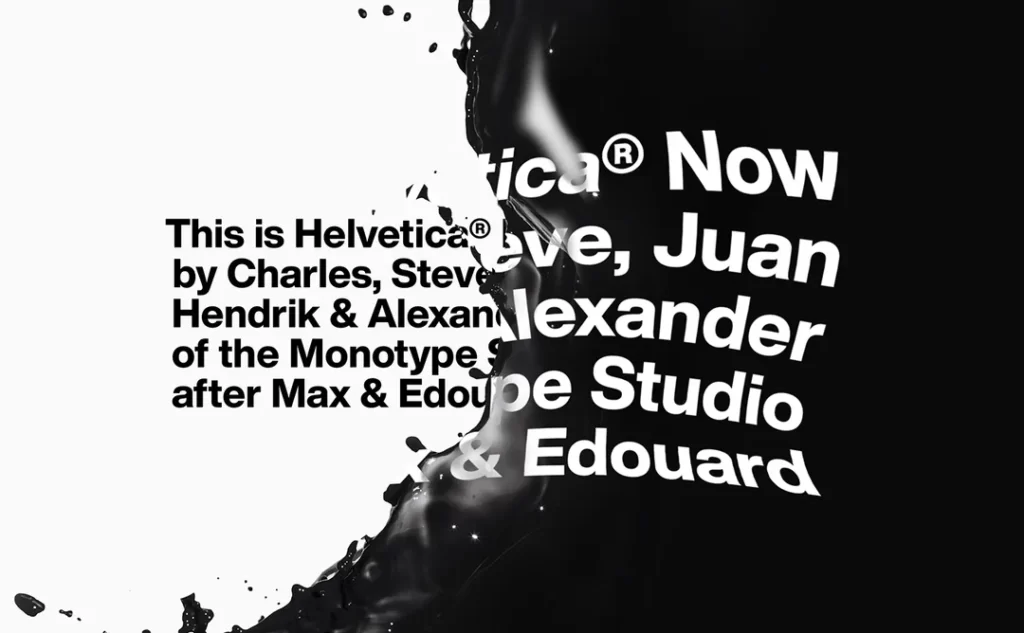
While Helvetica enjoys widespread acclaim, it has not been without its fair share of criticism and controversies. Some argue that its ubiquity has led to a lack of diversity in design, while others find fault with its neutrality.
Critiques of Uniformity
The prevalence of Helvetica in graphic design has led some to critique its contribution to a homogenised visual landscape. With its widespread use across signage, branding, advertisements and more, Helvetica has been accused of making everything look the same.
Critics point to the overuse of Helvetica in environments like airports, subways, highways and cities, where Helvetica-heavy signage and wayfinding systems create a sea of sameness. This uniformity can make it harder for people to orient themselves and dull the unique sense of place.
Others argue that Helvetica's neutrality and lack of distinctive personality lead to designs that fail to connect emotionally. They claim Helvetica is well-suited for straightforward information design but falls flat for more nuanced, feeling-driven communication.
For example, Helvetica may excel at providing precise transit schedules but needs to have the flair appropriate for an inspiring political campaign. Its absence of quirks and idiosyncrasies leaves little for viewers to latch onto. This can result in a cold disconnect between the designer and the audience.
Critics also contend that Helvetica's omnipresence leads to homogenisation across cultural contexts. They argue that using the same typeface everywhere – from Europe to Asia to the Middle East – shows a need for more sensitivity to local culture and visual heritage. Even different languages call for other graphic treatments.
In the view of its detractors, Helvetica flattens communication into a global monoculture. Helvetica's growing domination steamrolls regional diversity and traditions of type design. This limits the possibilities for more culturally resonant, creative design solutions.
In summary, Helvetica has been deeply impacted by its success. Its clean efficiency makes it popular, but some argue that its overuse leads to boredom and placelessness. They claim Helvetica needs other typefaces to balance its sterility and lack of local character. Though it may work in some contexts, Helvetica alone cannot satisfy every design need. Moderation and context-awareness, its critics suggest, are needed in applying this powerhouse typeface.
Conclusion: Helvetica's Timeless Legacy
Helvetica remains one of the world's most universal and influential typefaces more than six decades after its creation. Its clarity, legibility, and visual neutrality cemented its status as a design classic transcending temporal trends.
The enduring appeal of Helvetica stems from its embodiment of Swiss design principles that privilege simplicity, functionality, and objectivity. At a time when many designs were ornate and visually noisy, Helvetica arrived as a breath of fresh air. Its stripped-down, no-nonsense aesthetic communicated honesty, directness, and modernity.
Helvetica's versatility has also contributed to its longevity. It has been effectively implemented in various contexts and media, from corporate branding and signage to book and magazine covers to user interfaces and digital content. Major global brands have adopted Helvetica as part of their visual identity, recognising its strategic value in conveying stability, authority, and timelessness.
As new typefaces vie for prominence in our increasingly digitised society, Helvetica remains the gold standard – an exemplar of Swiss precision and discipline applied to typographic design. Its pervasive presence across both physical and digital environments attests to its firm grounding within the canon of graphic design.
Helvetica's understated power and universality will continue to shape visual culture for decades. Its legacy is a reminder that authentic, enduring design favours straightforward solutions over superficial trends. In a complex world, Helvetica's straightforward purity evokes a sense of optimism about design's potential to cut through noise and connect with people universally.
Frequently Asked Questions (FAQs)
Why is Helvetica so popular?
Helvetica's popularity can be attributed to its clean, sans-serif design, perfect geometric proportions, and neutrality, making it versatile and suitable for various design applications.
What are some famous brands that use Helvetica in their logos?
Prominent brands such as IBM, American Airlines, and BMW have adopted Helvetica for their logos, conveying reliability, professionalism, and modernity.
Is Helvetica still relevant in the digital age?
Absolutely. Helvetica seamlessly transitioned from print to screen, remaining popular for web design and digital interfaces due to its readability and adaptability.
Are there any alternatives to Helvetica?
Yes, there are alternatives like Arial and Univers, but Helvetica's enduring popularity has made it a benchmark for sans-serif typefaces.
What are the main criticisms of Helvetica?
Critics argue that Helvetica's uniformity can lead to a lack of diversity in design and that its neutrality may sometimes hinder emotional connections in messaging.
Last update on 2024-05-16 / Affiliate links / Images from Amazon Product Advertising API


