This article has been contributed by Colleen Gratzer.
If you’re not providing brand style guidelines after designing a logo, you’re leaving money on the table, leaving the client without guidance and giving your hard work the opportunity to be mucked up.


A lot of designers will design a logo and, at the end of the project, deliver the logo files and then be done. In the early days of my career, I did the same.
But there’s actually more work to be done after that, and it will actually be beneficial to the client. It’s not only an opportunity for you to add value to your work but to be seen as their trusted advisor, the brand expert.
You can charge more for that expertise and you’ll also demonstrate that you’re interested in helping them with their long-term success.
Definition and Purpose of a Brand Style Guide
We achieve that by creating a set of rules or guidelines about the client’s brand. This may also be referred to as a “brand guide,” “brand standards,” “brand identity guide,” “brand guidelines” or “brand bible.”
Sometimes this is in the form of a document. Sometimes it’s a page on a website.
Whatever form it takes, the brand guide will be used by the client, any subcontractors they may hire, such as designers or copy writers, and printers. It acts as a reference guide to keep everyone on the same page in terms of visual and non-visual elements of the branding. That way, people don’t make up rules as they go, which could affect the integrity of the brand if they do something unexpected.
The guide helps with consistency, which is key with branding. Consistency ensures recognition and builds trust with potential and existing customers.
Components of a Brand Style Guide
The contents and length of the brand style guide could range from a few sections and a few pages in length to many sections and up to a hundred pages (maybe more) in length. It will depend on the client’s needs, their budget and the size of their business in terms of number of employees and offices.
Visual Components
Brand style guidelines, at a minimum, include the main visual components of the brand, which would be typography, color palette and the logo design.
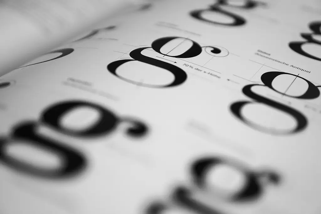
1. Typography
In terms of typography, a brand style guide should list which typeface(s) you’ve chosen, designating whether they are serif, sans serif, script, etc. Clients may not know which type of typeface is which, and someone may ask them at some point “which serif typeface” to use, for example.
You could also list which typefaces to use if the preferred ones are not available – fonts that everyone would have access to, such as Times and Helvetica. You never know if someone on the client’s team will not be able to access fonts from their server due to a power outage or if they’re working remotely and don’t have them installed on that computer.
For each of these instances, you could also include screenshots to aid the client even more, so they can visually see the typefaces as well.
Whether the typefaces are free or will need to be purchased, you could include hyperlinks for where the client and vendors may download them. If the client already has them, you could provide instructions for where to access them on their internal network.
If it makes sense to do so, you could potentially state how to use these fonts – for example, if the serif typeface should always be used for headings along with sans serif body text on a website, and vice versa for print collateral.
Depending on the client’s needs, this section could be extremely detailed, such as including the look for all levels of headings, body text, sidebars, etc.

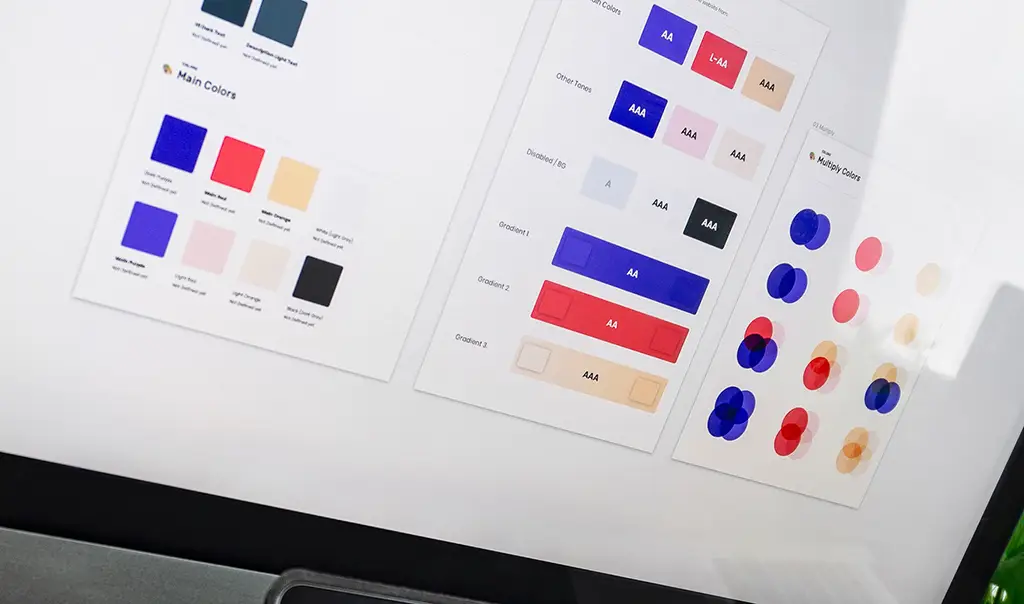
2. Color Palette
The color palette is another essential visual component. At a minimum, the brand guidelines should list and show the colors used in the logo and the primary and secondary color palettes, if you are developing those as well.
When listing the colors, there is a lot to think about and include – not just print versus web but other factors as well.
a. Print
A brand style guide should include the colors used for printing. These include CMYK builds (for four-color process) and Pantone (spot) colors.
In addition to that, you should check both of these in swatch books for coated and uncoated paper stock.
The reason for this is that clients won’t always be printing on coated paper stock, which is always more true to the colors you’ve chosen. This is because coated paper stocks reflect more light than uncoated paper stocks. On uncoated paper stock, the colors soak into the paper more. That causes the colors to darken or even shift in hue.
For example, if you compare the same yellow CMYK mix between a coated swatch book and an uncoated one, they may look drastically different. In the coated swatch book, it may look yellow; in the uncoated one, it may look orange.
Then look at the Pantone number for that yellow in a coated and uncoated swatch book. They may differ too, and it’s the same for some greens and blue hues as well.
You’ll also want to check the swatch books for similarity between the Pantone color and CMYK mix. Sometimes you can find a closer CMYK counterpart to a specific Pantone color other than the one next to it in the swatch book.
So, to maintain the integrity of the colors across CMYK mixes, spot colors and different types of paper stock, specify CMYK values and Pantone numbers for use on coated paper stock. Then specify a different one, if needed, for any that would print too dark or that shift when printed on uncoated stock.
That means you might end up with one set of colors for coated stock and another set for uncoated stock, such as:
- Pantone coated
- CMYK coated
- Pantone uncoated (if needed)
- CMYK uncoated (if needed)
b. Web
A brand style guide also includes color values for the web. These will end up being used by the client when producing marketing collateral in house, such as in Word and PowerPoint or their email newsletter. These values will also be shared with web designers and developers and app developers.
Web color values should be listed in RGB values and hexadecimal (six-digit) codes.
Keep in mind: the appearance of these colors can vary among web browsers, operating systems and even brands of monitors.

3. Logo
Another essential visual component is the logo design. It’s important to show:
- the variations of the logo with and without the tagline
- a set of colored versions plus black, grayscale (if applicable) and white
- the individual mark if you’ve created one to be used by itself
- how much clear space should be left around the logo and/or mark
- the minimum size at which the logo should be used (it may become too difficult to read it below a certain size)
- placement on light- versus dark-colored backgrounds (so the logo is always legible)
- when to use the stacked (vertical) version versus horizontal version, if applicable.
Because clients are not designers – and, in some cases, it would be akin to leaving a kid alone with crayons in a room of white furniture – you might also want to show what not to do with the logo, such as:
- scale it disproportionately
- scale any one part of it independently from the logo design as a whole
- not provide enough clear space around it
- place a black version of it over a dark-colored background
- move the position of the tagline
- replace a font in the logo design.
Additional Visual Components
Depending on the size and needs of the client, you might create a more extensive brand guide that includes sections for additional visual components such as imagery, design elements, templates and paper stock.

1. Imagery
The brand style guide may show examples of the type(s) of imagery that is consistent with the client branding, so that clients and their vendors know what to look for when selecting images on their own. These could be:
- photos
- illustrations
- icons.
You might also want to dictate some guidelines for the imagery, such as:
- Only use custom photos that show their staff or their own work.
- Always show diversity when photographs with people are used.
- Never use stock photos with people facing the camera directly.
- Only use illustrations that are of a vintage style.
- Only use FontAwesome icons.
You may also want to include hyperlinks to where they can find these images. The client might already have an account with certain stock photo sites. Maybe they have some they’ve previously downloaded free or purchased and stored them on an internal server.
It’s also helpful to clients, especially if they are placing images in various places themselves, to know what sizes will work and where. This also helps them understand before downloading images if they could work or not.
So, you could provide sizes for images used in:
- Word, Powerpoint or Canva templates
- the home page hero area of their website
- the pages and blog posts of their website
- Facebook, LinkedIn and Twitter headers and posts
- Instagram posts and stories, etc.
If you’ve created some design elements as part of a client’s branding, you could show those as well and explain where to use them. For example, maybe you’ve created a decorative divider image for use on a web page or in a print layout. Or you created a pattern to be used in certain places. So you would show some mockups of how they could potentially be used.
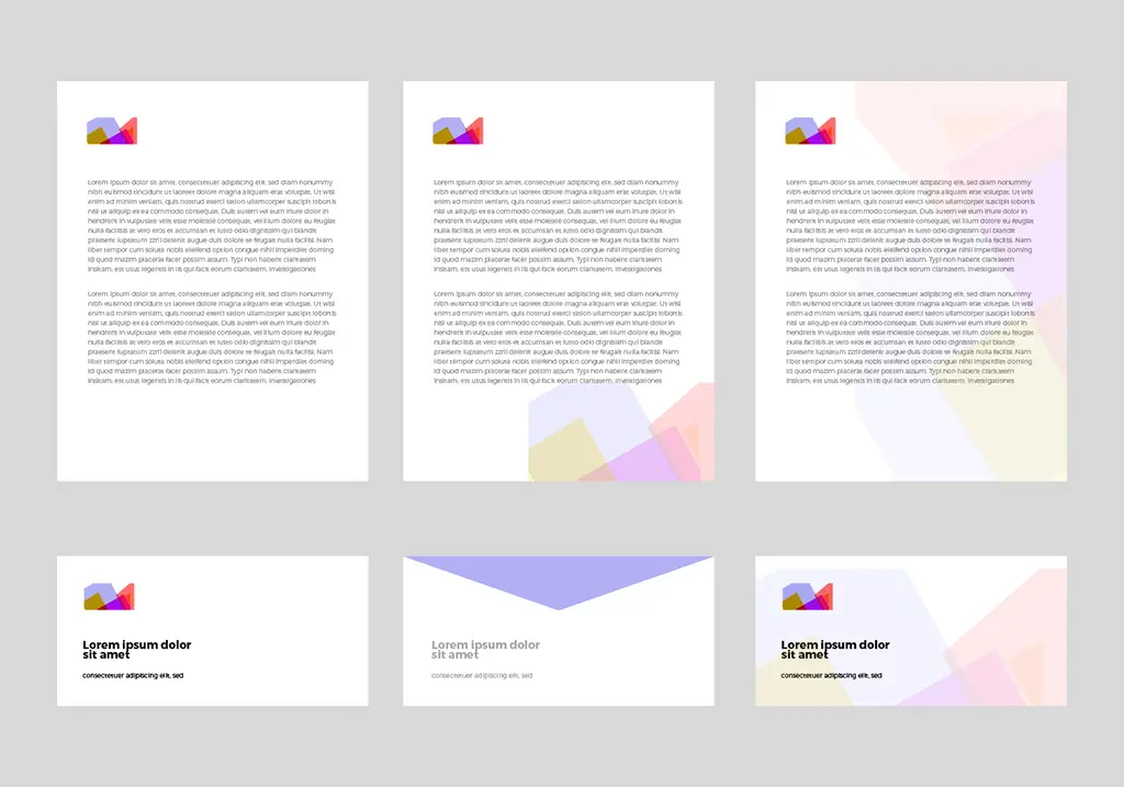
2. Templates
If you’ve also designed a stationery package or any document templates, such as digital letterhead in Word or a slide deck in PowerPoint, you could include images of those in the style guide, so that the client’s team knows what templates are available to them and which ones are the correct versions to use.
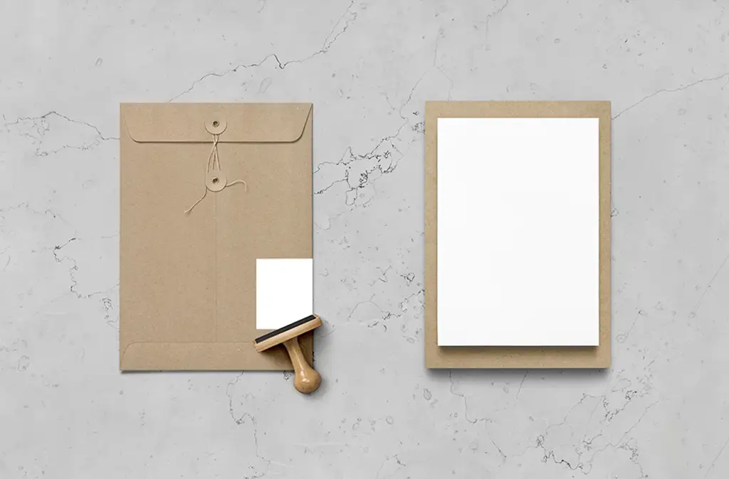
3. Paper Stocks
Choice of paper stock won’t be a factor for every client. For some clients though, paper choice can say a lot about their brand and affect how they are perceived.
For example, a business that wants to be seen as environmentally friendly may want to only use recycled papers. So you could designate an FSC-certified paper or a tree-free paper such as Yupo.
Or maybe they are going for a certain look, so all of their printed report covers need to be of a certain gloss and weight for durability.
Non-Visual Components
1. Mission, Vision and Values
A brand guide could also include a section about the company’s mission, vision and values. This makes sure that everyone, from staff to contractors, is clear on these core elements and specifically:
- why the company exists
- whom they serve
- how they help them.
2. Messaging and Tone
Messaging and tone may be included if you or someone else has done brand strategy work with the client, and this information has been decided on.
These are the verbal and written choice of words that the client and any contractors should always use. This will keep everyone on the same page about how the company should “speak” in order to be perceived a certain way.
This could mean:
- using certain words or phrases their audience uses
- coming across in a specific manner (i.e. friendly vs formal)
- greeting customers a certain way.
This will affect anyone who interacts with potential and existing customers, such as:
- phone receptionists
- live chat operators
- customer support
- sales people.
Deciding What to Include in a Brand Style Guide
A brand style guide can vary greatly in content and length from client to client. Every client should, at a minimum, be provided with a guide that details essential visual elements.
Solopreneurs and businesses made up of only a few people may only need a brand style guide that includes the mission, vision and values plus the main three visual elements and maybe imagery. Including anything more than that may (or may not) be overkill.
Larger businesses will need a more extensive guide that is longer in length.
The larger the business, the more people involved, the greater their needs, the more they have at risk, the more value the brand guide holds.
They might have employees in multiple departments and contractors who will come and go over time. Having a brand style guide for them all to reference helps maintain consistency and understanding of the brand and its various elements.
Delivering the Brand Style Guide
You could create the brand guide in page layout software and send the client a PDF with a table of contents and bookmarks for each section to make it easy to find what they need.
Alternatively, you could create it in Google Docs or Google Slides, or you could create a page on their website that is accessible only to them. You could even password protect the page, if needed, to keep out anyone who should not access it and to prevent search engines from seeing it.
Conclusion
You have a lot of options for what to include with brand guidelines, and they can be added to or modified over time. Choose what works best for your client’s needs and within their budget.
If you want to make the process of creating a brand style guide super easy, check out Creative Boost’s Brand Style Guide Builder. It has sections already set up with text that you can fill in your client’s information and modify as you please.
_
About the author: A veteran of the design industry, Colleen Gratzer hosts the Design Domination podcast and mentors emerging designers through her side hustle Creative Boost. She is also chief creative officer and accessibility specialist at Gratzer Graphics LLC, the design agency she started in 2003.


