What Does the Evolution of Logos Reveal About Our Favorite Companies?
When you think of logos, words like “innovative” or “innovative design” come to mind. But there is another side of the story. Regarding businesses and how they market themselves, four main types of logos can be associated with different companies. This blog post will explore those four types of logos. Logos are some of the most common symbols used by brands for different purposes. From email signatures to brand identifiers, logos represent a company's image and brand identity to its customers. But what does this evolution of logos reveal about our favourite companies?
Table of Contents
Let's see the evolution of logos and their usage:
Logos: what are they?
As per definition, a logo is a visual representation of text and images used to identify a company. An excellent logo represents the mission and core principles of the brand. The goal of logo design is to create the ideal visual brand mark for a business. Or we can say that a logo is a graphic representation that quickly and easily identifies a business, a product for sale, or any other public or private institution. It is one approach to set a business apart in a cutthroat market where daily graphic components compete for our attention. Typically, a logo consists of a combination of colours, illustrations, and typography. It is a graphic component of a brand's visual identity.
The logo's origins extend back to the time of the Ancient Egyptians. Before the Middle Ages, when graphic images like coats of arms were utilised to denote the status of various nobilities, they used hieroglyphics to brand and identify their goods.
There were over 700 lithographic printers in the US by the 19th century. Yet, at this time, printing corporations were given credit for the artwork that was produced rather than the artist or craftsperson.
In 1876, Bass Brewery received the first trademark for a logo. It featured a red triangle with the word “Bass” written beneath it in sweeping cursive reminiscent of the instantly identifiable scribble used by Coca-Cola.
Get to know about types of logos:
Consider all of the possible forms a logo may have while developing one. Here are nine distinct logos you can find, along with advice on how to use them to build a successful design. They range from a single graphic symbol to plain text or various mixes of the two.
Abstract logo marks
A corporation's branding is reflected in these image-based logos, which utilise abstract forms. In contrast to pictorial marks, which depict actual objects, abstract logomarks are more symbolic.
Abstract logo marks allow you to build something incredibly original because they don't represent a particular recognisable object. Using this logo style, you should identify your brand's fundamental principles. Try to reflect them in an exact geometric shape that will send the proper signals and feelings.
Make sure your business identity is established, and you are clear on the message you want to express to your audience before you design this logo style. Furthermore, international firms with unworkable names may find success with an abstract logo mark.
Combination marks
This kind of logo mixes text and (surprise, surprise) visuals. For instance, a combination logo might combine an icon with a wordmark, a mascot with a letterform, and so forth. Some companies use a combination mark as their primary logo, occasionally dividing the text and image to better fit different circumstances.
Due to their exceptional versatility, combination marks are immensely popular among firms across all industries. While making sure that there is consistent and unified visual language used throughout, you can design a variety of variations of your logo and utilise them for various reasons. Consider how Lacoste uses their combo logo on their website design but only employs the well-known and unmistakable green crocodile on most of its items.
Combination marks can be an excellent place to start when establishing a brand for businesses that are not yet well-known. You'll eventually be able to use simply the text or just the icon while still being recognised. Additionally, it aids potential buyers in understanding the essence of your brand by using Free Vector icons, symbols, and other types of graphics to accompany the content.
Letterforms
One-letter logos, known as letterforms, only contain the first letter of the company's name. Brands frequently have a second version of their logo—a wordmark or logotype, as previously mentioned—that includes their full company name to be used on various occasions.
Letterform logos may be easily scaled because they are small. They're likely to retain their recognisability even when employed in tiny proportions, particularly if they have a straightforward design without too many details. They can be used as favicons, social media profile images, app icons, and more.
Letterform logos are typically a wise choice for businesses with a decent level of brand recognition. Otherwise, spreading awareness of and helping people remember your company's name can be difficult. For brands with long names, they are also advantageous.
Mascots
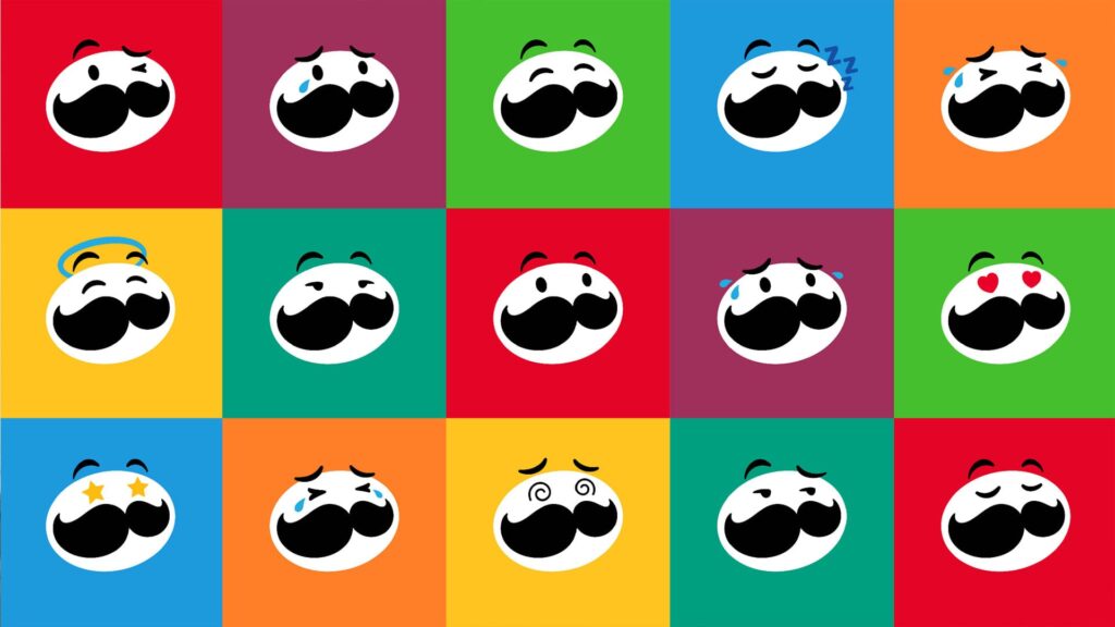
Mascot logos are made up of fictional figures that serve as “ambassadors” or visual representations of a business. They could be fictional characters or actual people if they convey the brand's identity.
Mascots can be valuable for engaging customers with your company since people instinctively identify with others or fictional characters. Companies that cater to children and families frequently use this logo style because you may employ a mascot to convey a happy, lively attitude that will appeal to your audience. If your company would benefit from having a mascot, think about how you can best utilise it to convey the right message.
Mascots can be effective when used in social media and marketing initiatives because of their typically amiable, exciting personality. Be aware that they frequently contain more features than a typical logo and may call for a simplified version for small dimensions, such as favicons or business cards.
Letter marks/monogram logos

Graphic icons, symbols, or images that represent a company's identity or activities are known as logo symbols, sometimes known as brand markings or pictorial marks. These kinds of logos typically depict a real-world object. The finest logos use symbols to recognise the brand when you first see them immediately.
If you opt for a visual logo, think about what will represent your brand. Do you want it to be an exact match for your name? Additionally, you can use it to convey your brand's principles or message quietly.
Finding the ideal symbol for your logo can be difficult, especially if your company is still relatively new. It might take some time for people to remember your logo and associate it with your business, and as time passes, you're also likely to expand, modify, and add new products.
A crucial guideline for logo design is to guarantee that your creation will always be ageless and make sure you select a symbol that changes with your brand. You don't want to have to design a new logo a few months down the road to be up to date, even though it may be tempting to produce a graphical logo that is contemporary and “of the moment.”
Wordmarks/logotypes

The corporate name is written in a specific typeface as part of wordmarks, also known as logotypes. Even though it sounds straightforward, you must pay special attention to every small element if you want to learn how to design a logo.
Here are a few options to create a text logo or wordmark. For their logo, several companies design a unique typeface. However, this demands patience and the expertise of a qualified designer. Alternatively, you can select a font for your logo that captures the spirit of your company. Think about your logo's font, special characters, colour, and size before using full capitals, small letters, or a mix.
Wordmarks are a terrific option for businesses with memorable names or those looking to spread their name around the globe because their logo will display on all of their promotional materials.
Emblems
Logos used as badge logos or emblems frequently resemble crests. They merge text and symbolic imagery to create elaborate patterns with a historic feel.
Consider the sector you operate in when deciding whether an emblem is appropriate for your brand. There are no set guidelines. However, universities, sports teams, and coffee manufacturers seem to favour this logo more than others. A modern interpretation of the emblem that favours a more minimalist approach and typically uses vector images and crisp lines is now widespread in logo design.
Incorporate a tagline that captures the essence of your brand into your emblem. When designing an emblem, remember that this logo style may be less versatile and not always function well on a smaller scale because of its subtle elements. You can design a more straightforward substitute in those circumstances.
Dynamic Marks
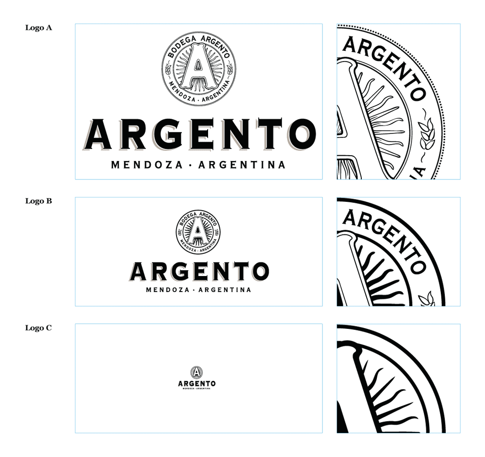
Dynamic logos are a peculiar oddity in that they may take on various forms when it comes to knowing the logos and which one is best for you. Since consistency is a standard criterion for logo design, it may seem strange to say this. However, dynamic logos are so adaptable because of this. Dynamic logos succeed precisely because of this uniformity. These logos must have a fundamental structure that acts as the central motif and can be seen in all logo variations.
For brands that are dynamic themselves, this works incredibly well. This kind of logo can be the perfect choice if you work in the creative sector and want to stay current and inventive. Try not to overdo it with your logo changes since you want clients to continue associating your brand with positive things as they form positive associations with it. Always remember that consistency is essential, regardless of the style of logo you use.
Logo symbols/brand marks/pictorial marks

Brand marks represent a company's identity or core competencies, often known as logo symbols or pictorial marks. These kinds of logos typically depict an actual object from the outside world. Some of the best logos that incorporate symbols are the ones that, as soon as you see them, you can immediately identify the business.
Finding the ideal illustration for your logo symbol might be difficult, especially if your company is relatively new. It could take some time for customers to remember your logo and associate it with your business, and you might develop, change, and add new things as time goes on.
A crucial guideline for logo design is to guarantee that your creation will always be ageless and make sure you select a symbol that changes with your brand. You don't want to have to design a new logo a few months down the road to be up to date, even though it may be tempting to produce a graphical logo that is contemporary and “of the moment.”
Using these kinds of logos has the advantage of helping to establish a powerful tone of voice. A well-designed logo symbol can become extremely recognisable if your business becomes well-known.
Evolution of Logos Reveals Our Favorite Companies
To remain updated, both brands and their logos must change. The 1950s snazzy, sleek, and cool style looks weak when taken into the modern era. A company must frequently update its logo to contemporary norms if it wants to project the image of being cutting-edge or modern. Evolution of a logo, the stylish surviving.
Apple

The most well-known brand in the world is Apple Inc., which created the MacBook, iPad, iPhone, and several other technological marvels that have led to people camping out in front of stores to purchase them.
And so is their logo. While the company's early logo—Isaac Newton seated next to a tree—was a touch off-putting, they altered it to their now-iconic apple design in 1976.
The logo hasn't changed much over the past 30 years, despite the company making subtle colour and finish modifications. The logo's effectiveness lies in making you think of Apple products the moment you see them. There is no ambiguity regarding what you are receiving.
Shell
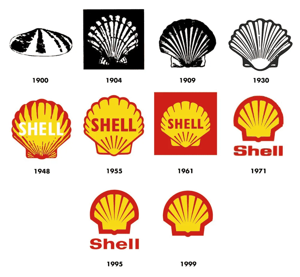
The clamshell-drawn trademark emblem for Shell gas stations dates back to 1900, yet it evolved into a smooth, red, and yellow stylised shell through time.
Because of the psychology of colour and the ease with which colour printing was possible, Shell's signature yellow-red colour scheme was first launched in 1948.
Shell's logo developed into a more minimalist one with smoother edges, fewer elements, and a broader outline after they added colour to it. Moreover, they can safely exclude their name from the logo, and customers would still recognise them because of their strong brand recognition and wise selection of logo graphics.
Nike
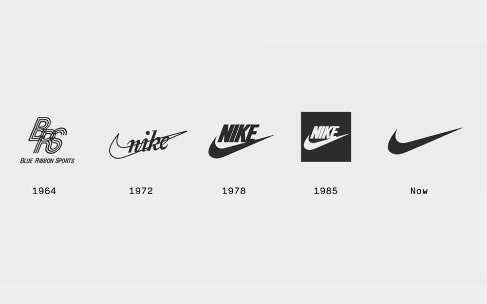
“The Nike Swoosh” is the name given to a single curved line that gets thicker at one end. Nike's name once accompanied the Swoosh, but the distinctive shape stands out on its own and is the epitome of minimalism.
When Carolyn accidentally met Phil Knight, the co-founder of Nike, she had just begun her professional life. When Carolyn was out with friends and mentioned that she needed additional cash, Phil offered her a $2/hour design job. She created the famous swoosh after a few draughts.
Microsoft Word
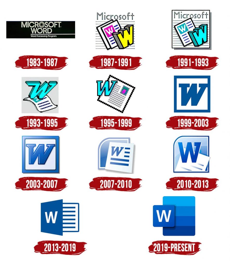
Many of us are aware of the progression of the Microsoft Word logo. You'll undoubtedly recall at least one iteration of the Microsoft Word monogram logo from your youth if you think back to that time.
These are all examples of how digital technology has advanced, how the internet has arrived, and how good taste has evolved. The different logo iterations are visible, and it is clear that the fashions probably influenced each one in graphic design at the time.
The sharp contrast between the 2013-2019 design and the current logo is particularly intriguing. The updated logo shows the change to the softer and “gummy” 3D design tendencies we frequently see in today's graphics and icons as opposed to the earlier logo's subdued and harsher appearance. The current design is soft and fluid, emphasising the W through layout spacing and using colour to express movement and unity.
Levi's
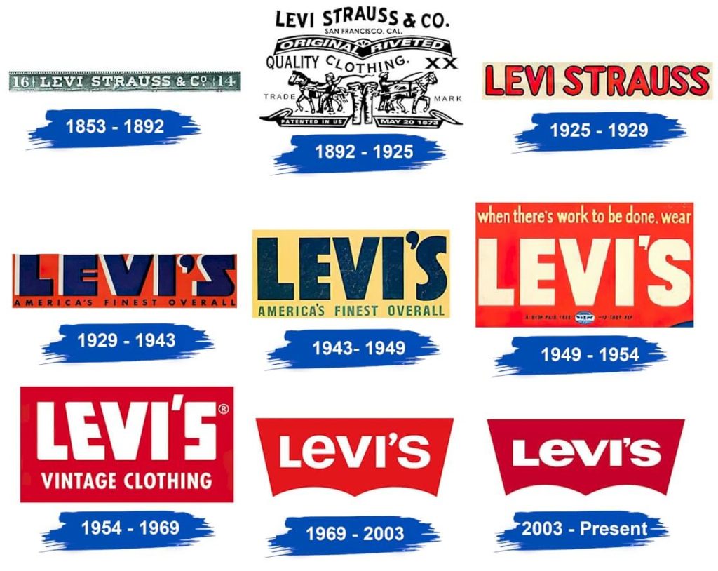
Simplicity and minimalism are key themes in the evolution of Levi's emblem. When displayed on a tablet screen or digital billboard today, that intricate and wordy logo—which was typical in the 1800s—looks out of place. Therefore, everything at Levi's was downplayed, even their brand name.
Their current emblem is small and plain enough to print legibly on a centimetre-long tag. It's also simple to stand out because they chose red, one of the most attention-grabbing colours. And if the company is given a chance to use a more elaborate logo, it can revert to its original design to serve as a friendly reminder to its clients that they have been in business for more than a century.
Pepsi
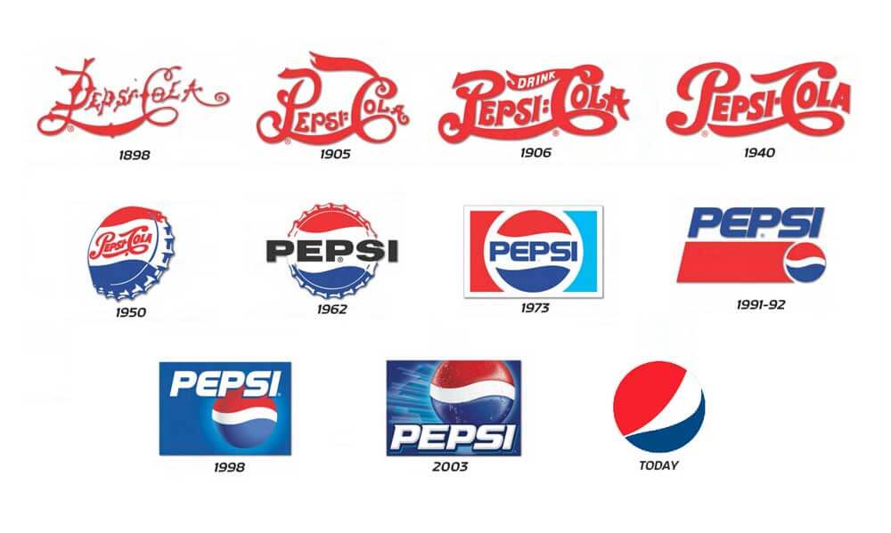
The aesthetics and fashions of each Pepsi logo's era are expertly captured. Swing skirts, Elvis Presley's rock and roll, and the beginning of American suburbia are all evoked by the logo's 1950s aesthetic. On the other side, the bottle cap insignia was redesigned, and a more subdued colour scheme was added in the 1970s, symbolising modernity.
Pepsi's logo underwent several revisions throughout the 1990s and early 2000s. The corporation ultimately changed its recognisable logo by inverting the circle so that the wave would resemble a smile.
Due to the use of a lowercase sans' serif typeface and a curved play on the letter “e,” this minimalist design is in line with current progressive and youthful design trends.
Starbucks
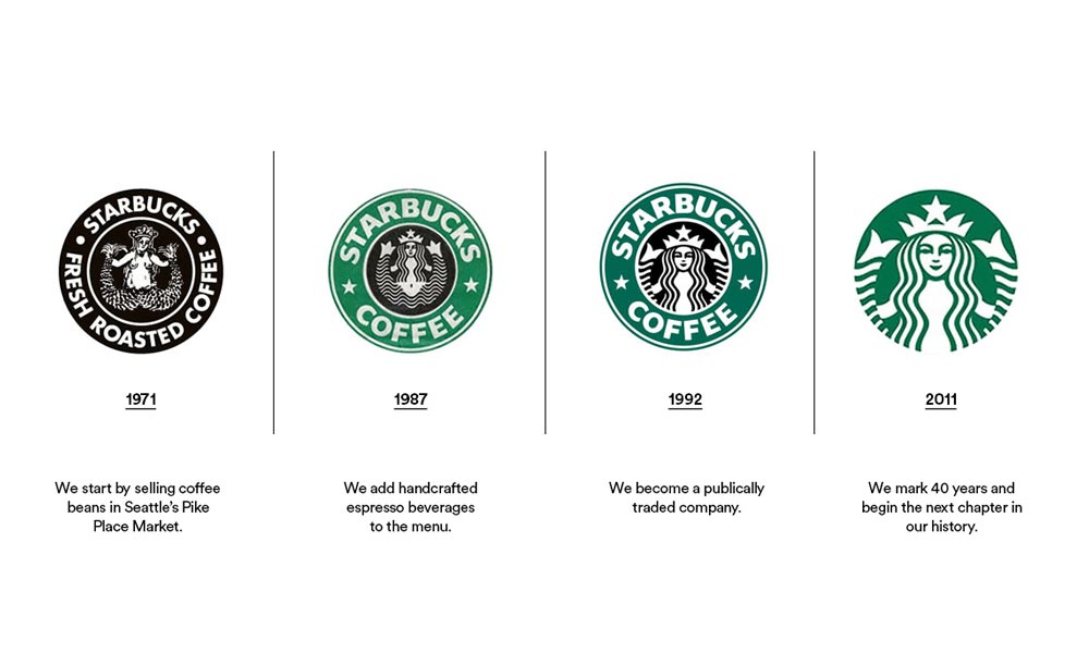
A definite improvement over the original is the redesign from 1987, which is when their signature green hue is first introduced. It appears that the initial idea was given to a skilled designer, who then created an aesthetically beautiful design that is straightforward enough to be printed easily on a coffee cup.
Starbucks gained widespread recognition by 2011, and its distinctive green logo was well-known to clients. Because of their increasing popularity, the business could simplify its logo a bit. They dropped the brand name and changed the entire colour palette to a monochromatic shade of green, which is where their contemporary logo originates.
BMW

Although most people are unaware of the meaning of the BMW insignia, everyone can recognise a BMW car when they see one. The iconic blue-and-white BMW emblem is intended to evoke the action of an aeroplane propeller, with its white blades slicing through the sky's deep blue. While the logo has seen some minor changes to its fonts and colours since it was first designed in 1923, it still mainly retains its original attributes.
Amazon

The evolution of Amazon's logo is fascinating.
At first, Amazon's design and overall brand identity were disjointed. That lack of identification is understandable, though, given that they were one of the original e-commerce sites.
Since Amazon changed its wordmark to a lowercase typeface with whitespace and an orange underline in the same year, it is evident that the early 1988 logo with a giant “O” didn't stick around for very long. The smiley arrow connecting the A and Z that the orange underlines ultimately took on in 2000 represented the enormous range of products offered on Amazon, covering you “from A to Z,” was introduced.
Let the conversation come to an end for now:
What stage in the evolution of your logo are you at? Are all the subliminal cues of a cutting-edge brand present in your logo's chic, contemporary design? Or is it a piece of luggage you've been dragging around for a while that's getting worn out?
Changes in logo design and design reflect societal, technological, and generational changes. Each of these elements impacts popular culture, affecting our preferences and understandings. This leads to the development of fresh design fads and yet another evolution of design standards.
Despite this, there are still many more things to discover by investigating the evolution of logos, so carry on your exploration by looking at the earlier iterations of your favourite companies.
Author Bio: I'm Olivia Welsh, a freelance professional creative writer. I am currently working with a start-up venture that provides free vector icons to users. It offers its services to graphic designers, visual designers, UI/UX designers and developers. Our team is dedicated to delivering high-quality content.
