7 Common Mistakes in Logo Design You Need to Avoid
The world of branding can be complex and challenging, but one of the most critical components is designing a logo that resonates with your audience. A good logo should be more than just a pretty image. It should be a memorable, recognisable symbol that represents your brand identity and values to the world. Unfortunately, many businesses make common mistakes when designing their logos, leading to disastrous results for their brand reputation and even loss of potential customers.
According to a recent survey, 48% of consumers state that clarity is the most critical aspect of a brand's logo, followed by how well it represents the brand (39%) and its memorability (37%). This underscores the importance of a well-designed logo that accurately communicates your brand to your target audience. Let's dive into the most common logo design mistakes you must avoid.
Table of Contents
1 – Not Understanding Your Brand Identity

A logo is the face of your brand – a visual representation of your values and identity. A logo design that accurately reflects your brand can create a meaningful connection with your audience and drive customer loyalty. On the other hand, a poorly designed logo can hurt your brand identity and lead to a loss of business.
However, in the excitement of starting a new venture, many businesses rush into the logo design process without understanding their brand identity, target audience, and market position. This mistake can lead to a disconnected logo that confuses your audience and fails to represent your values accurately.
Knowing your brand is vital to creating a successful logo. Define your brand values, mission and vision, and USP (unique selling proposition). This knowledge will serve as a foundation for your logo design.
Additionally, understanding your target audience is critical to designing a logo that resonates with them. Observe their preferences, pain points, demographics, and communication styles to connect with them through your logo effectively.
Furthermore, analysing your competition and market is essential for designing an attractive logo. It would be best to determine your brand's position compared to your competition to ensure that your logo addresses any gaps in the market and differentiates you from your competitors.
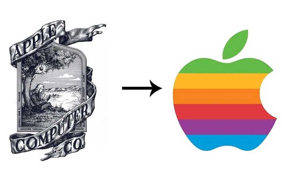
Once you clearly understand your brand identity, target audience, and market position, it's time to design your logo. Simplicity is the key to developing an effective logo. A clean and straightforward design can make your logo more memorable and recognisable and enhance its impact.
It's also crucial when creating your logo to choose colours that communicate your brand identity and evoke the desired emotional response. For example, blue is often associated with stability and trust, whereas red can symbolise passion, excitement and energy.
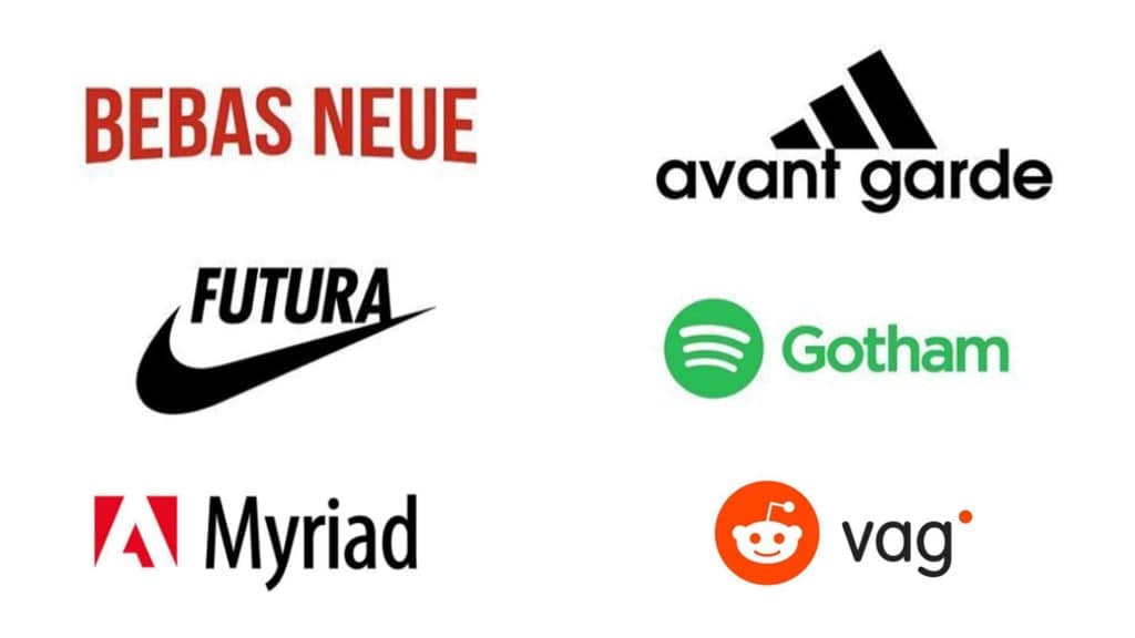
Choosing the right typography is just as important as choosing the right colours. Your typography should be legible and complement your logo design. Fonts have personalities like people, so ensure that the selected font reflects your brand values and personality.
Designing a unique logo that accurately represents your brand's personality is crucial, but originality is essential. Your logo should be unique and stand out from others. Copycat logos often go unnoticed and lack a connection with the audience, leading to lost business.
Finally, once you have designed your logo, it's essential to ensure consistency across different platforms. From social media to business cards, your logo should remain consistent, promoting consistent brand recognition.
2 – Over Complicated Designs

According to a recent survey of nearly 2000 American consumers, over 50% purchased a product because of its packaging design. The study shows that customers are drawn to products that create an emotional connection through visual cues, and a great logo is a critical element in making that connection.
An overcomplicated logo design can harm the brand's identity and impede customer recognition. It's essential to avoid cramming in too many elements, colours, or fonts to prevent confusion. Instead, aim for a straightforward logo that clarifies your target audience.
When designing your logo, strive for a maximum of two to three colours, with a minimum of contrasting colours, to ensure readability and attractiveness. Similarly, overuse of fonts or icons can create visual clutter and make it difficult for customers to recognise your brand. Choosing one or two complementary fonts and icons can help create coherence and balance.
It's essential to note that your logo should remain legible, even when it's scaled down. This is particularly important when designing logos in various sizes for marketing materials such as business cards and billboards. An excessively intricate logo will be hard to discern at smaller sizes, resulting in a lack of impact and potentially losing customer recognition.
Your logo should have a sense of uniqueness that reflects your brand identity while being recognisable to your target audience. A simple, memorable logo will stand out, while an overcomplicated logo can be lost in the sea of branding.
3 – Following Trends Too Closely

Trends come and go, and the logos representing your brand should have a timeless appeal. Your logo is the face of your business and should evoke emotions and remain memorable to your target audience. The importance of having a well-designed logo cannot be overstated. According to a recent survey by the Small Business Administration (SBA), 89% of consumers are more likely to remember a brand with a visually appealing logo than one with a poorly designed logo.
Following the latest logo design trends is trendy, but there may be better courses of action for businesses aiming for long-term success. Modern designs risk quickly becoming outdated, and the constant need to update them may result in additional expenses. Opt for timeless logo designs that adequately represent your brand to avoid these expenses.
To achieve long-lasting logo design, avoid fonts, colours, or design elements that take years to regain popularity. A logo designed for timelessness can withstand changes in fashion and otherworldly trends. To achieve a timeless design, you should focus on elements that accurately represent your brand: lighthearted or serious, playful or professional.
Another way to ensure a timeless design is to create simple logos. It is essential to remember that simplicity and timelessness tend to go hand-in-hand. Simple logos have an easier time withstanding the test of time. Refrain from relying on complicated design elements or font choices that may be considered visually pleasing now but may translate poorly to future branding strategies.
While following trends can be tempting, businesses must always consider their decision's long-term implications. A robust logo design may connect companies and their target audience emotionally. A logo that withstands market trends can make it easier for businesses to cement recognition among their audience, leading to increased loyalty and returns.
4 – Poor Font Choice

Selecting a font that correctly represents your brand, is easy to read, and stands out amongst competitors is critical. A well-designed font can capture a business's essence, while a poorly chosen font can send the wrong message to the customers.
According to a study by the American Psychological Association, font style impacts how people perceive and understand the text. People perceive a font style to influence the message's tone and emotion; hence, it is essential to consider font choices carefully. The wrong typeface choice can ruin a brand's image, damaging its competitiveness in the long run.
When creating a logo, selecting a font that is not too similar to other popular brands in the same industry is crucial. A font that appears identical to another brand may lead to brand confusion, resulting in a negative impact on the business. Furthermore, choosing an overused font can lead to a lack of brand identity, thereby reducing recognition among potential customers.
While selecting a font, it is essential to remember that looks are not everything. Cute, fancy-looking fonts may seem appealing; however, they may compromise the readability of your logo. Customers should be able to read your brand name easily and retain it in their memory. Confusing or unreadable symbols can lead to missed opportunities and lost revenue.
It is important to note that selecting a font that accurately represents business values and personality is just as significant as readability. A font that conveys professionalism may not work for a brand focused on fun and lightheartedness. Therefore, choosing a font that fits the brand's identity is crucial.
5 – Ignoring Colour Psychology

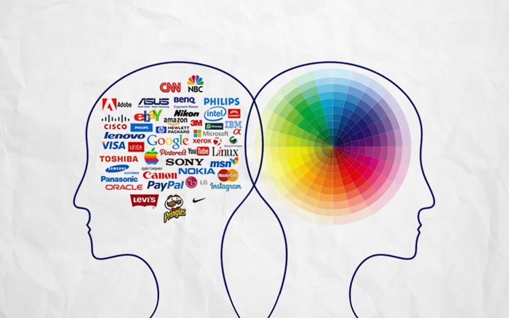
It is no secret that colours are powerful tools that play a vital role in brand perception. The right colour palette can evoke various emotions and associations to enhance a brand's personality while reinforcing its messages. Understanding the basics of colour psychology can empower businesses to make informed choices when selecting colours that accurately convey their brand values and identity.
According to a study by Satyendra Singh, colour accounts for 85% of the reasons people buy a product. Colours are imbued with meanings, and they have the power to elicit subconscious associations and responses. For example, red is often associated with passion, excitement, and urgency, while blue is usually linked to trust, tranquillity, and calmness. Selecting the right colour for your brand can help you tap into these associations, making it easier to connect with your target audience.
When choosing a colour palette, it is vital to consider the demographics and culture of your target audience. Different cultures associate different meanings with colours, and using a well-received colour in one culture might not have the same effect in another. For instance, blue is popular in the Western world but is viewed as a symbol of mourning in some Eastern cultures. Additionally, gender differences should be considered since men and women react differently to colours.
Understanding each colour's emotions and associations and using them appropriately is also crucial. Colours can communicate different messages about a brand, and they should be used in ways that align with business values and goals. Colours can differentiate brands, create emotional connections, and evoke certain moods. For instance, green is commonly associated with nature, growth, and health, making it a popular choice for organic and natural product brands. On the other hand, yellow is associated with optimism, making it an excellent option for brands that want to convey a sense of positivity.
6 – Relying on Stock Images

As a business owner, cutting corners regarding logo design can be tempting, especially with quick and cost-effective solutions like stock images readily available. While these options may seem simple, they need more originality and brand consistency to stand out in a highly competitive market. Avoid using stock images to make your brand unforgettable, and invest in a logo design that accurately represents your brand identity and values.
Stock images have long been overused in marketing and branding campaigns. It is impossible to guarantee that no other business uses the same ideas, which can dilute your brand's unique identity, making it harder for customers to recognise you among the competition. Additionally, utilising stock images can result in a generic design that doesn't accurately reflect the unique features of your specific brand. A generic logo that lacks creativity and originality can cause your brand to blend in with the masses rather than stand out.
A study by Zabisco, a digital marketing agency, found that 40% of people respond better to visual information than plain text. Therefore, a brand's logo and overall design significantly impact today's visual overload. Investing in professional logo design services ensures your brand has a unique and visually appealing visual identity that accurately represents your business values and caters to your target audience's preferences.
In addition to originality, a well-designed logo should be consistent with your brand identity. Your logo's colours, fonts, and graphics should reflect your brand tone and personality. Consistent branding helps increase brand recognition, essential for building customer trust. Utilising custom designs unique to your business facilitates consistency and brand recognition, demonstrating that you are intentional about your brand's message and values.
7 – Inconsistency Across Different Platforms

When it comes to effective branding, consistency is critical. Your logo is the symbol that represents your brand, and it should be recognisable and consistent across all platforms. Whether it's your website, social media, or other marketing materials, inconsistency can disrupt brand recognition and confuse customers about your brand's identity. That's why it is crucial to ensure your logo is scalable and its colours remain the same across different platforms.
A design and brand management platform study revealed that consistent presentation across all marketing materials could increase revenue by up to 23%. This is because consistency helps to build brand recognition and trust with customers. If customers see the same logo design everywhere, from your website to social media to physical marketing materials, it helps to establish your brand's presence in their minds. This leads to a higher likelihood of customers choosing your brand over competitors since they remember it more easily.
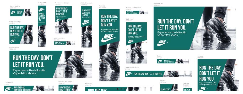
A scalable logo design allows your brand to maintain a consistent image regardless of the medium. Your logo should always look the same on a tiny social media profile photo or billboard advertisement. If your logo looks different on various mediums, it can confuse and remove your brand recognition. Therefore, working with a professional logo designer must create a scalable design that can be used across all platforms effectively.
Colour consistency is also a significant aspect of ensuring your brand's integrity. The same Lucidpress study mentioned above found that consistently using brand colours increases brand recognition by 80%. A brand's colours and matching shades contribute to the overall perception of its identity. Colour schemes can evoke emotions or signify intent, affecting how customers perceive the brand. Utilising colours inconsistently across different platforms can break continuity, detract from branding efforts, and damage the relationship between the brand and its audience.
Summing Up the Mistakes in Logo Design
Your logo is the first thing people notice about your brand, and it's essential in making an excellent first impression. It's one of your most valuable assets when branding your business. Therefore, avoiding common mistakes in logo design is crucial to creating a robust and impactful brand identity. Conducting thorough research and investing in original designs representing your brand's values and message can create a memorable, recognisable logo that stands out.
One of the most common mistakes in logo design is clutter. Adding multiple design elements to create a more complex or creative look is tempting. However, a cluttered logo can be overwhelming and challenging to remember. A study by the University of California revealed that the brain processes simple images around ten times faster than complex images. Therefore, choosing a clean, straightforward design that reflects your brand's values and resonates with your audience is essential.
Another mistake is using trendy or outdated design elements. Trends come and go, and while they may look great in the short term, they can quickly become obsolete. A logo should be timeless, and the design should hold up for years, especially for a symbol representing your brand for decades. Therefore, working with a professional designer who can create a logo that reflects your brand's values and has lasting power is essential.
Using too many or the wrong colours can also harm your logo design. While colour is essential in branding, too many colours can be overwhelming and detract from your brand message. A study by the University of Loyola found that using multiple colours can reduce brand recognition by up to 80%. Similarly, using the wrong colours can send the wrong message about your brand's identity. For example, using a bright pink colour on a logo for an accounting firm sends a mixed message about the brand's professionalism. Therefore, working with a designer who can choose the right colours that reflect your brand's identity and values is essential.
In conclusion, avoiding common mistakes in logo design is critical to creating a robust and impactful brand identity. A simple, timeless design that reflects your brand's values and message is crucial, while avoiding trendy or outdated design elements is necessary for lasting power. Additionally, using the right colours in your logo is critical for sending the right message about your brand's identity.
Investing in original designs representing your brand values and avoiding common mistakes can create a memorable, recognisable logo that stands out. So choose your designer carefully, conduct thorough research, and let your brand shine through your logo design.
