
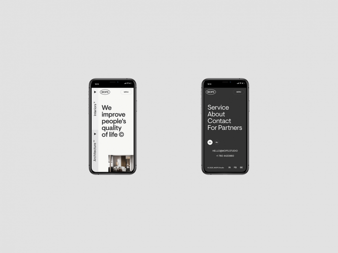
Mobile-first: learn how to create a mobile-friendly website.
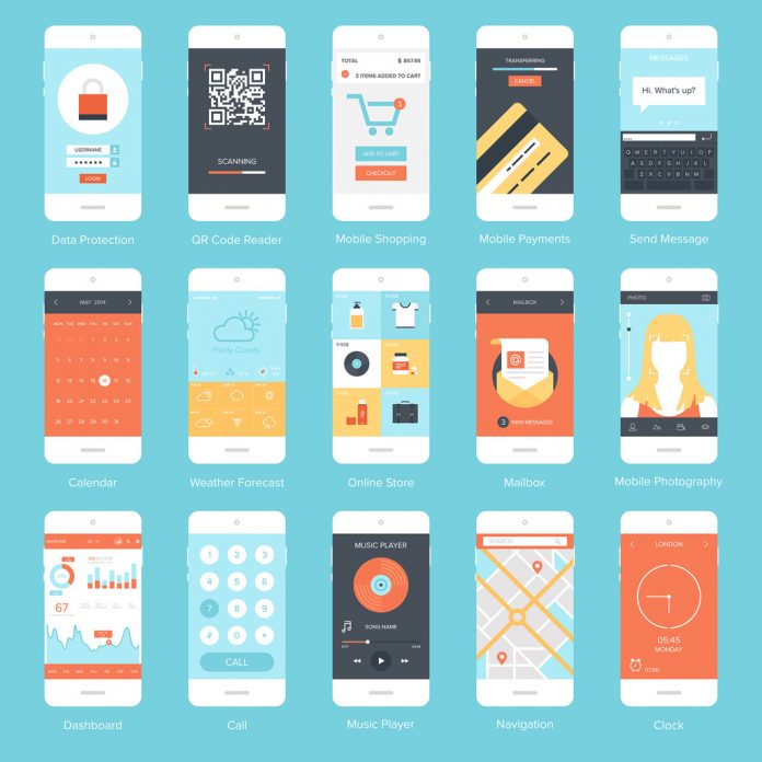
It’s no secret that more and more website traffic is coming from mobile devices such as smartphones and tablets. With great certainty, we can say that this trend will continue to rise rapidly. Therefore, today’s websites should be optimized for mobile devices in particular. Gone are the days when mobile websites were just an additional feature to the desktop version. A mobile-friendly website offers users a fast-loading and easy-to-use interface on any mobile device. In addition, it is also an important ranking feature for search engines like Google. Websites that fail to deliver a decent strategy for high-quality mobile experience risk falling behind their competitors. Don’t worry, we’ve put together 5 great tips on how to create a mobile-friendly website.
1. Optimize your website even for the thickest thumbs.
Especially on smartphones, most users use their thumbs to navigate through your website. These interactions include scrolling, swiping, clicking, or entering text. As the touchscreen will not respond if parts of the thumb are not touching the button, web designers should use very large shapes when creating buttons. The position of all interactive elements is also very important. Typically, smartphones are held in the lower area while the thumb is placed somewhere in the middle. That’s why the ideal interaction zone is roughly in the middle of the screen.
2. Keep navigations short and simple.
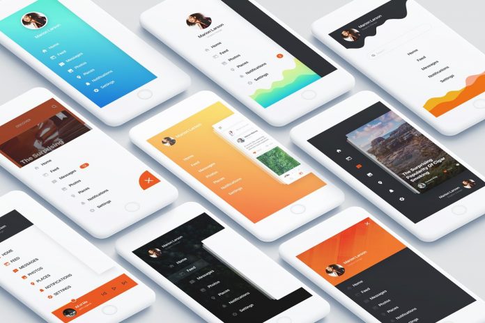
While most desktop websites have a full navigation bar with multiple main and sub-menus in the header, it has become a common standard for mobile websites to include them all within one recognizable icon. Depending on how complex a menu is, each menu can have additional submenus. If a user clicks on one of these submenus, it is best to replace the existing menu with the new list in order to keep it short and clear. Sidebars are usually used for mobile menus, which slide out and overlay parts of the screen.
3. Optimize your website for a vertical view.
Most users prefer to hold their smartphone or tablet upright while surfing the internet. The limited screen width is perfect for single-column layouts, which means: most website elements are placed sequentially from top to bottom. Smaller elements such as icons, graphics, or photos can be presented in a grid. Especially picture carousels can loosen up vertical scrolling by swiping horizontally. In addition, you should use visual sections for grouping similar information together so that the user can understand the purpose of each section immediately. Different background colors help separate these sections from each other.
4. Font size totally matters.
Make sure the font size is adequate. Google recommends a font size of 16 as a base, which is defined in CSS pixels. If you use a responsive mobile website, you have a big advantage: with the viewport tag, pixels are displayed independently of the respective output device. In addition, it is important that you don’t use too many different fonts. The more uniform a typeface is, the easier it is for users to read texts on small screens.
5. Think mobile-first.
Since more people are surfing on mobile devices than on desktop devices, the mobile website has become more important than the desktop version. In the past, the desktop was always optimized first and the mobile version came second. This has now completely changed. With mobile-first, simplicity and user-friendliness are the key features right from the start of any web design project. That doesn’t necessarily mean that the desktop version always has to be minimalist with just a few functions. The more simple mobile version can serve as a basis for the desktop version because it’s easier to extend a simple design than to simplify a complex layout.
These were our 5 tips for mobile-friendly web design. Of course, that’s not all you need to consider, but these 5 tips should at least be a good start. For those of you looking for more website inspiration, feel free to browse through our popular Web Design category. The section also includes a range of premium website themes, templates, and web elements.
Subscribe to our newsletter!


