Being ingenious products of designer creativity and remarkable development skills, digitally created animations have run the show several years in the row. Do you remember all of those scenes that can be explored in several dimensions? Well, it seems that the mainstream is not going to slow down nor fade away. Volumetric backgrounds are proof of that. It is a fresh wave that’s truly inspiring and increasingly techy.
As a rule, such animations are used to occupying the leading positions in web interfaces. However, this is not one of those instances. In this approach, they were shifted to the back – giving way to other integral elements of the interface like the tagline, navigation or logotype.
It may seem illogical and undoubtedly bold. Nevertheless, it has its own merits. Co-existing on equal terms with the content, 3D animations help to create a well-balanced design and harmonious experience.
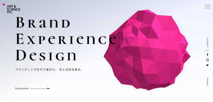
Art and Science
Art and Science is the official website of the Japan-based brand-related design firm. As practice shows, a website that comes from the land of the rising sun will separate itself from the competition with its incredible charisma, intricate design, extraordinary features, and of course, love of everything advanced. This one is no exception.
Here, a gorgeous polygonal sphere that rotates around its axis marks the hero area. Even though it is incredibly big, has a radiant purple color and occupies almost half of the screen, the tagline on the left still commands our attention. The team has managed to achieve a perfect balance between the volumetric background and content.
What’s more, they have also populated the website with trendy details like vertical lettering, thin lines, and corner navigation. This shows that not everything is riding on the volumetric, globe-based background.
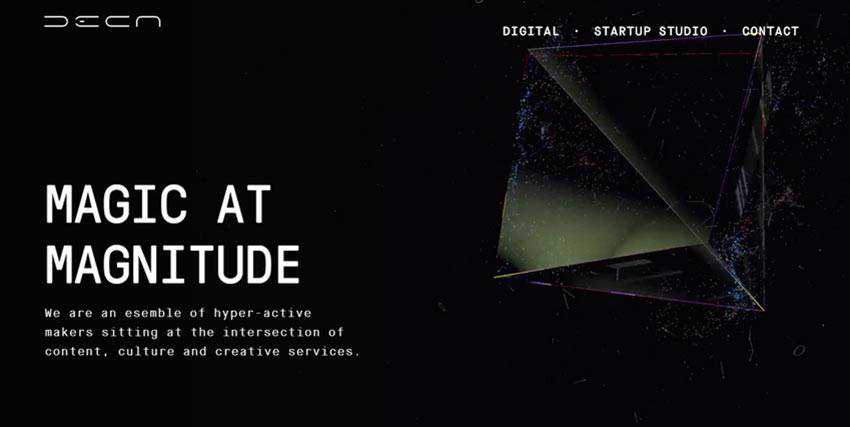
Deca Digital
Deca Digital is another fantastic example that exploits this trend. Unlike the previous one, the team wins over the audience with beautiful dark aesthetics, where black sets a sophisticated tone without much effort. Here you can see another 3D shape.
This time it is a pyramid, though not the usual one. It is created from glassy and glossy surfaces that are spiced up with particles. Much like the polygonal orb in Art and Science, it is also charged with motion.
Once again, note that the tagline on the left stands in stark contrast to the animated background. The team has achieved this thanks to two things. First, they have used several time-proven tricks in the design, such as black and white coloring, a generous amount of whitespace, and of course a left-sided location that is a reader’s natural starting point. Secondly, they have used transparent facets for the pyramid, thereby reducing its visual weight.
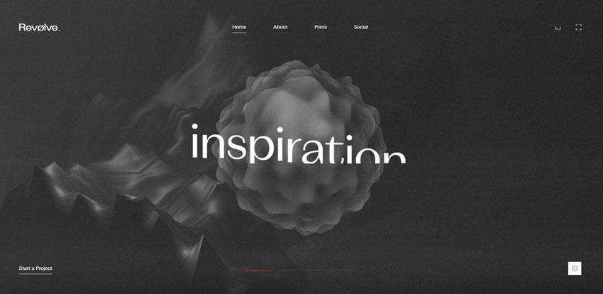
Revolve Studio
Much like Deca Digital, Revolve Studio has a beautiful dark aesthetic. The background features a morphing polygonal sphere and a digitally generated mountain. However, thanks to grey shades and white lettering, these two 3D objects play a purely decorative role remaining as a supporting asset.
Revolve Studio shows us how to achieve the compromise between the volumetric background and content by using 3D objects that lose in contrast to the foreground elements.
Unshift
Unshift is another example where the seamless appearance of the background makes the 3D animation less bold and overpowering. Again, the team bets on a traditional black and white coloring that is famous for its ability to create the perfect contrast between the parties.
Therefore, despite sitting in the heart of the screen and moving in various directions, the 3D cube does not grab the entire attention. The logotype and navigation easily stand out from the flow, catching an eye from the get-go.

Think? Festival
Think? Festival uses volumetric backgrounds throughout the entire front page. The hero area demonstrates an animation that shows a combo of parallelograms of various sizes that stretches from top to bottom. The rest of the page is populated with the sketch variants of 3D polygons.
In this way, the team adds diversity to the design, and at the same time, ties everything together creating consistency across the sections.

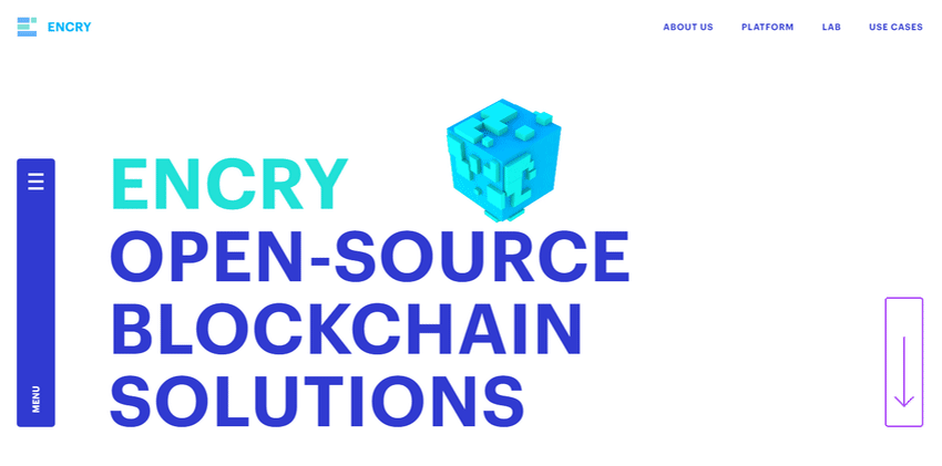
Prior Holdings / Encry
There are some other fantastic examples, for instance, Prior Holdings and Encry.
The first example has an elegant aesthetic with neutral coloring and a ton of whitespace that produce a businesslike feel. However, the website looks neither insipid nor trivial due to the clever background solution.
It features a long 3D ribbon that follows visitors on their way while exploring the project. It helps to create a continuous experience as well as establish the proper mood. Note, even though the stripe in the back performs a vital role, the content remains a star of the show.

The team behind Encry proves that you do not need to push boundaries to create something noteworthy. A small 3D animation in the background can be more than enough to make a statement.
In their case, the backdrop is a simple white canvas with a small Minecraft-inspired cube. It serves as a tool for supporting the theme and idea behind the website. It perfectly symbolizes the blockchain technology and adds a modern twist to the hero area.
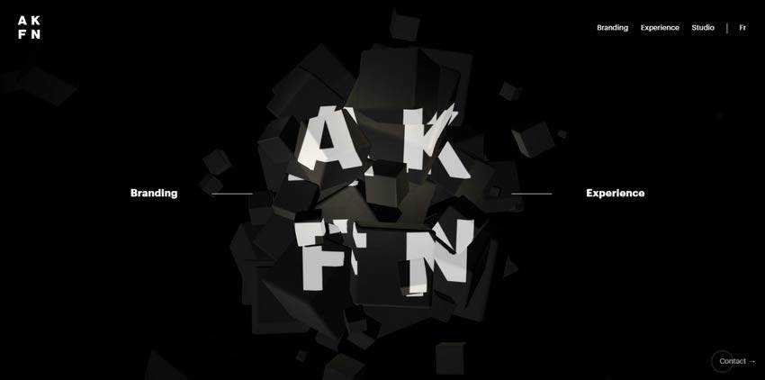
Akufen
The trend can be used, not just as a decorative part of the background, but also as a part of brand identity. Take a look at Akufen.
The website stands out from the crowd with its sophisticated, high-end appearance. It has a wow factor that wins over the online audience from the first seconds. Here the volumetric background underlies the logotype. Note, not only does it stay in motion all of the time, but you can also play with it a little bit. Simply outstanding.
Perfect Volume
Even though volumetric scenes deserve center stage in the hero area, they work perfectly as “backup dancers”. What’s more, since the online audience is spoiled with extravagant solutions, intricate ides, and interactive user experience, this approach is warmly welcomed.
Users are ready to consider 3D animation a supportive asset that reinforces the general impression and, at the same time, lets the content occupy its place under the sun.
Therefore, if you want to add something big and dimensional but still keep the content a king, do not hesitate. The above examples show how to do this in practice. Get some valid points from them and bring your idea to life.
Related Topics
Top