 Download 10 Free
Last year, the web development community was obsessed with vertical lines and vertical rhythm. This year, we see some interesting solutions that have originated from that tendency. The use of ultra-thin lines throughout the interface is one of them.
This is an incredibly small and elegant trend. Sometimes it can be difficult to notice at first glance, yet it becomes evident after spending some time on the project. It does not jump out at you; it waits to be discovered and charms spectators with a delicate, exquisite nature.
Let us consider some prime examples to see how artists play with it and how it can benefit a website.
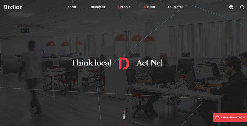
Dixtior
We are going to start with Dixtior, a digital agency where ultra-thin lines lie at the heart of the overall aesthetics.
They meet you right out of the gate. After loading, you stumble upon the continuous ultra-thin line that stretches from right to left. It is also set in motion. Note there is nothing extraordinary in the hero area. It is just a regular section with an image background that demonstrates the workflow in the office. However, thanks to this tiny trend, it looks creative and techy.
What’s more, ultra-thin lines can be seen in various corners of the website as well. Each section has its dose of the tendency. In some cases, they are used in tandem with the headings as though they are pointing at them. In such a way, they give them an extra focus.
In others, they are used to enrich blocks with text and images or even hover states, giving essential elements a subtle twist. And of course, they are used as pure decorative details. As a result, here, the theme runs across all the sections creating a consistent and harmonious experience.
Zajno
Zajno is another point in case. Much like in the previous example, the team leverages ultra-thin lines in every part of the interface. The website even opens with a splash screen, where the vertical line foreshadows the hero area. There are both vertical and horizontal ones.
Whereas the latter is used mostly in tandem with headlines and titles, the straight-up strokes are used to create visual paths that naturally guide visitors from one section to another or from one text block to another.
What’s more, the website has a unique background. It is an interactive canvas that features a globose grid. It perfectly matches the trend, thereby making the project feel even more sophisticated.

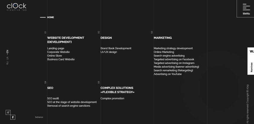
Clock Lab
Clock Lab is the official website of the creative agency from Ukraine. Here, you can feel the power that is hidden in the vertical rhythm: It ably benefits various aspects of the user interface. And since the upright direction is in charge, it comes as no surprise that the team has used lots of lines in the design.
They are used to finish off sections as well as add a subtle zest to the experience. Note, it’s not only vertical lines that populate the design, but also horizontal ones. As you may have already guessed, they accompany titles, thereby naturally directing viewers’ attention towards the names of the sections and content.
Homecult
The creative team behind the front page of Homecult has opted in favor of an iconic line style that is just an ideal partner for the ultra-thin lines. Here, the huge hollow circle marks the home screen. However, it does not stick out like a sore thumb.
On the contrary, it fits like a glove. And a bunch of short lines that are carefully scattered throughout the design assists in this matter. They underline navigation and call-to-action buttons as well as serve as decor for the background, thereby supporting the theme in every corner of the UI. As a result, the website feels elegant, stylish and modern in every section.

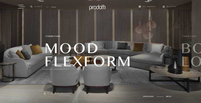
Prodotti
Much like in the previous example, this website presents a company that deals with interiors. Once again, the trendy solution perfectly blends in. It provides the interface with a touch of fragile intricacy that brings about elegance and refinement. You can see the straight, short marks mostly horizontal in direction, in various components of UI. For instance, the ultra-thin line connects “previous” and “next” controls, thereby saving them from looking too dull or trivial.
There is also a very long line that underlies the title of each slide. Although it does not add any visual weight to the latter, it still serves several purposes. First, it indicates the shifting between slides in the carousel. Secondly, it adorns the overall look, nicely echoing with the navigation, graphics, and even the logotype. And finally, it ties everything together.
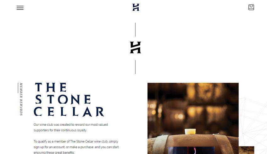
The Story – Head Wines
The team behind Head Wines employs the trend without overdoing it. Though, that is enough to add elegant traits and make the overall design feel tasteful. As usual, you can find short strokes near the titles and vertical lines that visually connect the sections. This creates a feeling of never-ending content that gently flows from top to bottom.
What’s more, note several things. First of all, there is a generous amount of white space. Secondly, vertical rhythm occasionally emerges from the shadow. Third, the background itself is not as primitive as it may seem at first sight. Some sections include outline illustrations that contribute to the overall theme. Finally, the graphics, as well as logotype, are made with an outline style in mind.
To make a long story short; the website is an example of compositional harmony where ultra-thin lines set the mood and skillfully interplay with other design features.
Using Thin Lines to Enhance Web Design
The use of ultra-thin lines in website design is further proof that even the tiniest details of the user interface make a difference. They are valid players that help to create aesthetics as well as user experience. As a rule, they benefit various parts of the UI. However, most often they can be found:
- near the headlines to give them an extra focus;
- as a part of buttons or icons to separate them from the content flow;
- near the navigation;
- in sliders;
- as regular décor used either on the background or the foreground near the main content;
Use the trend either alone or in unison with line styles to give your projects a stylish and exquisite edge.
Related Topics
Top