Hackney Church’s rebrand reflects its place as a “cathedral of creativity”
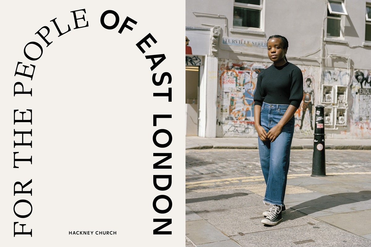
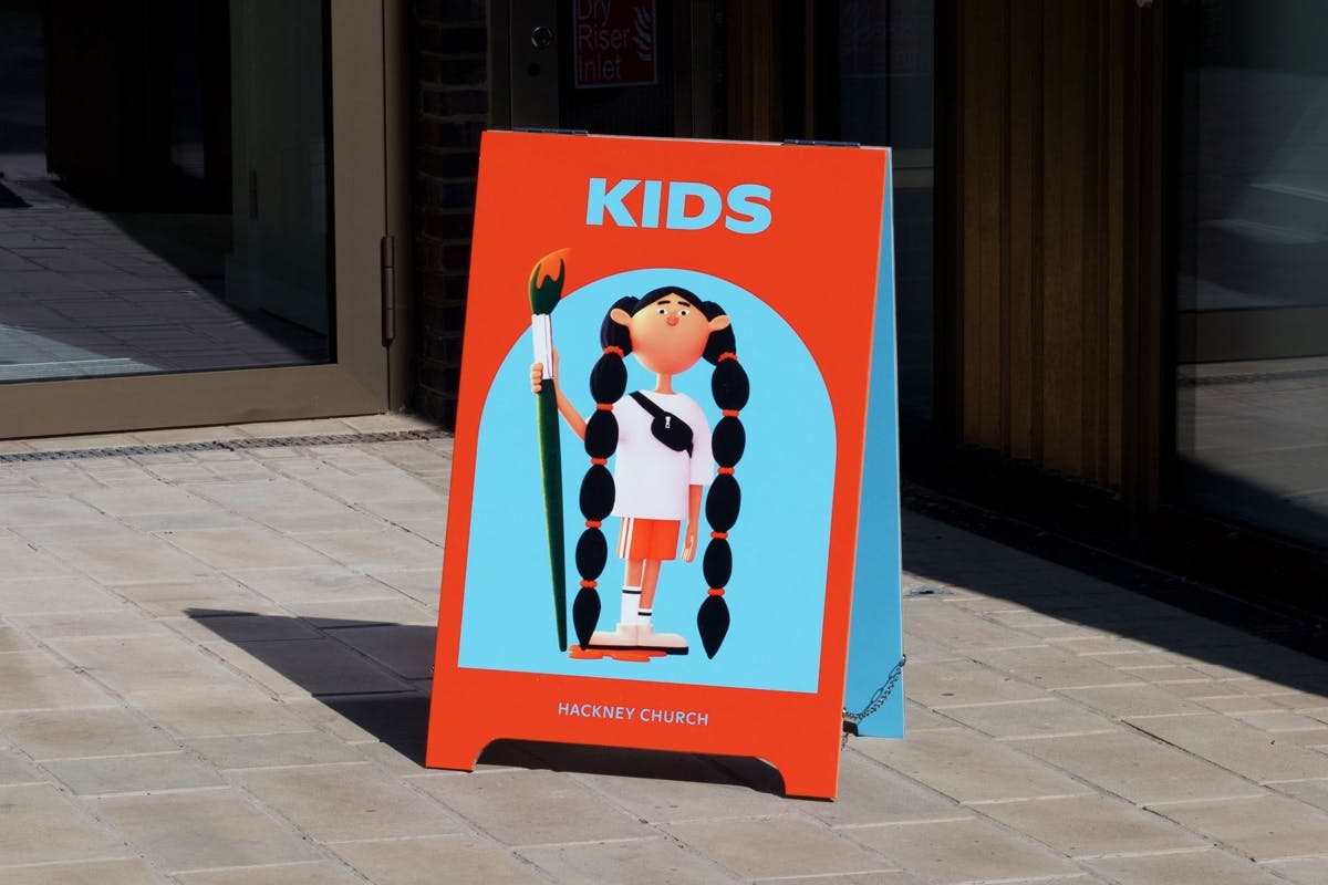
London studio Omse has designed a new identity that expresses the many ‘sub-brands’ of Hackney Church, which runs a gig venue, brewery, charity and apiary, as well as a place of worship
According to the studio’s director James Kape, the church needed updated branding that could “flex in many different ways” to encompass the organisation’s broad range of activities, as well as its mix of formal occasions, life events, and celebrations. “We see them as a cathedral of creativity,” says Kape.
It comes at the same time as a huge restoration project for St John at Hackney Church, which has been led by John Pawson.
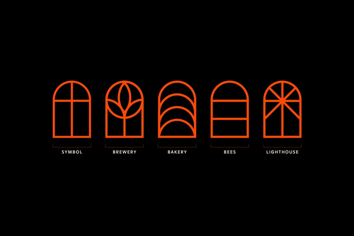
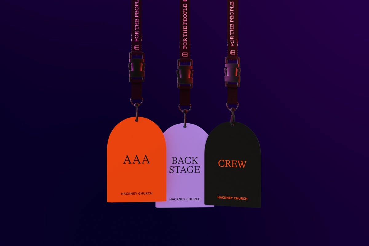
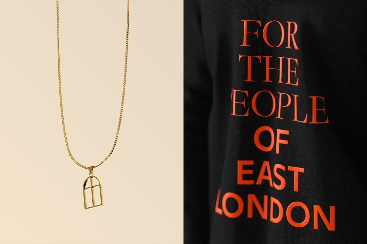
Omse have borrowed a familiar religious motif for the identity, designing a logo shaped like a radius window – based on the church’s own stained glass windows.
This is then adapted to reflect the church’s various activities, turning into a flower to represent the brewery, and a set of stacked loaves for the bakery.
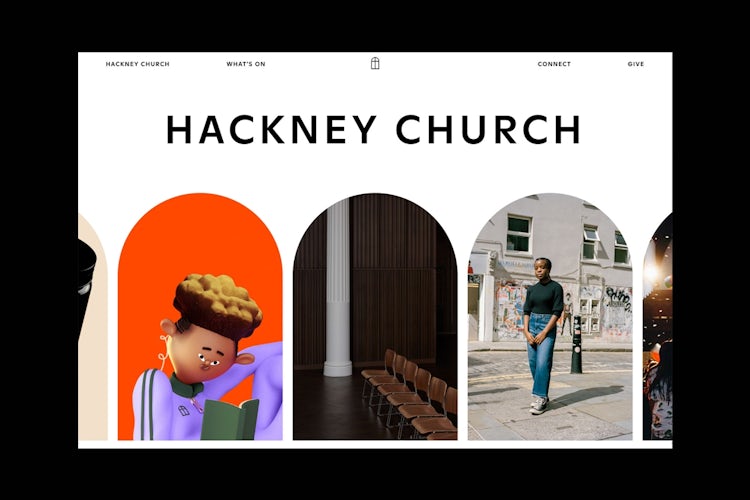

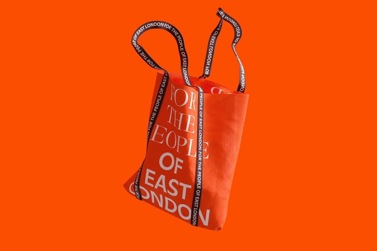
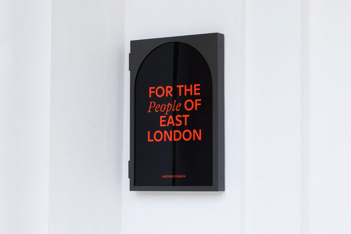
The arched shape also appears in the launch campaign, which features images of churchgoers, photographed by Vicky Grout and Toby Thomas, and taglines intended to emphasise its community focus. Omse has even designed a set of illustrated concept beer labels that would share details from the building’s history.
According to Kape, the identity was three years in the making, and coincides with the organisation’s rapid expansion of members, staff and locations, as well as its scope of business. It’s perhaps not what you’d expect from a church, but the identity does a good job of balancing the more sober, religious elements with a very welcome sense of playfulness.
Latest from CR


