
Commuting gets a friendlier face in Waze’s new visual identity
Pentagram partner Natasha Jen has rebranded the Google-owned GPS app, introducing a whole of host of cute creatures that mimic the many moods of drivers on the road
Waze has always been about making journeys a little bit easier. Founded in 2007, the crowdsourced navigation app was bought by Google in 2013 and today has 130 million users in over 180 countries, along with its spin-off rideshare app Waze Carpool.
Using smartphones and tablets that have GPS support, the app provides real-time updates on journeys by allowing fellow drivers to share information about accidents, traffic incidents and speed limits, while a community of 500,000 volunteer map editors help document any route changes.
Pentagram partner Natasha Jen was commissioned to create a new visual identity based on Waze’s crowdsourcing roots and collaborative spirit, working in collaboration with the app’s head of creative Jake Shaw.
At the heart of the rebrand is the updated Wazer symbol, which now features a rounder, more upright form to emphasise its speech bubble shape and the app’s focus on communication. The accompanying refreshed logotype is based on Boing, a sans serif typeface with rounded corners designed to give a friendlier look.

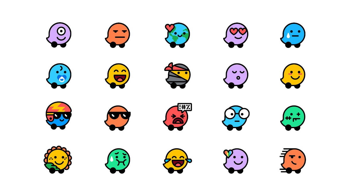
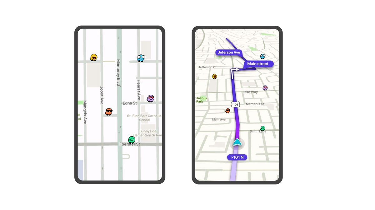
Building on the Wazer symbol is a whole suite of new mood-based driver avatars, which appear on the maps to express whatever a particular driver is feeling – from plain-sailing bliss to gridlock frustration.
To capture as many emotions as possible, Waze conducted research with 13,000 drivers to find out how they described they daily commute. The results formed the basis for a whole family of expandable moods, from adventurous to zombified.
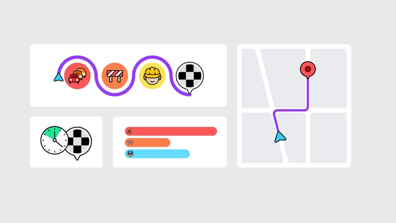
Jen’s team also developed a new visual language for the app called Block by Block, which is inspired by the modular design of city grids and road systems. The geometric grid ensures consistency across everything from infographics to email templates, featuring a flexible array of colourful block-like shapes.
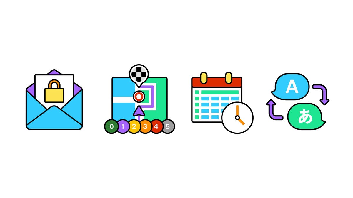
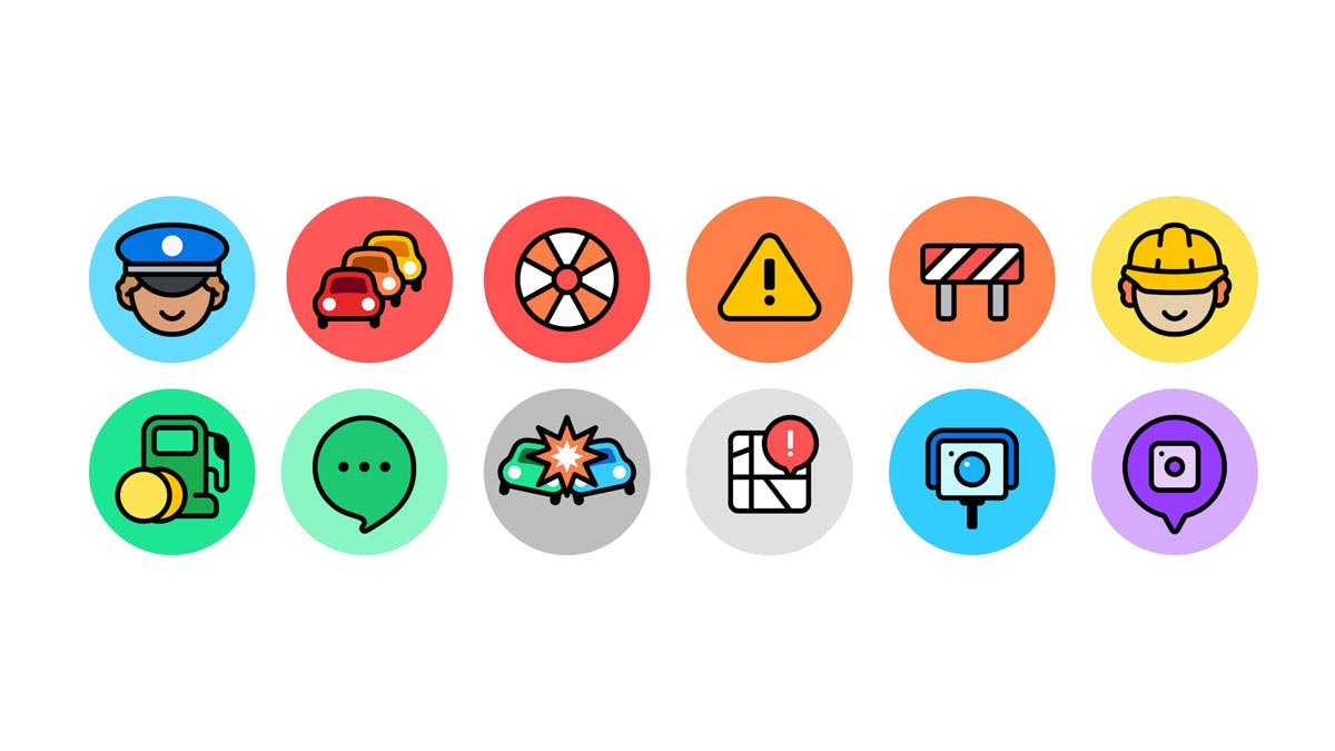
Illustration has always been a big part of Waze’s visual identity. The new branding brings greater clarity to this style, with Jen and her team redrawing existing icons and establishing a style guide for new illustrations going forward.
Adding a personal and touch and injecting a bit of fun into people’s journeys was a key consideration for Pentagram and Waze throughout the project. It’s an approach that feels reminiscent of Citymapper’s colourful aesthetic and friendly cartoon character mascots, and is a welcome change from the often stressful and sterile experiences we’re used to seeing with most transport brands.
Latest from CR


