
Burger King unveils a tasty new look
Created in collaboration with JKR, the fast food giant’s first rebrand in over 20 years features a more digital-friendly burger logo and an appropriately named brand font, Flame
While 2020 was generally pretty miserable for a lot of brands, Burger King managed to buck the trend with a wealth of brilliant creative work, most significantly in its Moldy Whopper campaign, which swept the awards circuit.
The fast food giant is showing no signs of slowing down as we enter a new year, however, having just unveiled its first major rebrand in over two decades.
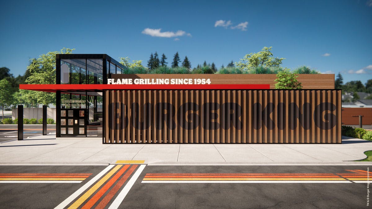
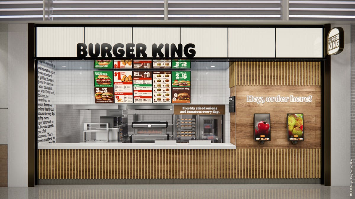
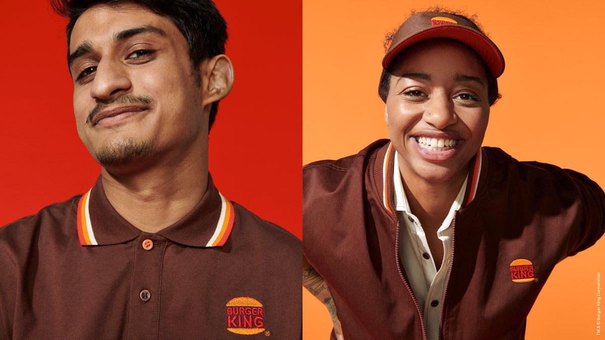
Created by Burger King’s in-house creative team in collaboration with JKR, the new identity encompasses everything from packaging and social media to staff uniforms and menu boards.
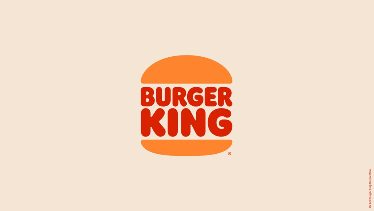
At the heart of the rebrand is a reimagined version of its existing logo, which ditches the reflective burger bun for a more stripped back design.

Speaking to Adweek, RBI global CMO Fernando Machado said: “The source of inspiration was from the logo we had from ’69 to 1999.”
“The main difference now is that we adjusted the colour to make it more vibrant and more like the colours of food. And we adjusted the proportions of the bun to look more like the products that we sell.”
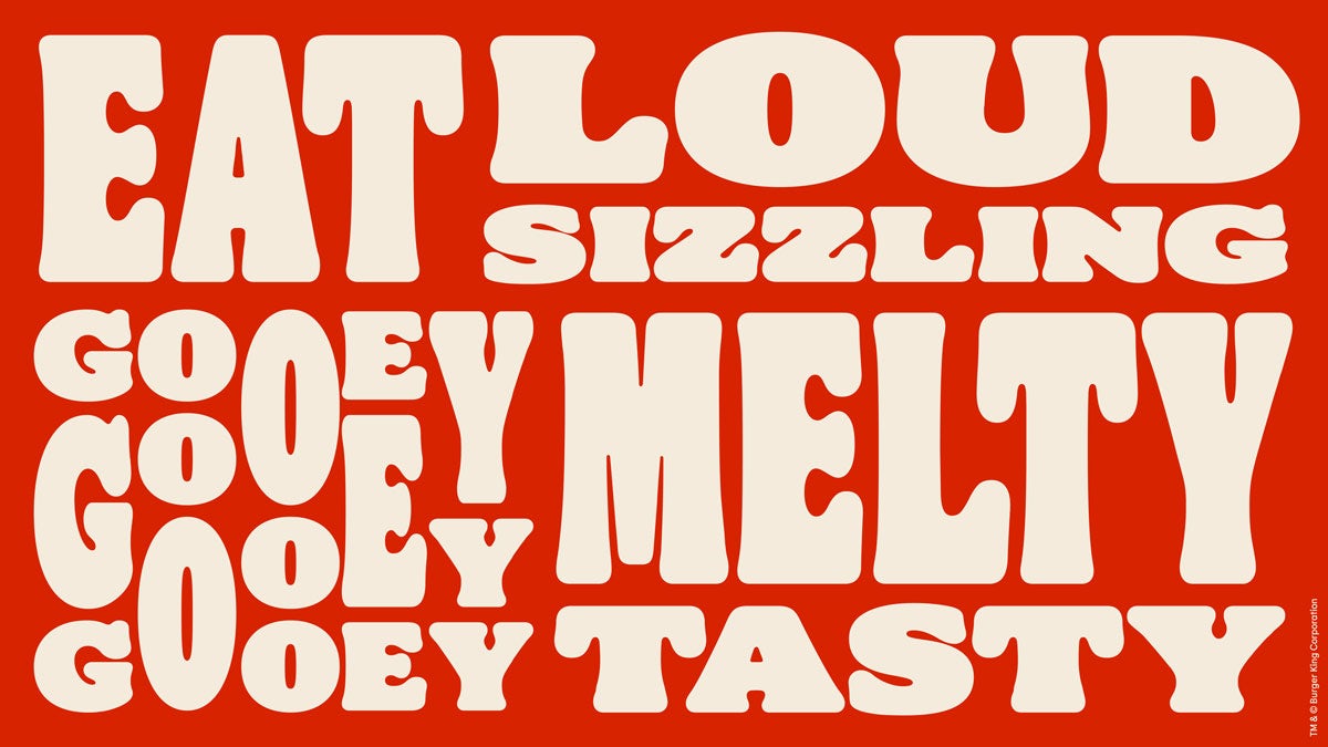
In keeping with this approach, the new brand font, Flame, takes inspiration from the shapes of Burger King’s food: “yummy and round”.
A rich colour palette nods to the brand’s long-established flame grilling process used for its burgers, including a fiery red, flame-like orange and BBQ brown.
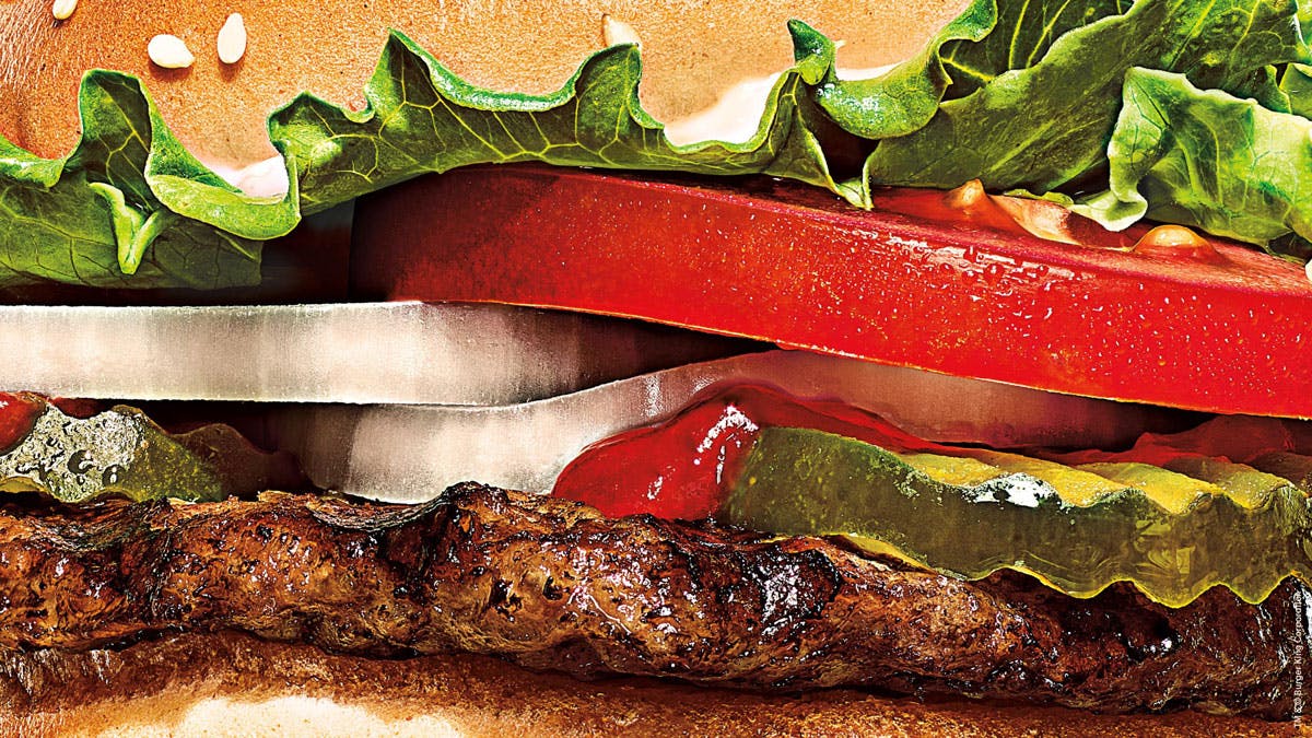
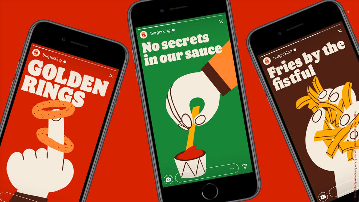
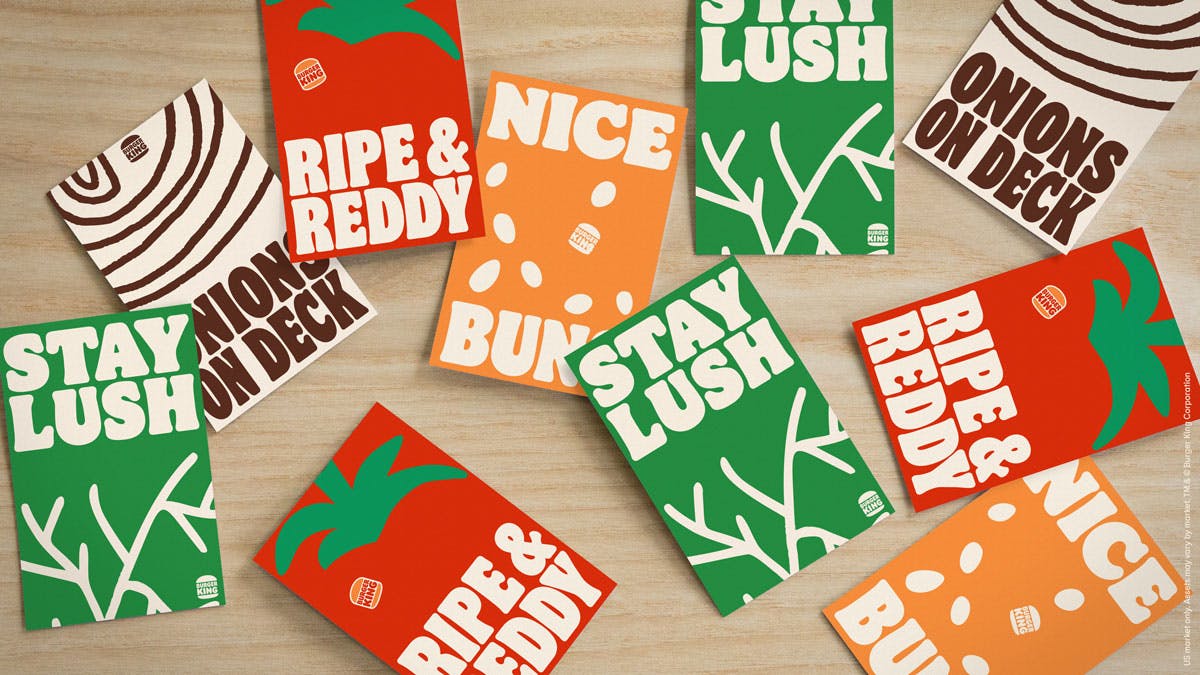

Meanwhile, a more in-your-face photography style using dramatic close-ups to communicate the fast food chain’s recent emphasis on its fresh food credentials, plus a new illustration style, adds a playful touch to the overall look.
Latest from CR


