
Many of the letterforms we use today evolved from pictures of things. Some, like the letter O, for example, retain those traces still — it’s easy to imagine an O as an eye, especially when we add a smaller circle or dot at its center, as it sometimes appeared in Egypt and the Middle East, more than 3,000 years ago. But our experiments with letterforms never ceased. Indeed, it’s through such experimentation that Roman square capitals (and Greek inscriptional capitals) evolved into cursive forms that eventually became minuscule or lowercase letters. If they hadn’t, then Europe would still be writing in all-caps. The story of writing is in large part written by those experiments, in adopting and adapting, in paring down and embellishing.
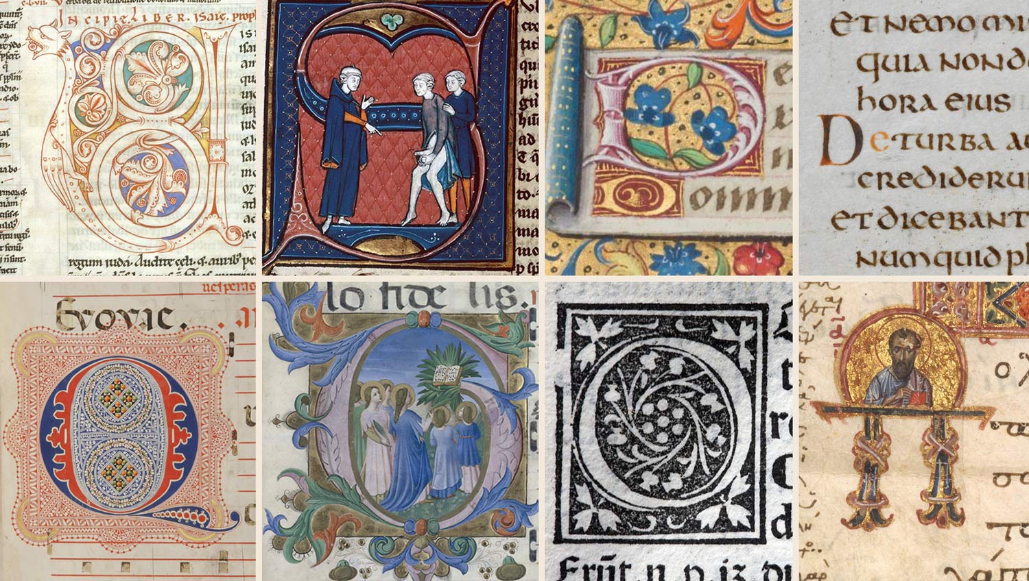
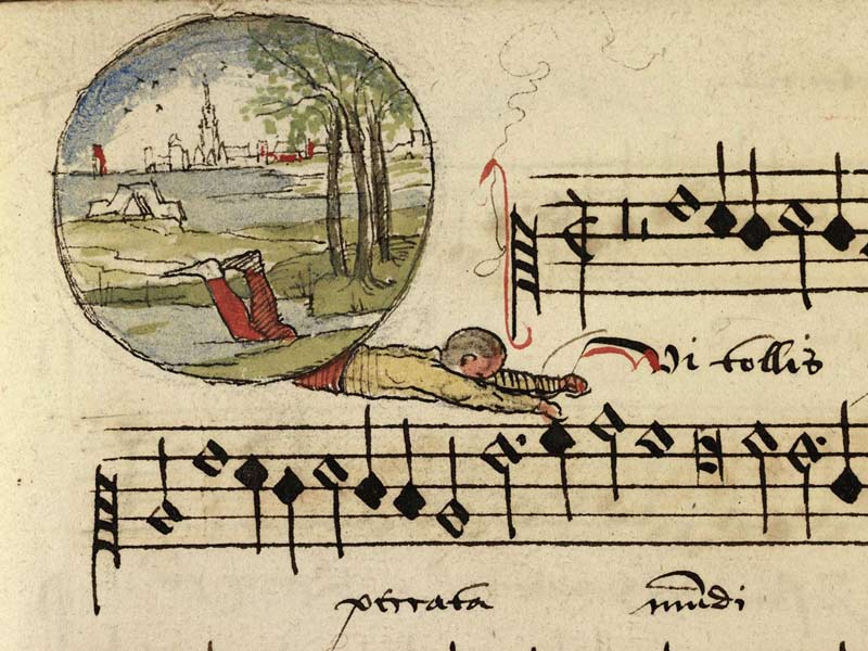
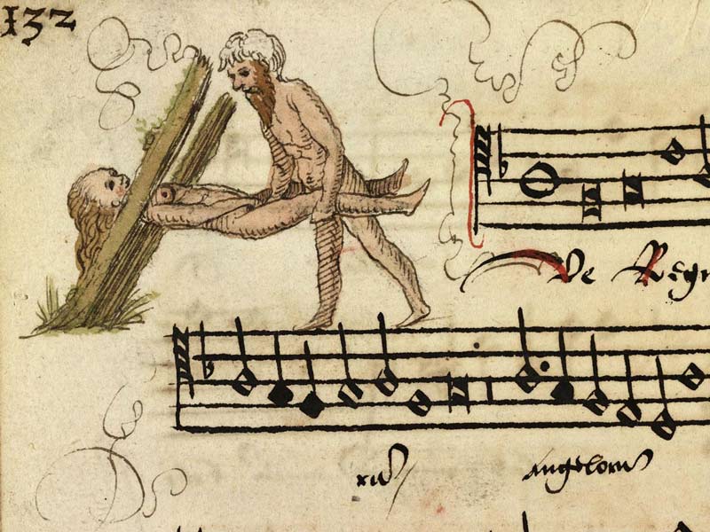
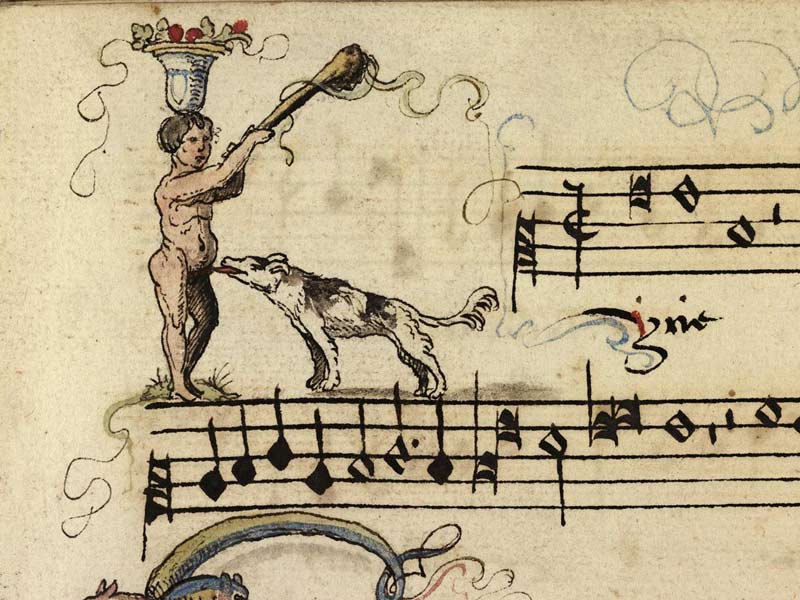
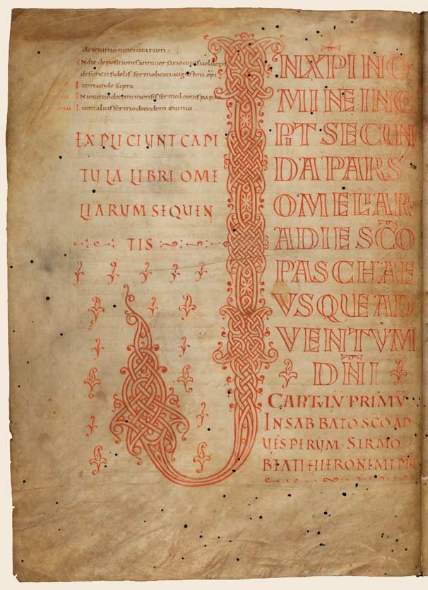
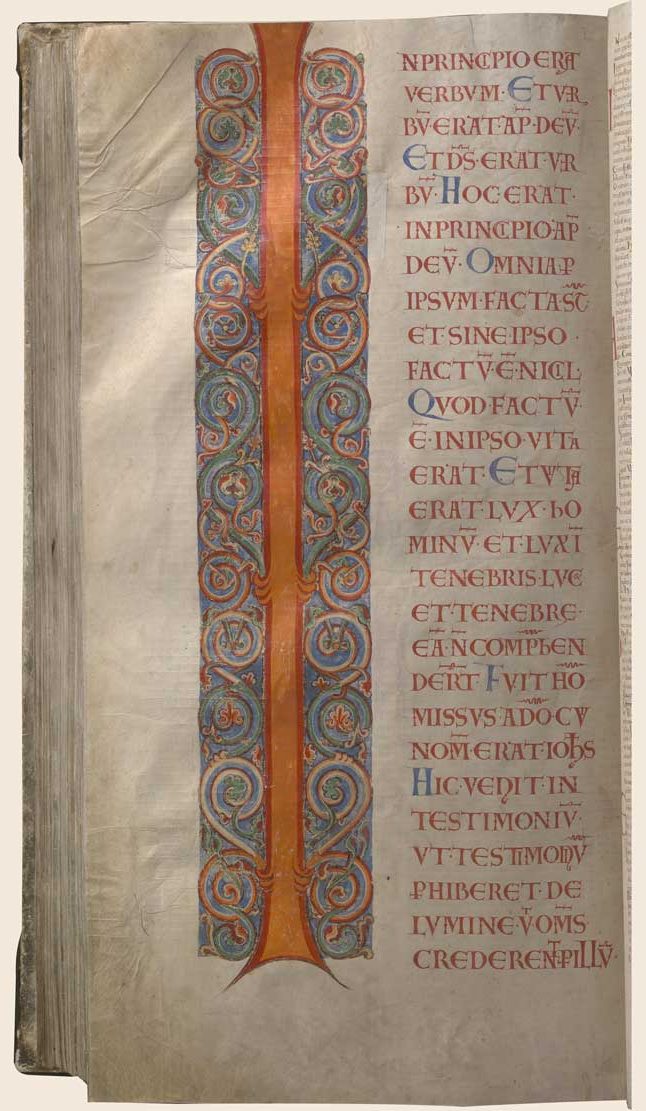
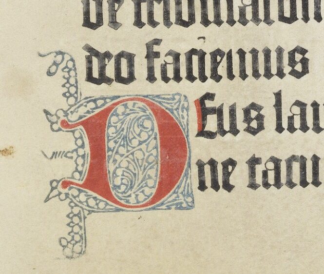
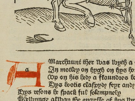
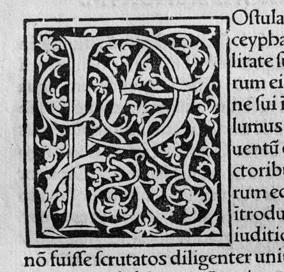
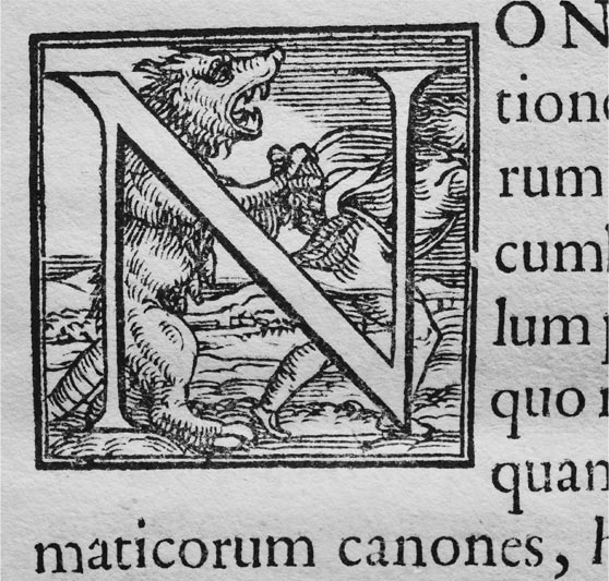
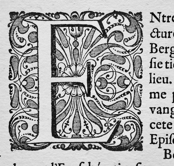
Centuries before the advent of lowercase letters, manuscripts were written in majuscule or capital letters. An obvious way to emphasize the beginning of a book or section was to simply increase the size of the first or initial letter. In time those initial letters were further differentiated by the addition of decoration and even pictures. Sometimes too, our letters went full circle when scribes turned those letters again into pictures of things: thus letters took on the forms of dragons, saints and sinners, flora and fauna. The illuminated or decorated initial was born, and would remain a regular feature of books for more than a thousand years.
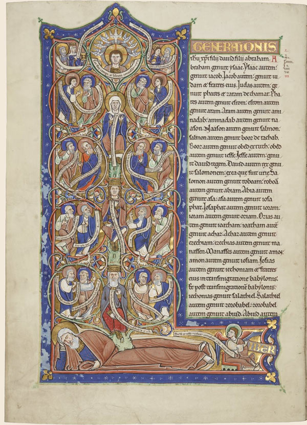
Initials were part of a textual — or paratextual — hierarchy. Later Medieval Bibles are good examples of the gradated or hierarchical nature of initials, with different sizes used to partition texts into major and minor divisions; for example, a Bible verse might begin with a slightly larger size of letter than that used in a regular sentence; a chapter would begin with a larger initial, two or more lines deep, and perhaps in a different style or script; and Bible books, the largest partitions, might begin with a decorated or historiated initial with pictorial motifs borrowed from the text itself. In this way, initials served as a kind of textual wayfinding, guiding readers through texts and aiding them in locating passages, long before page numbers were commonplace.
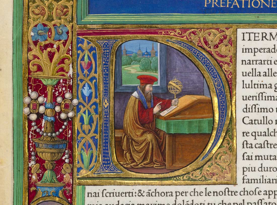
Centuries before people spent their money on luxury brands, they could advertise their status and wealth by commissioning deluxe manuscript books penned by the best scribes in the most beautiful hands. To decorate them, they employed the best contemporary artists to illustrate their texts with miniatures (paintings), and added exquisite borders and initials illuminated with gold leaf. And, if you wished to leave your neighbors in no doubt as to the size of pocket book, then you could splash out on a jewel-encrusted binding.
That so many medieval illuminated manuscripts have survived has distorted public opinion of them — as though such ostentatious and remarkably expensive books were commonplace. They were not. In fact, of the millions of manuscripts produced during the Middle Ages, the majority are rather pedestrian. And before paper was introduced to Europe, manuscripts were written on parchment (prepared animal skins), so even the plainest ones were pretty expensive, even before one began to add miniatures and illuminated initials. However, their beauty and expense ensured their long survival, and medieval illuminated manuscripts are now as much a part of art history as they are of our literary and intellectual heritage.
When did initials first appear in print? They do not appear in Europe’s first substantial typographic book, the so-called Gutenberg Bible (c. 1455). Gutenberg left spaces for initials (and some other elements, like rubrics) to be added in by hand. In fact, he even produced a guide for artists and rubricators, that provided models and methods for decorating this first printed Bible.
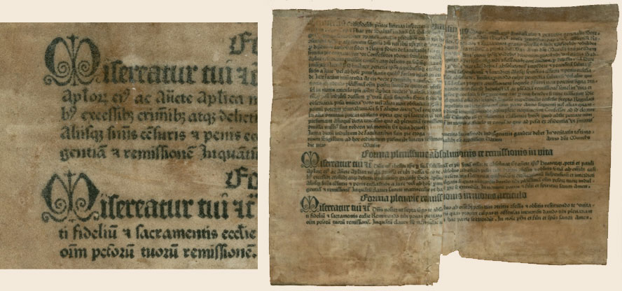
Interestingly, the very first printed initials appear before the Gutenberg Bible, not in a book but in ephemeral single-sheet letters of indulgence commissioned by the Church. In the crudest terms, Christians purchased these letters for forgiveness of sin. And for the church, they were a kind of medieval crowdfunding raising funds for everything from a Crusade in the Middle East to paying for a new church roof. The letter of indulgence was a form with spaces left for the buyer’s name and date of purchase to be inserted by hand. Those printed by Gutenberg include the first known letterpress printed initials.
Printed initials next appear in Europe’s second substantial letterpress printed book, from the printshop of Gutenberg’s former associates, Johann Fust and Peter Schoeffer. The initials in the so-called Mainz Psalter are rather ingenious in their construction and method of printing. In fact, they are Fust and Schoeffer’s solution to the challenge of printing initials in two colors. Each initial comprises two interlocking pieces, inked separately (à la poupée) in red and blue, then assembled and printed alongside the metal type. Some of the results are beautiful, while others have printed rather poorly. The process too would have been pretty fiddly and time consuming, especially when printing thousands of initials in hundreds of books. I imagine that Fust and Schoeffer were not entirely satisfied with the results, as they very seldom appear thereafter.
Two-part jigsaw initial as used in the Mainz Psalter of 1457 & '59
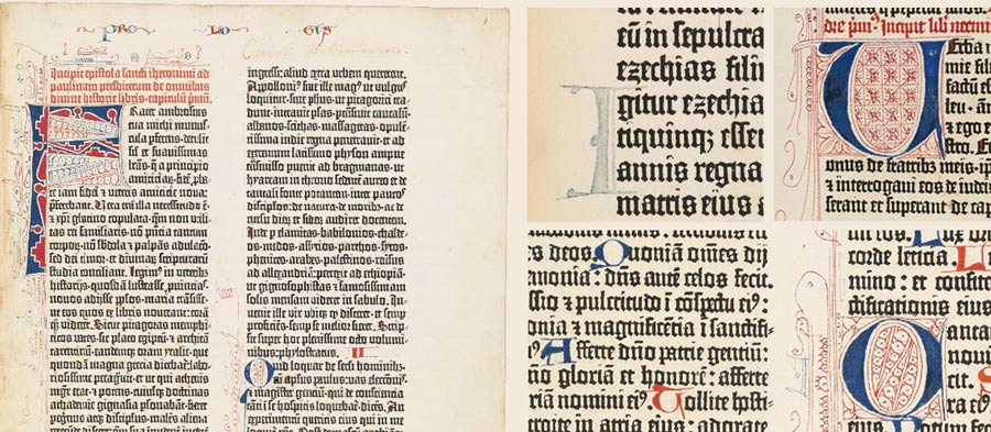
After this short-lived experimental jigsaw initial, almost all initials printed thereafter appear in a single color, and most, at least in the fifteenth century, were printed from woodcuts. However, there was still a market for deluxe printed books. The wealthiest patrons, desiring to differentiate their printed books from the same copies owned by the hoi polloi, employed illuminators and miniaturists to illustrate and decorate them. One of the most magnificent early examples, a copy of Pliny’s Natural History printed in Venice by Nicolaus Jenson in 1476, was illuminated by the Florentine painter, Gherardo di Giovanni di Miniato or his brother. The so-called Douce Pliny is now at the Bodleian Library at the University of Oxford.
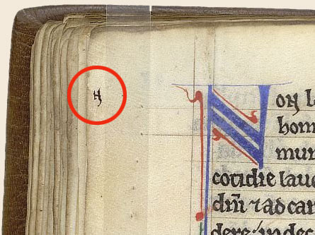
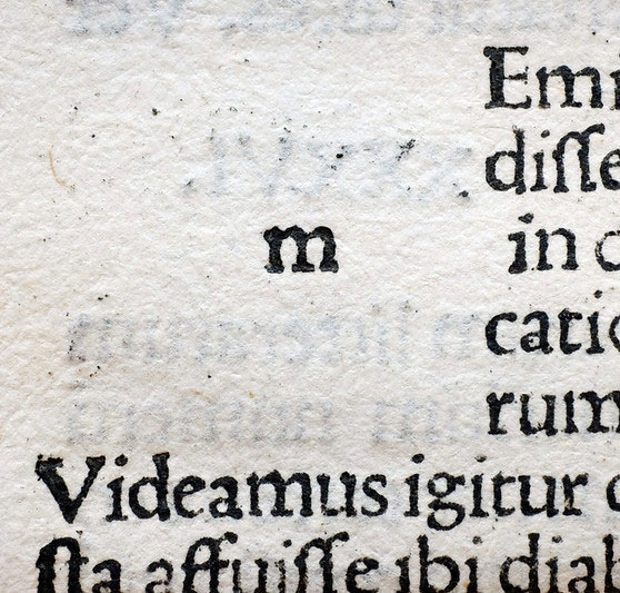
Guide letters were printed in the space reserved for manuscript or hand-stamped initials, so that when the printed pages were completed and passed onto the rubricator or artist, they would not have to guess. Quite a number of incunables (books printed before 1501) have survived without ever having their initials penned or painted in. Those lacunae are a reflection of several related factors: readers’ budgets (the cost of adding in initials by hand could easily exceed the cost of the book itself). And for printers, a full set of initials, in several sizes and styles, was a considerable investment. One can imagine print-shops deciding not to renew their stock when the old ones broke or wore out — and this was happening while readers were slowly acclimatizing to their omission.
Finally, the decline of the decorated initial can be explained simply in terms of fashion, in shifting tastes — all occurring within the space of a couple of generations as books went from being bespoke, scarce and expensive to mass-produced, ubiquitous and inexpensive.
In the early decades of European printing, the very scribes and artists involved in the production of manuscripts were employed in decorating and rubricating thousands of printed books. But as printed books inevitably ousted their handwritten counterparts, so too rubrication and hand-painted initials had all but disappeared by the close of the fifteenth century, and were henceforth replaced by mostly monochrome printed initials.
Contributing to the longer-term decline of initials is the advent of alternative paratextual or typographic hierarchies. Roman fonts, increasingly more popular from the sixteenth century, had been joined by Italic fonts in 1501. This new alphabet, modeled on cursive script, was also joined by a number of useful paratextual elements, like running heads, page numbering, all-caps, small caps, paragraphs, and indexes, titles and subtitles. Later those elements were also joined by fonts in different weights. Not that these elements were newly invented for or peculiar to the printed book — most had appeared in medieval manuscript books at one time or another, but in print they became a codified typographic hierarchy that we continue to use until the present day. ◉
Thanks to:
Craig Eliason for locating & sending me an otherwise inaccessible journal article.
Reference & further reading
J. Boardley, Typographic Firsts: Adventures in Early Printing, 2019
Gérard Genette & Marie Maclean, ‘Introduction to the Paratext’, New Literary History, vol. 22:2, 1991, pp. 261–72
Stan Knight, Historical Scripts, 2009
Elizabeth MacDonald, ‘Lighting the Way: How Illuminated Initials Guided Medieval Readers through Books’, Europeana
Paul Dijstelberge, an expert on early printed initials, has published Flickr sets of some 132,000 images, many of which are photos of early printed initials.
Image credits
Footer image: Detail from initial in Besançon, Bibl. mun., ms. 0457, f. 254v
Header image: Detail from a funeral procession in an historiated initial R, from a 15th-century Florentine Gradual. Source: The Met