University Press Cover Round-Up
We welcome you to another in our ongoing feature in which notable book cover designer Jordan Wannemacher periodically highlights a selection of recent university press cover designs. Please enjoy this celebration of amazing work.
This list is in no particular order. Credits are listed below.
If you are a book cover creative and want your work or the work of your department reviewed by Jordan be sure to get in touch with us!
As with any cover design we feature in our publications, we encourage you to head to your local library and/or bookstore to view the work in its full splendor when possible.
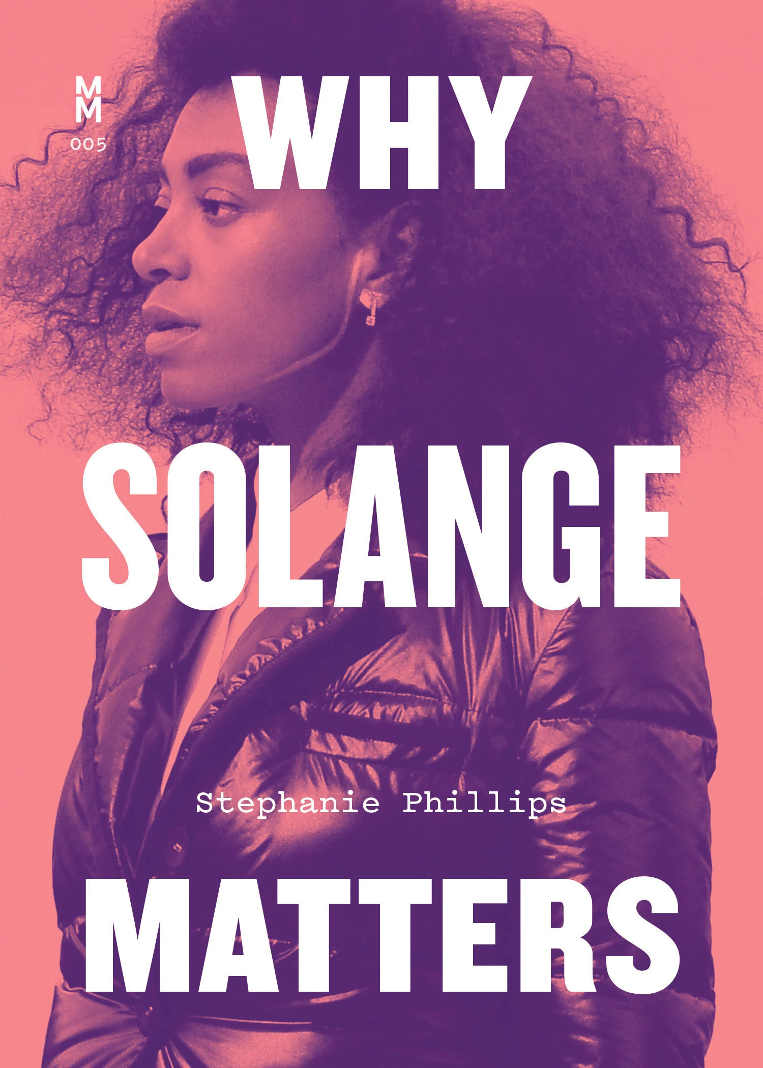
Princeton University Press
Designer: Amanda Weiss
Art Director: Maria Lindenfeldar
Personally, when designing covers, I always get uneasy when a client wants to use sculpture on a cover. The 3-dimensional object oftentimes just doesn't translate on the 2-dimensional book cover. However, this is totally an exception. Amanda's configuration with the lovely blue border paired with the flat soft colors really makes this pop on a book where the 3D object really is the best image option.
McGill Queens' University Press
Designer: Jeremy John Parker
Art Director: Elena Goranescu
I LOVE how fun this cover is! The halftone textures on the photos, the mosquito illustrations, the expressive hand lettering, the mustard tonal colors.Such an unexpected combination of elements but Jeremy pulls this off beautifully.
SCAD University Press
Designer/Illustrator: Michael Mullan
I am so thrilled to be able to feature one of the first titles from a *new* University Press, the imprint at the Savannah College of Art and Design. As a SCAD Alumni, I'm so excited to see the titles SCAD publishes showcasing all of their amazing exhibitions and expansive network of talent. The cover of this new volume that includes advice for high school students looking to discover who they are and what they were born to do is illustrated by fellow SCAD alumni Michael Mullan, showcasing the quality of the talent pool SCAD has to pull from for this imprint. The colors and embossed texture really showcase the joyful and hopeful messages on the inside. I'm also a sucker for illustration as type!
University of South Carolina Press
Designer/Art Director: Patricia Callahan
As a native South Carolinian, this is another one that is close to my heart. Growing up I watched first-hand the debates and social harm done by confederate monuments throughout the state. The issue has never been more relevant than in the last few years with the horrific murders at Emanuel AME and amid the George Floyd protests last Summer. This cover perfectly illustrates both the weight and delicacy of the issue, with the vertical title mirroring the Confederate soldier's monument in Richmond on the cover. The torn paper gives it a nice dimensional feel as well.
University of Texas Press
Designer: Amanda Weiss
Art Director: Derek George & Dustin Kilgore
Part of a series design, this cover is an absolute STUNNER! The soft duotone look paired with the bold type reminds me of old Rolling Stone spreads which is perfect for a Music Matters series. I also love the typewriter style font for the author's name, that style of typeface can feel kitschy but is perfectly executed here.
Harvard University Press
Designer: Henry Sene Yee
Art Director: Tim Jones
Pulling off a b&w cover is a very difficult thing to do, but leave it to Henry to knock this out of the park. It's so subtle yet so dynamic. I love how he handled the extensive typography in such a small space without making the cover feel crowded or leaving our eye confused on where to go. Just lovely.
University of Wisconsin Press
Designer: Jeremy John Parker
Art Director: Jennifer Conn
This collaged cover is SO fun, and quirky, and dark, and makes me so interested to read this novel. The reading line graffiti on the dumpster is such a unique typeface contrast to the grotesque style sans serif (crowded and textured together) makes a great pairing. I don't know what else to say other than the fact that I just love this cover. It's a funny coincidence that the two fun and quirky covers I picked were unbeknownst to me by the same designer!
University of Toronto Press
Designer: Kathleen Lynch/Black Kat Design
This is such a gorgeous abstract representation of a vast and delicate topic. The convergence of these beautifully painted circles in gorgeous cool tones gives this such a feeling of unity and balance. It's restrained in the best way and creates a container for the elegant typography.
Jordan Wannemacher is a book designer based in the NYC area. She was born and art school educated in the Southeast at the Savannah College of Art and Design where she focused on graphic design and creative writing. Currently, she is running Studio Jordan Wannemacher, a boutique book design studio based out of her home in Montclair, New Jersey.