Arek Dvornechuck has compiled a post showing famous logo sketches, and napkin doodle sketches, for various famous brands and companies.
There are plenty of blog posts that show one or some of these famous logo sketches, but this is a post puts the logo sketch up along-side the final logo design.
During some digging around for this I also came across some other blog posts that have other famous logo designs with their accompanying logo sketches, so have included these as well.
Some of the bonus logo sketches include: Firefox, Univision, Hartford Whalers, Starbucks, CN, ITV and Atari.
As a little extra: I’ve used this post as an opportunity to write a little bit about logo design sketching in general, so read on / jump past the Famous Logo Design Sketches below to find out more!
I Love New York Logo Sketch Designed by Milton Glaser
Milton Glaser drew the iconic I Love New York campaign logo way back in 1976 on an envelope, in the back of a taxi, with a red crayon.
What you might not know is that Milton requested no payment for his I Love NY logo design.
It’s also why I never leave home without my red crayon.
→ Watch: Big Think Interview with Milton Glaser
Citibank Logo Sketches Designed by Paula Scher
Before the Pentragram team could get to work they met with Citibank leadership to discuss their challenges and what they were hoping to get out of the engagement.
As she listened Paula started to idly doodle on a napkin, and said:
“This is your logo.”
→ Read More: The $1.5m napkin: Paula Scher’s 5 minute logo
Firefox Logo Sketch Designed by Stephen Desroches
Stephen Desroches created the original sketch, and the final design was rendered using Fireworks by Jon Hicks.
Jon Hicks: “The final chosen design was a concept from Daniel Burka and sketched by Stephen Desroches, which I then rendered using Fireworks MX. I’ve been using Fireworks over Illustrator or Photoshop for icon design as I love the way I can work in vectors and see the result in pixels, rather than smooth vectors. The updated gradient tools in MX make this possible too.“
https://hicks.design/journal/branding-firefox
→ Read More: Branding Firefox by Jon Hicks
From the Mozilla Digital Memory Bank
Mozilla Digital Memory Bank (DMB): “The sketch on the left was created by Stephen DesRoches of silverorange on Prince Edward Island in Canada. The concept was created by Stephen DesRoches, Daniel Burka, and myself along with input from a team of artists from around the world.
In December of 2003, Stephen, Daniel, and I were throwing around ideas for the logo and drew a silly little sketch of the basic shape on a white board at our office.
Stephen DesRoches then took this concept and drew the pencil-sketch shown here. We scanned this sketch and posted it to the other artists working with us.
Only three hours later, Jon Hicks, and illustrator and designer from the United Kingdom responded with his rendering of the concept drawn in Macromedia Fireworks.
This concept was then refined over a matter of months into what became the final Firefox icon and logo.”
http://mozillamemory.org/
CN Logo Napkin Doodle Designed by Allan Fleming
After experimenting with countless possibilities, Fleming hit on a particularly inspired design while sitting on a New York-bound airplane.
He quickly sketched the idea on a cocktail napkin – and CN’s logo was conceived.
While conceptualizing the future, Fleming drew on the past for the kind of image that would convey timelessness. Studying the Christian cross and the Egyptian symbol for life, he borrowed the idea of using a line of single thickness. “The single thickness stoke is what makes the symbol live,” Fleming later said. “Anything else would lack the immediacy and vigor.”
The continuous flowing line symbolized “the movement of people, materials, and messages from one point to another,” Fleming said. As the eye moves from “C” to “N”, the image suggests fluidity and motion. “It’s a route line that incidentally spells CN,” Fleming explained.
But let’s leave the last word to designer Allan Fleming, who unfortunately would not live to see his own prophecy borne out. He died in 1977, just 17 years after observing:
“I think this symbol will last for 50 years at least.
It don’t think it will need any revision, simply because it is designed with the future in mind.
Its very simplicity guarantees its durability.”
Allan Fleming
→ Read More: CN Logo Designed by Allan Fleming
Univision Logo Sketch Designed by Chermayeff & Geismar & Haviv
“The [Univision] mark is derived from the initial letter U in the company name and is broken up into four colorful panes.
The top left pane, which is identical to the lower forms but flipped on its side, gives the mark its unique character.
While overall the form is clearly a U, the flipped pane also makes it into a colorful abstract bird or flower.”
Chermayeff Geismar Haviv 60 Years
→ Read more: 60 years of Chermayeff & Geismar & Haviv
Virgin Logo Napkin Doodle Designed by a ‘young designer’
Mr Branson: “It looked like a signature. It had attitude. It had energy. It was in-your-face simplistic.”
→ Read More: The Virgin Logo and the Napkin Doodle
Mobil Logo Designed by Chermayeff & Geismar
Chermayeff & Geismar decided upon a clean break from the previous Mobil logos and created a radically simplified design.
The idea of the red ‘o’ came about partly to reinforce a design concept to use circular canopies, pumps and displays elements which Mobil was installing at its fuel stations at the time.
It was also used to help people pronounce the name correctly (Mo-bil, not Mo-bile).
→ Read More: Mobil by www.cghnyc.com
WWF Logo by Gerald Watterson & Sir Peter Scott
British environmentalist and artist Gerald Watterson played a key role in the original panda logo by producing the initial sketches.
The inspiration for our logo came from Chi-Chi: a giant panda that arrived at London Zoo in 1961 – the same year that WWF was created.
Aware of the need for a recognisable symbol that would overcome all language barriers, WWF’s founders agreed that the big, furry bear with her distinctive black and white coat would make a great logo.
The first sketches were done by the British environmentalist and artist, Gerald Watterson.
Based on these, Sir Peter Scott, one of our founders, drew the first logo. He said at the time that “we wanted an animal that is beautiful, endangered, and loved by many people in the world for its appealing qualities. We also wanted an animal that had an impact in black and white to save money on printing costs.”
→ Read More: What is the story behind WWF’s panda logo?
Nike Logo Designed by Carolyn Davidson
The Nike Swoosh was designed by graphic designer Carolyn Davidson in 1971.
Her invoice total for this important piece of design history? $35.
→ Read More: The $35 Nike Logo and the Woman Who Designed It
itv Logo Sketches Designed by Rudd Studio
Matt Rudd of Rudd Studio, explains on LogoDesignLove:
I wanted the ITV logo to get off the fence and stand for something. Alongside the informative BBC and the provocative Channel 4, ITV is friendly and warm. It brings about shared emotional experiences.
I felt that the logo should be based on handwriting, and that the letters might be lower case and joined up.
https://www.logodesignlove.com/itv-logo
→ Read More: ITV logo creation, by Rudd Studio
Exxon Logo Sketches Designed by Raymond Loewy
In Raymond Loewy’s 1966 Exxon Mobile logo process sketch, he visually emphasized the concept of the double “x’s” and created 18 variations of it.
He chose one, marking it it with an “OK.”
→ Read More: Full logo history on the ExxonMobile website.
Chase Logo Designed by Tom Gesimar
Tom Gesimar, in his interview:
“The hard task the designer faces is trying to help the client see how the logo might eventually be perceived, how it will work for them, not just whether they ‘like it’.
He then goes onto explain how this worked with the Chase logo presentation, or didn’t work:
“We learned this lesson early on when we first presented the Chase symbol to the chief executives of the bank. The man who was then Chairman said he would go along the decision of the others, but personally he hated it and did not want to see it on his letterhead his business card, or anywhere in his office.
Six months later we ran into him at the bank. He was wearing a pin with the symbol in his lapel, and a tie-tack with the symbol holding a tie that was itself a pattern of the symbol. To him, the mark was no longer just an abstract design, it had become the representation of his organization.”
→ An interview with Tom Geismar smith.gl/302jaej
→ Read More: An interview with Tom Geismar
Atari Logo Designed by George Opperman
The Atari logo was designed by George Opperman in 1972, after the huge success of the game Pong.
George Opperman: ”the two side pieces of the Atari symbol represents two opposing video game players, with the center line of the ‘Pong’ court in the middle.”
https://en.wikipedia.org/wiki/George_Opperman
→ Read More: The Atari Logo: Behind the Fuji
Starbucks Logo Designed by Terry Heckler
A 15th century woodcut of a Norse two-tailed mermaid was the original inspiration for Starbucks’ logo.
The logo sketches and ink drawings of the newly updated Starbucks logo, by designer Terry Heckler, shows how the mermaid has evolved over the years.
→ Read More: Brand Stories
Hartford Whalers Logo Design Sketches by Peter Good
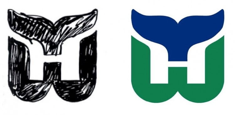
There’s a more detailed article, including a video of an interview with Peter Good about the logo process, and the development of the Hartford Whalers logo, over at: icethetics.co
Here’s a part of the interview where Peter talks about the inclusion of the initial H, which was not originally part of the design brief:
DENNIS HOUSE: And so you started sketching?
PETER GOOD: This is where all design projects start. Those are the original designs that I presented not as a design solution but as a way of thinking about the identity.
Curiously, when I did these, Howard Baldwin actually said, “I like the lower right one.” Shown here. With the trident. The trident was a reference to the harpoons.
I said, “Why do you like that one?” He said, “The ‘H’ is there.” So I said, “Wait a minute, that was a not a requirement. It was just an idea that I had. But now that I know that it limits the field. So let me have another three or four days to play with it, to go back and rethink this given the idea it should have the ‘H’ integrated.“
→ Read More: How the Timeless Hartford Whalers Logo Came to be
My Thoughts On Logo Design Sketching and Napkin Doodles
The subject of logo sketching always pops up from time-to-time, and it usually revolves around designers not feeling confident that their ‘sketching’ game is up-to-speed.
If you ever worry about how your sketches look to your clients: maybe you’re worried your it isn’t neat enough, or you only had some tatty used paper to whip-up that eureka moment, or you just have a bewildering selection of rough pencil doodles mixed-up together and it just looks messy…
There is absolutely no wrong way to do sketches.
As you can see from the 8 examples above, from: Milton Glaser, Tom Geismar, Paula Scher, Raymond Loewy, Chermayeff & Geismar each one looks pretty rough, with Mobil and Chase being the exception to the rule.
Try not to over think how you sketch.
The most important thing is capturing the logo design idea so you don’t forget it!
On what you sketch it, and with what you sketch it, is entirely irrelevant.
If you’re still a little worried about showing your logo sketches to your clients, then you can simply pre empty it by explaining your logo design process to your client (or having a handy FAQ page). You can then better prepare your client for the presentation of rough logo design sketches, or napkin doodles.
I make sure that I tell my new clients that any sketches I show them are exactly that; rough sketches, and are to show the proposed idea before spending time in Illustrator.
My own sketches are notoriously rough looking, and the one for Pure Storage is a prime example of this:
The Napkin Doodle
I will often drop in the phrase “napkin doodle”, as this gives a better sense of what a client can expect.
Napkin Doodle conveys the more rushed and unprepared nature of suddenly coming up with an idea when you are eating, or somewhere other than your studio, and finding the closest thing to draw the sketch on.
The Virgin logo is famous for the napkin doodle sketch, and is a great example to show your clients if you’re worried about being unfairly judged on the quality of your logo sketches.
Some of my past clients don’t seem to believe me when I say napkin doodles can often lead to the final chosen logo design.
In Virgin’s case, it was a young designer who came to meet Mr Virgin on his houseboat, and whilst talking about about the logo, scribbled what you see on the napkin.
And that was it, it was love at first sight!
Mr Branson: “It looked like a signature. It had attitude. It had energy. It was in-your-face simplistic.”
This original Virgin logo sketch became the official brand mark of Virgin in 1979, and has since disrupted everything from air-travel, to banking, health clubs and hotels.
Do I HAVE to Sketch my Logo Ideas?
No. There is no right or wrong way to explore the idea phase of a logo design project.
I have plenty of projects in my logo portfolio that didn’t see a pencil and sketch book used at all!
In many cases I go straight to Illustrator and mess around with shapes, objects, fonts to stumble across that winning idea.
Admittedly, sketching does provide a freer and more organic experience from which to start the process of logo design idea exploration.
Sketching and doodling can lead to ideas and directions that might not have occurred if you went straight to vector.
There’s also something quite liberating about just sketching and doodling until something promising starts to show itself.
It also depends on the type of logo you are designing, as to what method might yield the best results.
It would make sense that if you are opting for a word focused logo design; that exploration of font styles in Illustrator is a far more practical solution, than drawing each letter time after time after time.
So long as you try to let go of any sketching inhibitions you might have: quality of sketches, number and quality of ideas sketched, presentation of sketches, etc then you might find sketching more of a joy, and less of a drag.
After all, you don’t have to show the client your sketches if you don’t want to.
Many logo designers consider their logo design sketches ‘intellectual property’, and thus really quite precious, and rightly so.
There can be many other ideas for other future jobs amongst those rough ideas, so no point sharing and showing how the magic is done unnecessarily.
Keep the majority of sketches to yourself, and just present the ones you feel are worthwhile.
Plenty of times I’ve just photographed/corner of a portion of my sketch book page, and shown that to the client, rather than the whole page.
To Sum Up on Logo Sketching
Milton Glaser famously sketched the I Love NY logo idea in a taxi cab; Paula Scher sketched the Citibank idea in 5 minutes also on a napkin doodle; Raymond Loewy came up with seventy-six rough pencil sketches; the Virgin logo idea was quickly sketched on a paper napkin during the discovery phase, on a house boat!
If famous designers, or even unfamous designers who created famous logos, can use a napkin doodle and show that to their client, then you certainly can as well.
As I mentioned above; just try not to overthink the sketching process.
The creation and capturing of the idea is the most important thing!