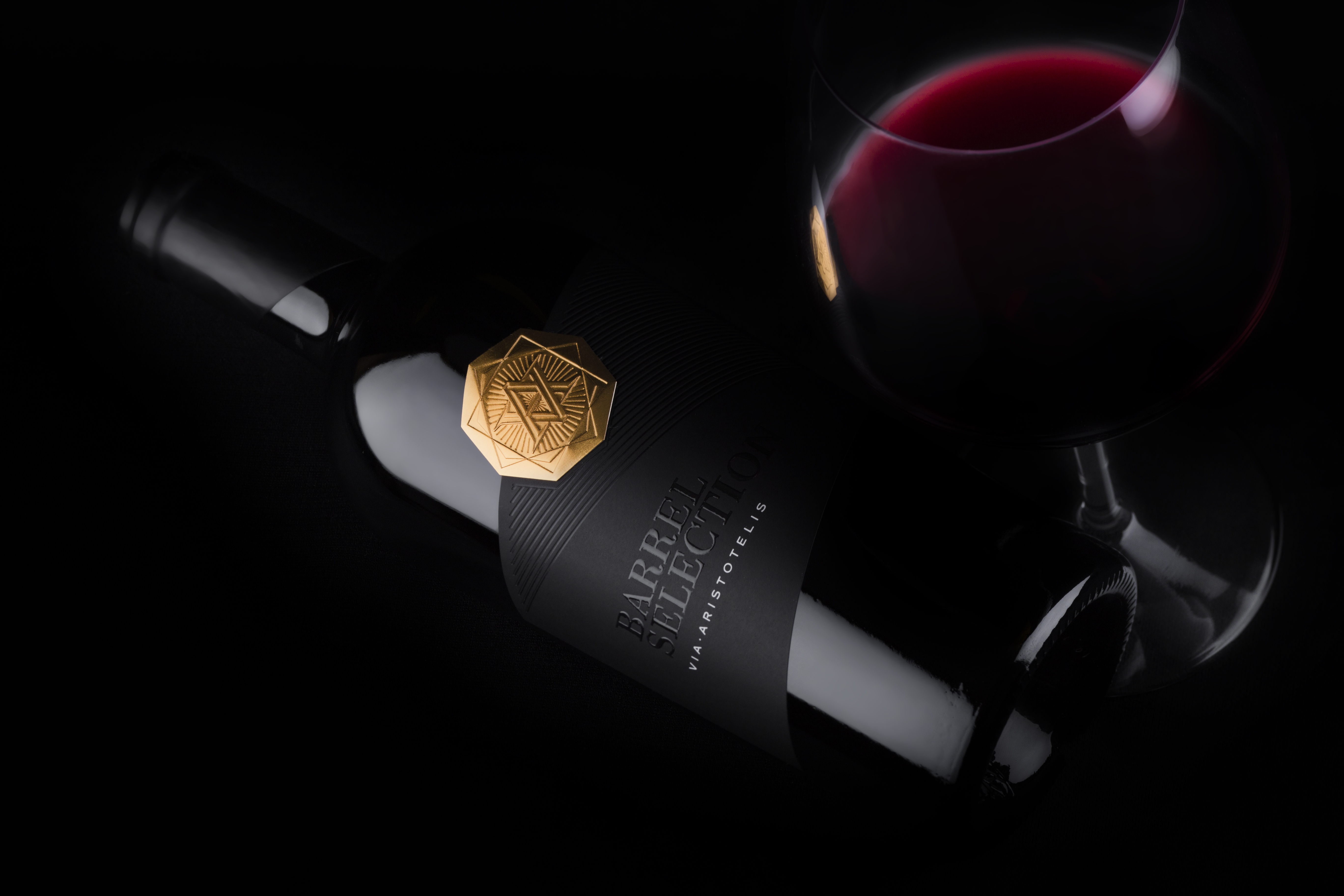
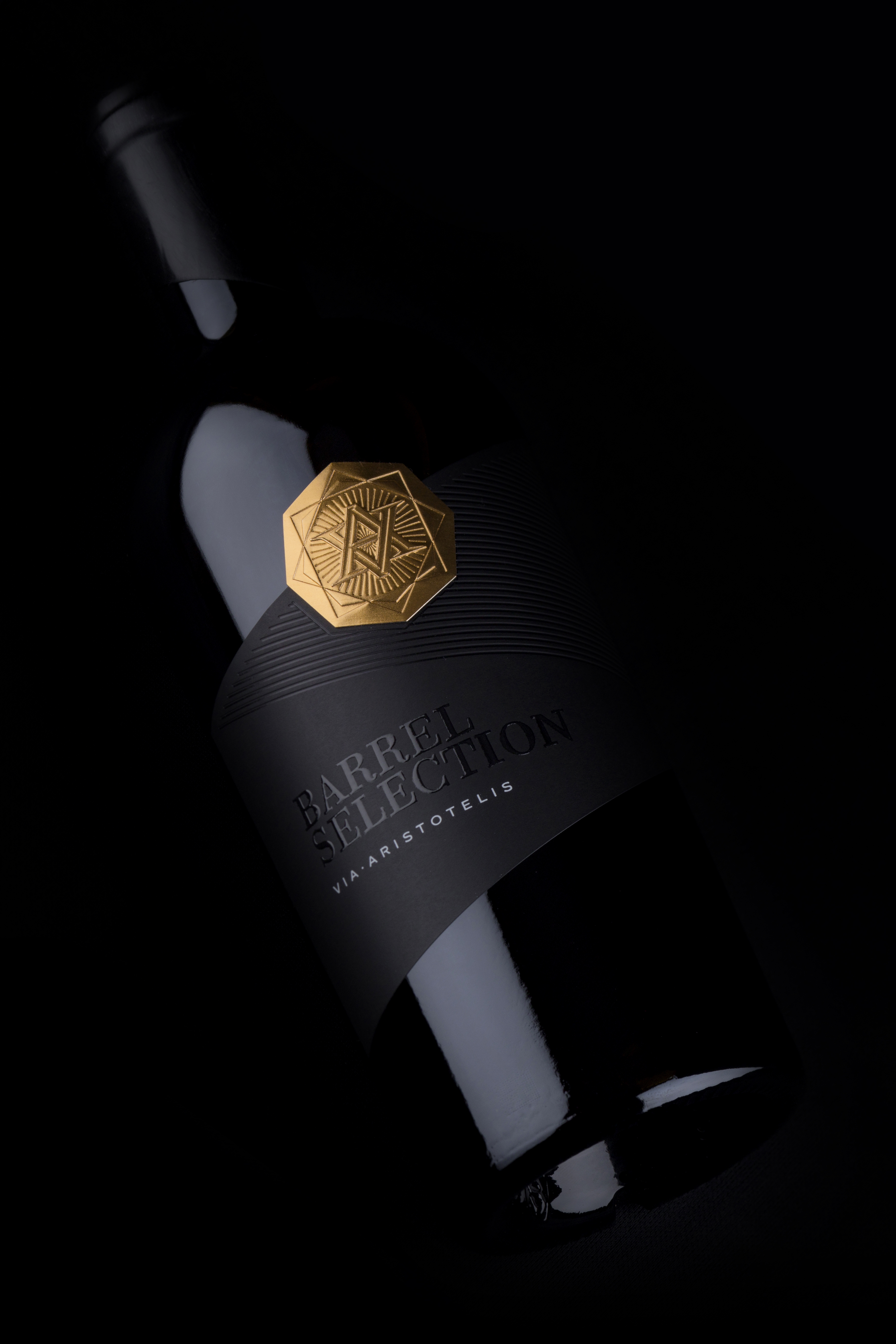
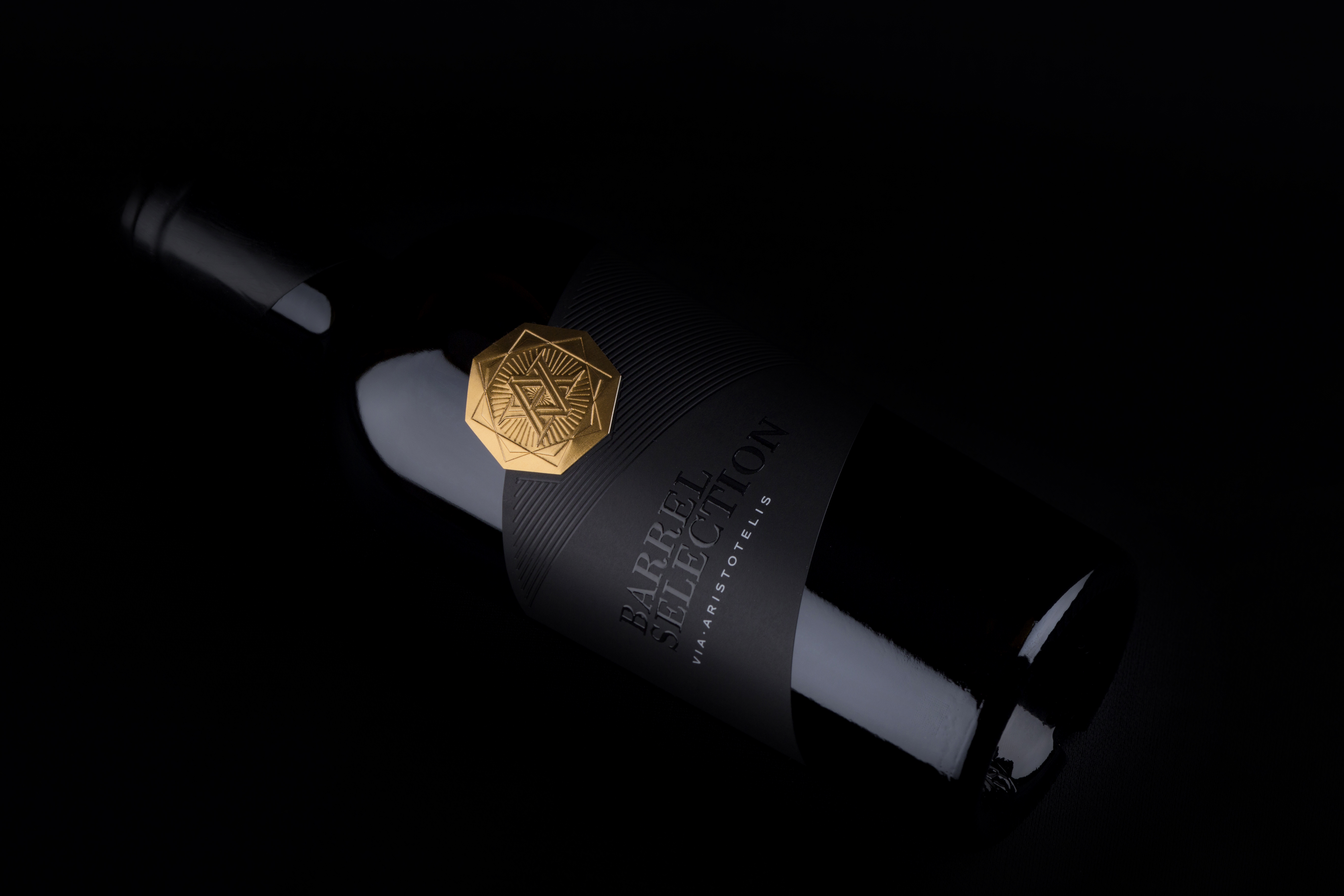
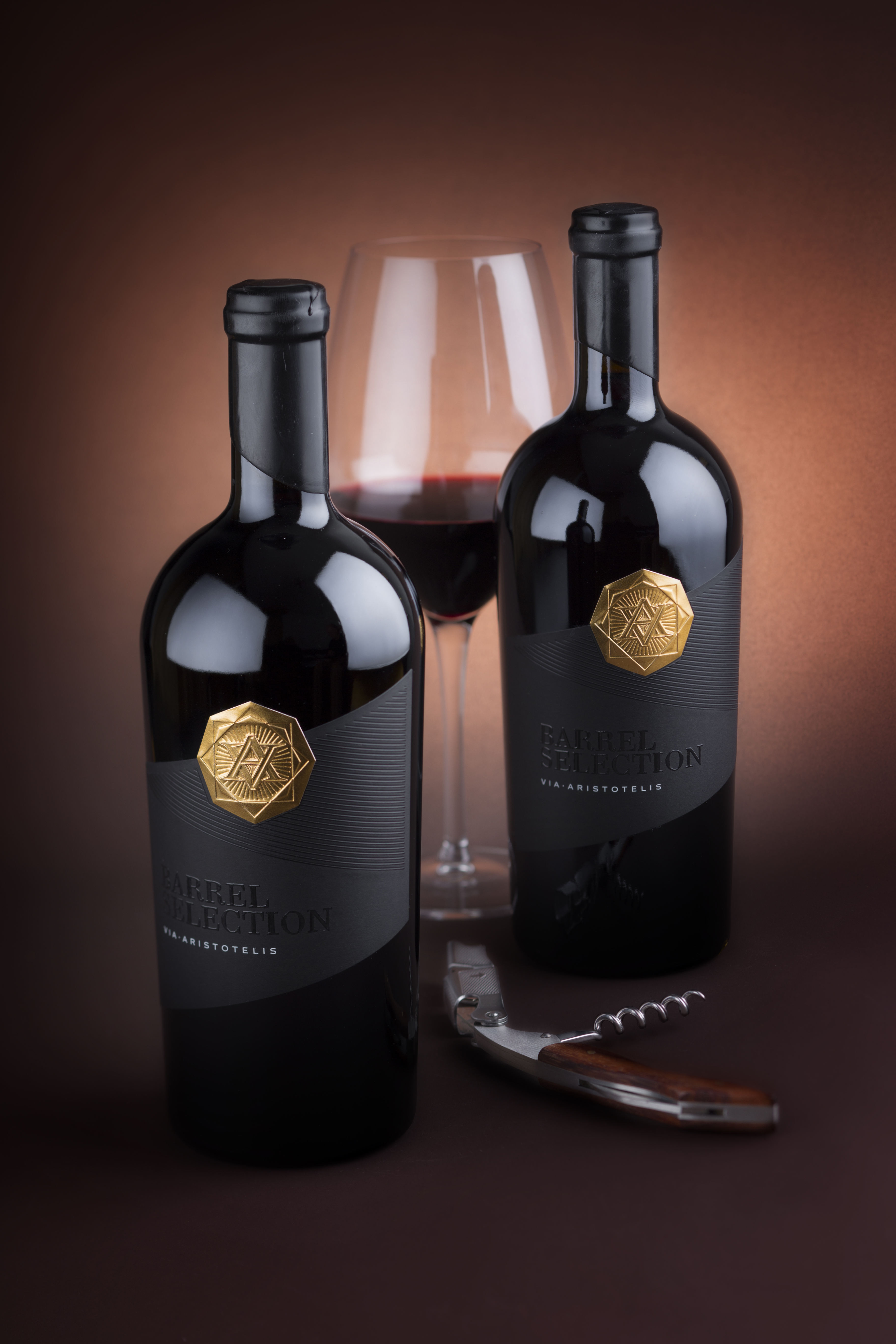
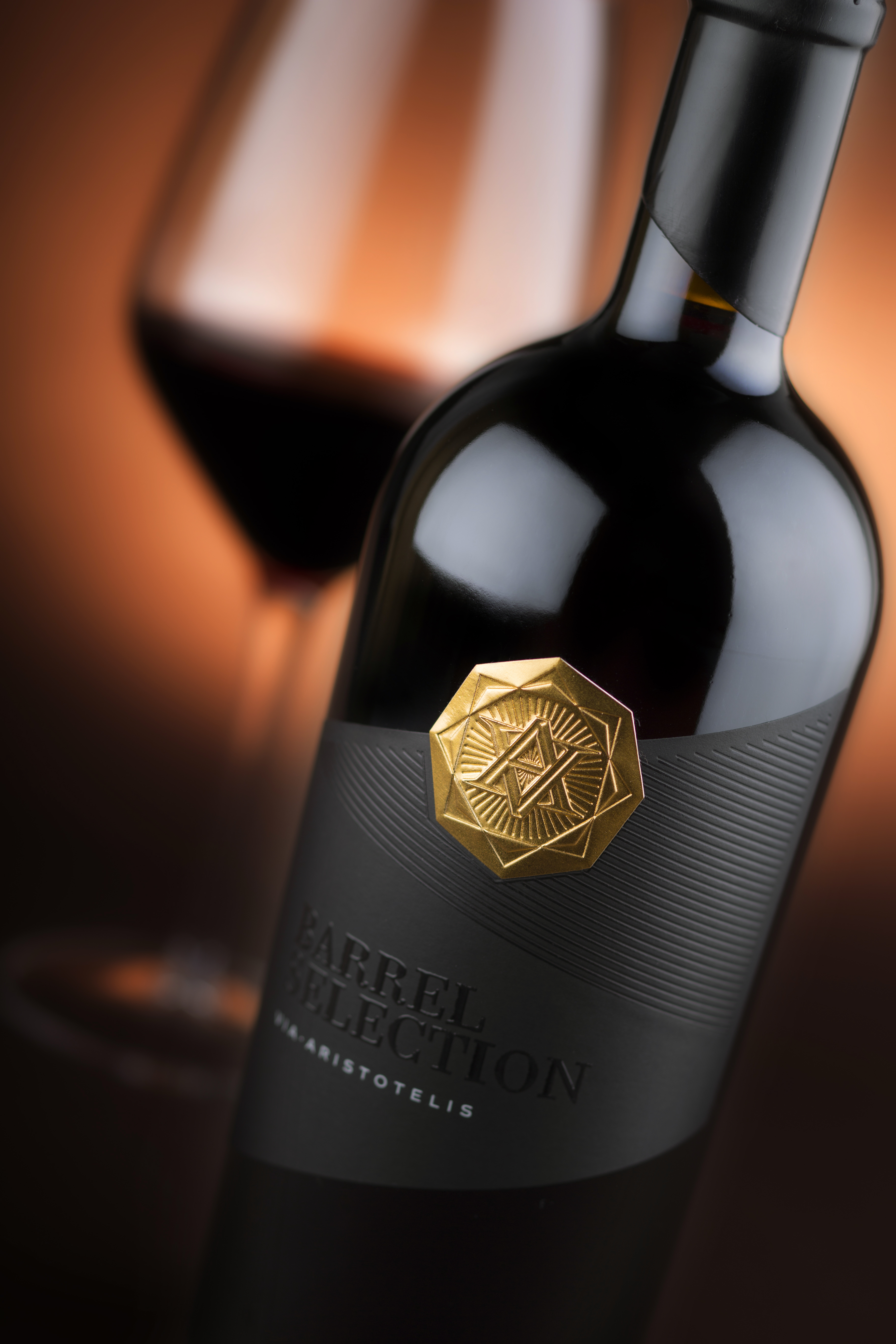
You ever see a wine bottle label so textured and fun you just want to rub your hand all over it? Usually, we don’t either. In the case of Via Aristotelis Barrel Selection, we’re all fingers and palms. The debossing and embossing elements, combined with the luxurious gold foil, make for a luxe design that you’d be proud to bring to a fancy dinner party, or the first time you meet the parents.
The waxed-sealed top is fit for a king or queen, which is exactly how you’ll feel while sipping on this gorgeous bottle.
Via Aristotelis Barrel Selection is the newest and most precious gem in Orbelia’s growing portfolio.
Intended as top, premium-brand it consists of only two selected barrels. Limited batch, attention-to-every-detail, outstanding wines – this is the philosophy behind these new wines. It is not simply an upgrade of the existing Via Aristotelis brand but a professional attempt to create a wine that will turn every sip in small treasure.
This project was a real challenge. First, because it was designed for very ambitious premium wine and second, because projects like this throw you in competition with yourself. Most of the wines of Orbelia were designed by me and step-by-step we lift the level making more and more prestigious brands. With Via Aristotelis Barrel Selection we set the highest level for this producer. For now…
For the sealing, wee used black semi-matt sealing wax. Every bottle is manually dipped in melted wax like they did in the old days.
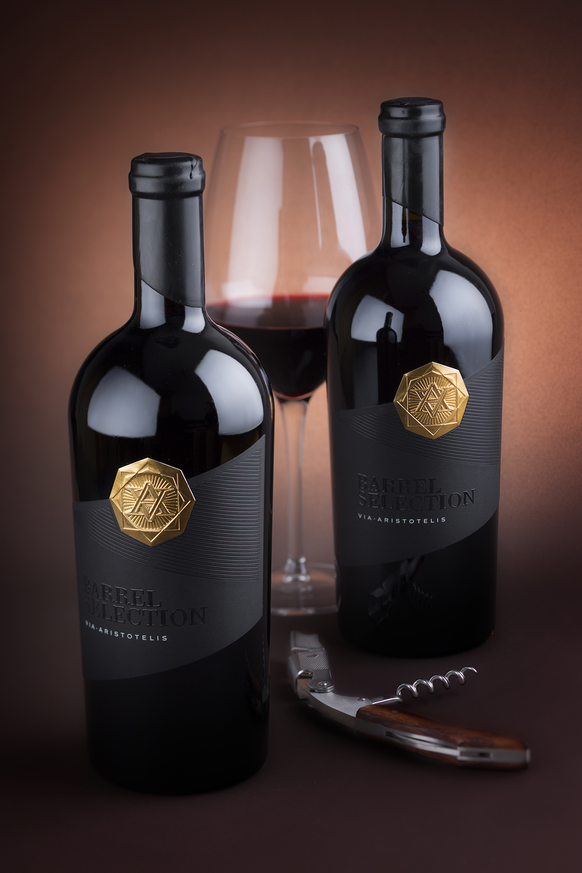
We picked the Bordeaux version of the Incredible Antik bottle by Saverglass. The Orbelia premium brand used the Burgundy version of same Antik bottle so this time it was quite logical to use its tapered brother. This bottle has strong presence and unique, attractive look that somehow complemented elegantly the feeling we were aiming to have in this wine packaging design.
For the paper, I picked one of my favorite papers by Arconvert, the Ispira Nero Mistero. Produced in natural black semi-matt color this paper corresponds visually with sealing wax and blends elegantly with the deep glossy black of the glass bottle.
For the printing, I love to play with different aspects of the black color, and this time I used high-build transparent varnish to print the Barrel Select title against the black paper background. Via Aristotelis text is stamped with white hotfoil. The linear pattern in top half of the label is printed with black glossy ink and then debossed which made it look like carved grooves. Together with the diagonal shape of the label this pattern is taken from the original Via Aristotelis label to indicate visually the origins of this new wine packaging design.

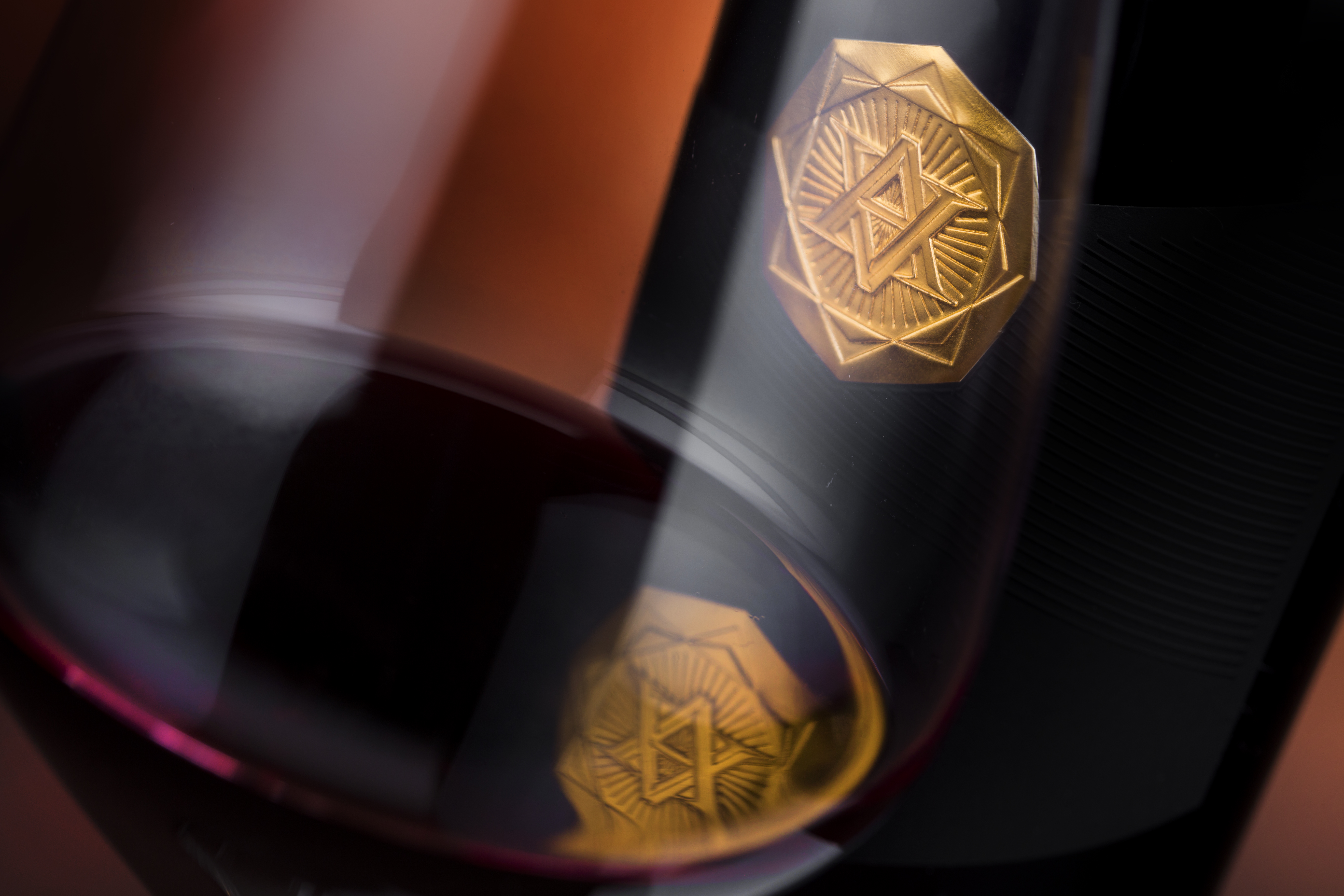
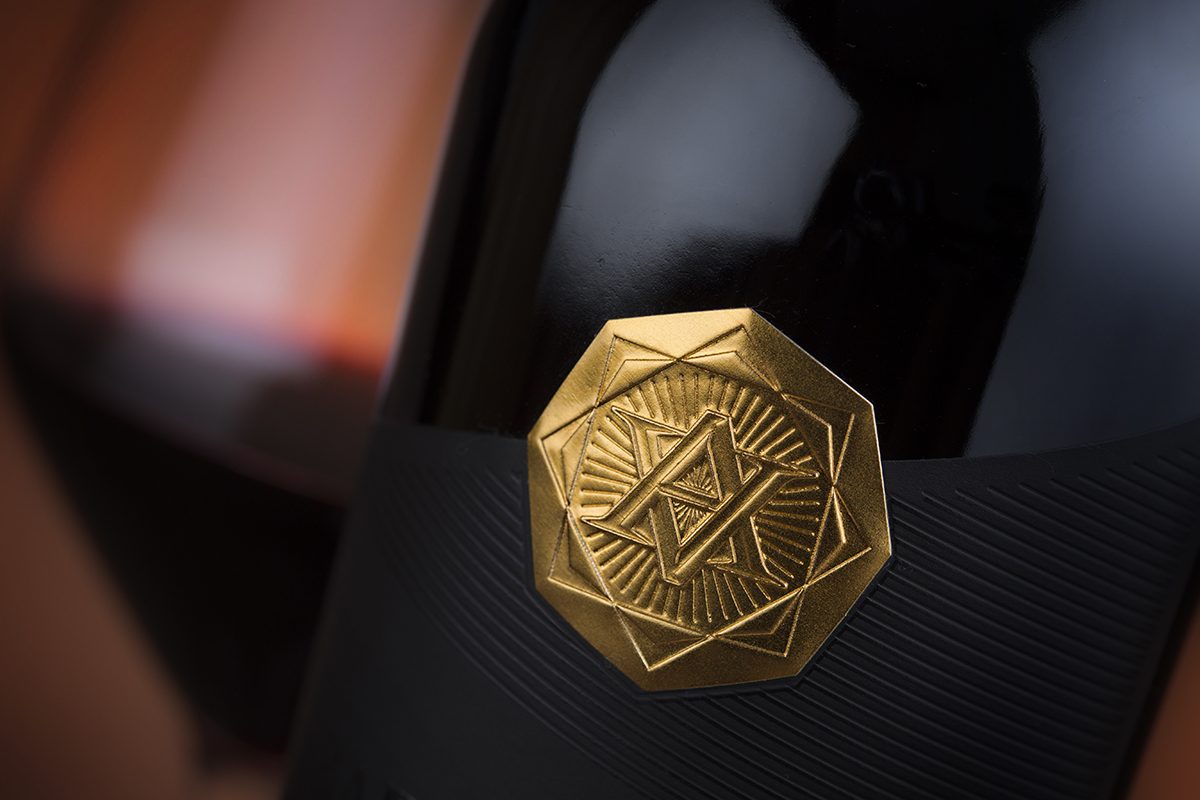
At the top of the label is reserved special place for a gold octagonal seal with embossed VA monogram on it. In fact, we used embossing and debossing on this metal seal to achieve maximum possible 3D effect.
The result is a stunning package enhanced by an eye-catching label that combines paper and metal in one unique image that gives the consumer the opportunity to discover more and more new details with every pour.