
Tokyo 2020: designing the Olympics
With the delayed Olympics finally set to begin this week, we take a look at the design elements of a Games like no other.
The Tokyo 2020 Olympics finally begins this week. While the Games were rescheduled for this summer, COVID still looms large at this year’s ceremony. Live spectators will not be able to attend events while pandemic protocols have affected some of the ceremonial events. Amid these concerns and a state of emergency, Olympic organisers are pushing forwards with programming to build excitement – and design is a crucial aspect to that, from opening ceremonies to torch relay kits.
Opening ceremony

While details of the opening ceremony are typically kept secret, Tokyo 2020 has confirmed some key elements for this year’s celebration. Crucially, there will be no spectators for the events and unlike previous ceremonies, the cauldron will be located away from the stadium (instead placed at Tokyo’s waterfront city). Despite those restrictions, organisers says that viewers can still expect “fireworks, flagbearers and fanfare”.
The event has been led by executive producer Takayuki Hioki, who has worked with actor Mansai Nomura to convey the concept of United by Emotion. That theme is an attempt to show how “sport is universal” following a year like no other, according to organisers. They add: “It is an invaluable treasure that Tokyo 2020 believes has the power to unite the world through emotion, even if we are apart, speak different languages, or come from different cultures.” The overarching theme for both opening and closing ceremonies at the Olympic and Paralympic Games is Moving Forwards.
Japan National Stadium

The opening and closing ceremonies will take place at the Japan National Stadium, designed by architect Kengo Kuma. It was completed in November 2019 and is built on the site of the old National Olympic Stadium (which was constructed for the Tokyo 1964 Olympics). The stadium has had a controversial design process. The original design for the stadium – by Zaha Hadid Architects – was scrapped because of mounting costs and its perceived environmental inefficiency.
Athletics and football will take place at Kuma’s stadium while venues across the country will host other sports. Another new construction, Tokyo’s Ariake Arena, will host volleyball and wheelchair basketball while Tsurigasaki Beach (to the east of Tokyo) will witness the Olympic debut of surfing.
Logo
The Tokyo 2020 Olympics logos were designed by Asao Tokolo, an architect graduate from the Tokyo Zokei University. The chequered designs had several references to Japanese culture, according to the Tokyo 2020 Emblems Selection Committee. The traditional indigo is a reference to the “refined elegance and sophistication that exemplifies Japan” while the pattern is inspired by ‘inchimatsu moyo’ patterns from the Edo period (1603-1867). The three varieties of rectangles more widely represent “different countries, cultures and ways of thinking”, the committee says, while also promoting “diversity as a platform to connect the world”.
The journey to choosing a logo was not simple for Tokyo 2020. The initial logos, designed by Kenjiro Sano, were scrapped following claims that it was plagiarised. Belgian designer Olivier Debie claimed that the identity shared similarities to his 2011 design for the Théâtre de Liège. Though Debie eventually withdrew his lawsuit because of financial costs, the Tokyo organising committee had already move on from Sano’s logo.
Pictograms

Pictograms were first introduced at the Olympics at the Tokyo 1964 Games as a way to communicate visually across language barriers and have been updated for every subsequent Games. This year’s pictograms were designed by Masaaki Hiromura and fall into Free and Frame Type versions. Free Type unframed pictograms will be used on posters, tickets and licensed products while the framed versions will be used on maps, signage, guidebooks and websites. “I have tried to express the dynamic beauty of the athletes through these pictograms, while respecting the legacy bequathed by the pioneers of the Japanese design industry in their designs for the Tokyo 1964 Games,” Hiromura says.
Mascots

Two mascots have been revealed for Tokyo 2020. Miraitowa represents the Olympics while Someity stands in for the Paralympics. These were designed by Ryo Taniguchi and chosen from a public competition voted on by the Mascot Selection Panel and Japanese elementary schoolchildren. Indigo blue Miraitowa takes its name from the Japanese words ‘mirai’ (future) and ‘towa’ (eternity). Described as “cheerful and remarkably athletic” by the selection panel, the character can teleport wherever it wants. Someity takes its name from somei yoshino, a type of cherry blossom. According to the committee, pink-hued Someity “loves being in nature and can communicate with natural elements, such as stones and wind”.
Torch and cauldron
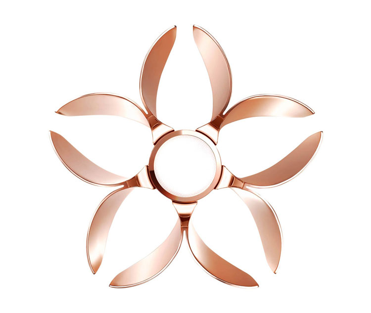
The Olympic torch was conceived by Tokujin Yoshioka, a multidisciplinary designer who is known for his work with light and nature. The torch has been inspired by Japan’s cherry blossoms with a pattern that resembles petals. It’s been fashioned from aluminium, incorporating the same manufacturing technology that’s used in the production of the country’s high-speed bullet train. In a bid for sustainability, 30% of the torch is made from recycled aluminium – metal that was taken from the prefabricated housing set up in the aftermath of the 2011 Great East Japan Earthquake.

Yoshioka’s cauldron continues the torch’s cherry blossom theme and uses the same recycled metal. It weighs around 200kg. Yoshioka also designed the torch relay lantern, which is used to transform the flame lit in Greece to the host country. This year, following governmental requests for the torch not to pass through public roads, an alternative lighting ceremony will take place. Torchbearers will pass the flame on at designated ‘torch kiss’ points in the coming days, at Tokyo-based parks.
Broadcast
The Olympics is a major television event – the 2016 Rio Olympics drew in 3.6 billion viewers worldwide. As such, networks design significant campaigns around them. London-based Nexus Studios collaborated with BBC Creative on Tokyo Olympics Trail, an immersive journey through Tokyo which is littered with Olympics-themed Easter eggs (visual clues). The video was directed by Factory Fifteen.
The teams worked with Japanese artist and designer Fantasista Utamaro on the television spot, mixing animation and illustration to bring a world of arcade games, a sports fanatic’s bedroom and a J-Pop (Japanese pop) music video to life. Look out for the shop signs and logos that use pictograms originally designed for the Tokyo 1964 Olympics as well as a music video inspired by US gymnast Simone Biles. It’s set to original music from anime composer Kenji Kawai.
Uniforms
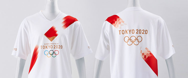
Kits have been designed by a range of sports brands, though there’s an overall focus on sustainability. The torchbearers will wear uniforms made from recycled Coca-Cola bottles. The kit has been designed by Daisuke Obana and feature a chequered pattern reminiscent of the logo.
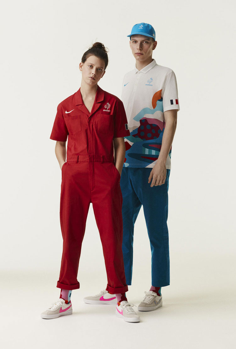
The debut of six sports – surfing, skateboarding, sport climbing, baseball, softball and karate – at Tokyo has also presented opportunities for uniform designers. Nike’s skateboarding kits for the US, Japan, France and Brazil play on the respective countries’ landscapes – a reference to the relationship between the environment and the act of skating, according to Nike’s design team.
Ben Sherman has designed the kit for Team GB’s opening and closing ceremonies. With visuals inspired by what athletes wore during the Tokyo 1964 Olympics, the new kits use organic cotton and bamboo viscose. Adidas has created the sports kits for Team GB, which features an abstract version of the Union Jack.


Brilliany circular design combines 12 points of the clock/compass and the Edo rectilinear shapes/rectangles. May I use it as a roseboard?