
Design Week’s most popular news stories of 2020
Custom typefaces and flat logos, furlough and anything to help keep kids entertained – these were the news stories you read the most this year.
Dyson creates engineering challenges for kids in lockdown

With schools shut for a large portion of 2020, parents in their droves were seeking home schooling resources that were engaging, creative and free. Just a few weeks after Boris Johnson announced the UK’s first lockdown, Dyson came up with the goods.
With the help of its design team, the James Dyson Foundation devised 44 Challenge Cards designed to keep kids entertained and help them learn a thing or two while at home. The challenges put forward by Dyson included making a marble run, building a periscope and designing a bridge made of spaghetti.
Beyond the cards, this news story also gave us the chance to speak to Dyson design manager Ben Edmonds, whose daily livestream of STEM activities for kids garnered interest from around the world. Edmonds’ goal was to show that parents and guardians could help foster “skills for life” in their children, with only the contents of a recycling bin for help.
Toyota reveals new logo and visual identity for Europe
One of many car brands that opted to flatten out its marque this year. In July Toyota unveiled its new look for use in Europe. According to the company, the updated identity was an attempt to forge “a more progressive” brand.
International consultancy The&Partnership was behind the work, which included a new logo, colour palette and typeface for use both internally and externally. Consultancy head of design Dan Beckett told us at the time the old branding had begun to feel tired and the new look was a chance to show the world something more “premium” and “forward-facing”.
While it was one of our most widely-read stories of the year, the explanation behind the update wasn’t enough to convince all. One Design Week commenter lamented the chain of events that saw Toyota become the latest in a long line of “flat” rebrands, while another wondered if we’ll be seeing a whole new trend for 3D rebrands in ten years’ time.
The new BrewDog identity – who designed it and how it was done

Seemingly out of the blue in February, craft beer brand BrewDog unveiled its new identity. London-based studio Made Thought was behind the work, which graced the cans of the brewers most popular beers, such as Punk IPA and its Pale Ale.
The previous colour palette for each beer was largely stuck to, but the new designs did feature cleaner graphics and more tonal colour variations. Sticking to this approach reflected BrewDog’s “very simple and straightforward” philosophy when it comes to design, Made Thought co-founder and co-creative director Ben Park told us.
But what was the reason for the work? Parker said BrewDog’s characteristically “anti-establishment” tone was starting to confuse the brand. This “sense of nonchalant rebellion” has been augmented into a tone that instead communicates a “greater sense of meaning”, he said.
BMW updates logo to mark a “new chapter”
The first of the major car brands to go flat in 2020 was BMW. Back in March, it revealed a digitally-friendly 2D version of its familiar roundel, displayed on images of its new Concept i4 vehicle, which is planned for production in 2021. Munich-based studio BECC Agency was behind the rebrand.
BMW’s roundel has gone through several different iterations since 1917, but the 2020 rebrand – the first in 23 years – was perhaps the most significant in the car manufacturer’s history. The black ring found in each previous version has been replaced with a transparent one – something BMW senior vice president of customer and brand Jens Thiemer says is supposed to “radiate more openness and clarity”.
But while the intention was to mark a new chapter, the work didn’t go down as hoped. One of our most commented on stories of the year, the news left readers confused. One commenter questioned the effectiveness of white lettering on a transparent background, while another wondered how easy it would be to implement. Indeed, in a bid to explain the thinking behind the logo change better, BMW vice president of brand Marc Mielau went on to speak with Design Week about prior “misinterpretation”. You can read that here.
Cadbury “reconnects with roots” with first image overhaul in 50 years

Another redesign story which ruffled some feathers in 2020 was the Cadbury Dairy Milk range. Bulletproof led the project, which sought to put a “distinctive and modern twist” on the brand’s heritage.
The new look included iconography, typography and packaging design. It was a balancing act, according to Bulletproof global creative director Nik Rees, who said the studio needed to balance visual innovation while staying true to consumer perception. To tread the tightrope effectively, the team went into the Cadbury archives to resurface historical packaging.
It was however the redrawn wordmark that divided people. Some appreciated the subtle update and its juxtaposition next to the bolder, all-caps typeface used on-pack. But others took issue with it, and Bulletproof did catch some heat when (untrue) stories hit the press of a supposed £1 million price tag for the design work. Rees went on to talk with us about how designers can steel themselves against undue criticism in a careers advice piece a few weeks later. You can read it here.
Freelancers finally given government coronavirus support – but it comes with a catch

Furlough has marked almost everyone’s experience of 2020, with Design Week statistics suggesting half of the UK’s design workforce has been furloughed at one point this year. But for freelancers and the self-employed, it’s been an even more complicated journey. It was not until a week after the unveiling of the furlough scheme back in March that the Treasury announced a similar support package for them. And it didn’t come without catches – most notably, the fact freelancers were going to have to wait until June to get financial support. The decision drew criticism from design industry leaders.
Creative Industries Federation CEO Caroline Norbury perhaps best summed up public sentiment, saying: “Self-employed workers have outgoing and business expenses due immediately – they cannot wait three months to be paid.”
And that wasn’t all – unlike the furloughs scheme for employees, the scheme also left out support for limited company contractors, recent graduates and the newly self-employed.
Tripadvisor reveals new logo ahead of year-long identity refresh

In January Mother Design shared its work with travel guidance company Tripadvisor. The new look included a simplified logo and “subtle” name change.
The company’s mascot, Ollie the Owl, got a makeover in a bid to “reduce complexity” and “amplify character”, according to the studio. Ollie used to appear with two different coloured eyes, but now exists in a black-only rendering. Despite the change, his personality remained intact, Mother Design told us.
Alongside the logo work, the studio also devised a series of icons relating to the platform’s various functions and a bespoke typeface, Trip Sans, was provided by Colophon Foundry. Most subtle of all, the company moved from the moniker TripAdvisor, to Tripadvisor. Supposedly the name change was undertaken to reflect the fact users recognise the name and pronounce it “as a single word”.
Durex’s “sex positive” rebrand introduces One Night Sans typeface

Tripadvisor wasn’t the only company to get its own typeface in 2020 – British condom manufacturer Durex also adopted its own signature one in February. Named One Night Sans and designed by Colophon Foundry again, it was part of a wider rebrand for the company which aimed to take aim at “sexual taboos, stigmas and outdated, non-inclusive attitudes”.
The project was led by ad agency Havas London and beyond the typeface included a redrawn logo, updated communications and a new brand strategy. Known as the “Lozenge”, the logo was pared back, with Havas head of design Lorenzo Fruzza telling us the minimal change was to keep the look familiar.
Ultimately, Fruzza said the rebrand was designed for versatility – the new logo and typeface accompany a new photographic imagery strategy and “intelligent” colour palette. The overall effect, Fruzza hoped at the time, was to cut through the “crowded landscape of love”.
Pentagram’s Yuri Suzuki has designed a machine that lets you cut your own vinyl

Our most-read product story of the year was the work of Pentagram partner Yuri Suzuki, who back in March unveiled a new product in collaboration with Japanese publishing and toy company Gakken. The device, aptly named the Easy Record Maker, allows users to cut their own vinyl records.
Suzuki spoke to Design Week, saying he wanted a way to make it “easy and cheap” for people to create their own records, without having to press a whole batch. It works by using the player’s stylus to directly engrave the record, which can then be played back immediately. It was, he told us, the realisation of a long-held desire – he called it his “teenage dream machine”.
Surprisingly or not, 2020 appeared to be a year for all things vinyl. As Design Week wrote about in November, lockdown caused a surge in innovative record design, while other vinyl-based projects came from the likes of Baxter & Bailey, Whistlejacket and Pentagram.
Museum of London seeks designers for £175,000 visual identity
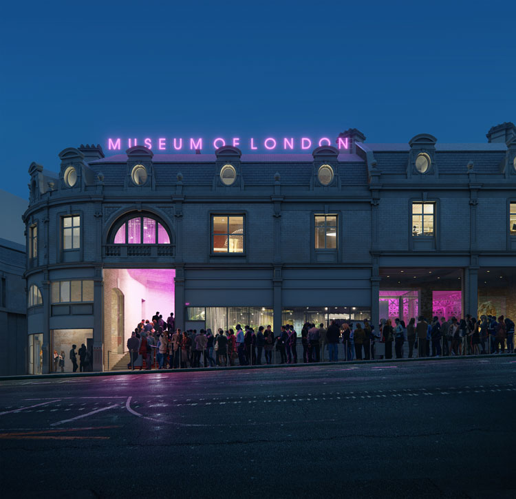
It was a dry year for a lot of designers, but a handful of big-ticket projects did provide work for some. Among them was the August tender announcement for the Museum of London’s new visual identity. The museum is set to move from its current site to a new one inside Smithfield Market in 2024, and wanted a new identity to accompany the relocation.
The total estimated value of the project was £175,000 – £125,000 for the work and £50,000 for the rollout. The identity needed to be “all-encompassing”, according to the museum, while also “enriching the understanding and appreciation of London and Londoners”. It also needed to reflect the changing aims of the museum itself, which will have a restaurant and performance space in its new home.
Beyond the identity, it was a big year for preparations for the new Museum of London site – in June, bosses launched another tender for exhibition design for a £2 million project.


‘Flat Rebrands’ – I tend to agree that discussion about this is pretty pointless as in most cases the average viewer will probably not see the difference. It’s there purely for digital requirements.