Aaron Munday on Designing The Last Human

Aaron Munday is a graphic designer and illustrator based in the South East of England. He started freelancing as 12 Orchards in 2012 and works in all areas of graphic design and illustration. Here he talks us through his process for designing The Last Human.
Fans of Brian Eno will have heard of his ‘Oblique Strategies’ – a set of cards he created with artist Peter Schmidt, with tips to help creatives come up with ideas. Two tips I really like are: ‘take away the elements in order of apparent non-importance’ and ‘use an unacceptable colour’. Other good ones are ‘use an old idea’, ‘honour thy error as a hidden intention’ and ‘look closely at the most embarrassing details and amplify’. I often refer to these when working on a design.
This YA story is about Sarya, the lone survivor of the human race; a species deemed too dangerous to exist. When the project was first given to me by Hodder and Stoughton, the working title was The Life Interstellar; a title that evokes a hive of alien activity with lots of whizzy spacey doodads. Think Guardians of the Galaxy. The brief also suggested showing the central character amongst it all, looking too-cool-for-school.
I love working on YA and sci-fi covers, and this book has lots of wonderful visual imagery – alien creatures, spaceships, a giant spider who is the human character’s adopted mother – I wanted to include all of this and more on the cover, but I lack the illustration skills of, say, a comic book artist, who would have found such a task less daunting. I also struggled with the word ‘Interstellar’ as it’s so long. Fortunately for me, the book was put on hold for a few months, and when it came back it had been renamed The Last Human.


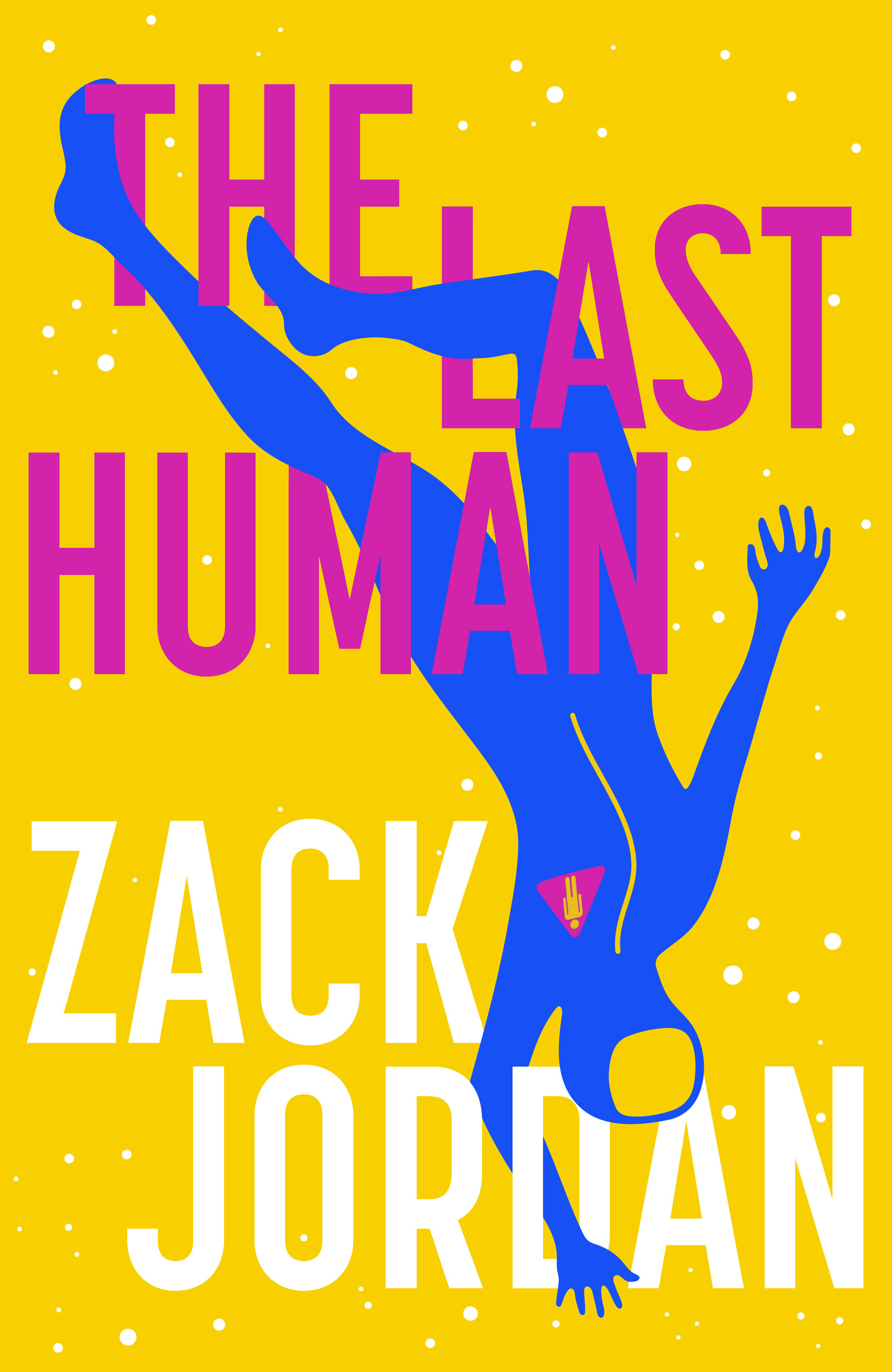
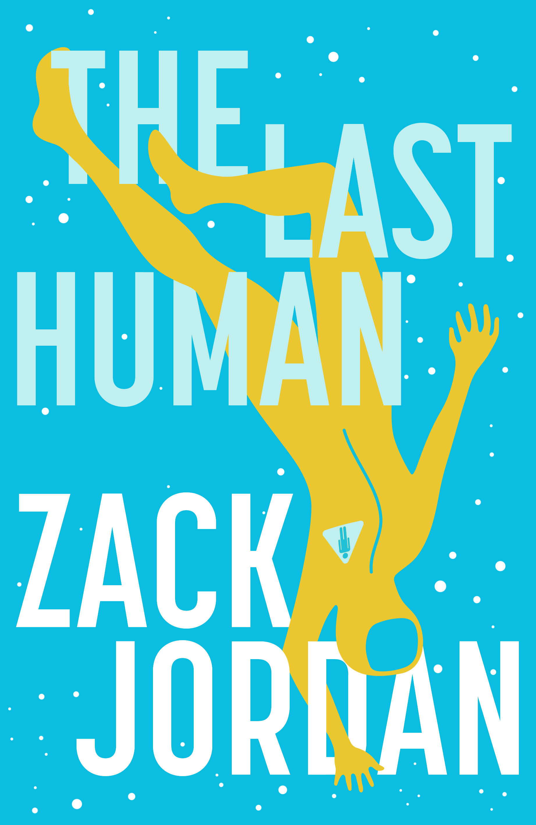
The Last Human is a title that seems to have an entirely different energy to The Life Interstellar – it’s more intimate, and somehow the roughs I’d done previously were no longer a good match. I remembered the oblique strategy ‘take away the elements in order of apparent non-importance’ – the whizzy spacey stuff was cool, but really the most important thing was the character. In a previous visual I had her blowing a bubblegum bubble inside her space helmet, but in the end even her face seemed non-important. Besides, she’s trying to keep a low profile in the story so it seemed appropriate to keep it hidden on the cover.
I wanted to see her floating alone in space, but not in a sad, lonely way – and certainly not ‘upright’. In films, I’ve always found it odd when objects are shown in space (like a fleet spaceships against another fleet of spaceships)… They’re always orientated the same way, on the same parallel plain of reference, as if there was some sort of standardised up or down that every species in the universe knows about, regardless of where they’ve each hyperdrived in from. It’s kinda sassy too, floating upside down, so even with her face and all the space doodads removed, her pose still needed to look too-cool-for-school. I looked at some Spiderman comics for inspiration.


For some final extra sass, I referred to my other favourite oblique strategy ‘use an unacceptable colour’. Once I was happy with the main composition, I let rip on colour options, the more garish the better (at one point there was even talk of using holographic foil).
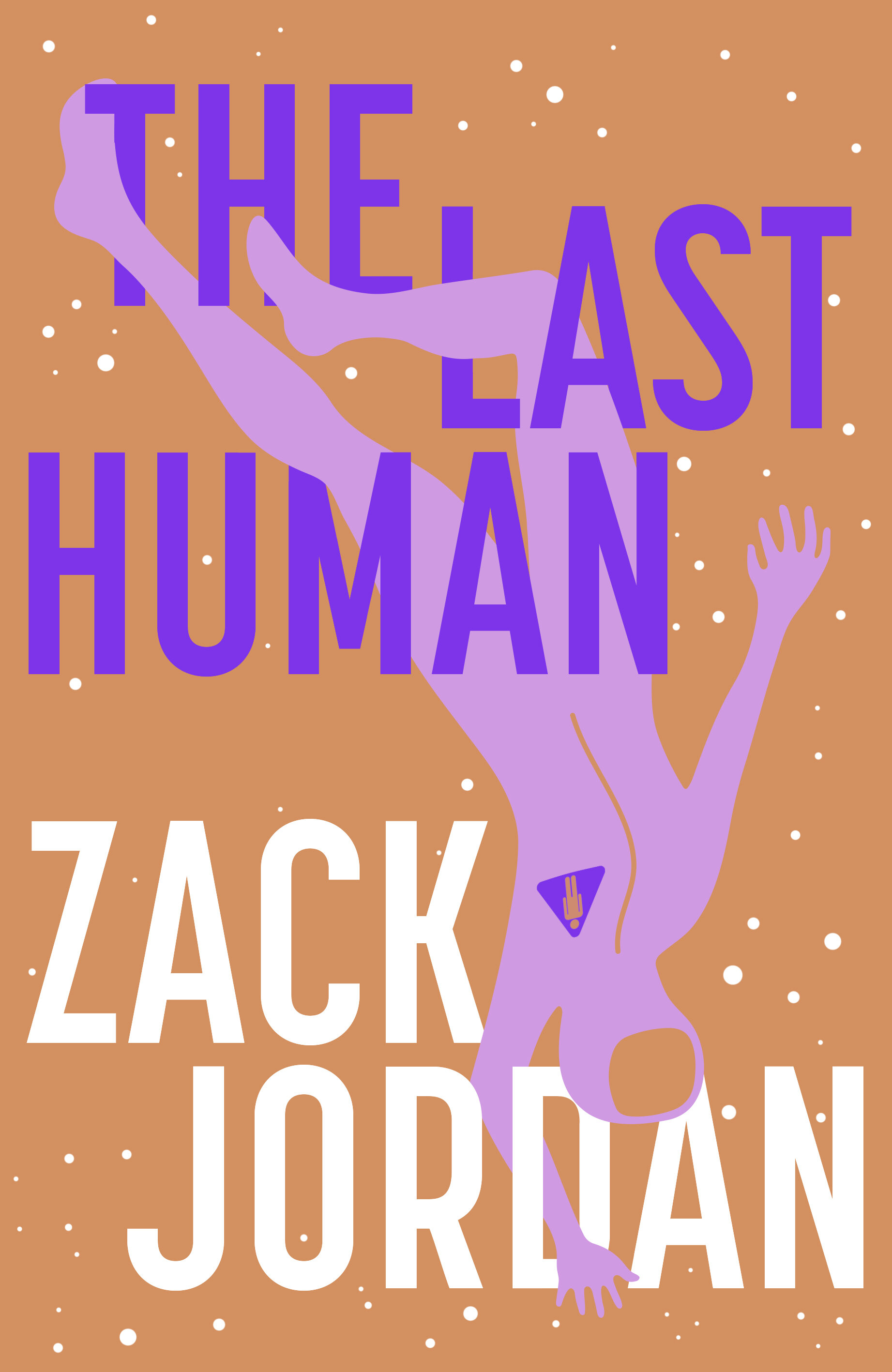

I love the rhubarb and custard colour scheme we chose, even if it isn’t entirely ‘unacceptable’… I think we’re saving that for the paperback.
Final cover
Editor, artworker and lifelong bibliophile.