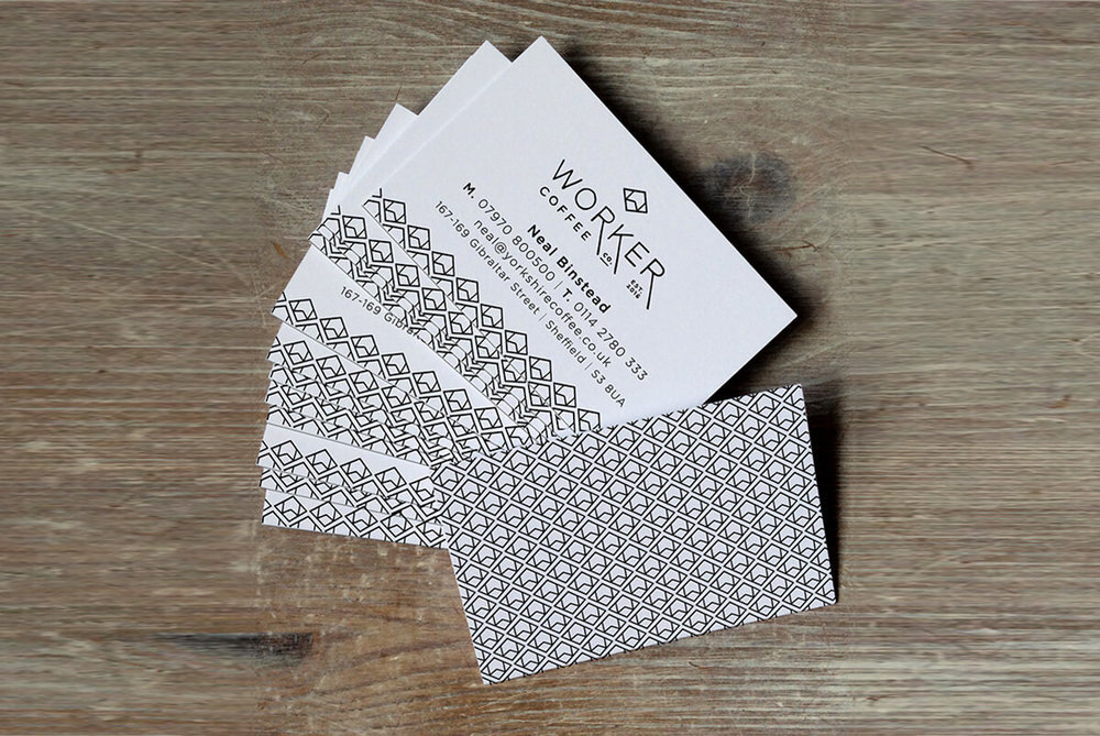
Worker Coffee Branding

Worker coffee is a company that is rooted in traditional industry, with the founder’s background in engineering. The company prides itself in good honest coffee that is crafted with care and has impeccable taste – premium coffee that has a nod back to the past. Originally named ’Yorkshire Coffee Company’, we changed this to a name that was more reflective of the company’s ethos and ’story’. The hand drawn diamond shape used in the icon is reflective of some of the traditional icons and symbols used in engineering – reflective of the companies roots – and so this was developed to become an integral part of the brand identity. The hand drawn aspects of the brand give a feel of authenticity and tradition. The identity was then developed into packaging designs, each with different symbols to represent each flavour.