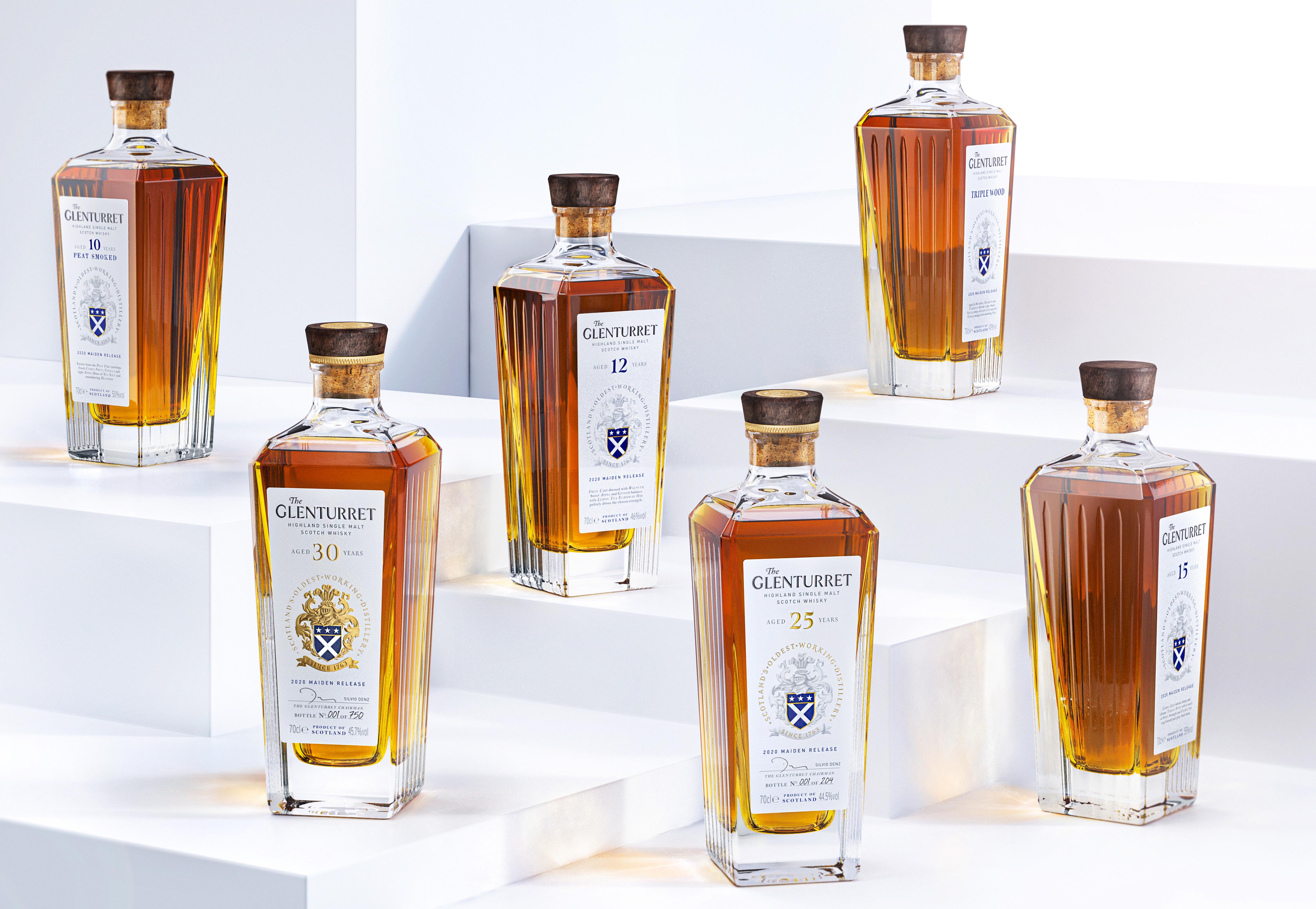
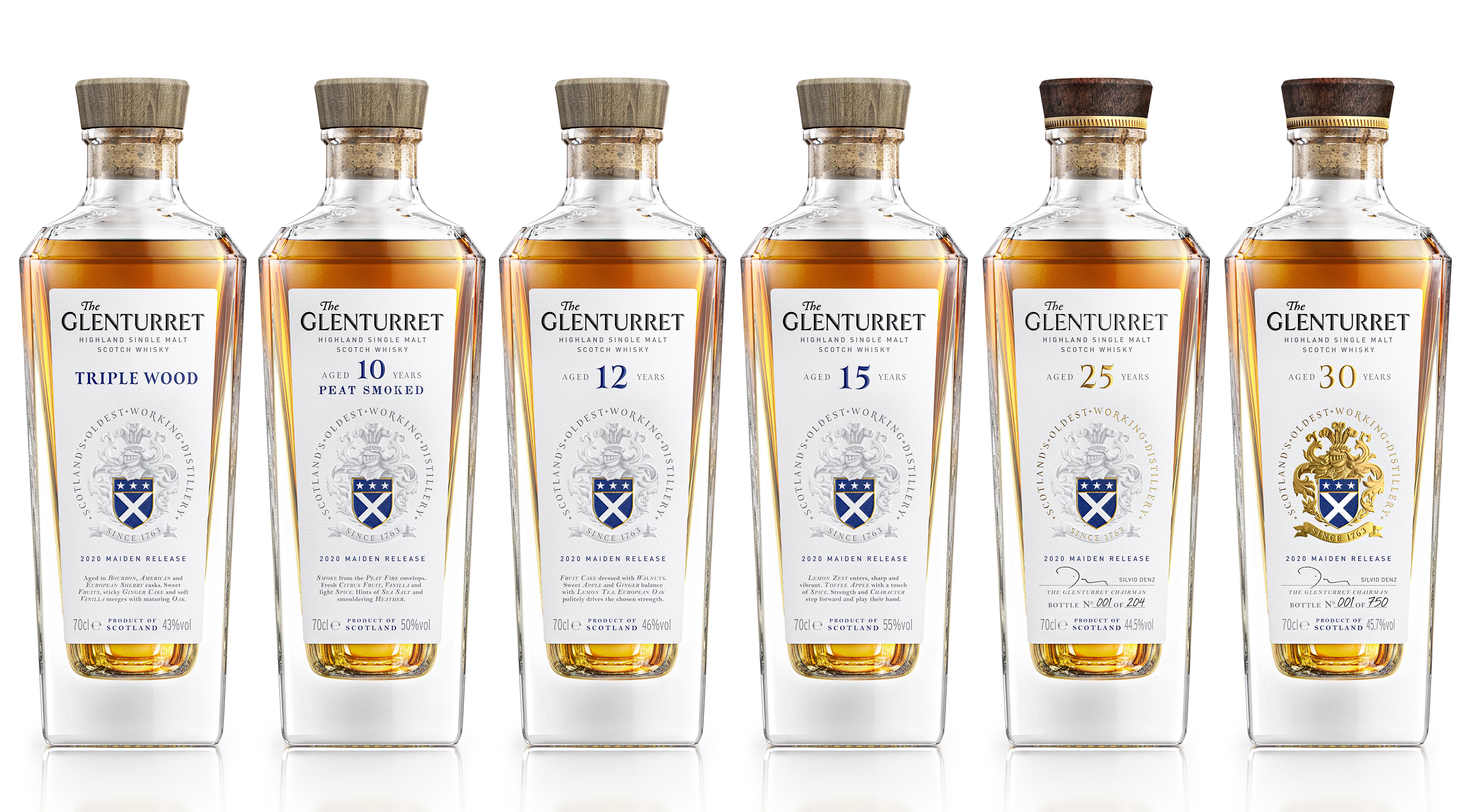
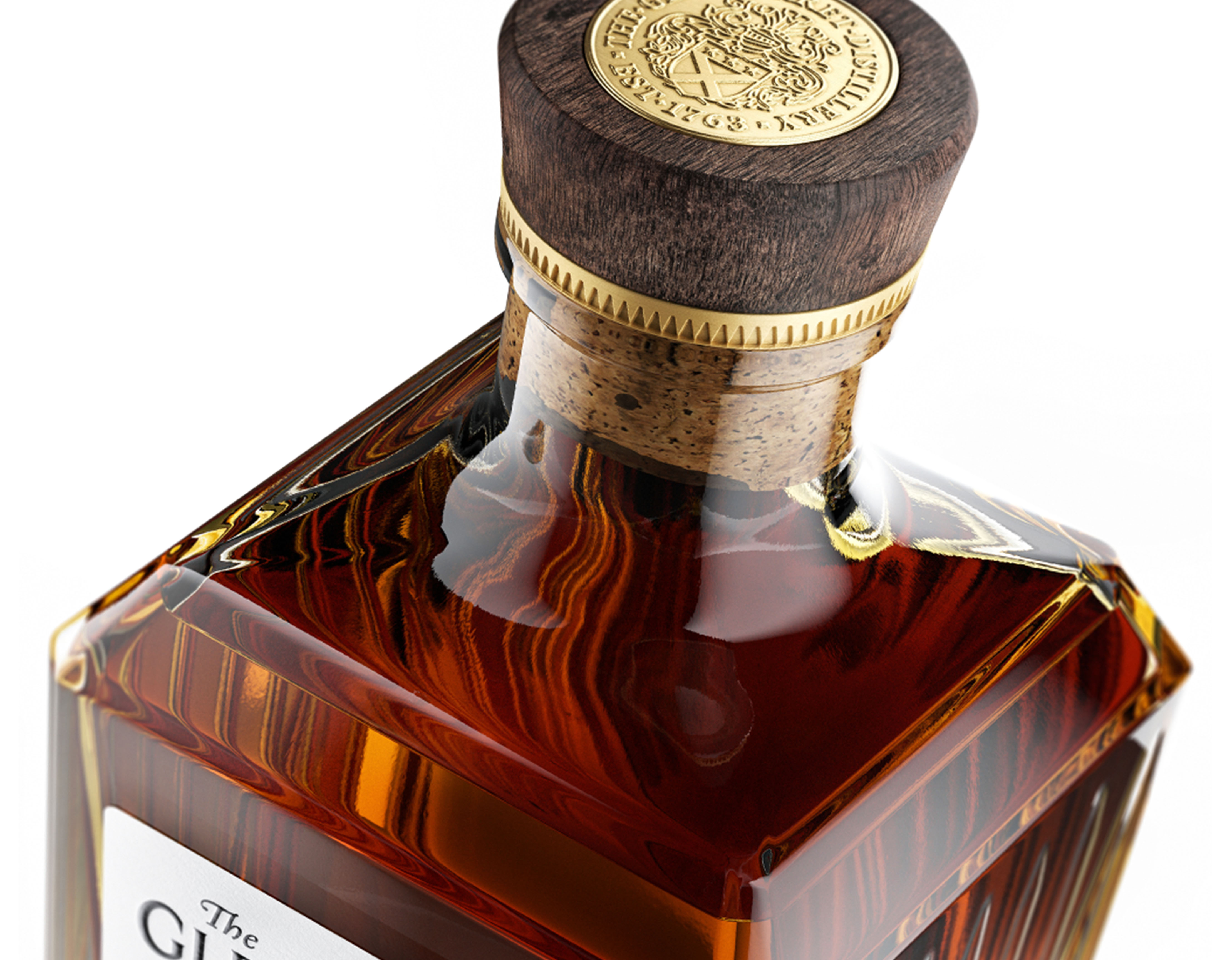
There is a lot of design ground to cover when you’re approaching a redesign for a brand with 250 years of history behind it. Thankfully, the design of Glenturret’s whiskey approaches all this history with the distinct classiness the distillery is known for. The uniquely shaped bottle already brings a breath of fresh air to the spirit. The ridged sides convey luxury, while the white label allows the amber color of the spirit to pop.
Celebrating it’s 250-year-old history, The Glenturret is a rare jewel that needed to be understood from its heart in order to write a new chapter with relevance and respect, staging the brand for future growth under the new owners. Therefore, the project started with an immersion visit at the distillery in Crieff, where our team had the privilege to share time with highly passionate people, understanding the brand history, core values and expertise in producing some of the finest whiskeys.
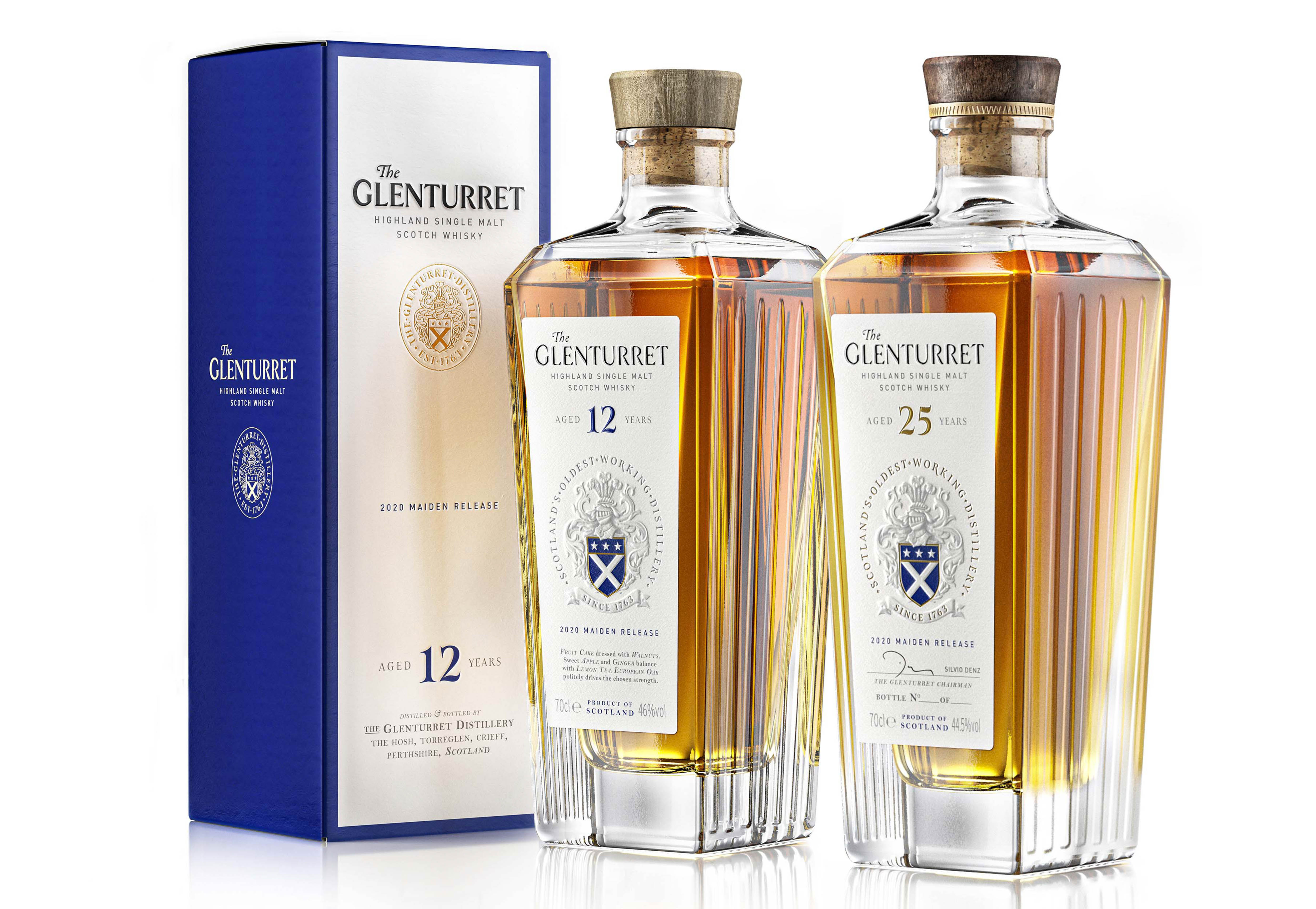
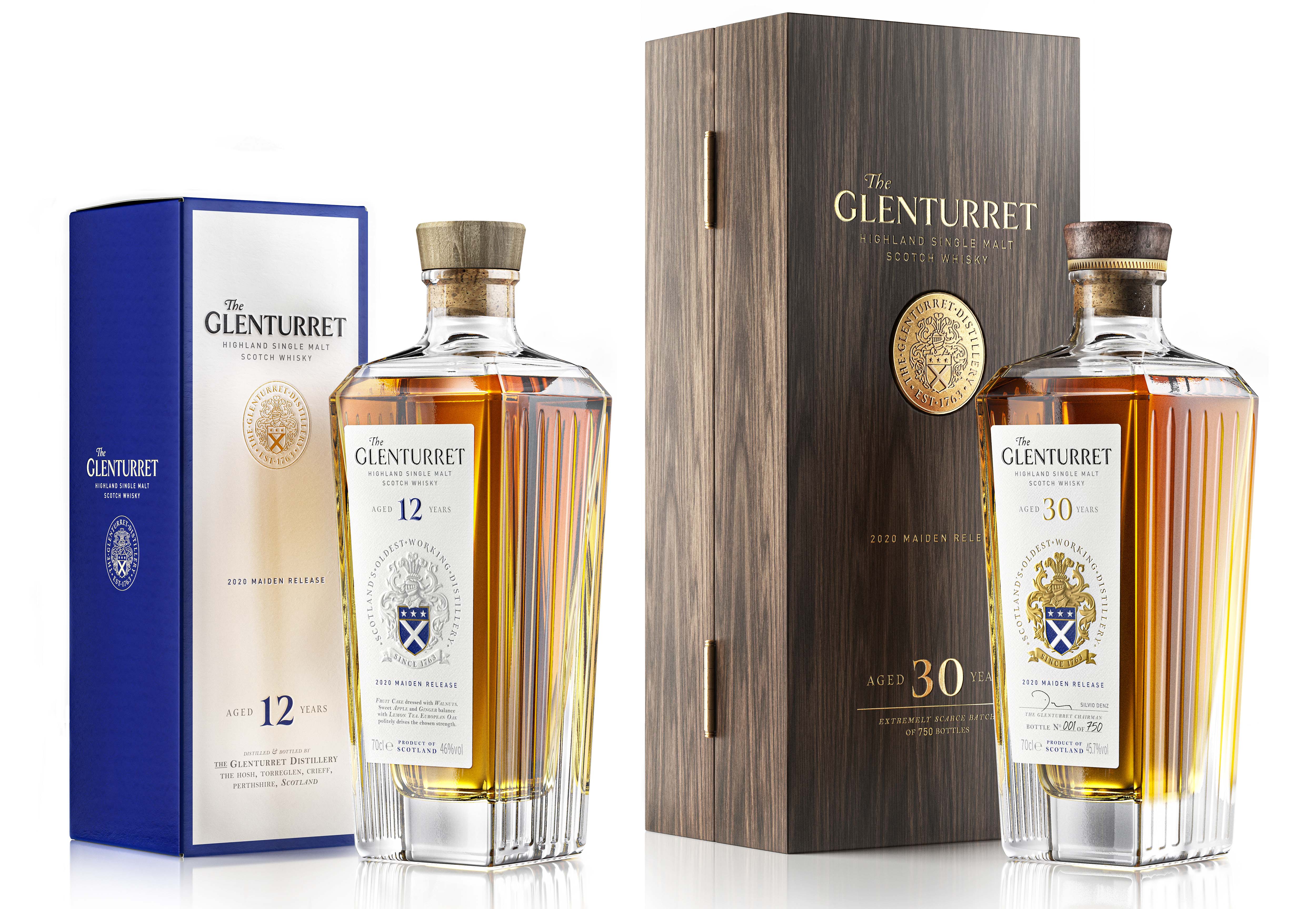
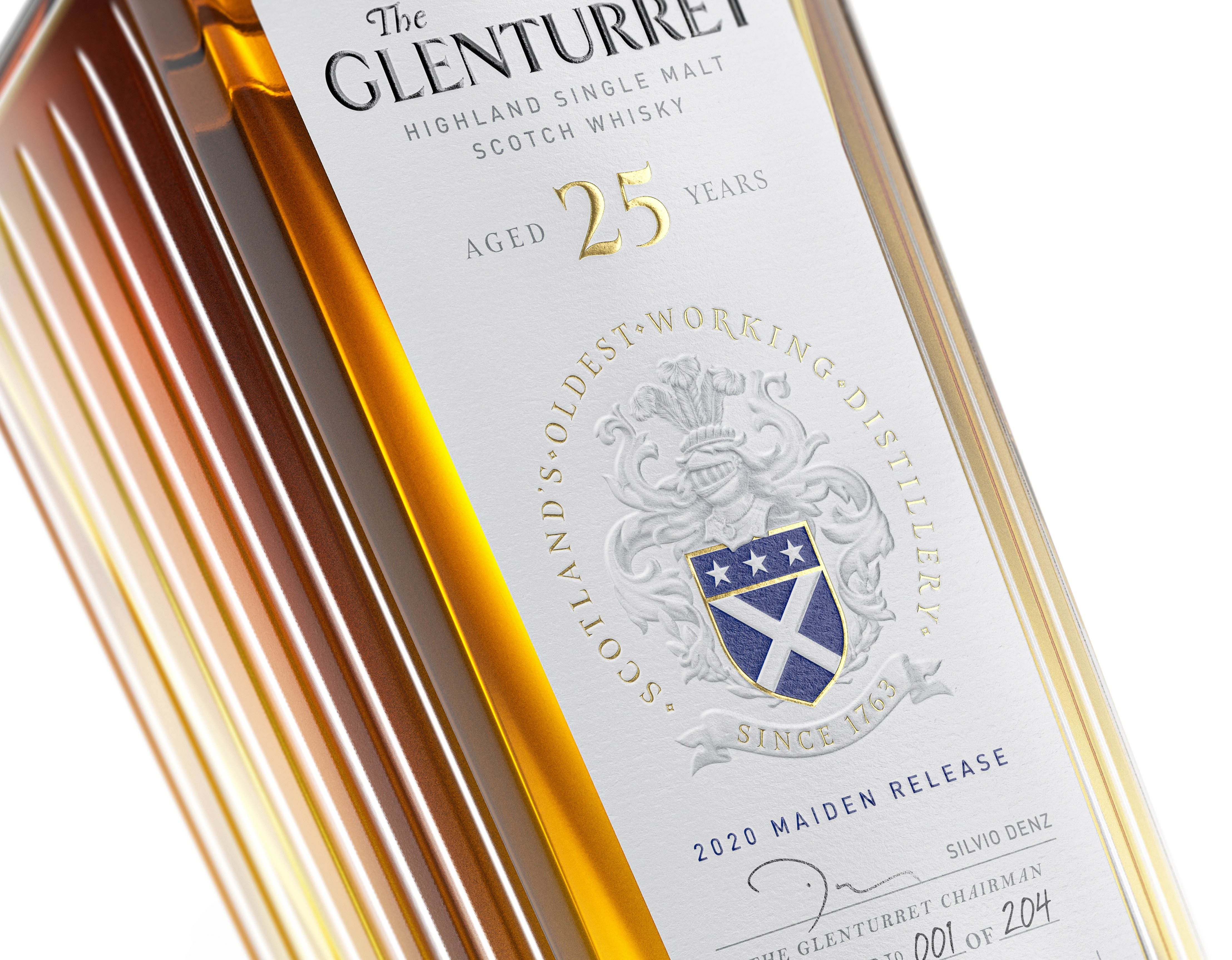
Each bottle is signed by Lalique, the new owners of the distillery. By keeping this handwritten touch, coupled with the Glenturret family crest, this is a luxury spirit design that honors the future and the past. Our favorite element of the design has to be the bespoke cap with a gold trim. This is the bottle you break out when you want to impress guests.
All expressions are presented in a new, distinctive bottle signed by Lalique, which breaks conventions within the world of single malts; the rectangular profile, broad shoulder, crafted detail and reassuring weight epitomize The Glenturret’s elegance and stature. By injecting a daring touch of modernity while the visual graphic identity balances the overall presentation and conveys The Glenturret’s heritage.
The Glenturret crest, hand-drawn by our team, proudly features on the new packaging, through a subtle play of embossing, hot foils and printing details, showing a premium position across the range. It is inspired by the original Murray family coat of arms, who founded The Glenturret Distillery and has played a key role in the journey of the distillery over the past 250 years. The Murray family crest was represented by a striking azure colour and included three silver stars, the Scottish flag, a knight’s breastplate and crested helmet entwined with an olive branch. All details were carefully looked at. From black hot foil, natural paper texture, embossing and finishing to convey the premium look that the brand deserves. Adding a touch of refinement to the ultra-premium range, we designed a bespoke cap, made from natural oak and metal engraved pieces. The secondary packaging also reflects the institutional character of the brand through a clean but striking presentation enhanced by printing details and the vibrant azure tones.
On the other hand, the 25 YO and 30 YO are carefully protected into a wooden box featuring metal gold coins.
“This was a significant project; new full brand packaging, from the glass through to shipping case and every component in between across six expressions. The brief was tough: provide packaging design projecting tradition and luxury positioning, be different, relevant and cut through in a demanding category. Appartement 103 delivered above and beyond the brief possessing a rare combination of creativity, project management and delivery. The team is very professional and always pushing hard to get the best possible design outcome. We are delighted with the new packaging and I can highly recommend Appartement 103.” Matthew Turner-Global Brand Manager, The Glenturret.