Tipple Topper by Marx Design
Opinion by Richard Baird Posted 17 May 2022
The pandemic catalysed the at-home market for a whole host of products. Paired with social isolation, it’s no wonder that one of the markets to benefit would be alcohol. Just like coffee, dried flowers and cleaning products, alcohol was packed down into letterbox-sized parcels and sent through the post. Mail-order cocktails have been a somewhat surprising development. The drama, theatre and careful orchestration of nitrogen, the flourishes of cotton candy and edible petals, and novelty vessels and classic cut glass are conspicuous in their absence when having an at-home cocktail. It just doesn’t feel right.
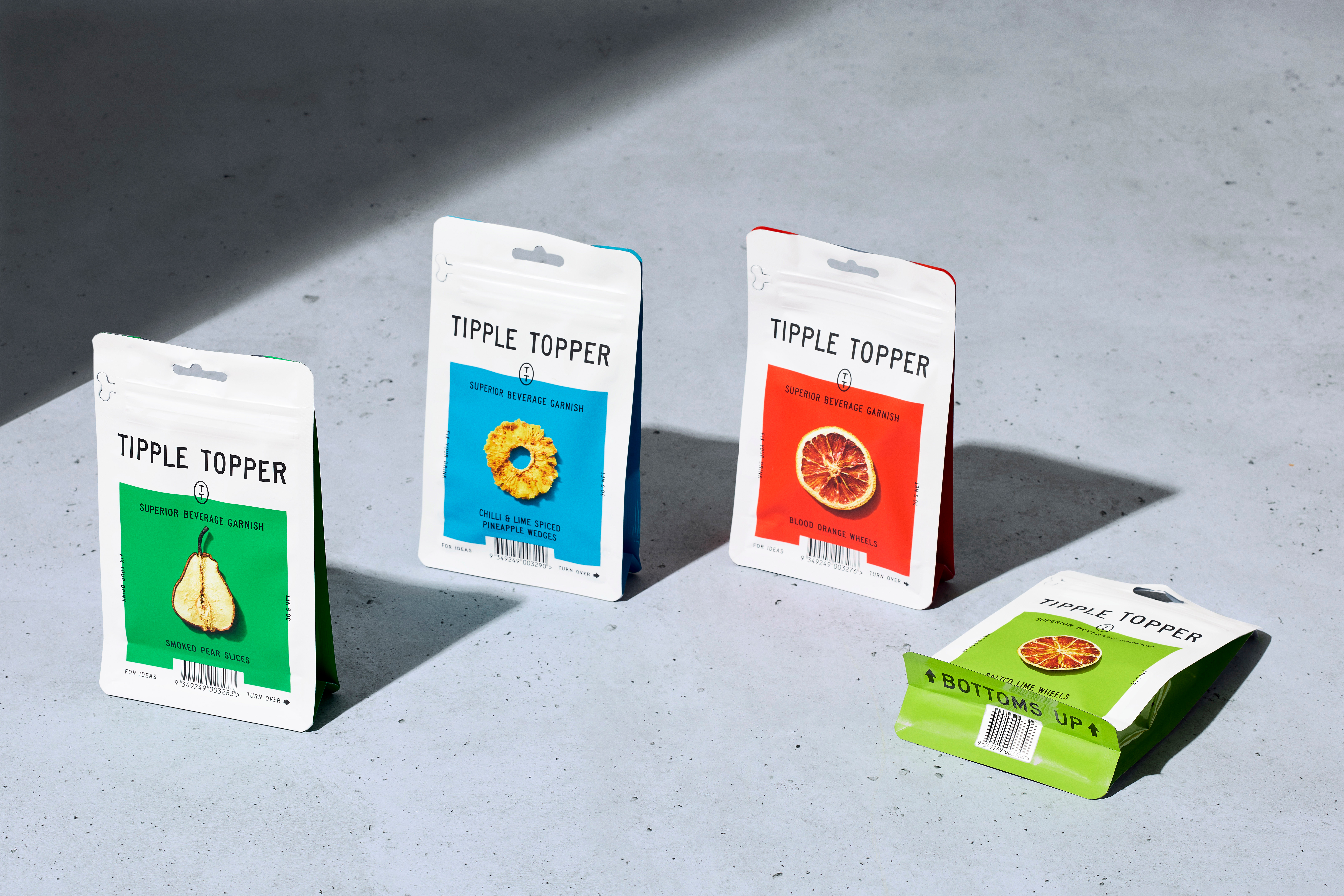
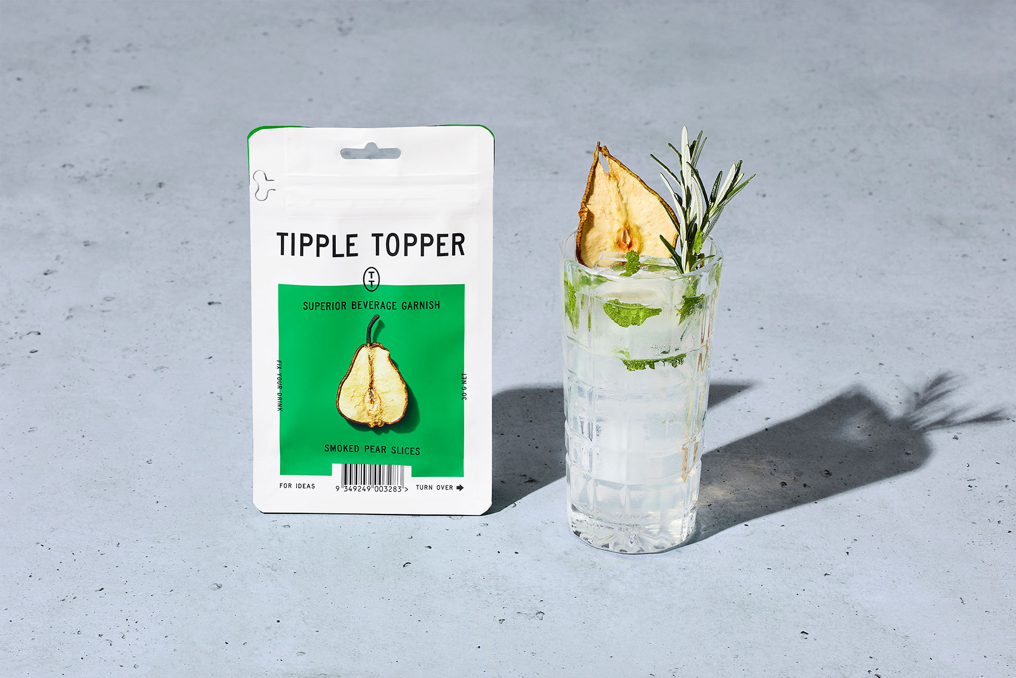
Tipple Topper enters the market as a partial but welcome upgrade, bringing drinks closer to the cocktail bar experience with a range of all-natural dehydrated garnishes. These include ‘chilli and lime spiced pineapple wedges’, ‘blood orange wheels’ and ‘smoked pear slices’. New Zealand-based studio Marx Design, continuing to build on their relationship with drinks innovator StrangeLove, has positioned Tipple Toppers as emergency cocktail upgrades that ‘fix your drink’. and has developed a visual identity and packaging treatment that draws inspiration from military ration packs.
For those familiar with the products of StrangeLove, Tipple Toppers will appear as neatly fitting in with the company’s portfolio of innovative drinks brands, of which Marx Design has helped develop into a convivial range with strong visual character and market positioning. The Tipple Topper range continues in the same spirit, and looks to cultivate further a post-lockdown market of fine drinking at home.
This post includes Extended Insights for BP&O Plus members.
Find out more and sign-up here.

It would be fair to say that StrangeLove and Marx Design are, at this point, inextricably linked. They have clearly developed a trusting longterm relationship that has proven successful. Together, they’ve innovated to create products with thoughtful visual identities that are well-timed and understand emerging markets trends and evolving consumer interests. This relationship has developed far beyond their early work reviewed on BP&O back in 2015. A milestone and highlight has to be Marx Design’s 2019 packaging on StrangeLove’s LoCal Soda, of which I was able to get a hands on with. This had a truly elegant visual and structural design language to it.
Marx Design and StrangeLove have managed to create a unique intersection within the beverage market, between the sophisticated and humorous, the past and the present, often drawing on historical references and giving them new contexts without appearing gimmicky. This includes elements such as ASCII code for StrangeLove’s Mineral Water and classical illustration for StrangeLove’s Organic Elixir. Although each product is distinct, they are linked by an overall strategic direction Marx Design created for the brand, which has produced some unusual and creative results.
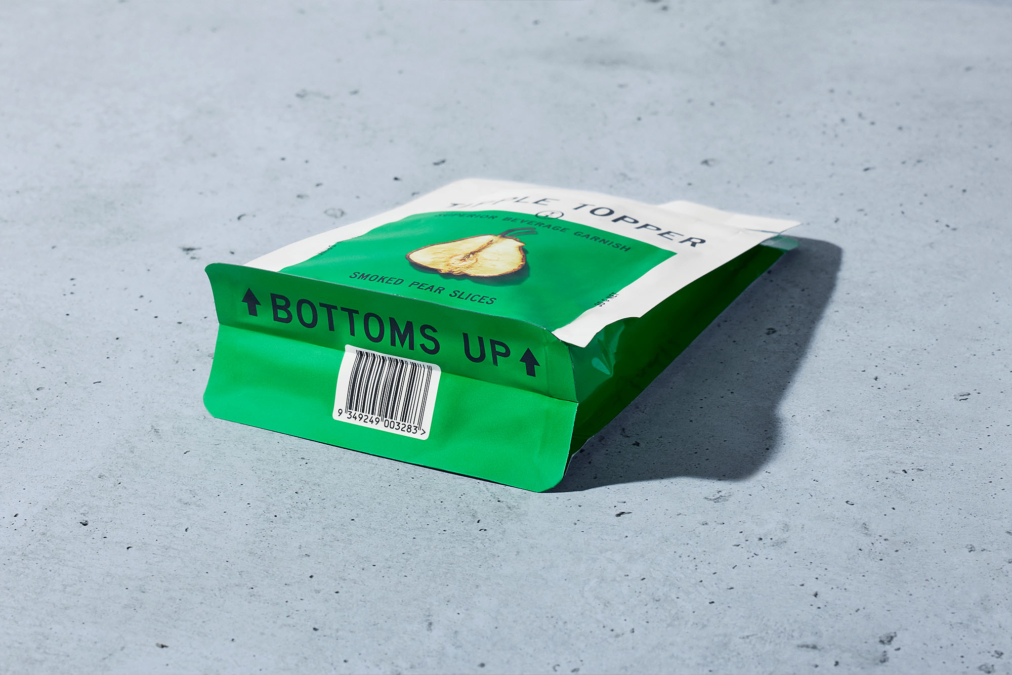
Here, Marx Design takes its cues from the utilitarian needs of emergency ration packs, blending functional elements such as a high-legibility monospaced typeface (SAA Series), clear directional cues and language with colourful social-ready aspirational imagery and bright colour blocking. Marx Design have continued to find a cohesive continuity between social media messaging, the practical considerations required of physical retailing and direct-to-consumer sales online.


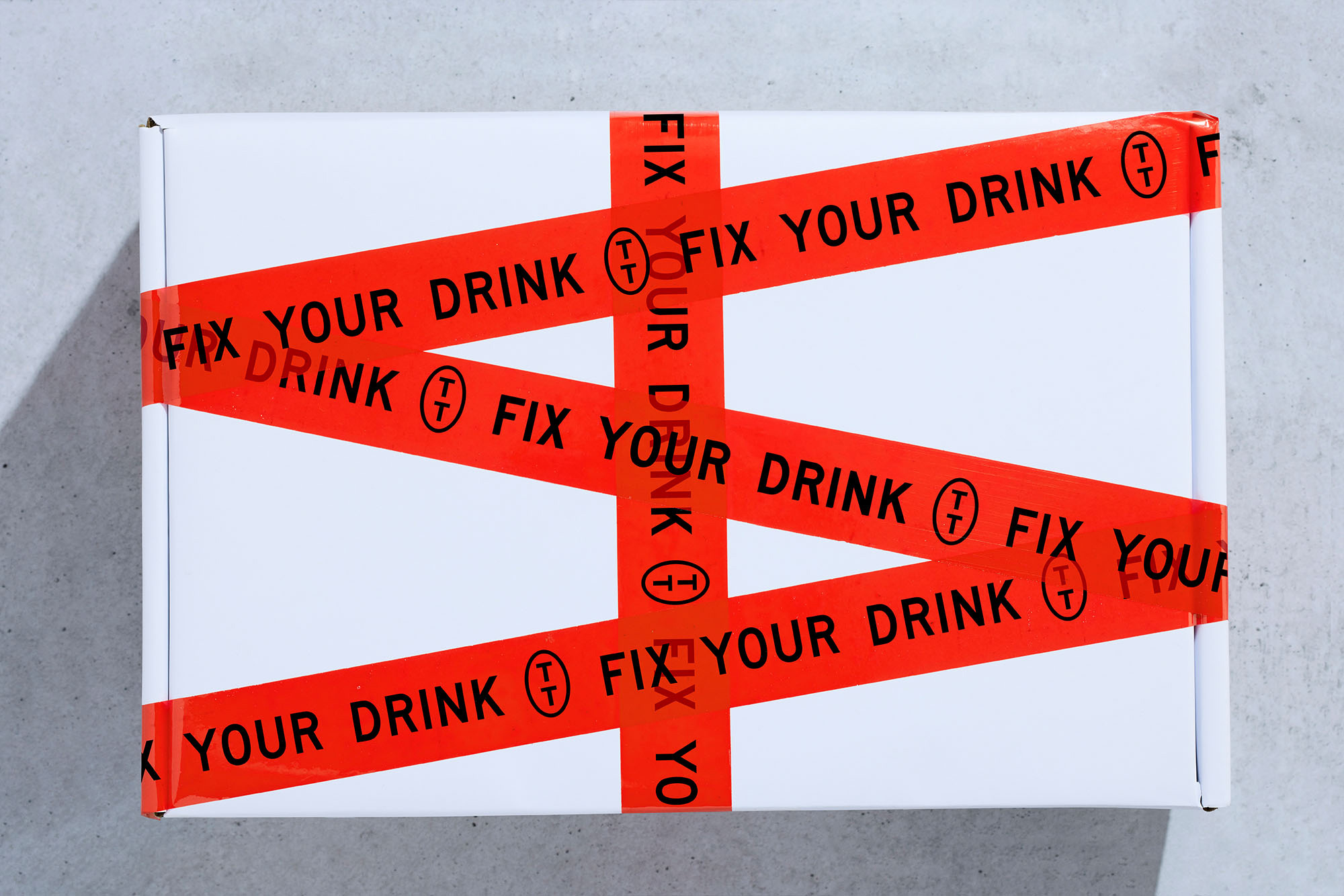
As with previous collaborations, Marx Design draw out a modernity from their historical references. The directional language of ration packs becomes tied to the language of drinking. ‘Bottoms up’, ‘residential purpose beverage equipment’ and ’emergency friend impresser’ find a synergy between product and creative concept. This does not feel forced, and lends the work a humour within bounds.
Marx Design have continued to show a creative hand within the discipline of structural design (check out True Honey and Rare Harvest) both in design and sourcing. Tipple Topper’s packaging appears as an authentic (if not slightly more premium) interpretation of the ration pack, and also draws on the freshness associated with speciality coffee packaging. The dehydration process of emergency supplies and the dehydration of drinks garnishes is the basic associative foundation, and where the strength of the idea (and its visual manifestation) lies. All the visual elements are then rooted in and flow from this.


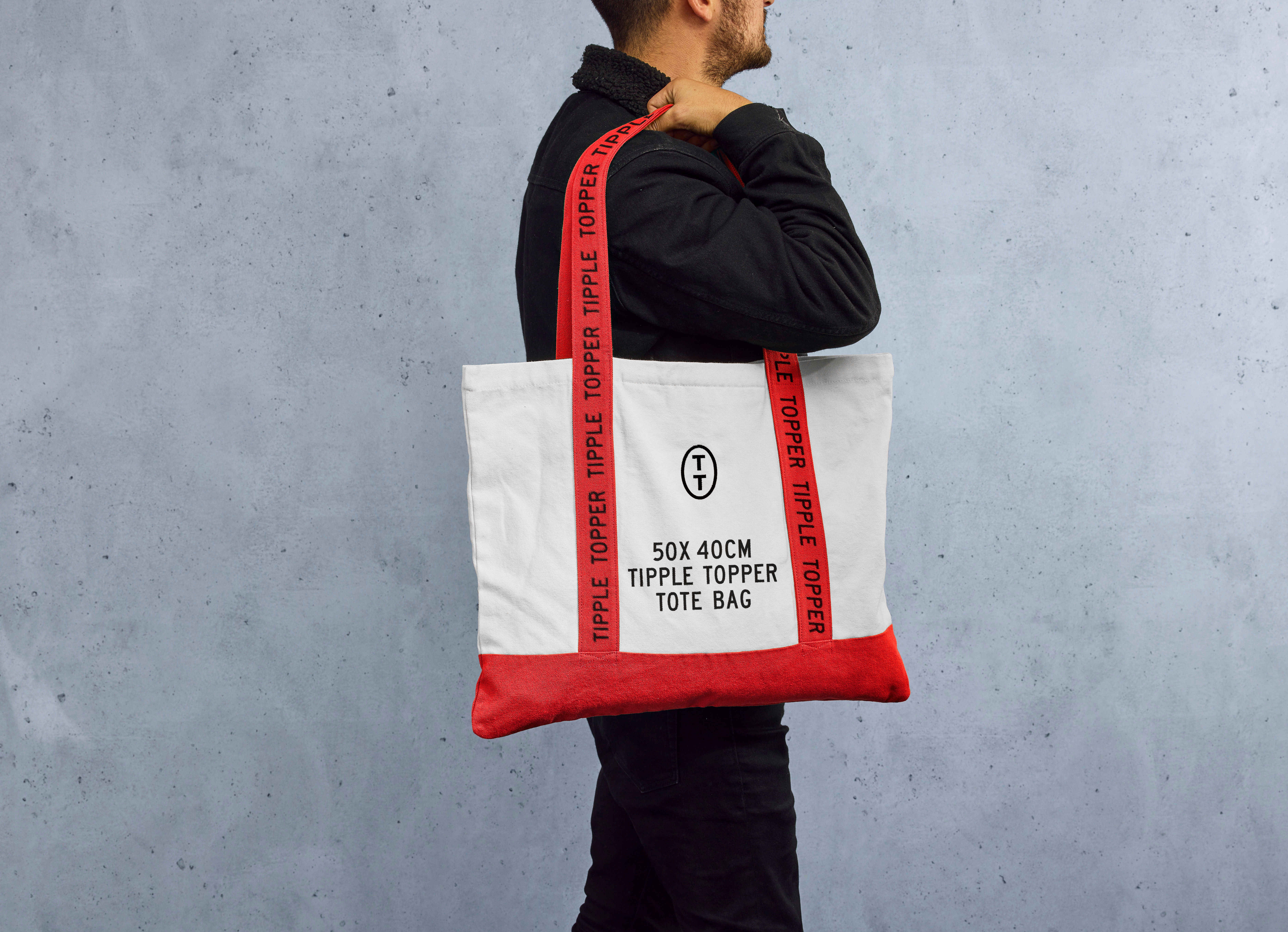
Visual identity drives home the idea of ‘an emergency fix’ through a high contrast red and white. This is used to great effect as box tape and then as the straps of the tote bag, which calls to mind emergency pull cords. There’s plenty of other small details that add creative range. The repetition of words delivers visual drama, and the SSA Series typeface, iconography and the arrangement of type back of pack and the barcode front of pack all functions in much the same way, to support the creative concept. Typography acts as a useful frame for imagery which delivers colourful and fruitful visual immediacy that makes it easy to delineate between products, whilst also adding in another social media asset.


Marx Design manages to draw a lot from the creative concept and reference, but avoids it all becoming a gimmick. They’ve effectively used all available assets; typography, structural design, colour and language to establish a brand that can exist in the many contexts the product needs to exist within, online and offline. And, perhaps more importantly–and this largely comes from the ‘scene setters’, a series of cocktail shots–Marx Design has managed to present Tipple Topper, not just as dehydrated spiced fruit, but as one part of a bigger creative opportunity to improve the at-home drinking experience.