Berg by Marx Design
Opinion by Richard Baird Posted 2 May 2022

Marx Design worked with drinks company Lion to develop a brand identity for Berg, an alcoholic / hard seltzer free from artificial colours and preservatives aimed at “discerning drinkers who’ve been yearning for a more refined alternative.” Berg is available in three flavours, Berg Watermelon, Berg Lemon & Yuzu and berg Blackberry. While delivering a clarity and crispness of flavour, Berg is produced using a complex process. This reduces the calories and carbohydrates but maintains flavour and sweetness. The name Berg, and the notion of a simple drink being the product of a complex process, leant itself well to an iceberg metaphor. Marx Design have built on this idea, tied it to a clear product proposition, and spun it into a number of different assets; from photography to tone of voice to illustration.

‘Refreshingly deep’ serves as a great brand promise and starting point for creative, and Marx Design have really pushed it far, with plenty of playful details to engage whilst also delivering on the simplicity and clarity you would expect from anything that could be associated with the purity of artic ice water. Fundamentally, the visually language is anhored to a vertical band and the silhuoette of an iceberg, and the associaitions of, more to be discovered, is fairly universal and immediatly communicated. As an idea and as a creative expression across packaging, this may have been enough, however, Marx Design push the idea further into photography and tone of voice.


There are a bunch of ideas at play, and all neatly tied to the same simple idea. From the name Berg, the promise of being being ‘refreshingly deep’ comes other expressions that include ‘just the tip of the ice berg’. These then inform an art direction linked by a horizontal plane, a graphic device embedded in photography that connects it to the illustrations and packaging, but also conjures up a range of appealing beach settings. These are connected with an above and below the line contrast with enough range to keep these distinct. There’s plenty of these images for the brand to use and by dialling up the blue, saturating it, delivers a eye-catching and current quality that should work well online. As Marx Design puts it “with deep thinking drinkers in mind, Berg also needed to portray a high level of visual interest to get across its point of difference and project a strong shelf presence.”

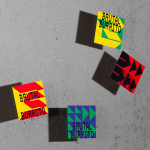
Elsewhere, there is a strong interplay of bold and fine. The graphic language created by the horizontal colour blocking and the identifiable silhouette of an iceberg is immediate. And this works great from a distance. Up-close, there’s texture, be that in the form of finer illustrative details or the satisfying touch of a matt surface can. A highlight has to be the switching of the boxes from a typical horizontal design to one that is vertical, really emphaising the notion of depth.

The strength of the idea is not only in conjuring up a brand promise aligned with name, and then developing a creative response that is conceptual and immediate visually, but the extent to which the studio have extracted value from this across illustration and photography and copywriting. This latter detail, copywriting, delivers a final verbal layer to tie it all up in a playful first person humour that sets the groundwork for cheeky ongoing exhange across different contexts. The Titanic reference is, interesting, but you can imagine how other things could be constructed from the idea. ‘Looking deep’ is a good example, and takes on a secondary visual element with eyes being used in a number of situations.

As much as there is going on, it is well-orchestrated and remains cohesive and clear. The work is distinctive visually, with the surfaces of cans and boxes used effectively to deliver an eye-catching visual motif and trigger some association. Tone of voice, illustration and photography effectively develop the central graphic premise with interest and humour that is well-suited to constructing an online social presence.