


In this article, I'll show you ten ways to get out of the box and break some traditional design rules in page layout design.
Magazines have been rising in popularity these past few years. When we thought they were going out of style, they resurged with more interesting and experimental layouts. Traditional magazines are a thing of the past, but designers have been thinking out of the box in order to create interesting and creative layouts. Keeping the reader interested and offering a surprise with each spread is one way to do so. While it is important to keep consistency in the design of a publication, it is also important to make the articles stand out. So how can we create something new and exciting that isn't repetitive?
Try things like changing margins, adding new elements, and considering the article you are working with. Get inspired by it and reach for unconventional materials that can emphasize the layout. The main question we should ask ourselves as designers is: why not? There's a right time and place to experiment with editorial design, so make sure the publication is aligned and open to that.
In this article, I’ll highlight ten ways you can take your editorial design spreads and page layout design to the next level. By using a few images and some text, I'll show you how each experimental point can help you create something unique and unexpected.
Looking to learn more? Check out my course on Creative Magazine Layout Design:
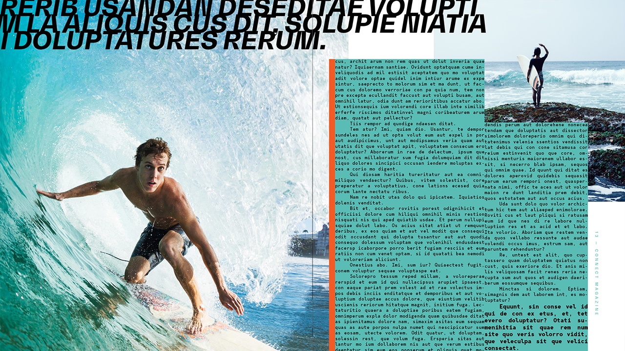
1. Play With Font Size
While there are specific typographic hierarchy rules when it comes to editorial design, it's good to break them every now and then. If you’ve learned and mastered the rules, now it’s time to go a step further. Playing with font size should still be part of a typographic structure.
For instance, if you are looking to highlight the title of an article, there's no easier way than making it big. Using large scale type will create a higher contrast on the page, drawing attention and setting the article apart from the rest of the magazine. Don’t do it mindlessly—pay close attention to the details. Where is the type falling? Is it moving to the next page?
Large type can do many things to a page. It can create balance or imbalance, and at some point, the large text will become a graphic element instead of just text. This will allow you to experiment with letterforms, making the spread your playground. From here, you can also play with the font weight. Bold fonts can turn too heavy at a large scale, so maybe you could change this to a normal weight or even thin to balance the opposite page.


2. Cross Borders
As a young designer, I was always told to keep images inside the page. We’ve seen so many progressive designs in the last few years that challenge this view. Depending on the publication or topic you are working with, bleeding images not only off the page but crossing over the gutter has become normal. There’s a tasteful way to do it, and many designers like to challenge the “norm.” The same goes for text that overlaps images—once it was considered a “no-no”, but more recently it’s seen as experimental, and it can convey certain ideas that support a magazine, article, or idea.
For instance, an image tends to be more powerful than words. If you happen to use an image that you consider worth displaying on a spread, why not? If you are not feeling too experimental, you could push the edge by using the image on the left page and bleed it off towards the right page. Consider the pacing of a magazine. Imagine your reader flipping through the pages and suddenly coming across an image that occupies almost a whole spread. Bleeding off images can bring a dramatic impact because it tends to be unexpected, so treat it as eye candy for the reader.


3. Change Directions
Typography has taken on a new graphic role that challenges legibility and strongly conveys new ideas. Changing the direction of type can help your layout achieve exactly that direction. It helps the viewer direct their eyes towards the focal point on the layout.
Changing the direction of type can also create contrast against horizontal lines that are created by copy text. Vertical lines will break horizontal lines and spice up the design. It'll add visual variety that will stop the page from feeling static and bland.
Ungroup the text and treat individual letterforms to rearrange or rotate each letter. Play with the placement of the characters and make sure the text is still legible. We are graphic designers, after all. Try to reach a good balance between experimental type and legibility.


4. Negative Space
This concept is a fundamental part of the principles of design. It's quite easy to understand when we see Saul Bass’s posters, but how can it be applied in the present? Negative space or white space is the area of the layout which is left empty, the breathing room. Negative space can enhance the visual hierarchy in your design, reducing distraction and adding style.
For instance, playing with shapes to achieve a relationship between positive and negative spaces in your design can result in a highly textural layout. By hiding and showing different parts of an image or text, you can highlight important elements that can further convey a message.
The play on the spaces can also lend depth to your design. Graphic design tends to be very two-dimensional, and there's nothing wrong with that, but many designers want to include a tactile feel that isn’t exactly a texture.


5. Use Highlighters
Using bold colors in your design can add an extra layer of eye candy. It can help you balance elements on the page while creating a spotlight on certain elements. Having a color palette for a magazine is essential, but sometimes keeping it simple is the best way to go. Use custom Pantone inks if there's the budget to splurge. If not, select one or two colors and add a third color that is a complete surprise.
Highlight certain elements in the design. For instance, set the drop cap to be a completely different color so the reader knows where to start. Photo captions tend to be pretty quiet on a page, so why not accentuate them by using a different color or adding a color box? Bold and large page numbers will add a dramatic effect to the page. This tip is also useful if you are trying to spice up a layout—small details like adding a strip of color can make a difference.


6. Apply Textures
Using textures in your layout can create a physical illusion and evoke certain sensations from the reader. You can add texture in many ways: one would be by adding an organic image like plants and combining it with text on top. To add depth, weave text through the image so it feels as if both elements belong together.
Another way to add texture in editorial design is by paying attention to text boxes. When you look at a spread, you’ll notice there’s a hierarchy which also translates into visual texture and contrast. If columns of text are viewed as graphics, these would also be considered texture. In this case, we can add small elements to enhance the texture of the page.
Texture can also be added by layering elements as long it achieves a sense of depth. Graphic design is two-dimensional, so try to make your design feel three-dimensional by overlapping elements when it makes sense.


7. Experiment With Images
Giving images a new flair will completely change the level of design on your layout. Photoshop is a great tool not only for correcting images but also for experimenting. Photographers always work hard to capture the best images, so make sure they are OK with you experimenting with their work.
You don’t necessarily have to use Photoshop in order to experiment. You could repeat an image several times in your layout, highlighting different parts of it. This is great if you are short on images and need more graphic elements in the design. Try to take images to extremes—what if they are overly dark? What happens if you bump up the contrast and create more texture?
Let the text inspire how you experiment with images. Layer images to achieve metaphors or surrealism, or apply effects or colors that can visually enhance the layout. If you are feeling extra experimental, you could always print physical images and give collaging a try.


8. Layer It Up
If you are stuck in the two-dimensional world and want to add something intriguing to your layout, layering elements is an awesome and easy way to do it. Layering elements will add depth and texture to your design. You can layer images and text for visual texture. Not only that, but you can also layer text on text as long as it is still legible. Play with an image’s opacity, or close-crop an image to see where it can take you.
Layering needs to have the right elements. For instance, if an image is too busy, it might not work that well. The good thing is that this is all about experimenting, so try different images and different font weights to make your text as legible as possible.


9. Take Advantage of a Scanner
If there’s one thing I love more than typography itself, it's experimenting with a scanner. Digital software has made it easy for all kinds of layouts to look extremely similar. Experimenting with analog tools will result in more unique visuals. For instance, a scanner can be used in many ways to experiment with typography for unpredictable results. You can elongate graphics, glitch them, and in return, you’ll get lots of texture that you can further experiment with.
The effect below I created by printing the title of the article. Then I scanned the page while dragging it to create an elongated effect. Each scan will be different, so try a few times to see if you can achieve what you are looking for.


10. Use Analog Materials
With the help of a scanner, we can go on to use many other analog materials. Use scissors, tape, a correction pen, and any materials you can find around you. Experiment by cutting and pasting letters and trying out what works and what doesn't. With the help of a scanner or even a camera, transfer the analog piece to your computer.
For the piece below, I printed the title of the article and used scissors to cut individual characters to fit as I wanted. Using transparent tape, I went over a few of the characters to achieve a grunge texture. That same tape I placed over the letters "TH" to add even more texture. Using a correction pen and correction tape, I painted over a few characters to break up the edges. Lastly, I placed a couple of random elements I found lying around on my desk. Items like barcodes can help create balance or randomness in your design.
Analog materials allow you to really get out of the box and create something custom and unique that you won't be able to make with digital tools. Embrace the imperfections in the design.


Now It's Your Turn!
In this article, I showed you ten different ways to experiment with your layout design. Getting out of the norm and breaking the rules can be daunting as there isn't a right or wrong. Use your intuition and knowledge to see what works and what doesn't in your layout. Here's a recap of how you can experiment with your layout:
- Play with font size: don't be afraid to go extremely big or the complete opposite way to add a surprise in your layout.
- Cross borders: margins and gutter can be restrictive, so break the rules by crossing over to the next page.
- Change directions: vertical and angled type can add direction to your design and break the horizontal pattern created by body copy.
- Negative space: consider the empty spaces of your design to amplify the impact of an image.
- Use highlighters: if the budget allows, use a Pantone or special color to brighten your layout.
- Apply textures: use textures over images to enhance a message.
- Experiment with images: try mixing and collaging images or play with different blending modes to achieve something out of this world.
- Layer it up: layer multiple elements in your layout to achieve depth and add texture. This is an unconventional way of designing but can result in some interesting shapes.
- Take advantage of a scanner: play with a scanner and typography to get unusual shapes out of simple characters.
- Use analog materials: last but not least, work with your hands. Get inspired by your surroundings and copy and paste the real way. You'll get something unique that no one will be able to recreate.
If you liked this article, you might like these:

 The Ultimate Guide to Basic Typography


 How to Create a Colorful Collage in Adobe Photoshop & Lightroom


 A Brief History of Display Fonts

 How to Combine Fonts, How Not To, and the Best Font Combinations

 10 Typefaces That Changed the World


 The Basic Elements of Design

 The Best Fonts for Magazine Designs (& Famous Typefaces for Magazines!)


