
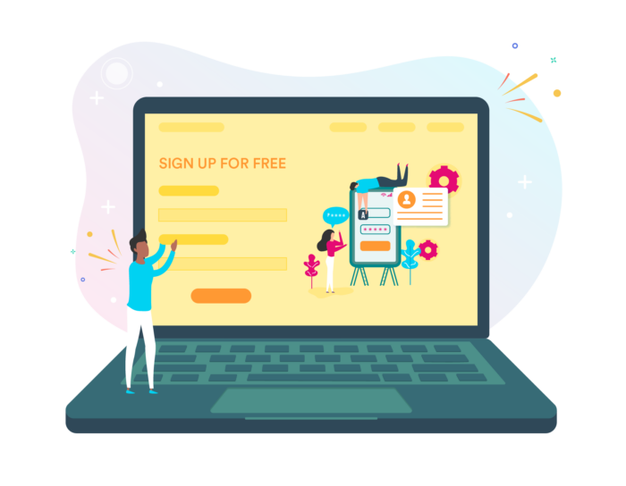
What Is a Landing Page

Though it may not seem like an obvious choice, a landing page — or two or three — can help generate leads and grow your business. A landing page is a web page with a singular focus: to convert website visitors into leads. When visitors click on a link from an ad or a post on social media, they go to a landing page that describes what the offer in the ad or post is and what they need to do to get it.
If they’re designed well, landing pages can drive conversions at a higher rate than your website’s homepage. The median conversion rate from a landing page is between 3 and 5.5 percent, compared to the average e-commerce conversion rate of 2.9 percent.

The beauty of a landing page is its simplicity. It targets visitors who are interested in one specific thing (like an e-book or a free trial) and gives them clear directions on how to get it. Most landing pages include text, pictures, and a call to action (CTA) to get visitors to convert.
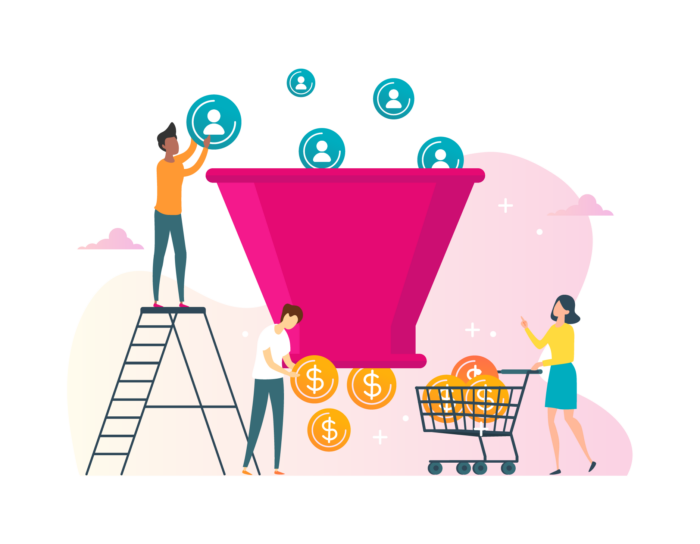
Landing pages offer a few major benefits, but one of the biggest is their ability to capture leads. For example, a landing page to download an e-book might require a person to fill out a contact form before getting access to the e-book. Once the visitor downloads the e-book, the company can reach out later and see if the visitor has any questions or needs more information — effectively pulling them into the sales funnel.
Your company should have at least a few landing pages on your website to optimize lead generation. In this guide, you’ll learn
- Why you need landing pages
- How to create the right landing page strategy
- How to use landing pages
- How to optimize and track landing page performance
- How landing pages for apps and mobile sites differ
- Things to avoid in your landing pages
- How JotForm can improve and streamline your landing pages
Why you need landing pages
Since the sole purpose of a landing page is to convert visitors into leads or customers, it’s very different from the standard web pages on your site. Your “About” page, product pages, and homepage all have navigation options so that visitors can click around your site.
For example, a visitor may land on a blog post, then navigate to a product page, and finally check out your “About” page to learn more about the brand. A landing page doesn’t have that — it’s a standalone page without the distraction of navigation, and it exists for the main purpose of converting visitors into leads.
Theoretically, you could send someone to a standard page on your website from an advertising or social media campaign. But you can’t rely on regular web pages to convert visitors into leads. They’re often too general and not geared toward the visitor’s intent. Without a direct and obvious next step, the visitor will likely end up visiting a few pages on the website and eventually leaving without completing an action.
If the goal for your website is to convert leads into customers, landing pages are an effective way to do this. They have content that’s targeted toward specific products or offers, which makes them more relevant to the visitors who land there.
More relevant content and more targeted traffic translates into higher conversions. That’s good news for your sales team, as HubSpot’s 2018 State of Inbound Marketing report found that 75 percent of North America-based sales teams list closing more deals as a top priority. Leads that have already expressed interest in your products and services can go a long way toward hitting those sales goals.
Landing pages also provide a way to test how to improve conversions. You can put up different landing pages with different layouts and content to see which one actually gets people to sign up, download an e-book, or buy your product. This can help you figure out what elements (such as images, content, and layout) will work best for you. You’ll learn more about landing page optimization — including testing — later in this guide.
Make onboarding easier with landing pages
Landing pages are most often associated with advertising campaigns, but they can also be used for other functions, such as user onboarding. The goal of user onboarding is to introduce users to a new product and explain how it works. A typical onboarding process takes a user through the signup, the product tour and tutorial, and finally turns them loose to start trying the features.
When you onboard new users for your product, like a new application or software product, you want them to immediately find value so that they’ll keep using the product and paying for their subscription. Right out of the gate, a good landing page can set the tone for the relationship and let the user know what to expect.
If your onboarding landing page is targeted, user-friendly, and streamlined, the user will be more likely to use more of the product’s features and become a long-term customer.
Landing pages can also be part of the product tour of an app or software product. The text and imagery on a landing page can provide a preview of what the user can expect after signing up.
After signup, the landing page can segue directly into the app, using similar imagery to reassure the user that they’re in the right place. The onboarding sequence can continue, showing the user how to customize the app to their preferences and get started with it.
For example, a landing page for a website builder might promise that it’s easy to set up the website and, therefore, show images of the user interface. After signup, the user would be taken into a tutorial with popup guides that show them how to choose a website template, add images, and add text to their websites.
Landing pages improve lead generation
All companies want to close more deals and boost sales. To do that, they need a consistent stream of new leads that can be moved down the sales funnel. Landing pages play a critical role in the lead generation process by capturing website visitors’ information and converting them into leads who can be contacted by the sales team.
You can also use landing pages to help your sales team upsell, and make their jobs a whole lot easier. Landing pages optimize the lead generation process because they take visitors to pages tailored to their specific interests and intent.
For example, a T-shirt maker could run ads promoting a new line of kids’ T-shirts, and users who clicked on that ad would go to a landing page where they would see only information about the company’s line of children’s products.
Once visitors complete an action — such as filling out a web form — a salesperson or customer service rep will know what types of products each visitor is interested in. They can then tailor their sales pitch or messaging to better meet each lead’s expectations. Salespeople can also provide targeted educational or product information, like case studies, to help persuade each prospect to become a customer. This gives your sales team an edge and can help them improve their close rates.
Landing pages aren’t a “nice-to-have” part of your marketing campaign — they’re a “must-have.” But where should you start with your landing pages, and how do you create them?
In the next section, you’ll learn how to lay the foundation for a strong landing page by identifying your target audience and choosing the right landing page builder. You’ll also learn about calls to action and how to use them effectively on your landing pages.
Where to start with landing pages
The goal of a landing page isn’t to get as much traffic as possible — it’s to attract the visitors who are most likely to convert, whether that means they’re making a purchase or handing over contact information in exchange for a discount or useful piece of content.
But before you start driving targeted visitors to your landing pages, you first need to know who your target audience is and why they’d want to take that action.

To do this, you need to research your target audience and what motivates them. Start by looking at the following audience characteristics in your existing website analytics platform (like Google Analytics), social analytics platforms (like Facebook Analytics), and even your e-commerce platform analytics:
- Demographics. Age, gender, location, and income all fall into the category of demographics. When creating a landing page offer, the content and imagery you’d use for a 55-year-old male are much different than what you’d use for a 22-year-old female.
- Psychographics. Psychographics is the study of personality traits, lifestyle characteristics, aspirations, opinions, and interests of certain groups of people. They help companies understand the triggers that push a customer to buy.
- Where they spend time online. Your visitors may spend most of their time reading blogs, searching for information on Google, or checking out social media ads. With this information, you can tailor the content, design, and layout of your landing page to look and feel similar to the channels where your visitors spend the most time.
- Design preferences. If you’re selling a visual product or service, consider the types of graphics and visuals your customers respond to best. For example, if you’re offering a free trial of a software product, screenshots can be an effective way to show your audience what they’ll get after signing up.
- Cultural preferences. If you’re marketing your product to a global audience, think about the types of design, content, and even colors that would appeal to different cultures and nationalities. For example, if your ideal audience is Chinese, you may want to feature colors that are viewed positively, like red.
- Accessibility requirements. Regardless of the demographics and psychographics of your ideal audience, your landing pages need to be accessible to those with disabilities. Some of these standards include providing text for all non-text content so it can be turned into large print, braille, or speech; making sure color isn’t the only visual being used to convey information; and allowing text to be resized up to 200 percent without losing functionality.
Finding the right landing page builder
Once you better understand your target audience and what they’re looking for, you can begin to sketch out what your landing page will look like.
This is where landing page builders comes in handy — they allow you to choose from different templates so that you won’t have to code a web page or add a page to your website’s standard content management system. Instead, the landing page builder will do this for you.
A good landing page builder should include
- A wizard that lets you easily build your landing page without needing to code anything
- Templates you can easily modify to match your existing website branding
- Tools to add long-form text, images, or other design elements to your landing page
- A call-to-action button to encourage landing page visitors to perform an action or conversion
- A form or form integration where visitors can sign up to get more information
- A way to customize the domain name for your site
- Analytics that track the performance of your landing pages
- Testing options that let you run A/B tests and multivariate tests
When choosing from the many different landing page builders available, make sure you can easily customize anything you create to suit the look and feel of your website. Using readymade templates can help speed up this process, but you’ll still need to add your own images and visuals, and change fonts and colors.
If the purpose of your landing page is to capture leads, you’ll need a form or form integration that allows you to do that. You’ll also need a way to send the data you collect straight to the database you’re using. For example, if you’re already using JotForm to collect data and have integrated it with your CRM system or other third-party applications, it may make more sense to look at landing page builders that allow easy integration with JotForm.
Selecting a landing page template
Be sure to choose a landing page template that will best convert visitors based on the offer on your landing page. Regardless of which template you choose, make sure it has a responsive design — meaning it works well on mobile devices as well as desktop computers.
Beyond that, think about how you’ll use your landing page. Will visitors be downloading an e-book, going through an app setup process, or something else? The function of your landing page will help decide which design elements to prioritize. For example, a landing page to download an e-book will likely use just one image, versus a landing page for an app, which will have more screenshots and other visuals.
Work on crafting the right ask or offer to persuade your visitors to act. When you create content for your target audience, whether it’s a blog post or an ad, the goal is to develop messaging that gets readers to convert, such as signing up for a newsletter or making a purchase.
Also, look at loading speed for the landing page. While a landing page that promotes a highly visual product will need lots of high-resolution images, you don’t want visitors to get bored while waiting for images or videos to load. Your template should be optimized for a fast load time to keep visitors on your page.
There are several types of landing pages to choose from:
- A squeeze page is often a top-of-the-funnel page that is created solely to capture your visitor’s email address. The page has no exit hyperlinks, and the content and layout are focused only on converting the visitor.
- Splash pages are a little like popup ads, except that they cover the entire page. The goal might not be conversion; it might just be to get the visitor to click on an ad, to make an announcement, or to let the visitor choose how they want to interact with your site.
- A lead capture page can be used at any stage of the funnel, and its main characteristic is the lead capture form. Top-of-the-funnel lead capture pages ask for less information than a bottom-of-the-funnel landing page, which may ask for more details so you can get more qualified leads.
- Click-through post-click landing pages are bottom-of-the-funnel landing pages that let your visitors read through your offer without being distracted by a “Buy Now” button or the equivalent. They’re ideal for products or services that require more consideration before purchase, and they usually include a free trial offer.
- A sales page is a landing page that focuses on turning a visitor directly into a customer. This requires the landing page content to be even more persuasive than other types of landing pages. These pages, often include testimonials and reviews from other customers. Many also offer a special promotion or limited-time offer to entice visitors to buy the product right away.
As you look at landing page templates, be sure to choose the one that most closely matches the type of page you’re trying to create.
The call to action
Possibly the most important part of any landing page is the call to action (CTA). The CTA is a very clear instruction to your visitor: Buy this now, download this e-book, sign up for our newsletter, etc. You need to give visitors a reason to take that action, so start with a strong command and use words that will inspire emotion or enthusiasm.
One useful tactic is to instill a little fear of missing out, such as a call to action that says, “Buy this today! Sale ends Tuesday!” By evoking enthusiasm or emotion, this tactic gives your visitors a reason to take action now, instead of leaving your landing page and then forgetting about the offer.
Now that you know where to start with your landing page, the next step is to learn how different industries use landing pages and what some of the different use cases are.
Landing page uses
In the previous section, you learned about the different types of landing pages and how to start creating your own landing page strategy. We also talked about the many different ways landing pages can be used: to capture leads, sell a product, or onboard new users.
The industry you’re in can also affect the type of landing page you use, and it’s important to know what’s already working for your industry before creating your landing page.

This section will discuss ways that industries like real estate, consulting, and education can leverage landing pages, as well as how “coming soon” landing pages can help capture leads before you’ve officially launched a new business.
Landing on your next home
Real estate landing pages, like other landing pages, are highly targeted and focus much of their content on highlighting specific property listings.
Most real estate landing pages feature short, direct copy, along with images or videos of a specific property. There are three standard types of real estate landing pages that Realtors and brokers frequently use:
- A home search landing page
- A home value landing page
- A free content landing page
The home search landing page is probably the simplest of the three because it gives the visitor a place to start searching for real estate listings. As the visitor browses listings, they’re encouraged to save favorites and leave their contact information so they can come back and look at the listings later.
The home value landing page offers a tool, such as a home valuation calculator. The visitor inputs their address and has to enter their contact information before getting their home valuation. These can either be instant home values, where the visitor immediately receives an estimated value for their home, or a comparative market analysis (CMA) value, where the visitor leaves contact information in exchange for a more accurate, professional home valuation.
Real estate agents also offer free content, like guides for buying or selling homes, in exchange for contact information. These landing pages give potential leads valuable content and let the real estate agent know what they’re interested in.
Capturing consulting leads
Business consulting firms can also leverage landing pages to capture leads. To do this, they provide a download, like an e-book or a checklist, in exchange for contact information.
Best practices for consultant landing pages include keeping the copy short and using a bold headline with a question that taps into a common industry pain point, like “Are you as efficient as you could be?” Follow this with a few sentences explaining the benefits of the consulting firm and bullet points outlining what visitors can expect after they download the gated content (usually an e-book or whitepaper).
Traveling to higher revenues
Travel industry landing pages can also be great for lead capture. These pages tend to have a lot of stunning imagery of the location, along with simple, persuasive language. Often, the travel landing page is designed to get the visitor to book a vacation now, so it has to have compelling visuals and copy to get them to hand over their hard-earned money.
Alternatively, travel landing pages can also offer a downloadable guide, like “The 10 Things You Need to See in Italy.” Not only does this provide the visitor with interesting and useful information, but it also lets the travel company know what they’re interested in — in this case, a trip to Italy.
Educating potential customers
Even higher education can benefit from landing pages. Education landing pages typically have the contact information form at the top, with a call to action to apply to the institution. Below that, they often highlight the benefits of attending the school and testimonials from successful alumni.
Educational institutions also use landing pages to encourage the visitor to request more information. In exchange for their contact information, visitors get a downloadable brochure or other piece of content regarding a major they’re interested in.
This is the natural evolution of the way people used to request information about schools — by sending a letter asking for a print brochure — and it helps the institution follow up with the visitor by offering more details about the specific program they’re interested in.
Coming soon to an inbox near you
For companies that haven’t yet launched, a “coming soon” landing page can help build buzz. These are fairly simple pages that lay out the benefits of the business and ask for the visitor’s email address. Often, they include a countdown to launch and encourage visitors to sign up for early access to the service or for a newsletter where early subscribers can get perks.
These types of landing pages focus on providing visitors with information about what to expect once a service or product launches. For example, they can include a demo video or screenshots of a product in development to help visitors decide whether they want to be notified when the launch happens.
There are a lot of uses for landing pages in a variety of industries; these are just a few. In the next section, you’ll learn about optimizing and tracking your landing pages so you can get the most out of them.
Landing page optimization and tracking
Choosing a landing page builder and template, deciding what you’ll offer in exchange for valuable contact information, and populating the landing page with content takes a lot of time.
Naturally, you’ll want to make sure your landing page performs at its absolute best. That’s where landing page optimization and tracking come in.
Landing page optimization
Landing page optimization is the process of testing different elements of your landing page to see what gets visitors to take action. You may find that using certain words or images works better when it comes to getting visitors to provide their contact information or make a purchase.
When you optimize your landing page, you use methods like A/B testing to see how well different elements work. With A/B testing, you change one element of your landing page and serve both versions (Version A and Version B) to a set of visitors to see how the change affects the conversion rate.
For example, you might use a red signup button on one version of your page and a blue one on the other. The only thing you change is the color of the button. The goal is to see which small changes produce an increase in conversions.
Optimizing your landing pages begins with understanding where your traffic comes from. Visitors may be coming from social media, ads, or email campaigns.
If you’re running a Google AdWords campaign and bidding on a particular keyword, like “Omaha real estate,” you’ll want to make sure that your landing page for that campaign is geared toward people who are looking to buy real estate in Omaha.
Conversely, if someone is coming through a social media link looking for information on selling their home, make sure the landing page they go to is geared toward how to do this.
From there, you can try different tactics to optimize your landing page:
- Limit how much a visitor can do on the landing page. Test out how the conversion rate changes when you remove elements from your landing page, like extra form fields or website navigation. More white space may mean more conversions.
- Try different variations of your headline and call to action that match what visitors are searching for. For example, if you get a lot of traffic for the search “how to stage my home for sale,” you could change the call to action for that landing page to “Learn how to stage my home” to see if it boosts conversions.
- Establish credibility by adding customer logos, quotes, or case studies. Sometimes, just adding social proof like a Realtor® logo (if you’re a licensed Realtor) can get visitors to trust you and share their contact information.
- Test different offers for your landing page. Think about the types of offers that will be compelling to your target audience and will drive conversions.
- Do search engine optimization. Your landing pages don’t exist in a vacuum. Search engines can index them — if they are valuable. You can link to your landing pages from a blog page or a resource section to help get them indexed.
Landing page tracking
To help with landing page optimization, you should track certain metrics. These will help you evaluate the success of your landing page.
- Views. You need to know how many people are viewing your landing page as a baseline. Check to see when people are visiting your landing page, e.g., during the week or on weekends. Look for patterns that show if there’s a particular day or time when traffic spikes.
- Where visitors come from. To gauge how effective a certain campaign is, it helps to know where your traffic is coming from. You may be getting a lot of traffic from an email campaign but none from social media. This information can help you decide whether to double down on the channels that are working or try to improve the ones that aren’t getting much traction.
- How many visitors are converting. You can track this metric through Google Analytics if you set up goals. By doing this, you can see how many people are completing a goal, whether it’s completing a form or downloading an e-book.
- What your visitor-to-contact ratio is. This metric helps you reverse-engineer your campaign goals. Before you launch a campaign, you can set a goal for how many leads you want a campaign to receive. If you have an estimate of what your conversion rate should be, you can figure out how much traffic you’ll need to reach your goal.
- How long your visitors spend on your landing page. If you have a longer educational landing page, you’ll want to make sure your visitors are giving themselves enough time to read it. If you notice a low average time on page, that may indicate you need to shorten the content or make it more digestible.
- What the bounce rate is. If a lot of visitors leave your site after seeing only your landing page, and not taking action, this may mean that your offer isn’t clear or your campaign promotion is misleading.
Tracking these metrics can help you figure out if you need to further optimize your landing pages. But there’s another factor you’ll need to consider: mobile devices. In the next section, you’ll learn the difference between a landing page for a desktop computer and a mobile device, and how to optimize for both.
How to create mobile landing pages
When you create landing pages, don’t forget about mobile. Most organic search traffic in the U.S. originates from mobile phones, meaning that a lot of people use their smartphones to browse the internet. A mobile landing page can help you convert those visitors into customers.
But a mobile landing page is different than a desktop landing page. Whereas a desktop landing page is designed for visitors with more time to spend on your site and gives you more screen real estate to use, a mobile landing page is supposed to get visitors to convert quickly on a small screen. Mobile landing pages need to be built so that visitors can find what they need quickly and complete the suggested action without endlessly scrolling.

The small screen size of mobile devices probably poses the biggest problem for mobile landing pages. When visitors scroll, the call to action button might not be visible on the section of the page they’re reading. Some mobile device users may also have data limitations. For companies that have very visual products, this makes it harder to translate their full desktop landing page to a mobile page.
You must create a separate mobile landing page. Responsive design isn’t enough; all the elements on a responsive page are designed for a desktop, and mobile users search and browse sites differently than desktop users. Mobile landing pages also need shorter copy: bullet points, short sentences, and paragraphs. Don’t pack the page with images and videos; that takes up valuable screen real estate and can eat into a visitor’s data plan.
Also consider how scrolling affects your mobile landing page. You can create a shorter landing page with a “click to scroll” option that lets users go to a longer, scrolling page. On a longer page, use a sticky header or footer with your call to action. This will help users find what they’re looking for quickly and complete the action you want them to take.
Click-to-call landing pages
Sometimes you won’t be able to fit key information on your mobile landing page, like inventory, business hours, and pricing. A click-to-call landing page makes it easy for visitors to contact you to get this information. If your business offers complex products or services, a click-to-call landing page may be the best option for a mobile landing page since it gets right to the point.
Unlike a desktop landing page, where the visitor’s call to action is to fill out a form, the click-to-call landing page features a large button that will launch directly into a phone call. This makes use of both the browser and the mobile phone’s dialing capabilities, whether it’s through the phone or a service like Skype. Visitors don’t have to go to your main website to search for the information they need; they can just click on a button and get a representative on the phone to answer their questions.
Naturally, you should optimize this type of mobile landing page to encourage visitors to call you. First, make sure that the code for dialing is embedded in the page. Your landing page template should be able to handle this. Next, make sure your call to action is clear: Ask the visitor to call for more information.
A simple click-to-call landing page usually focuses on one specific product. A good example is a mobile landing page for an automobile. These types of landing pages are typically designed with one goal in mind: to get the visitor to schedule a test drive at their local dealership.
A mobile landing page for an auto dealership would include elements like a short, direct headline, a photo of the vehicle, and likely some pricing information for that model. A large “Call for Details” button will encourage the visitor to call the dealership to find out when they can schedule a test drive, what it costs for the model with a sunroof, or how many of the vehicles the dealer has in stock.
App download landing pages
If you’re an app developer, it makes sense for you to have a mobile landing page so that visitors can download your app. A mobile app landing page is the starting point for your user’s journey with your product. In Chapter 2, you learned that landing pages are effective ways of onboarding new customers; this is also the case with a mobile app landing page.
The landing page for your mobile app should clearly explain what problem your app solves. This is likely the first time your visitor has come into contact with you, and the content on your mobile app landing page needs to be compelling enough to capture their attention. A simple way to do this is by describing your app’s features and benefits in short, snappy bullet points, along with the app’s value proposition.
Another effective tactic is to provide social proof, like a testimonial, and a visual that can be easily viewed on a mobile device. Testimonials show your visitors that your app is trustworthy and really does solve problems, and a strong visual gives visitors an idea of what to expect once they launch the app on their mobile device.
But remember, that call to action button is key. Make it as easy as possible for users to see it, click on it, and go the appropriate app store for the download. Now that you know some best practices for creating landing pages, including mobile landing pages, you’ll want to know what to avoid. The next section discusses the worst practices for landing pages and how to avoid them.
The 7 deadly sins of landing pages
You’ve learned about landing page strategy and different uses for landing pages, and by now, you should have a good idea of how you’re going to structure your landing page. However, there’s plenty you shouldn’t do when creating a landing page.
Your visitors should know exactly what to do when they’re on your landing page: Provide their information, whether it’s to get a free trial or downloadable resource; click a button to call you; or download an app. Your landing page should be enticing enough to get them to convert.
If you’re making the following mistakes, you’re missing the point of a landing page.
Your landing page redirects visitors to another page
When a visitor attempts to go to your landing page, they’re redirected but to a slightly different page. Redirects can be useful for regular websites if the original site moves or you want to track what’s referring visitors to your site. But for landing pages, it’s not necessary. It slows down your site load time.
To avoid landing page redirects, make sure you send visitors to a URL that doesn’t take them somewhere else. Also, make sure that resources like images are being called directly so that there aren’t any redirects to load these files.
Your offer or call to action isn’t clear
Most people want to find easily readable, digestible, and valuable information when they’re online. Your visitors are no exception. But if they get to your landing page and can’t figure out quickly why the page even exists, they’ll go elsewhere. Your landing page needs to lay out the offer, whether it’s a free download or an app, and make the benefits clear.
In addition, your visitors can’t take action if they don’t know what to do. When you create your landing page, highlight the important parts of your product or service, the parts that are the most relevant to your ideal visitor.
The call to action should be positioned so your visitors will immediately see it. Use a color that contrasts with the background of the page. Make sure the button provides a clear direction, e.g., “Start my free trial.” The center of the page is a good place for the CTA.
The landing page loads slowly
This guide mentioned the importance of page load speed, but it can’t be stressed enough: If your landing page takes too long to load, you can lose your visitors’ attention, and they’ll leave your site.
To make sure your page is loading quickly, use tools like Google’s PageSpeed Insights to help you identify the causes of any bottlenecks. You might need to compress your image size or store static content on a cloud storage service so that your server doesn’t get bogged down with traffic requests.
There aren’t any visuals on your landing page
While too many visuals or visuals with too-large file sizes can slow down your landing page, you still need to use visuals to entice your visitors, especially if you sell a highly visual product.
Screenshots, product images, short videos, or a simple illustration of the resource you offer can all help convert visitors. Visuals can also help point your visitors to the call to action on your page. For example, a photo of a person looking in a certain direction — which just happens to be where your call to action is — can help draw your visitor’s eye to that spot.
Your landing page is cluttered
Your visitors should understand the benefits of taking advantage of your offer. But if you have too much on your landing page, including multiple offers, they’ll get overwhelmed and confused. Keep your landing pages simple and clean, with a single offer and just enough visual elements to assist with the conversion.
You don’t test your landing pages
What works well for a competitor may not work at all on your landing page, which is why A/B testing is so important. It will help you identify the elements that work for you and the ones that drive visitors away.
Create different variations of your landing page, changing just one element: the background color, page headline, type of offer, or call to action text, for example. Use one landing page with a video and another with a static image to see which one gets more people to convert.
Your landing page doesn’t match your ad
How many times have you clicked on an ad, only to be taken to a landing page that has nothing to do with the ad? When this happens to your visitors, they feel a little betrayed, like you’ve pulled a bait-and-switch on them, and they won’t be inclined to convert.
In some cases, this will leave them with such a bad taste in their mouths that they won’t trust you — for example, if you promise them a free trial but then ask them to provide their credit card information. Make sure your landing page imagery and content is consistent with your ad imagery and content.
These tips should help you avoid creating landing pages that don’t get the results you want. In the next section, you’ll learn about how JotForm can help you make the most of your landing pages.
How JotForm can enhance landing pages
As we’ve discussed, two of the main purposes of landing pages are onboarding new users and collecting contact information in exchange for a freebie. Both require a form that can integrate with your landing pages, reliably collect information, and deliver it to your backend system.
JotForm makes this process easy. You can create forms using JotForm’s drag-and-drop form builder, adding the fields you need visitors to fill out. You can also place a button on your landing page to direct visitors to the form.
JotForm allows you to style your form so it will match the look and feel of your landing page and your overall branding. With over 10,000 templates to choose from, it’s quick and easy to design and implement a contact form for your landing page.
The forms come already optimized for mobile devices, so you can embed one directly into the landing page, or you can send visitors to a JotForm mobile form to collect their information.
JotForm integrates on the backend with most CRM systems and databases, storing the data where you want it while your user continues on their journey.
JotForm ensures the data your visitors submit is safe. A 256-bit SSL connection with a SHA-256 certificate, the same level of protection used by online banking providers, keeps all of your lead and customer data safe. You can also encrypt your forms to make sure that submission data is transferred and stored securely. JotForm uses high-grade RSA-2048 on the user’s computer. If you collect payment data, JotForm is fully PCI DSS compliant.
In addition, if any of your users are in the European Union, you need to comply with the EU’s General Data Protection Regulation (GDPR), which applies to any business that collects information from customers in the EU. JotForm is GDPR compliant, which makes it easier for you to expand your global reach.
JotForm helps ensure you collect useful data from visitors. While you’ll get a lot of valuable leads or new users if you’ve followed the advice in this guide, you’re also likely to get your fair share of spam bots filling out your lead capture forms. JotForm lets you use Captchas in your forms and provides options to protect yourself from spammers. For example, you can restrict submissions to just one per IP address, or you can disable your form after a certain number of submissions.
Finally, JotForm lets you run A/B tests on your forms so you can see if eliminating a form field or changing the color of the submit button leads to more conversions.
Examples of JotForm in landing pages
There are a lot of ways that JotForm can enhance your landing pages, no matter the sector. One example is summer camp registration. Your landing page can direct prospective campers to a registration form. By integrating JotForm, you can register campers, accept payments, and populate your system with the relevant information on your campers automatically. You can even build a form for other purposes: collecting medical information, accepting a payment, arranging for arrivals, or getting feedback.
You can also use JotForm to create a PayPal form. A PayPal form lets you collect payments directly from your landing page, as opposed to collecting information to make a sale later on. JotForm has several PayPal payment tools available, including support for both PayPal Pro and PayPal Checkout.
You can create HIPAA-compliant forms with JotForm. Access to HIPAA compliance features requires a Silver plan. If your visitors need to submit medical information, you can rest assured that you’re following HIPAA regulations. Users can also upload images or electronically sign documents. With HIPAA compliance, you can integrate with other HIPAA-compliant software, such as Google Sheets. JotForm even has HIPAA-compliant templates you can use so you don’t have to start from scratch.
With JotForm, you don’t have to reinvent the wheel when it comes to the forms you use to collect visitor data. Whether you embed the form into your landing page or direct visitors to a separate form via a button, JotForm lets you focus on building a stunning landing page that inspires visitors to complete the call to action. It’s one less thing you have to worry about, and it makes the conversion process that much easier.
Conclusion
Landing pages are effective ways of generating leads, onboarding new users, and collecting visitor information so that you can move them further along the sales cycle. In this guide, you learned about the importance of building a landing page that’s separate from your homepage or product page so that your visitors know exactly what you want them to do.
Getting started with landing pages can seem daunting, but once you identify your target audience, find the right landing page builder or template, and craft a call to action that will resonate with visitors, you have a better chance of getting them to convert.
You also learned about the seven deadly sins of landing pages, like landing page redirects and unclear calls to action. Using best practices will help increase conversions because your landing page will display quickly, provide visitors with the information they need, and make it clear what you expect them to do.
Finally, this guide also covered how you can use JotForm to enhance your landing pages. The primary goal of many landing pages is to collect information, and JotForm gives you an easy way to capture visitor data and store it securely.
The tips in this guide will help you build landing pages that convert website visitors into paying customers. Follow our tips and best practices, and keep testing different elements on your pages to make improvements over time, and you’ll see the results start to roll in.