

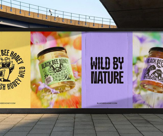
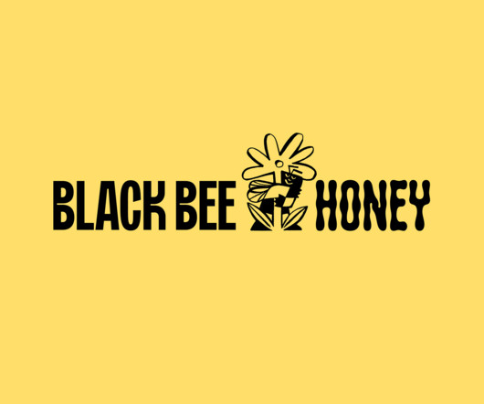
OMSE's charming new identity for Black Bee Honey is inspired by the flight of the bumblebee
Creative Boom
DECEMBER 19, 2023
A typeface inspired by the waggle dance of a bee and illustrations that help visualise the location and seasons behind each product – OMSE ends the year on a high with its new identity for a British honey brand that aims to "free the bee". Did you know that honey is the world's third most faked food product?


Let's personalize your content