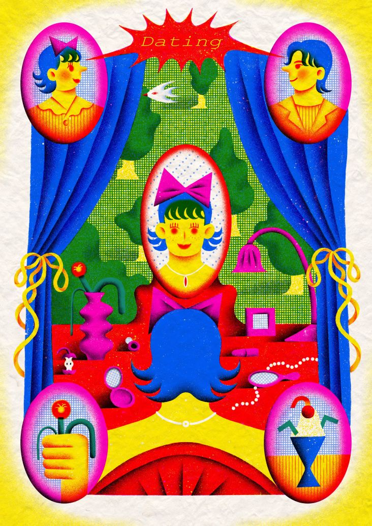
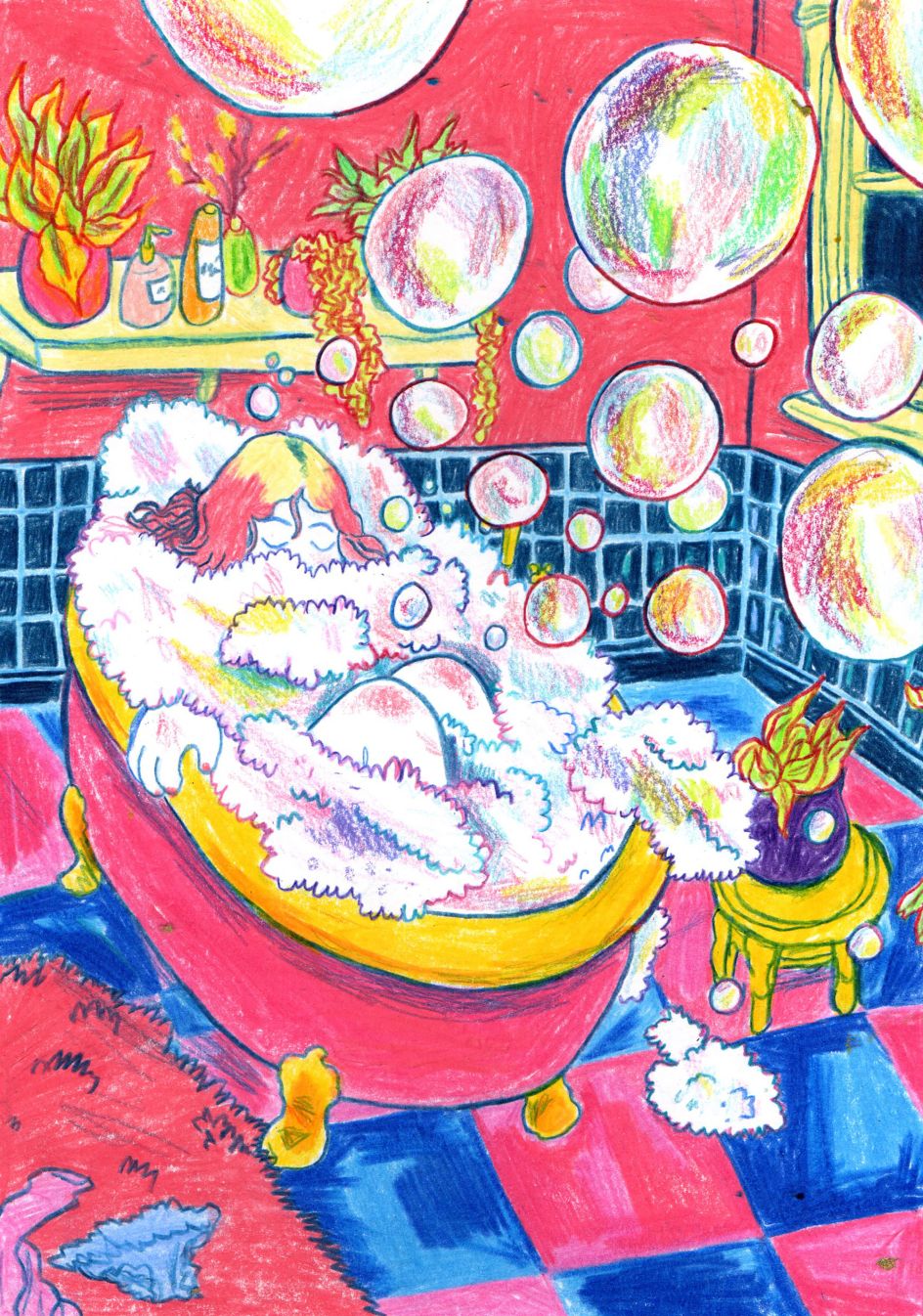
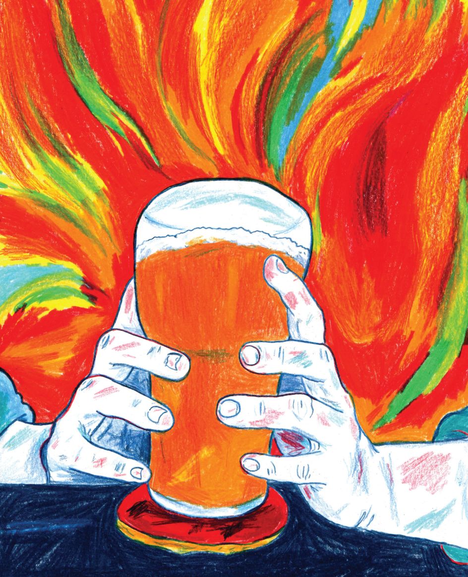
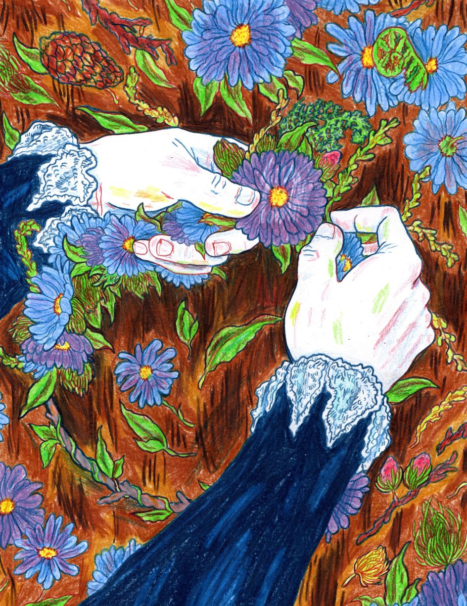
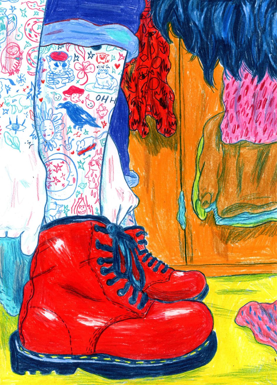
Hannah Lock draws hard with pencils and pastels to create vibrant, textured illustrations
The work of West Yorkshire-based illustrator Hannah Lock is hard to miss, thanks to its bold, in your face colours. But rather than layering up these tones digitally, she creates them the old fashioned way by pressing coloured pencils firmly onto the page.
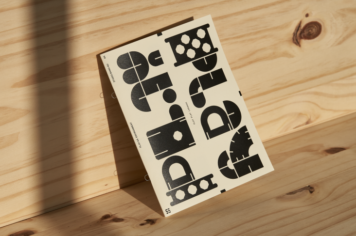
© Hannah Lock
As well as describing her artistic style as colourful, Hannah says that her illustrations sit "somewhere between semi-realistic, and not." And her mediums can be said to straddle different worlds, too. Despite not being adverse to digital illustration, she greatly enjoys working with something tangible like inks, coloured pencils and pastels.
"When I illustrated with ink, you can't really undo what you've done," Hannah tells Creative Boom. "But with the way I work, coloured pencils are more flexible.
"I mainly use Faber-Castell Polychromos pencils and Derwent Coloursoft pencils, and I gravitated towards the former due to the selection of bright colours. I don't tend to layer up colour or draw with coloured pencils quite gently. I press quite hard into the paper with the pencils and go for a solid line, which you can't do with some brands of coloured pencils. Lately, I’ve been adding a bit of oil pastel and crayon into a few of my colour pencil drawings to add more texture to them."
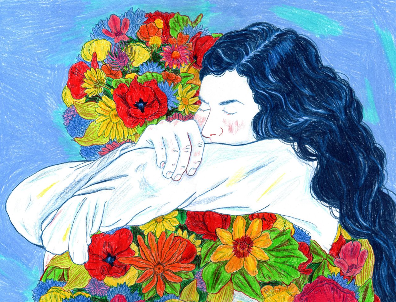
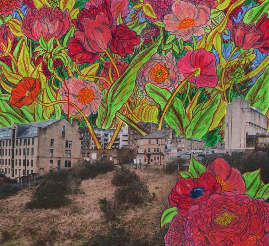
© Hannah Lock
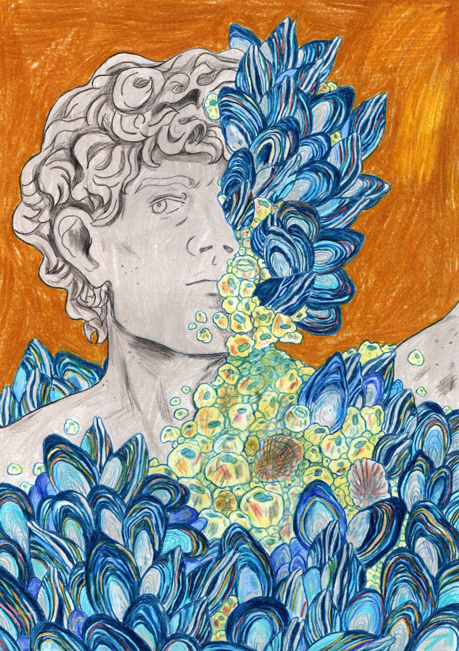
© Hannah Lock
Having honed her colourful approach at the Cambridge School of Art, Hannah has gone on to create illustrations for the likes of The New York Times, POLITICO, and Pellicle Magazine and scooping a commendation from the Stratford Literary Festival along the way. It's an already impressive career for an illustrator who's always known what she wanted to do.
"In high school, my art teacher just said, 'you should become an illustrator,' and I thought, 'Yes, I should become an illustrator'," she explains. "I haven't really deviated from that thought since apart from brief forays into writing and considering maybe I should study History or English instead."
Yet even as a constant drawer from a young age, it took a while for Hannah to realise that there was a precise, professional word for that job title. "I did a foundation year, after sixth form, and the idea of doing illustration at university and becoming an illustrator solidified."
Inspired by how other artists use colour, Hannah is fascinated with how David Hockney paints the "normally muted colours" of the Yorkshire landscape. According to her, he uses hues "in such a vibrant, visceral way [and] colours you wouldn't normally associate with it."
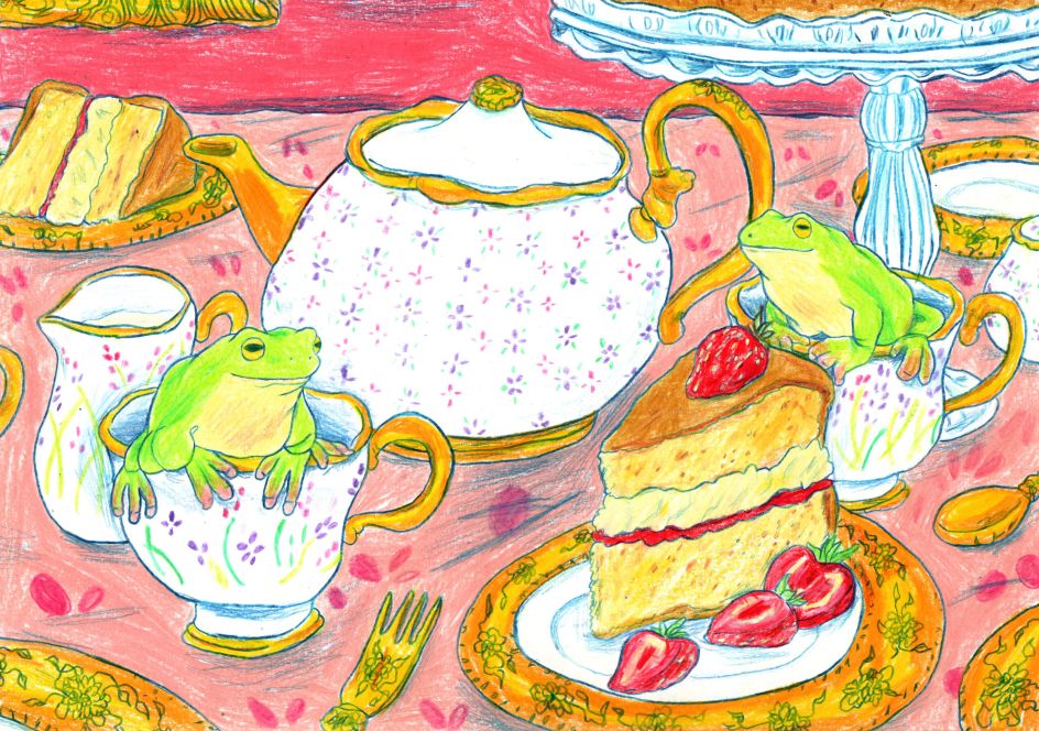
© Hannah Lock
© Hannah Lock
The children's picture books of Jiri Trnka also have a "soft, quiet vibrancy to them", which also appeals to Hannah, as does the fluidity of Jean Cocteau's pencil drawings, which became a big inspiration for her line work. Matisse's colours and pencil drawings also helped to inform her style.
However, one of Hannah's biggest artistic inspirations for paintings and illustrations is Moomin creator Tove Jansson. "I love her colour palettes, especially her murals and the original covers for the Moomin books. I also really like the work of illustrators Eveline Ness, Molly Mendoza, Matthew Forsythe and Stepan Zavrel. The list could be endless."
There's more to Hannah's inspiration than illustrators, though. "Artistic inspirations, for me, change daily," she says. "I have too many illustrators and artists I admire. I try to look within and beyond illustration for inspiration, as otherwise, I think you can become a bit burnt out by illustration."
© Hannah Lock
© Hannah Lock
When it comes to creating her illustrations, Hannah gathers all this myriad material, draws roughs in her sketchbook, and experiments with the odd collations of reference material. "I normally lay out a rough sketch with a light blue pencil, or I create a sketch with the colours I know I will be working with.
"I then tend to fill the outlines solidly and then work on layering the colour and the outline. I normally stick to Prussian blue for the outline and try to switch it up with different colours."
Hannah's eye for colour is unmistakable and unmissable, but how did she hone it? "One of the first things at university we did was a colour workshop with acrylic paints. I think that colour theory has also been permanently stamped in those students' heads since then, myself included," she reveals.
"I think it developed by looking at other illustrators' colour palettes and seeing what I liked. I remember seeing an interview with Eric Carle whilst I was at university. He talked about the painting Blue Horses and German Expressionism and realising that you could depict the world through colours other than those traditionally associated with the subject."
© Hannah Lock