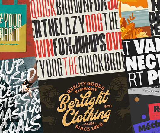
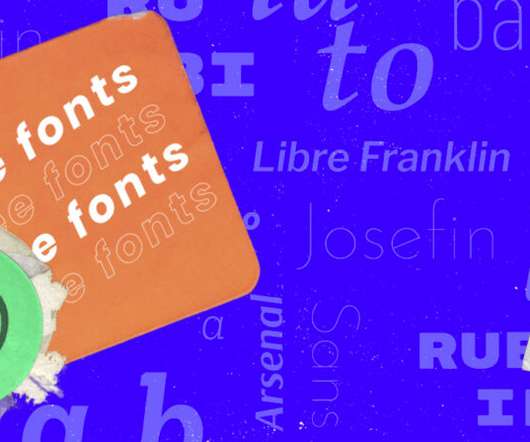
Neue Haas Grotesk | AisleOne #font #neue #helvetica #grotesk #haas #typography
Designspiration
JUNE 23, 2021
Neue Haas Grotesk | AisleOne #font #neue #helvetica #grotesk #haas #typography

 helvetica-neue
Designspiration
JUNE 23, 2021
Neue Haas Grotesk | AisleOne #font #neue #helvetica #grotesk #haas #typography
Creative Boom
NOVEMBER 16, 2023
The logo, headlines, and body copy all feature in Monotype's Neue Haas Unica , a revival of a sans-serif typeface by Team '77, released to great acclaim in 1980. In typical Modern Designers' fashion, the identity is clean and bold, with typography leading the way.
This site is protected by reCAPTCHA and the Google Privacy Policy and Terms of Service apply.
We And The Color
OCTOBER 12, 2023
Maison Neue Superfamily Maison Neue Superfamily by Milieu Grotesque The original Maison typeface family has undergone a remarkable transformation in the Maison Neue superfamily, designed by Timo Gaessner and published by Milieu Grotesque. Download at MyFonts 1.

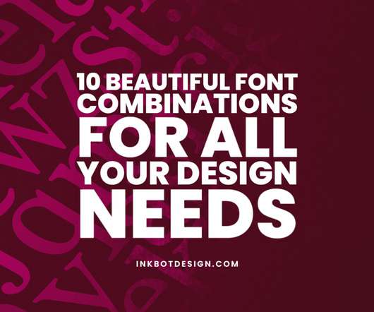
Inkbot Design
JANUARY 10, 2024
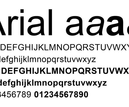
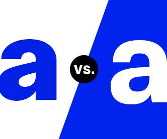
Arial Initially designed by Monotype in 1982 to offer Helvetica-style appeal more economically, this ubiquitous neo-grotesque sans serif font conveys professionalism and modernity. Helvetica Neue This seminal, globally recognised neo-grotesque face originated from the 1957 Helvetica release. What fonts do lawyers use?
Abduzeedo
DECEMBER 13, 2023
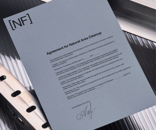
NobleForma: A Study in Minimalist Branding abduzeedo 1213—23 Discover NobleForma's branding and visual identity, a minimalist masterpiece by Tim Harrison, featuring Helvetica Neue and a distinct color palette. Helvetica Neue, known for its clarity and versatility, is employed with skillful restraint.
Spoon Graphics
MARCH 1, 2024
Greater Neue Condensed Greater Neue Condensed… Or ‘NOIER’ is if I was to pronounce it correctly… is a nice new industrial style condensed sans that’s right up my street. It’s another font that is currently on offer at 60% off. The Brucken has plenty to choose from!
Creative Boom
MARCH 8, 2023
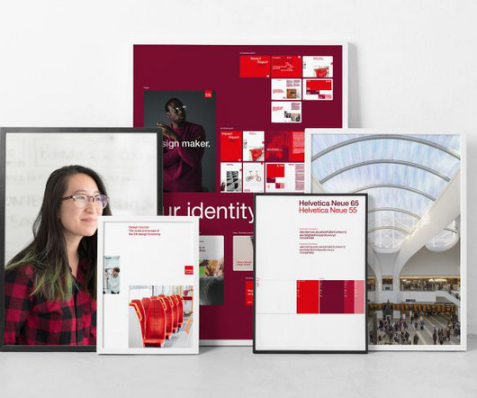
Helvetica Neue was selected for the signature typeface because serif fonts have been found to be harder for neurodiverse people to read. The recommendations led to several adjustments to the new guidelines, including: The addition of an off-white colour to use in digital applications, as white is the most energy-emitting colour.

Expert insights. Personalized for you.


Let's personalize your content