This article has been contributed by Natalka Antoniuk.
If you’ve got a knack for graphic design then I applaud you. I know it’s not easy. Creating visually appealing artwork that is designed to serve a purpose is harder than most people think. Balancing user experience with everything you know about art (and trying to please your client) is a skill in itself. But what happens when someone approaches you to design something slightly different?

Instead of another website, marketing brochure or poster, let’s say you get asked to design a billboard. Or a bus wrap. Or an exhibition stand. Would you approach this job in the same way as every other job or pass on it all together?
The thing is, graphic design is bundled into one set of skills. Clients approach you to create something without any idea of what is involved. And when it comes to large format print there is a whole lot more involved.
Even the most skilled graphic designer would be lost if they suddenly found themselves working on a large format graphic.
In this guide we will cover the basics of designing graphics for large format print, and even sneak in our top five tips to help you nail your project.
What Are Large Format Graphics?
On a typical day, a graphic designer will work on small projects such as websites, marketing literature, magazines and posters. Their aim is to get the balance between design, user experience and customer conversion just right.
Often the slightest changes, such as a font or colour, can significantly impact how an individual perceives a piece of artwork. So a graphic designer’s job is to create the perfect graphic to achieve the client’s overall objective.
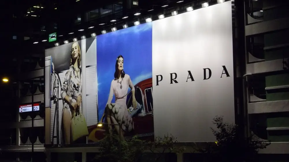
Large format graphics are completely different. They are big. Obviously. But I mean very big, often towering meters above passers-by. They are designed to be observed from a distance, meaning the design has to demand attention. The other thing about large format graphic design is that any mistakes that you make will be blindingly obvious once they are blown up to full size and displayed for the world to see.
Think about it. Large format graphics are things like:
- Bus advertisements
- Billboards
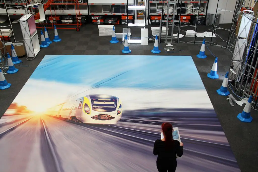
- Custom floors, ceilings and walls
- Trade show signage and exhibition stands
- Point of sale displays
If you don’t color match, spell check or align your imagery correctly, thousands of people are going to see it. It’s for this reason that a lot of designers choose to avoid large format print jobs. And that’s exactly why you shouldn’t.
Large graphics are becoming increasingly popular amongst business owners looking for new avenues of marketing and advertising. As summer comes around again, more and more people are outdoors and away from their screens. Digital campaigns take a back seat as businesses of all sizes fight over the most prolific outdoor advertising spaces.
Why shouldn’t you get a slice of this pie?
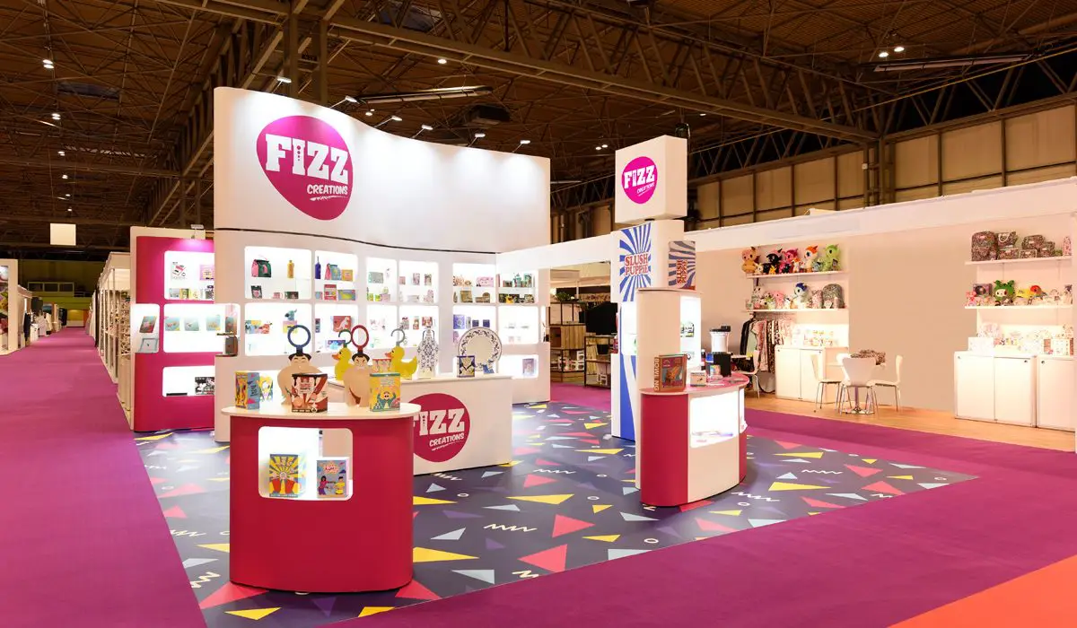
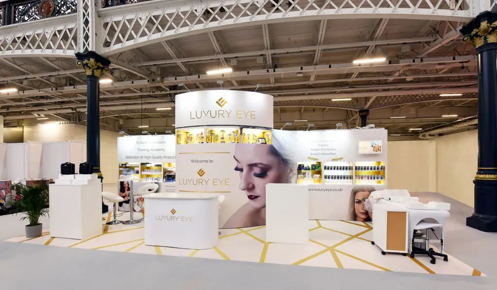
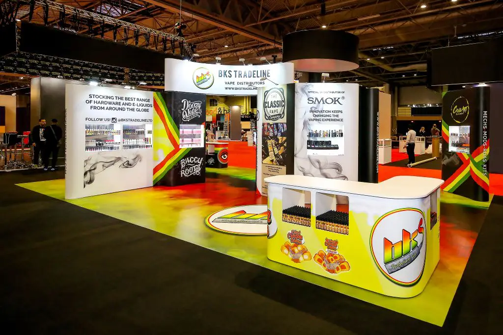
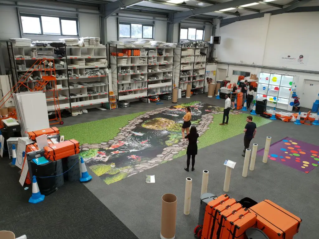
Leading exhibition stand designers, Quadrant2Design, have been designing large format graphics for exhibition stands for over twenty years. They’ve seen and done it all. From personalised printed flooring to fully branded pop-up environments, it’s safe to say they know a thing or two about large format graphic design.
Now they’re sharing their top tips to help you become more confident when it comes to large format graphic design. By the end of this guide you’ll be an expert.
5 Top Tips To Become A Large Format Graphic Designer
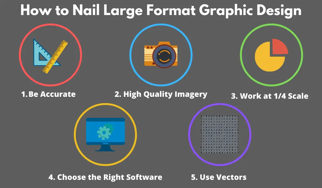
Image source: Quadrant2Design
By the end of this guide you’ll be able to take on bigger, better and bolder design projects. You are guaranteeing perfect, high-quality artwork every time. And who wouldn’t want to see their designs come to life on the side of a bus or in a busy exhibition hall?
Here are Quadrant2Design’s top tips to large format graphic design.
1. Be Accurate
This should come as a given. All graphic design work requires accuracy, and large format is no different. Except it is. If you are even a fraction of a millimetre off when you align your graphics, the misalignment will be a few centimetres when it’s printed. Accuracy really is essential when it comes to large format printing.
One of the best pieces of advice that anyone can give you is to make sure you are using the best alignment tools. Bear in mind that these probably aren’t the same ones that you use to create brochures or logos.
Smart Guides are the pitfall of large format graphic design. We all know how easy it is to automatically snap elements together, but when it comes to larger graphics this should be avoided at all costs. You can never be certain of which elements are snapping to which. That means working on large complex projects with several elements involved, can become a lottery.
Avoid the embarrassment of huge misalignments by:
- avoiding Smart Guides
- looking for more reliable alignment tools
- sticking to the coordinate system.
2. Use The Best Software For The Job
On that note, we need to talk about software. Hands up if the first programme you open when you sit down at your computer is Photoshop. We don’t blame you. It’s a great piece of software. We just don’t think it’s the best programme to use when designing large format graphics.
Photoshop isn’t the best programme for large format graphic designers because the software doesn’t automatically set up for print, making colour management and managing vectors a nightmare. Your project risks looking like a dog’s dinner. Furthermore, the file sizes are huge and take up far too much space on the server.
That doesn’t mean we don’t use it. We use a handful of programmes when it comes to designing exhibition stands. Photoshop is ideal for editing imagery, as it has unique tools that are unavailable on other platforms. We also use Illustrator regularly to create the more complex vectors in our artwork.
Related: Get 40-70% off Adobe Creative Cloud
There is nothing wrong with using different software to complete different tasks. Some are just better at certain things than others. It is your understanding of these programmes, as well as your own skill level, that will help you choose the right one.
When it comes to creating your final graphic, we highly recommend InDesign. This programme seamlessly integrates vector and raster imagery and uses RGB and CMYK colour modes alongside each other. It also sets the graphic up for print – one less thing for you to worry about.
3. Always Use Vector Graphics
As a professional graphic designer we’re sure you know the difference between vector and raster graphics, but just in case you’ve forgotten let’s refresh your memory.
Raster graphics are created using lots of pixels. This means that, once you have created your artwork at a certain size (using a certain number of pixels), you won’t be able to scale it up without losing image quality. File sizes for raster graphics can be extremely large, given that every pixel is storing information.
Vector graphics create designs using mathematical equations. These equations translate into points that are then connected with straight lines or curves. You end up with a number of vector paths, which come together to create your vector image.
Vector graphics are essential for large format graphic design. Firstly, they can be scaled to any size without losing image quality unlike raster graphics. Secondly, without hundreds of pixels to keep track of the file sizes remain small and won’t slow down your computer.
The final (and probably most important) reason that you should use vector graphics is to ensure smooth communication between your artwork and the printer. You should use vectors to create everything, from logos and icons to block colours and gradients. That way you guarantee a high-quality finish.
4. Start With High Quality Images
You’d be amazed at how many people ignore this tip. And that’s why, as a graphic designer, you’re probably rolling your eyes at this section. Unfortunately, we have to say it. Without high quality images, you can’t produce large format graphics. In fact, we feel so passionately about this tip that we’ve had to break it into three.
a. High-Resolution From The Outset
It doesn’t matter how many times we say it, people still send us images taken on their smartphone or lifted straight off their website. There is always going to be scaling when it comes to this type of artwork, which means that we can’t simply use the logo from your website when building your exhibition stand.
If you want to use photography on your large format graphic, it has to be of the highest possible quality. Using high-resolution imagery from the beginning will give you the best starting point.
b. Imagery Scaling
Repeat after me:
“I will never let InDesign scale my imagery.”
Now say it again.
We’ve already mentioned how much we love InDesign, but we never let it scale our imagery. Unfortunately, the software hasn’t achieved the scaling abilities of Photoshop yet. InDesign uses tools which reduce the effects of scaling. If you need to scale the original image up, then you should always do this in Photoshop.
Once you have imported your imagery into InDesign you will be able to see the actual dots per inch (DPI) of your graphic as well as the effective DPI of the final result. If the imagery has been scaled up then the effective DPI will drop, if the image is 100% in scale then the two numbers will be the same. This is an easy way to measure the overall quality of your graphic once it has been printed.
c. Output Resolution
What makes a large format graphic different from a standard format (other than its size)?. The way that people interact and engage with it.
If you design a website, you are designing something that a user will interact with from a matter of centimetres away. The same goes for a brochure, business card or other business graphics.
Large format graphics aren’t designed for an audience who is standing directly in front of them. In the exhibition industry, we design graphics for people to view from a distance of 1m or more.
The standard output resolution is 75 dots per inch (DPI).
That doesn’t mean that your project will have an output resolution of 75 DPI. Unless you are also designing an exhibition stand. You have to think about the graphic and how it is intended to be viewed and then choose the right resolution for you.
5. Work At ¼ Scale
How is your maths? Can you divide numbers by four (or at least input these calculations into a calculator)? Then you should be working at a ¼ scale. The graphics that you will be working on will be extremely large. There is absolutely no need to put yourself through the stress of working at full scale.
The file sizes will be huge, making them a nightmare to store and share. And your accuracy will go out the window.
Working to a ¼ scale makes the whole process much easier. The file size is much smaller. You can easily share your graphics. Making it easy to pass it around your team for proofing and back-and-forth between your clients for any edits. The benefits of working to this scale far outweigh the negatives! Keep an eye on these three things to make sure nothing goes wrong:
- Be mindful of human error. It happens to the best of us but it can easily be avoided by double-checking your calculations and having a second person proof your work. Remember, large format printing is expensive. Any error on your part is going to cost you a significant amount.
- You also want to avoid any communication error with your printer. Large format printers run powerful software. They are designed to take your artwork and scale it up. All you have to do is give them the right scale to work with.
- Finally, double check your large graphic in its final size. You can do this by exporting the artwork as a PDF and then zooming in by 400%. This can take a little bit of time given the size of computer monitors, but it’s worth doing – especially if you catch an error.
Summary (and our final piece of advice)
By now you know our secrets to creating glorious exhibition stands. In fact, we’re confident that you could go out and design your own large format graphics without any errors whatsoever.
Remember the five tips to large format graphic design:
- 100% accuracy
- Choose the right software
- Use vector graphics
- High quality imagery
- Work to ¼ scale
And you’ll be creating billboards, custom floors and bus wraps in no time. If you are going to take anything away from the guide, make it this…
Large format graphics are expensive. Not only do they require a high level of skill and patients to design, but the printers and materials cost a lot of money. Mistakes will be expensive.
Do whatever it takes to avoid them. Ideally, have your designs looked over by at least three other designers before you send them to the printer. We can tell you nightmarish stories of exhibition stands that have gone wrong due to a lack of scrutiny. This really is the most important aspect of large format graphic design.
_
About the author: Natalka is an exhibition blogger for Quadrant2Design who uses her industry expertise to teach business owners the benefits of the trade show floor. She has developed a unique insight into the world of exhibiting, having spent time working alongside exhibitors, event organisers and exhibition stand contractors.


Thank you for the article. It is a great nuts and bolts rundown of what large format production requires. As a trade show graphic designer I would love to send this to all my clients.
I would recommend Illustrator instead of InDesign. InDesign will work, but, some of the publishing features get in the way. I feel Illustrator is a little more streamline.
Accuracy and resolution are a must. I do not know how many times I have seen bad knockouts and poor artificially blown up images. They look great on a website but terrible enlarged to life size.
One other tip, limit the copy. No one wants to read The Great American Novel on a lager format graphic. Be concise.
Fantastic job.