Remove founders-grotesk
article thumbnail

Monotype partners with Sharp Type to add 27 font families to library

Creative Boom

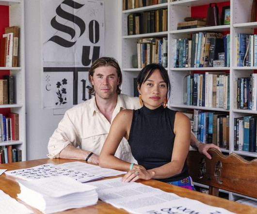
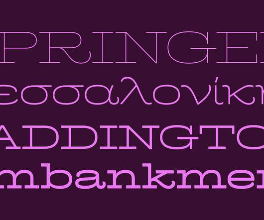
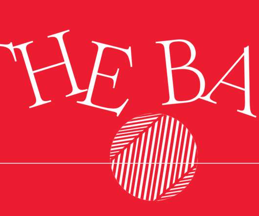
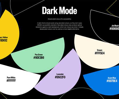
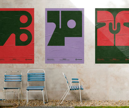
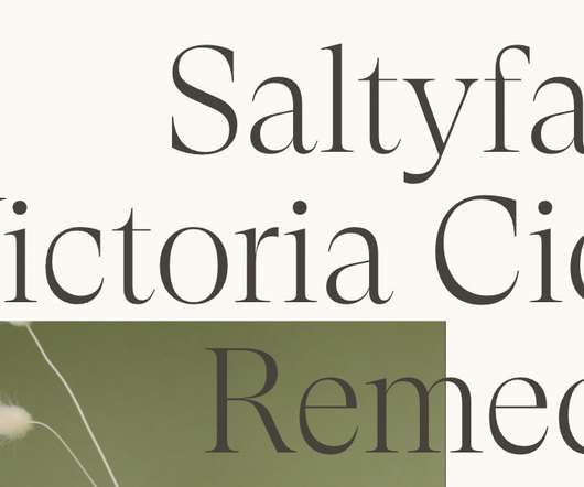
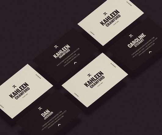
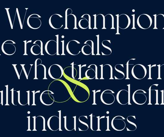
Founders Lucas Sharp and Chantra Malee Exclusive to Creative Boom: Boutique digital type foundry at the vanguard of contemporary typeface culture and design finalises asset sale today. The collection includes superfamilies such as Sharp Sans, Sharp Grotesk Global, and Beatrice.

Fonts 412
article thumbnail

YumBun’s 'optimistic' new look features a 'bunrise' and a mascot called Bowie

Creative Boom

The studio started working with YumBun founder and CEO Lisa Meyer on the project in November last year. How&How co-founder and Creative Director Cat How designed the original Yum Bun logo when the brand launched 15 years ago. "It The custom Yum Bun word mark is based on the font Ogre Mono Grotesk by Brazil-based Leme Studio.

Brand 455
Insiders

Sign Up for our Newsletter

This site is protected by reCAPTCHA and the Google Privacy Policy and Terms of Service apply.

Trending Sources

article thumbnail

elevenfiftyfive turns 15 and receives collage-like rebrand from Studio Moross

Creative Boom

Used throughout is PFA Typefaces' Haben Grotesk – in both the logo and across the typography – lending its beautiful inky-bleedy/sharp graphic edges to the work and mirroring nicely with other moments throughout the identity.

article thumbnail

Without's rebrand ditches the marketing BS and finds the soul in luxury villas

Creative Boom

Uncovering the real stories – from the founders renting diving gear to clear rubbish from the sea to the family history at a villa like Don Arcangelo all'Olmo – inspired a language that's more emotional, specific and immersed than the rest of their category. Typography was inspired by The Thinking Traveller's connection to the Mediterranean.

Marketing 298
article thumbnail

Kinoto Studio on living a design double life, launching in a pandemic, and staying versatile

Creative Boom

Romi Rios and Lucho Geoffroy, co-founders of Argentinian studio Kinoto, discuss their journey to agency success and why they never get bored. The logo was built from a serif font and the text from a Grotesk, living together in an organic way in the different layouts. Like the idea of striking out solo and founding your own agency?

Agency 303
article thumbnail

Matt Willey gives the Paris Review a minimalist makeover

Creative Review

Klim Type’s Founders Grotesk sans serif now sits on the cover, while body copy is set in the foundry’s Heldane Text. This latest redesign adopts a far more minimal approach than its previous incarnation, replacing the magazine’s former serif masthead and side strip. theparisreview.org ; mattwilley.co.uk.

Magazine 119
article thumbnail

London’s Olympia complex unveils architecturally inspired branding

Creative Review

The primary typeface is Right Grotesk by Montreal-based foundry Pangram Pangram, and appears in various styles and weights as a nod to the venue’s vintage exhibition posters. Meanwhile the letter ‘O’ has inspired a ring-shaped motif that appears across accompanying visuals. someoneinlondon.com.