Stewart Scott-Curran wears more than one hat—he’s an art director, graphic designer, and illustrator. Currently he’s he art director at CNN digital, and he hosts Creative Mornings in San Francisco, where creatives of all walks of life share their experiences with a group of like-minded individuals looking for inspiration and the motivation to take the next step in their careers.
Curran values his deep connection to the creative community and how important that is to the development of designers, writers, and artists, which is why he facilitates Creative Mornings. He also regularly speaks at creative conferences, and here on CreativeLive, he is teaching a class on drawing in Illustrator.
Here, he talks to us about the Sprite campaign he developed while he was an in-house design manager at Coca-Cola in Atlanta.
Why did Sprite want an additional logo, when the one they’ve been using for years is so well recognized on its own?
They wanted to re-imagine the entire look and feel for Sprite to appeal more to teenagers. There are two distinct consumers for Sprite:
1. Parents who buy multipacks and large bottles from the grocery store who are attracted by the no-caffeine, no coloring attributes of the soda. They perceive Sprite to be “less bad for you” than other sodas.
2. Teenagers who generally buy individual servings at vending machines. They are attracted by the high carbonation and clean, refreshing taste.
As teens are not necessarily interested in buying into the perceived health benefits of Sprite, we had an opportunity to rethink how we spoke to them through a cultural lens that they understand and are attracted to.
We were required to build out an entirely new visual identity system that delivered a point of view on color, typography, photography, branding, illustration, and possible executions at point of sale and on signs and billboards.
What kinds of visual cues did you use to activate this teen market?
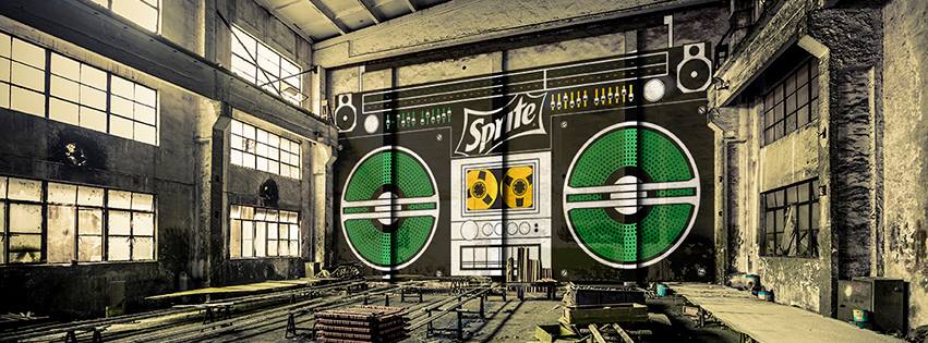
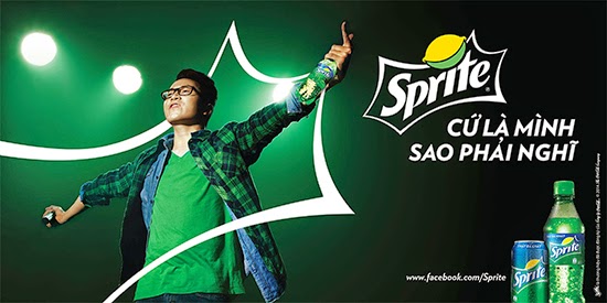
We used imagery and illustration that invoked the feeling of intense refreshment via art, music, dance, and especially sport.
You’ll notice this simplified logo in use on cling wraps on vending machines and at local events at basketball courts and skateparks. It’s also featured at larger events such as the slam-dunk competition at the NBA All Star Game.
How many concepts did you present to the creative team?
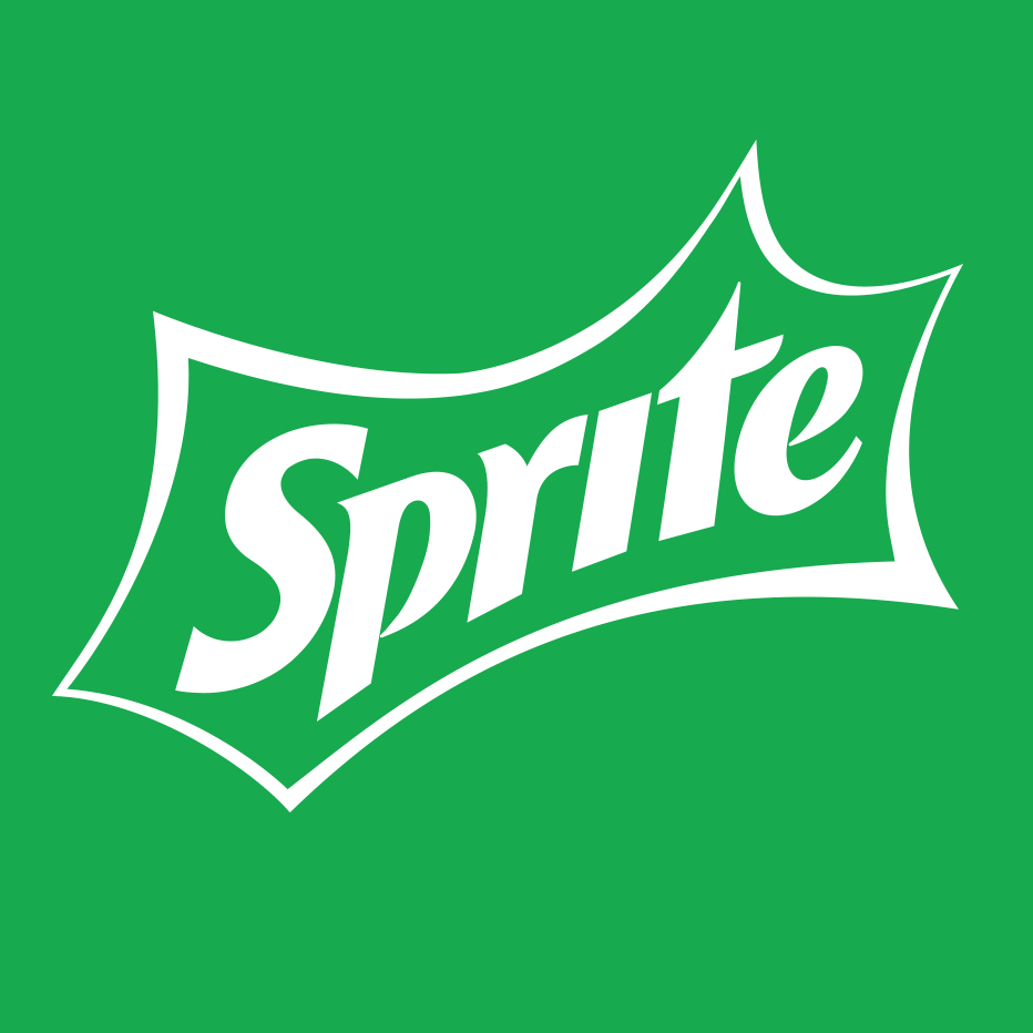
In this case, just one! We did play with some color options and adding a shadow or keyline, but we were pretty confident that the stripped down logo was the way to go in this case. We wanted to enhance the iconic nature of the brand mark.
Why the enclosure around the word Sprite?
This is called the “spark.” It’s a visual interpretation of “intense refreshment.” It actually carries a lot of brand recognition and although it can be tricky to use and balance visually, it’s instantly recognizable.