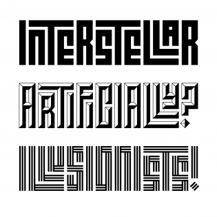
If typography is writing with preformed and reusable letters (or, to put it more conceptually, with the instructions for making those letters) that can be combined and recombined into arbitrary texts, then there is no aspect of typography that hasn’t been challenged, undermined, or expanded by digital type. In this context, much has been made — and rightly so — of the significance of the OpenType Variable format, but Shiva Nallaperumal’s Calcula shows us how fluid the lines between digital typography and other forms of writing were even before OTVar came about.
Calcula was Shiva’s MFA thesis project at MICA under the supervision of Tal Leming. It’s a Latin typeface that uses the forms and structure of Kufic Arabic scripts — specifically, the square, geometric, or Banna’i (“builder’s”) variant of Kufic that Islamic architects, beginning in Syria and Iraq around the eighth century CE, used to brick or tile the surfaces of their buildings with decorative texts.1 Calcula embodies the two most notable features of architectural Kufic: the regularization and integration of its intra- and intercharacter white space, and the geometric modularity of its letterforms. Together these features allow characters to expand into one another’s spaces, interlocking them and their lines of text to continuously cover the surfaces to which they are applied, creating a labyrinthine effect.
Emin Barin, a Turkish calligrapher who applied architectural Kufic forms to Latin scripts, was a particular influence for Shiva. Barin’s work convinced him of the potential for a Latin font that combined the regularity and arbitrary repeatability of typographic writing with the specificity and adaptability of Kufic lettering. As he notes in the essay he wrote to accompany Calcula’s release, Shiva, along with his adviser Leming, reviewed existing typefaces that also blur the distinction between type and lettering. Such typefaces use glyph substitution and ligature features to vary combinations of alternate forms of their letters (here, he mentions Typotheque’s Delvard Gradient, Julien, and Irma — in particular, Irma’s randomized highlighted stylistic set) in order to create fluid and adaptive script forms (see Underware’s Liza and House Industries’ Studio Lettering) and interlocking letters (see Photo-Lettering’s Swiss Interlock and House’s Ed Interlock).
Shiva used the structural possibilities of a 5×5 grid to create multiple alternate versions of his glyphs, and he systematically charted — and, with Leming’s help, coded — the various ligatures needed to combine and interlock them within the constraints of that matrix. (Unsurprisingly, of the nearly 7,000 glyphs in the font, far and away most of them are ligatures.) This approach represents another way of thinking about parametric type design: not adding outlines to conventional skeletons in controlled ways (à la Prototypo or LetterModeller), but working out the permutations of a geometrically constrained design space according to strict rules that generate pattern and rhythm out of the balance of positive and negative space. It was obviously necessary to add punctuation and symbols to Calcula for a commercial release, but to me the samples and specimens on Typotheque’s site suggest they’ll see little use, because of how compelling those patterns and rhythms are without them. (Modulating the design space to accommodate punctuation and symbols in the same interlocking way as the letters would have increased the number of glyphs exponentially, but it’s still interesting to think about what the result would have looked like.)
At Peter Biľak’s suggestion, Shiva enlisted Frederik Berlaen’s expertise to generate a series of textural variations on the original solid version of Calcula. These are appealing on their own and wonderfully complex in layers with one another. Even in its simplest version, Calcula urges readers to slow down and look closely, as Shiva says. The proper test of a display design like this is whether it rewards the user’s attention and patience, and Calcula passes that test easily. Moreover, it captures the formal logic of its source materials without committing itself only to applications with their cultural affiliations.
The name “Calcula” echoes Shiva’s combinatorial exploration of the design space, and it also recalls the enormous debt that mathematics owes to the Arabic and Islamic cultures that provided Calcula’s formal inspiration. I hope to start seeing it soon in applications as thoughtful as its designer — designers, he might perhaps correct me — was, or were, in creating it.
PS: Let me take this opportunity to plead with Shiva and David Jonathan Ross never to join forces. If they ever found a way to work it out, a mashup of Calcula and Fit could paralyze the type and design communities.
Note
- Examples of tiled architectural Kufic are everywhere online; interested readers will find on Square Kufic a useful demonstration of a few different ways in which the script is applied. Shakil Akram Khan is a contemporary artist living in Toronto who experiments with geometric Kufic tessellation. Gülru Necipoglu’s The Topkapı scroll: Geometry and ornament in Islamic architecture might be the most definitive English text on the subject.⤴


