Become the designer you know you can be – learn the Fundamentals of Graphic Design from an industry-leading expert.
Timothy Samara is a New York-based graphic designer and educator. He has taught design at the college level for nearly 15 years.
As the author of eight graphic design books, his academic reach spans the globe.
All of his books have a common thread—they address the fundamentals of graphic design. “The fundamentals always surface for consideration, no matter how advanced the student or complex the project,” he says. Here he discusses the importance of understanding the core elements of graphic design.
What are the basic fundamentals of graphic design?
The fundamentals of graphic design are about seeing (and understanding) how the qualities of visual material—shapes, images, color theory, typography, and layout—work, and work together… and then being able to decide which qualities of each are relevant and engaging and useful for visualizing a particular idea or solving a certain problem.
What is the most common question you hear from design students?
“What typeface should I use for this (project)?” And my answer is usually one of three: a) That’s the least of your worries at the moment; b) The one(s) that make the most sense for what you’re trying to accomplish; c) Pick one and see what happens. Then pick another and compare them.

Do you think anyone can become a graphic designer with the right tools/skills, or do you think people are born to be designers?
Absolutely anyone, with the right tools and skills, can become a graphic designer. I used to believe that only people who were born visually creative could become designers, but there are so many other kinds of creativity that lend themselves to the job, that I find it’s more of a mindset that’s important; the visual skills can be learned.
What is a recent project that you’ve done that really put your skills to the test and why?
This answer is sort of a cop-out: Every project always puts my skills to the test. Every project brings different requirements and limitations, so there’s no way to lean on a formula or directly apply a previous visual idea to something new. Even simple projects, like a business card or an image ad with a single piece of type, are situations where you’re starting from scratch. I guess some projects evolve more quickly or with fewer challenges, but there’s always something new about each that you have to confront in a different way.
You can only really break the rules and get away with it once you’ve mastered the rule, so what is your favorite rule to break?
Presuming I’ve actually mastered “the rules,” I’d have to say there isn’t one that’s a favorite to break: I always like breaking rules, if there’s a good reason to do so—especially when they stand in the way of achieving what I need to in a given project.

The images in this post are also examples of graphic design fundamentals. Here’s a little more information on each:
1.) Via Sci-Fi Channel Limited Edition DVD Library
One of a series of covers for DVDs that form a boxed-set library of essential science-fiction films. The series is broken down into five sets, each of which focuses on a particular subject area within the genre; this cover is from the second series, “We Are Not Alone”, whose films all deal with extra-terrestrial encounters.
A specific linear “icon” language was developed for each of the sets; for this one, different configurations of concentric ellipses visualize each of the respective film’s central subjects—for “Close Encounters” the ellipses form a hovering spacecraft from the film’s final sequence; for another, “Alien,” the ellipses form the shape of that narrative’s infamous egg.
The fundamental design issue here is image language—defining a visual form that communicates something specific, without having to show a film still—and using a particular kind of drawing—lines—to unify the images across the series. Color coding plays a role in distinguishing each set, based on an analogous color scheme, with the branding’s universal yellow for continuity. Typefaces were chosen for their contrasting geometric and soft edges, as all as their “technological” qualities.
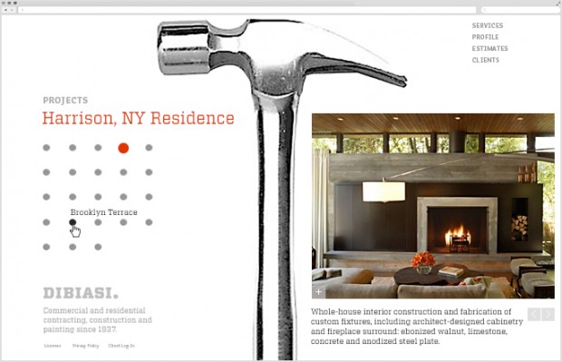
2.) DiBiasi Construction Website
The site functions as an online brochure for a family-owned construction firm, showcasing projects and providing basic company information. The choices of bold iconography and photographic image elements, together with a strong layout grid, geometric visual elements and an industrial, slab-serif typeface all allude to the precision of the company’s work, nations of architectural detail and tools, and the family’s heritage—in a nod to Italian International Style modernism.
Global navigation was minimized at top right to provide maximum area for content; the content area is divided roughly in half to provide a place for sub-navigation within a specific content area to the left, and selected, in-depth content to the right. The grid is structured to support this left-right configuration throughout, but allows for flexibility when content demands a slightly different solution.
3.) Spring of Freedom, Summer of Fear
This poster promotes the opening of a theatrical drama that takes place in Tehran, Iran around the time of the 1979 Islamic Revolution—which happened to coincide with the fall of the Persian New Year, Nowruz. One of the chief symbols of that holiday is the hyacinth, a symbol of renewal and fertility associated with Spring.
The symbolic flower is represented as a cluster of grenades, suggesting the dualities of celebration and fear, life and death. Rendering the flower in a reductive, iconographic form gave it an engaging, contemporary, and decorative quality and, further, cast it in a pattern form typical of Iranian ceramic decoration.
The fundamental design issues here are those of symbolic representation, image manipulation and style as vehicles for specific messages; the color language is borrowed directly from Iranian ceramic work and so is culturally relevant.
While the informational typography is set in a serif to add delicacy and detail, the poster’s titling manipulates a bold, organic sans serif typeface that reflects the script-like drawing of Arabic writing (further enhanced by added diacritical marks characteristic of that language) and visually corresponds to the image elements’ varied linearity and mass.
Think you might want to be a graphic designer? Are you a graphic who’s looking for fresh inspiration? Learn the Fundamentals of Graphic Design from Timothy Samara and make stuff that inspires you.
[subscribe2download link=’http://blog.creativelive.com/wp-content/uploads/2015/06/Freelancing-Guide-eBook-PDF.pdf’ title=’Enter Your Email to
Download the Free 24 Page eBook’ source=’freelance-ebook’ type=’Download’ channel=’Art & Design’]
< >
>
[/subscribe2download]


