The KLM House Mark – Logo Construction Grid Designed by FHK Henrion, 1961
Interesting for me as a logo designer to see a reference to KLM House Mark (FHK Henrion), rather than KLM Logo Mark or KLM Brand Mark, or of course, KLM Logo Design.
The House Mark term really adds a sense of prestigiousness to an otherwise saturated use of the Logo Design term.
Can’t help but now feel that the Logo Design term is really rather worn out, and a reassessment of terminology would be refreshing.
There are other terms that I’ve seen, like Signature Mark, that encompassed and expressed a brands sense of class and uniqueness, far more than Logo Design could ever achieve.
Might look to refer to myself now as a House Mark Designer, or Signature Mark Artist, etc. Not.
Just want to make it quite clear here: FHK Henrion is one of my all-time graphic design hero’s.
“His work always moves along the shortest distance between two points. No dodging about. No waste. No cautious detours in the name of good taste.”
https://www.uniteditions.com/blogs/news/book-of-the-month-fhk-henrion-logos
The KLM House Mark
Logo terminology aside, the KLM House Mark construction grid is certainly a joy to come across; being able to see how it was constructed with a keen eye, pen and paper, by a particularly talented individual.
The fact that it’s unchanged since 1961, is testament to FHK Henrion’s talent.
Utterly timeless…
Vintage Logo Grids Recreated
The KLM House Mark is certainly one that I’ve set my sights on recreating, such as I have for a few other famous vintage logo design construction grids that you can also download, like:
VW Logo, Tokyo Olympics Logo, Argentina World Cup Logo, 1976 Montreal Olympic Logo Grid, SwissAir Logo Grid
Link Credits
Found some of the KLM House Mark grids via a few Twitter posts by Nick Job & Logomark.
Also Shaugh Nessy chipped in with a link to a nice post on Unit Editions, covering FK Henrion’s other logo designs: https://www.uniteditions.com in a booked called: FHK Henrion: The Complete Designer, which seems to now be unavailable.
FHK Henrion: The Complete Designer
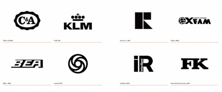
FHK Henrion’s best symbols, logos and logotypes are distinguished by their simplicity and directness.
He stripped them of extraneous detail, and as Ken Garland has noted:
“His work always moves along the shortest distance between two points. No dodging about. No waste. No cautious detours in the name of good taste.”
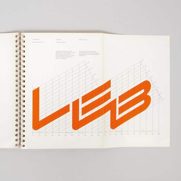
Amongst the best logotypes and symbols designed by Henrion were for Tate & Lyle, Blue Circle and LEB (London Electricity Board):
https://www.uniteditions.com/blogs/news/book-of-the-month-fhk-henrion-logos
About Frederick Henri Kay Henrion (1914–1990).
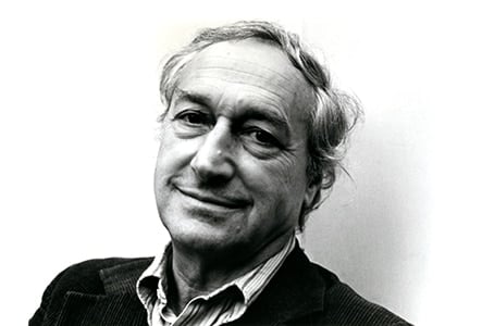
Frederick Henri Kay Henrion (born Heinrich Fritz Kohn, Nuremberg, Germany) (1914–1990), was a German graphic designer. A celebrated poster and exhibition designer, Henrion was also the founding father of modern European corporate identity.
https://en.wikipedia.org/wiki/Henri_Kay_Henrion