University Press Cover Round-Up

We welcome you to another in our ongoing feature in which notable book cover designer Jordan Wannemacher periodically highlights a selection of recent university press cover designs. Please enjoy this celebration of amazing work.
This list is in no particular order. Credits are listed below.
If you are a book cover creative and want your work or the work of your department reviewed by Jordan be sure to get in touch with us!
As with any cover design we feature in our publications, we encourage you to head to your local library and/or bookstore to view the work in its full splendor when possible.

University of California Press
Designer/Illustrator: Glynnis Koike
Art Director: Lia Tjandra
These colors are so lovely and vibrant and work together so well to mirror the same colorful varieties that tea comes in. I love how the negative space was used for the obvious image of a tea bag and the subtle simple type treatment lets these colors shine.

Princeton University Press
Designer: Amanda Weiss
Art Director: Maria Lindenfeldar
This photograph is a STUNNER! I love the way its dramatically lit, the perfect glitter on her dress vibrating off the champagne glass, those bright red nails. This perfect photo choice makes such a perfect statement for this cover. The gold outline of the sharp terminal sans serif is the perfect touch to round out this glamorous cover.

University of Virginia Press
Designer: Derek Thornton
Art Director: Cecilia Sorochin
I am truly a sucker for a collaged cover. It takes a true mastery of balance and composition to pull it off without making it appear busy or crowded and Derek did a fine job of this. The same can be said for pulling off a cover with this many different typefaces, and again, they all work seamlessly together. I love the unexpected robin's egg blue background as well.

University of Texas Press
Designer: Amanda Weiss
Art Director: Dustin Kilgore
Full disclosure: I usually pick my favorites from the month BEFORE I confirm the design and art direction credits, and while I do try to pick from different presses, it is always a total coincidence when I pick two covers from the same designer. I would argue that Amanda's bold, colorful approach to cover design makes it not a coincidence that I am drawn to her designs over and over. This cover is seemingly very simple, but the smart intertwining of its elements are what make it really pop.

University of Washington Press
Designer: Will Brown
Art Director: Katrina Noble
SWOON! This simple geometric cover is perfect in its minimalism of shape and color. It perfectly represents its subject matter while using a total economy of line and shape, stripping everything down to just the basic elements. Just lovely.

John Hopkins University Press
Designer: Michel Vrana
Art Director: Martha Sewall
I can't tell what I'm more in love with, the cover design or the content of this book! Michel has some of the most interesting type-based designs in the UP world these days. Michel, what are your secrets for finding so many interesting and unique typefaces and combining them so perfectly?! The complementary color palette combined with great textural elements really sets the stage for this charming design.

University of Pittsburgh Press
Designer: Melissa Dias Mandoly
I've said it before, but I absolutely love poetry covers. UPitt has a reputation for having not only a great poetry list, but notably beautiful designs to cover them. This art reminds me of a lava lamp and I mean that with the highest compliment. Lava lamps set a mood, and that's the most important function of a great poetry cover. The type is simple and subdued and lets the atmosphere of the purple and green abstractions hold your attention, strongly contrasted against the deep background. Stunning!
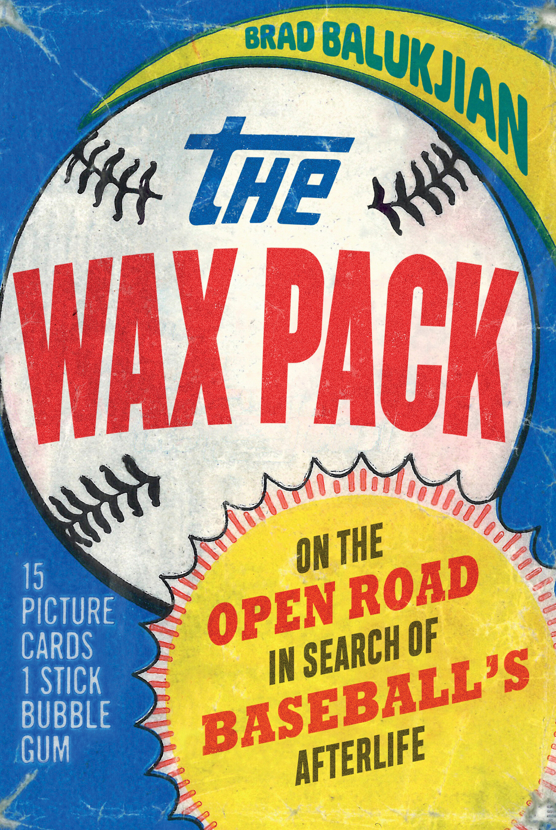
University of Nebraska Press
Design: Andrea Shahan
Art Director: Brad Balukjian
This cover inspires so much nostalgia, which I ascribe as its most winning factor. It's a perfectly executed homage to its subject matter. I really feel like I'm drawn to these nostalgic designs this month! The team at Nebraska Press mentioned to me that the printed cover had some great production effects to mimic the real wax packs which I would love to see! It makes me all the more excited to get out to my local bookstores when they reopen to see some of these in person.
Jordan Wannemacher is a book designer based in the NYC area. She was born and art school educated in the Southeast at the Savannah College of Art and Design where she focused on graphic design and creative writing. Currently, she is running Studio Jordan Wannemacher, a boutique book design studio based out of her home in Montclair, New Jersey.