
The Clearing helps Marcus Rashford call Full Time on food poverty
The footballer’s new campaign comprises 52 easy to make recipes and has been designed to “stop hunger in its tracks”.
London-based design studio The Clearing has created the branding for footballer Marcus Rashford and chef Tom Kerridge’s new initiative to end food poverty in the UK.
The Clearing has created the the branding for Full Time, which includes the visual identity, naming and strategy.
Rashford and Kerridge have teamed up to create a series of 52 easy to make meals, one for each week of the year. The Clearing has also designed meal cards and visuals for an accompanying series of Instagram tutorial videos.
“This project is for every child and I really hope parents and carers will benefit from having a bit of valuable time together in the kitchen when family activity is heavily restricted by financial restraints,” Rashford says.
Rashford has been vocal about these issues before, last summer prompting a government U-turn over its decision to end voucher schemes for school children during the holidays. Around four million children live in poverty in the UK.
Full Time has been launched in response to the government’s Healthy Start voucher scheme, which provides help for women with young children to buy basic foods.
“Football has incredible cut through”

The Clearing founder Richard Buchanan says that while the campaign deals with serious issues, the positioning needed to be “ultimately positive”. “It’s not that moment on The X Factor where violins come out and we start hearing someone’s life story,” he adds.
When the design team was initially briefed, the concept was around a ‘cookery school’ but Buchanan says that this was the “language of the middle classes”.

Instead the focus had to be on sport as a way to reach a more youthful audience, according to Buchanan. “Football has incredible cut through,” he says. “And we knew Marcus and Tom had to be on it as Marcus is the thing that will cut through here.”
As well as children, the campaign had to connect with parents and carers, explains Buchanan. One the main points of contact will be at supermarkets which meant that the brand had to be “something to take notice of”, he says.
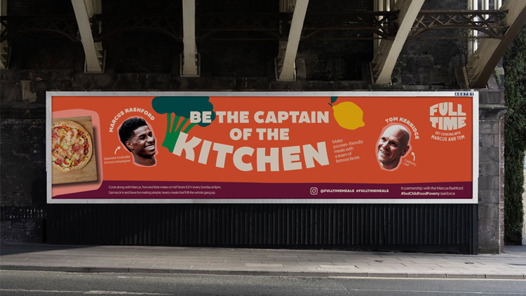
Buchanan adds that the branding had to “connect in an informal way”, channelling Kerridge’s conversational tone of voice.
In an effort to achieve this, The Clearing avoided any health-related vocabulary. “Menu cards that are about healthy eating are normally patronising,” he says. “They’re like instruction manuals for food.”
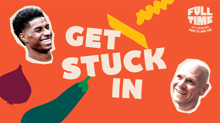
The studio has set guidelines for language, with phrases like ‘Get stuck in’ and ‘It’s time to fill up’. “We didn’t want it to feel like it was designed by the NHS,” Buchanan says.
The name balances food, the campaign’s purpose and Rashford’s sporting background. “Full Time is what we’re trying to deliver here,” Buchanan says.
Building a brand with “energy and enthusiasm”
“We wanted to build a brand that is full of fun, bursting with energy and enthusiasm and has simplicity at its heart,” says The Clearing designer Martin Willitts. He adds that it had to appeal to children and also “entice parents into getting their kids involved”.
The mouth-shaped wordmark is inspired by the concept of “big smiles”, Willitts says. An animated version depicts a slurping tongue. “It also represents our campaign aim to stop hunger in its tracks by creating simple, hearty meals that’ll make you feel full.”

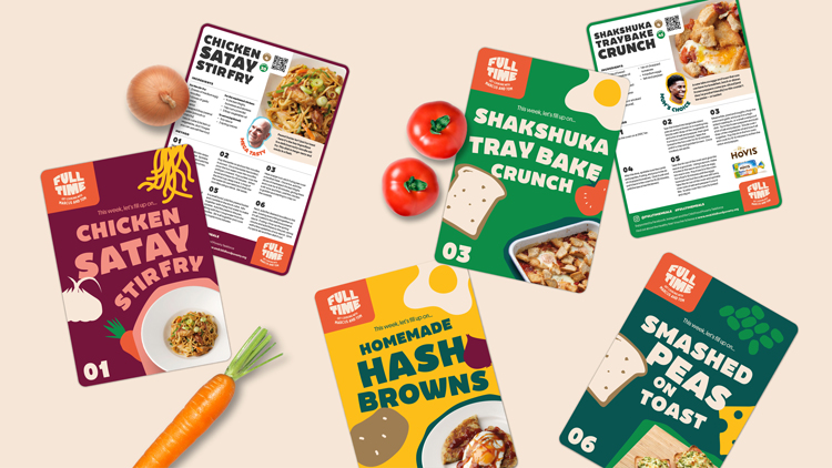
The Clearing has created a toolkit of illustrations in an attempt to create a “scrapbook style” for the identity. “We needed a design asset that would complement our food photography and help bring our ingredients to life,” Willitts adds.
A new recipe will be released every week, and the studio has designed cards for each of these. Examples include Shakshuka Tray Bake Crunch and Smashed Peas on Toast.
Together with the ingredients-inspired colour palette, this “cut-out illustration style” aims to be “instantly recognisable and engage people of all ages”, the designer says.
“Joy and charm”
The key factor in choosing the typography was legibility and accessibility, according to the designer. Becky Extra Bold has been chosen for the headline copy while Platform is used for body copy.
“We needed headline and body fonts that were accessible for both children and parents, yet still have the personality, joy and charm in its characters to match the ethos of the brand,” Willitts adds.
These visuals will be incorporated into cook-along videos which will be released every Sunday on the Full Time Instagram account. The first in the series will show Kerridge teaching Rashford how to cook while subsequent episodes will feature celebrity guests and families.
The campaign will roll out on 25 April. Recipe cards will be available from participating supermarkets and on the campaign’s Instagram account @fulltimemeals.


How can we get recipe cards for our social supermarket