
Ocado goes purple in new visual identity
Created by JKR, the online supermarket’s new branding aims to stand out in a market dominated by green and cement its position as the UK’s most valuable retailer
One time the butt of jokes that its sole purpose was to supply middle-class Londoners with the latest pretentious food items, Ocado’s business has undergone a huge transformation in recent years.
The online grocery delivery pioneer has emerged as one of the clear winners of the pandemic. It is now the world’s largest dedicated online supermarket with over 625,000 active customers, and last year overtook Tesco as the UK’s most valuable retailer, after its stock market value soared to over £21 billion.
In the wake of this growth, and following a recent upset that saw it switch its main supplier from Waitrose to M&S, the retailer has unveiled a new visual identity by JKR.
Focusing on Ocado’s growing own-brand range, the new identity looks to build on the retailer’s continuing growth, and is centred around a reimagined version of its swirl-shaped logo.
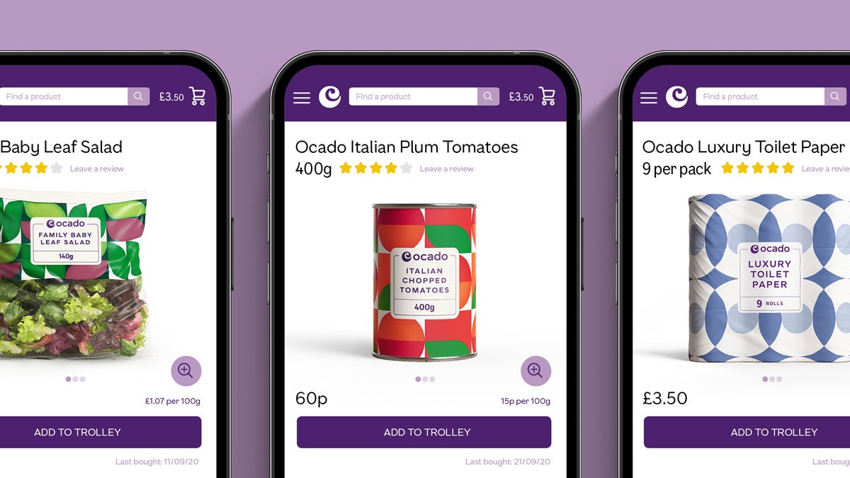
“As an online supermarket, Ocado today needs to stand out on screens of all sizes. The distinctive swirl has been rotated, redrawn and fine-tuned, making it easier to recognise in static and now, animated forms,” says JKR creative director Ivan Mato.
One of the most noticeable differences is the switch from green to purple as the main brand colour, a decision that Mato says will help set the supermarket apart.
With purple already associated strongly with brands including Cadbury and Premier Inn – both a world away from Ocado – it is a bold move, though will strike a new note in a sector that is saturated with green.
“The vibrant colour looks fresh as either a foreground or background, and it can travel seamlessly between offline and online environments. It will also travel literally when it appears across the fleet of Ocado vans,” he adds.
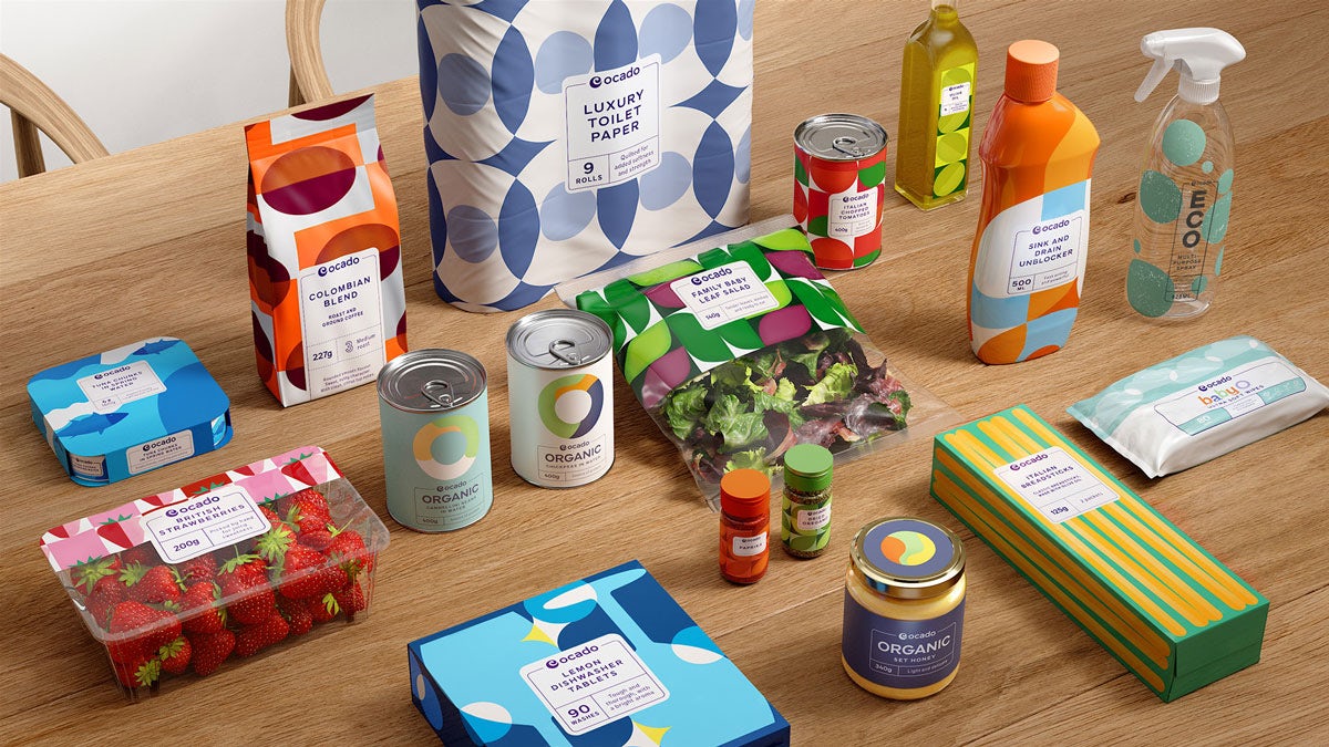
A new custom typeface, Ocado Full Fig, has been designed in collaboration with F37 Foundry, and is inspired by the shape of the logo’s distinctive swirl.
A refreshed line-illustration style includes a new set of characters that can be paired with products and packaging, with the aim of adding more warmth and personality to the brand. The style echoes the feel of retro Sainsbury’s packaging, with a dash of Orla Kiely in there too.
In addition, Ocado’s own-brand range of over 530 products now features a revamped packaging design focused on sustainability. According to JKR, 27 tonnes of plastic packaging and nine million non-essential packaging components have been removed from the range, while the modified packaging is now easier to recycle too.
Latest from CR


