
Japanese Minimalism in UI Design for Digital Products
In this article, I’m considering the concept of Japanese minimalism, its implications in the user interface design of digital products, and its key principles.
Are you ready to immerse in Japanese art trends leveraged in the context of the modern digital world?
"Be content with what you have; rejoice in the way things are. When you realize there is nothing lacking, the whole world belongs to you." — Lao Tzu
Konnichiwa, and welcome to the overview of the digital product design trend emphasizing the beauty of Japanese minimalism in the modern digital world. Here old art traditions combine with digital technologies, and the ancient stays side by side with innovation. This incredible cohesion of styles and technologies has given birth to a new trend in product user interface design — Japanese neo-minimalism. Let's dive deeper into the history of the concept and see incredible samples of this style implemented in UI design for mobile apps and websites.
Minimalism Deep-Rooted in Japanese Art
When thinking of minimalism, Japanese interior and graphic design are likely the first things coming to mind. Japanese minimalism takes roots in traditional Zen Buddhism aesthetics, the minimalist movement that carries the mission of keeping life simple and uncluttered by focusing on the bare essentials.
At the heart of it is MA (lit., "gap", "space", "pause"), a Japanese cultural concept meaning the love to not things but space between them. It is all about the negative space, emptiness, and clearness. MA is usually considered as space where the absence of things means more than the presence of them. It is filled with nothing but energy and feeling. Ma means silence as opposed to sound and lack as opposed to excess.
This concept moves us away from modern consumerism and helps re-connect with simplicity, naturalness, and functionality. It's relished in interior design, architecture, art, music, and other Japanese life aspects. It has also become one of the most significant sources of inspiration for digital product creators worldwide. Today, you can see many examples of digital illustrations in web design featuring Japanese minimalist aesthetics.
Principles of Japanese Minimalist Aesthetics in UI Design
Let's think of Google. The world's top brand has implemented all principles of Japanese minimalism in its memorable yet straightforward design. It is full of emptiness and meaning at the same time. It is clear and simple. It celebrates the beauty of contrast and bold typography. And it keeps a focus on the most important.
The Use of Negative Space
In this case, negative is positive. The negative space (or white space) is the emptiness between elements in the user interface design. Modern brands leverage the power of negative space in web design and mobile app design to emphasize the importance of existing things. Using negative spaces helps avoid cognitive user overload and keep design intuitive.
The white space is a friend of user-friendliness in UI design for digital products. It allows emphasizing the most important and focusing attention on the essential content. By removing all the necessary things, we remain the most important and help the user easily find it in an interface. The most successful products are mostly easy-to-use, minimalist, and have a lot of negative space in the UI.
Simplicity & Clearness
"Simple can be harder than complex: You have to work hard to get your thinking clean to make it simple. But it's worth it in the end because once you get there, you can move mountains." — Steve Jobs
Simplicity is not only about how it looks but also how it functions. Let’s consider simplicity from the UX perspective. A simple user interface design empowers users to navigate between the web pages or app screens easily. It makes them enjoy interacting with the UI and gives them confidence that they can quickly accomplish tasks and goals they’re using your digital product for.
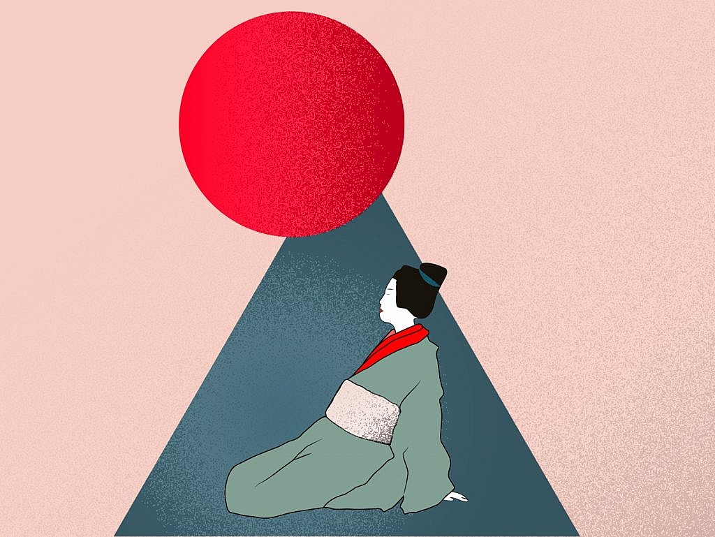
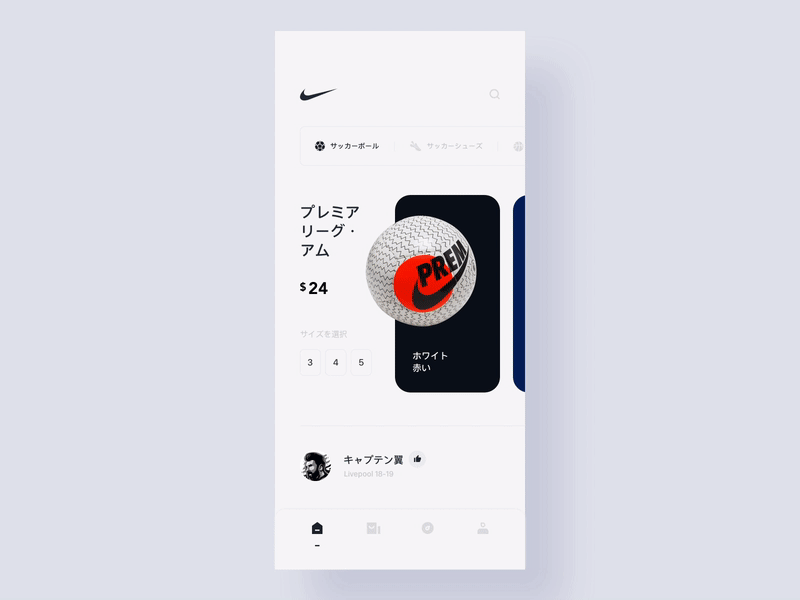
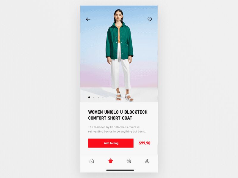
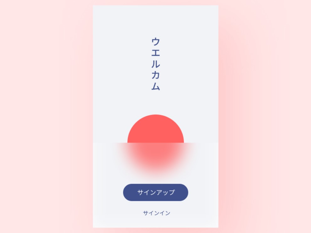
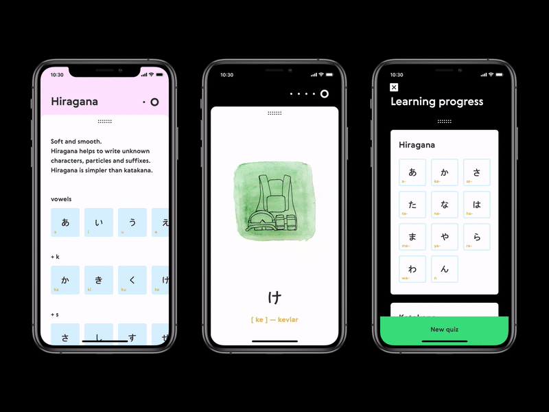
Japanese minimalism implies the absence of the cluttering details and decorations but keeping everything simple, elegant, strict, and clear. An excellent example of this is a mobile app design below.
Contrast
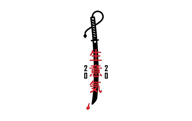
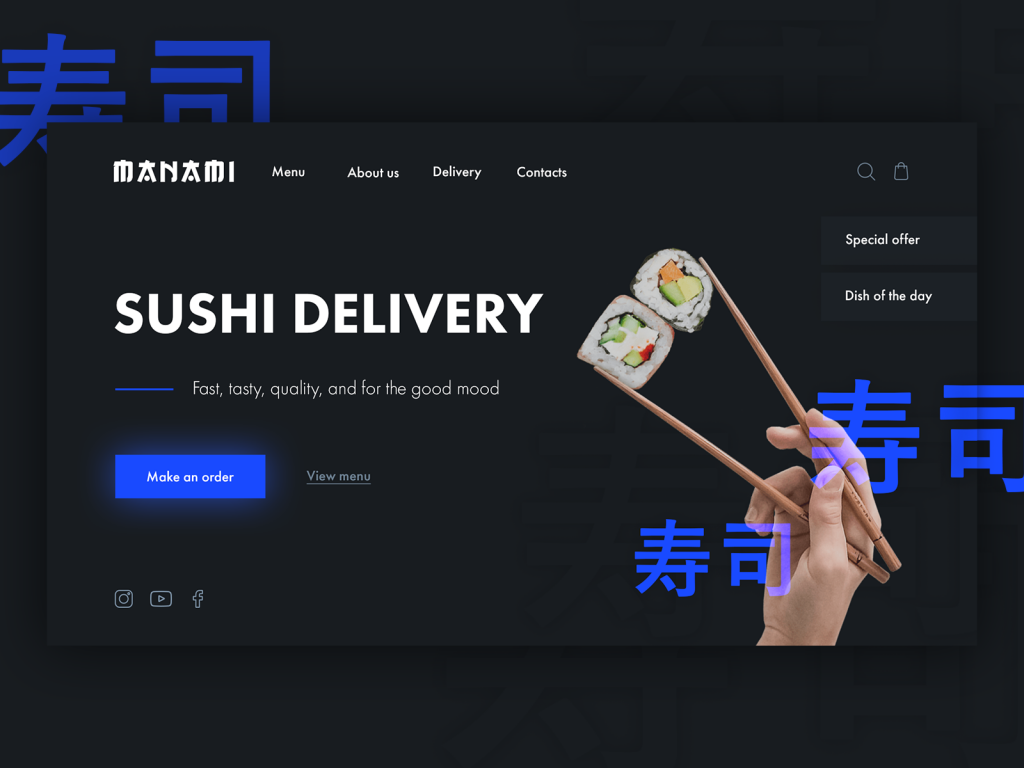
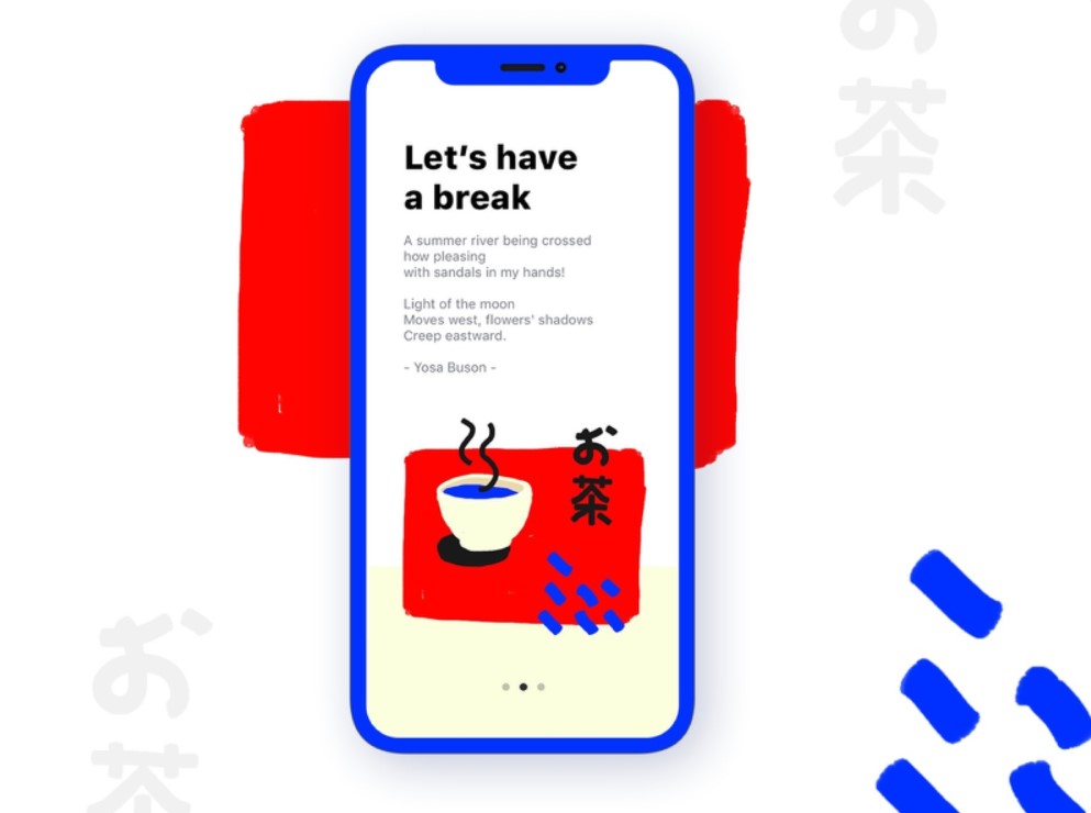
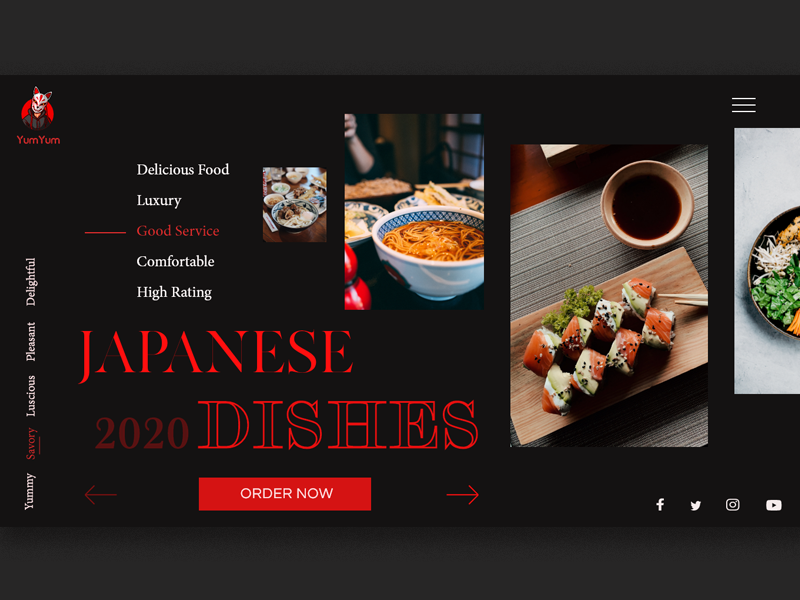
Japanese minimalism is in love with the art of contrasts. Traditionally, it uses red & white and white & black combinations the most often. The frequent color combination is also red-blue-white. The monochromatic and high-contrast palette reveals the elegance of a digital product and gives it a fresh and modern look.
Furthermore, high-contrast design increases the content readability and enables users to consume information more easily. The UI clarity, understandability, and ease of use are key goals of intelligent UX design, and a contrast color palette may help achieve them faster. The two examples below show how you can apply it to mobile app design.
Dramatic Typography
We often associate the Japanese culture with Kanji, the adopted logographic Chinese characters used in the Japanese writing system. Inspired by Kanji's distinguishable beauty, digital designers often create typography of a similar mood and look.
Japanese minimalism tends to use bold typography, and we can see the same tendency in the UI design of many new digital products. Large Japanese typography implemented in high-contrast palette creates a feeling of drama and intrigue. It helps shape an unforgettable online brand image and lasting impression from a website or mobile application. Are you looking to build a memorable brand for your digital product? Just try adding a bit of dramatism to its design by leveraging high-contrast color and bold typography, like Japanese art senseis have done it for their masterpieces.
The Focus on Essentials
Japanese people are thought to be masters of concentration since all the local religious and philosophical movements say about the importance of this human ability. Are they? Probably, we’ll never know until visit Japan in reality. However, local art brightly demonstrates it.
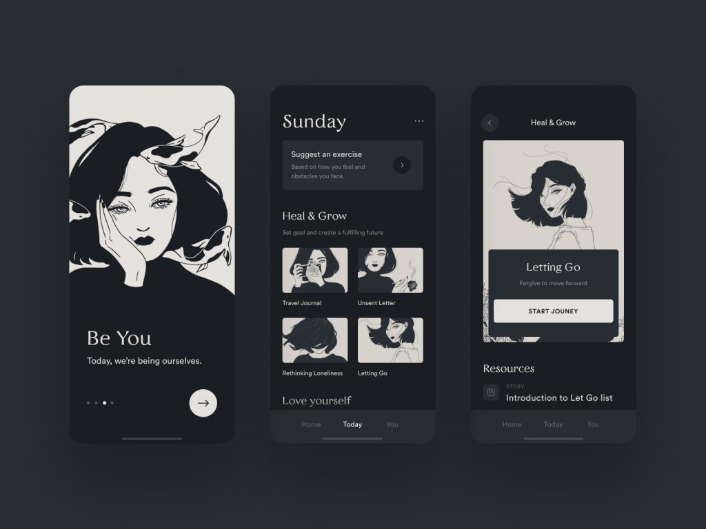
Japanese design is usually ultra-minimalist and focuses the viewer’s attention on one or several elements located in the center. There are no distracting details and unnecessary decorations in the user interface. This design is most often concentrated on the functionality first, and the visual part after. Mobile app designs presented below are great examples of this peculirity.
Less is More Today
Less is more. "More" may feel too cluttering and obtrusive for the user's overloaded mind in the noisy modern world. Minimalism remains the optimal option for digital products. Rooting in Japanese culture and widely spread around the globe, the art of minimalism has conquered the hearts of millions of people today. It has become a continuous trend bringing a fresh look and ease of use to digital products. I hope that this article will help you reinforce your inner creative engine and inspire you to produce even more amazing minimalist designs for your next projects.