Emily Osborne on Designing The Swallows

Emily Osborne is a graphic designer and illustrator, and Art Director at Penguin Random House, NY. Here she takes us through her process for designing The Swallows.
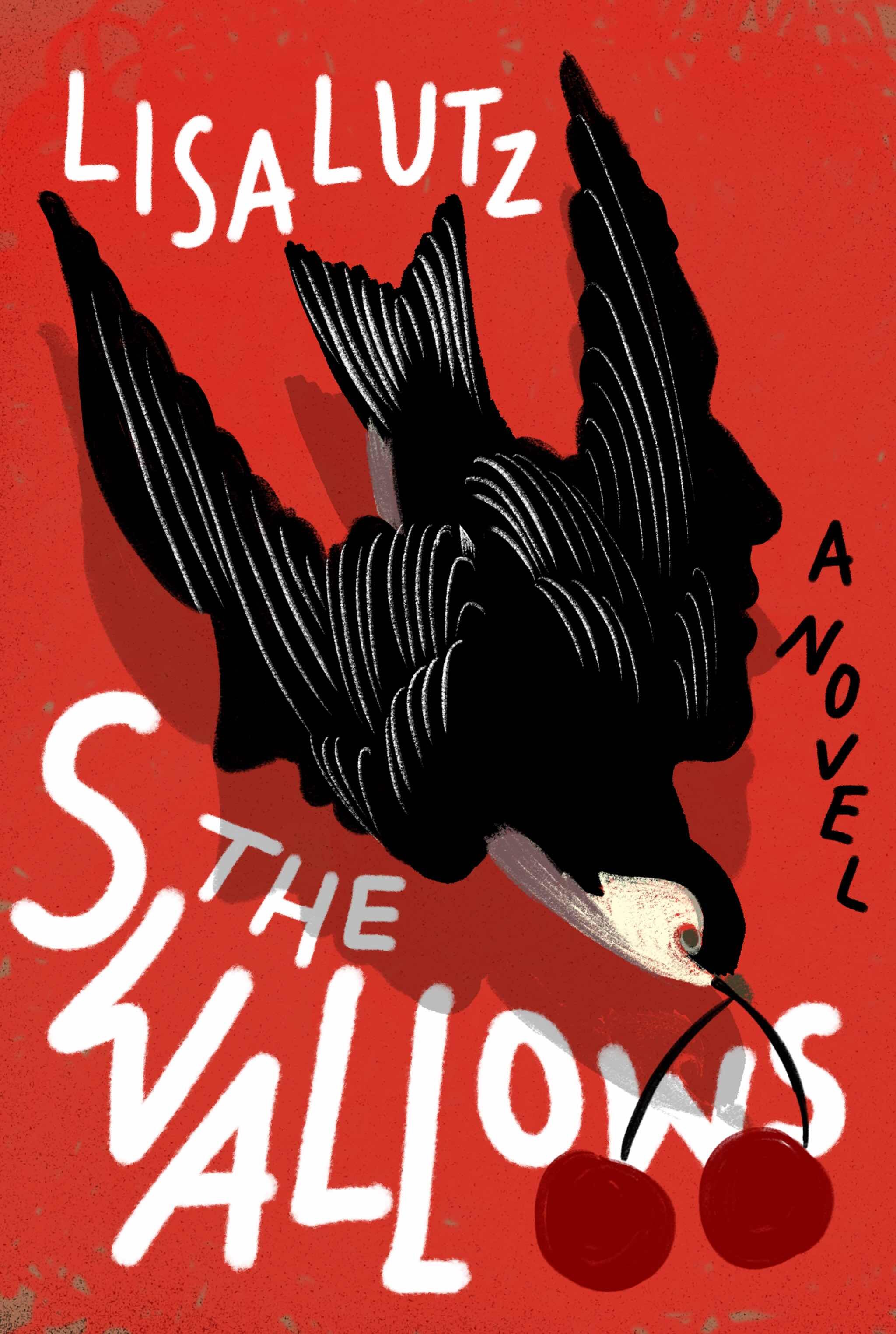
The cover design for Lisa Kutz’s The Swallows, was one of those special experiences where my first round ended up including the final cover, every last detail was on that initial comp. When does that happen? Almost never, for me at least!
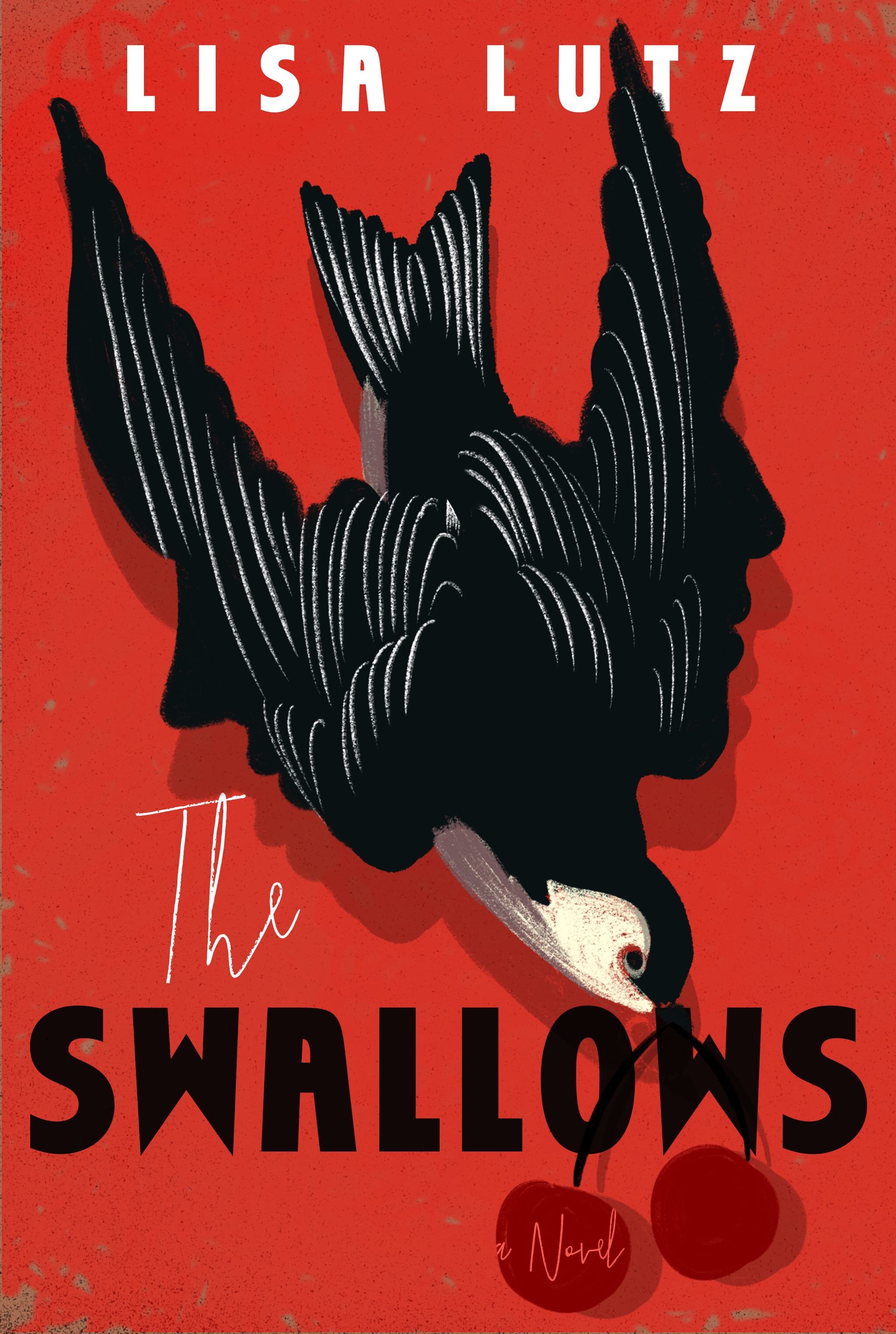
I dove into the manuscript not knowing what to expect - Lisa’s book was a very surprising read! A new writing teacher arrives at a small boarding school, and gives the students an unusual writing exercise. The results reveal some troubling things, and hint at a dark underbelly to the charming school and town. Without giving much away, there is a bird theme to this darkness, and a lot of tension between the genders. The swallow bird seemed an obvious place to start. But I knew this had to be a bit more than a pretty bird cover, especially since it is really not about birds.
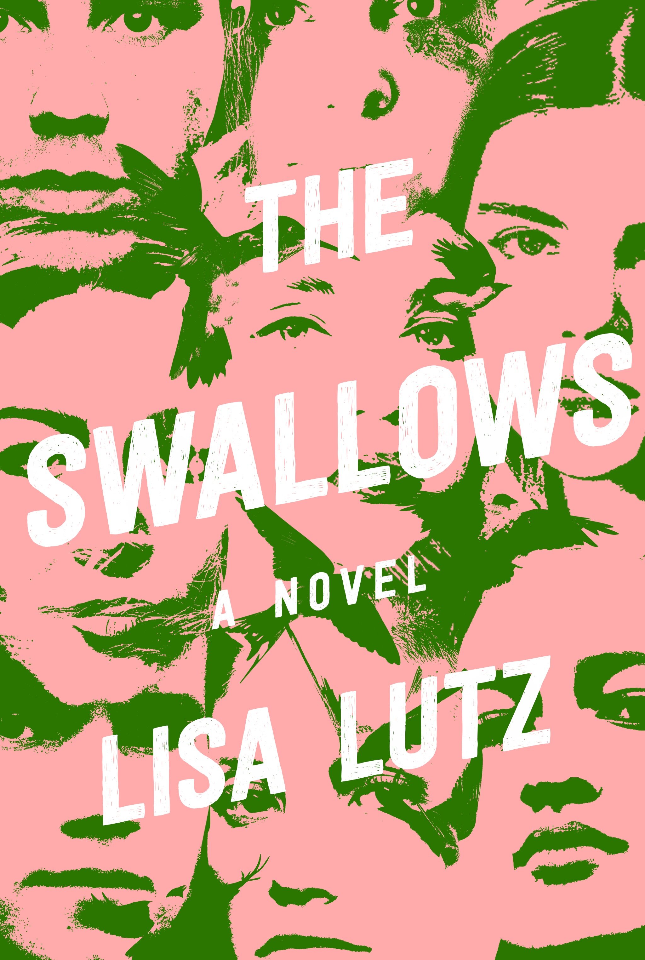
The art director, Scott Biel and the publisher sent a few covers for inspiration, one being my own design for The Care and Feeding of Ravenously Hungry Girls by Anissa Grey - illustrated in cut paper by the fantastic Alice Lindstrom. They liked how we showed a group story and wanted something similar to represent the rotating narrators in The Swallows. I tried to show that with a few cover options, with and without birds, and it was difficult to get the balance right, with this very suggestive title. They also wanted something with YA crossover appeal.


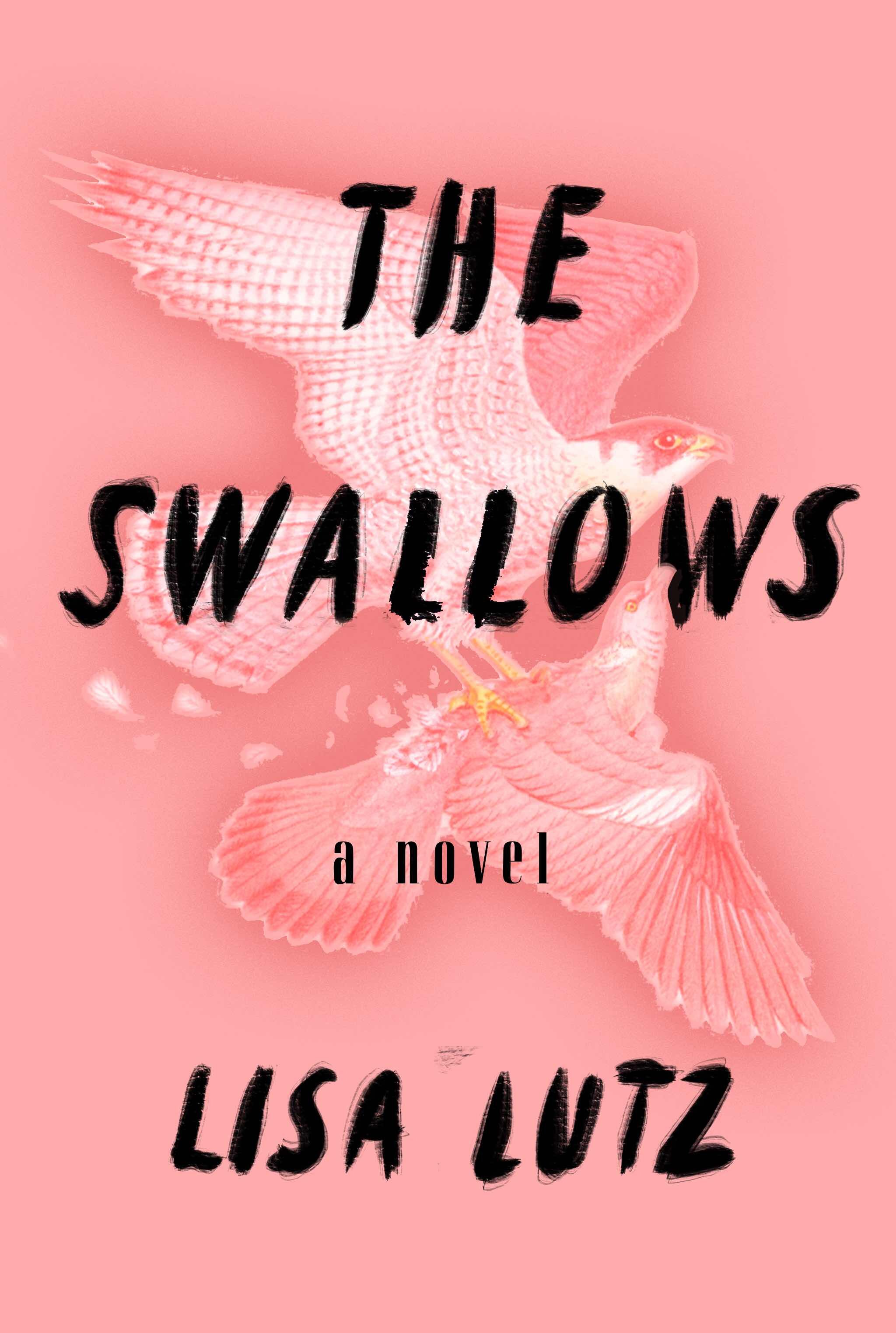
Lisa’s previous book, The Passenger, had a very thriller cover, and both the author and publisher wanted to circle back to her previous look, which was illustrated and colorful. One of my favorite parts of cover design process is the research - I could do it forever, really. So, I researched the area the book takes place, the nature, how swallows dive, what they eat, how complex their wing movements are, and I explored how to show birds or people but made of something else, like paper or ash, shadows, or superimposed on something else. I liked the idea of incorporating writing, since the students are in a creative writing class, as well as lists and charts.
I generally start with sketches, doodles on the manuscript, then later on my (newly acquired) iPad. I knew I wanted to do something with a lot of energy and tension. Were the birds prey or predator? Was it enough to show a feather? Should I have several birds - how do I keep this from looking too... Aubudon? When I first painted the Swallow, it was just a regular bird - but when I flipped it upside down I noticed how the wings almost looks like a profile - so I played with that idea for a while.


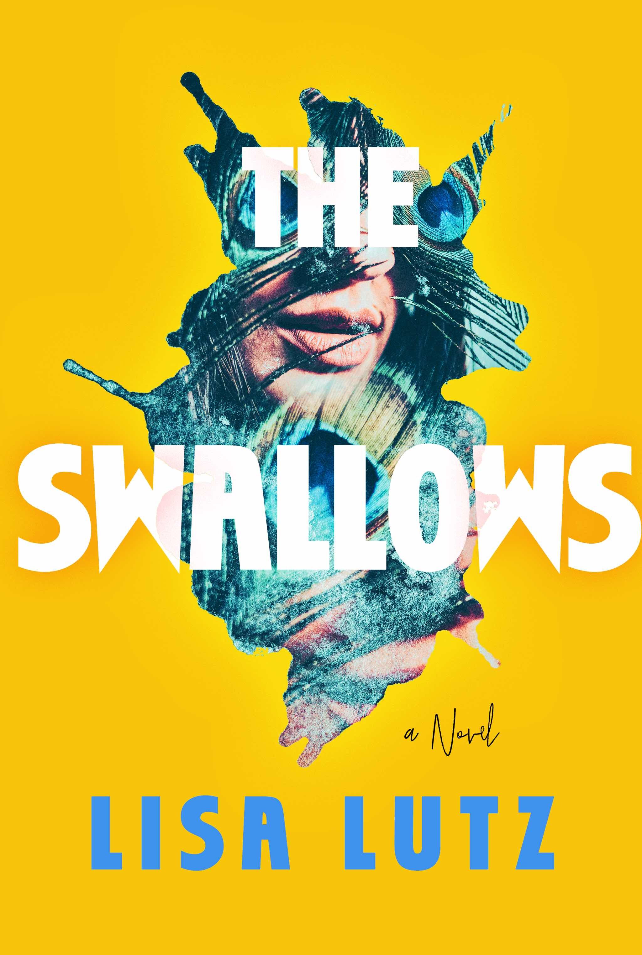

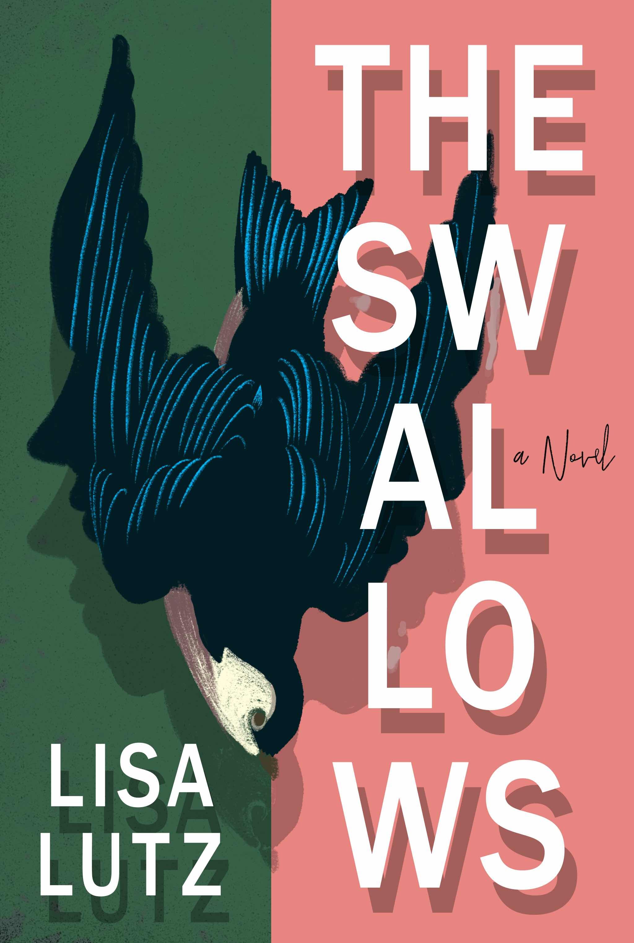
Scott and his team liked several of the comps in my first round, but were quickly drawn to the black bird, but… they wanted to see some type options to share with the author, along with the original. There was some concern that the original type felt too young.

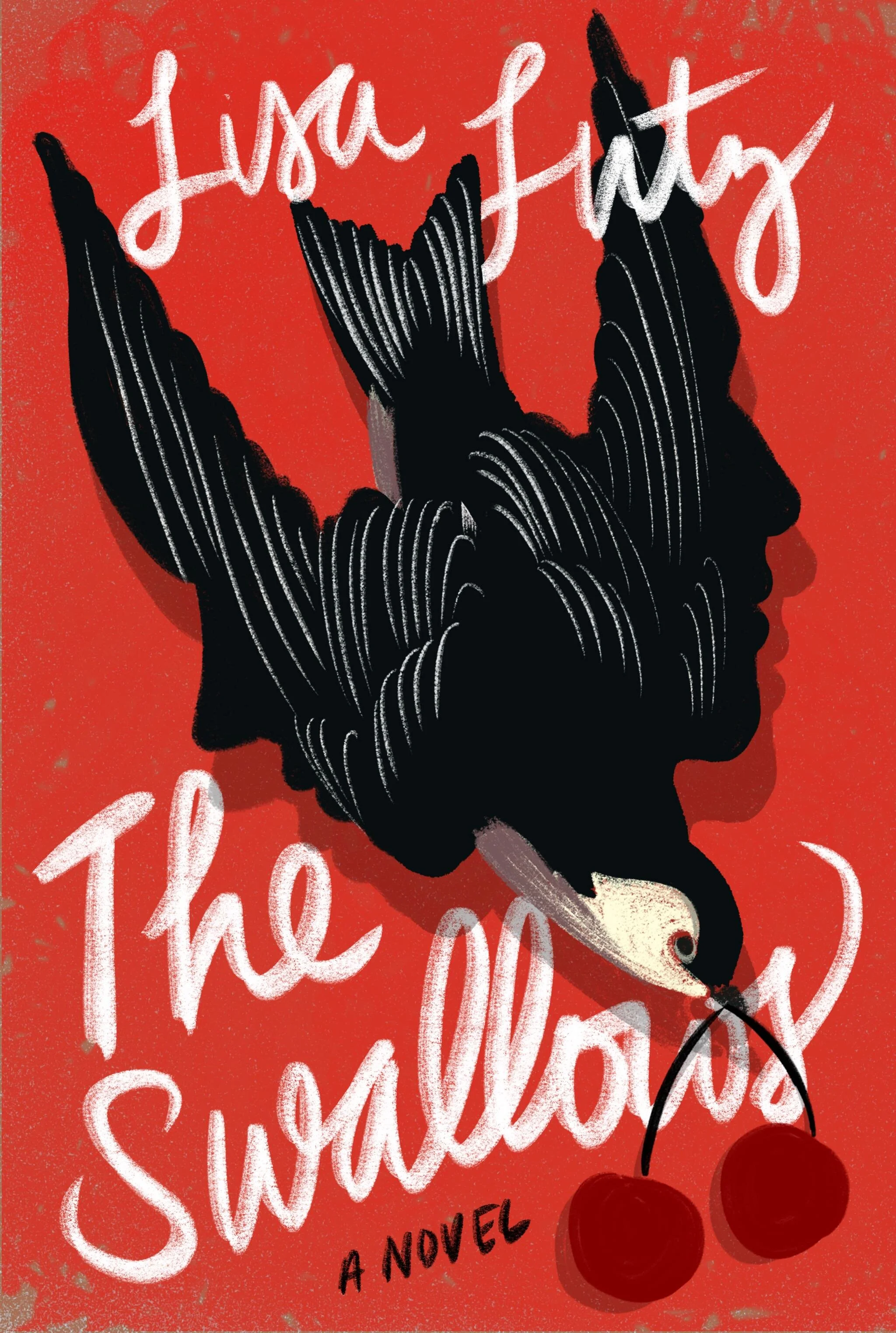

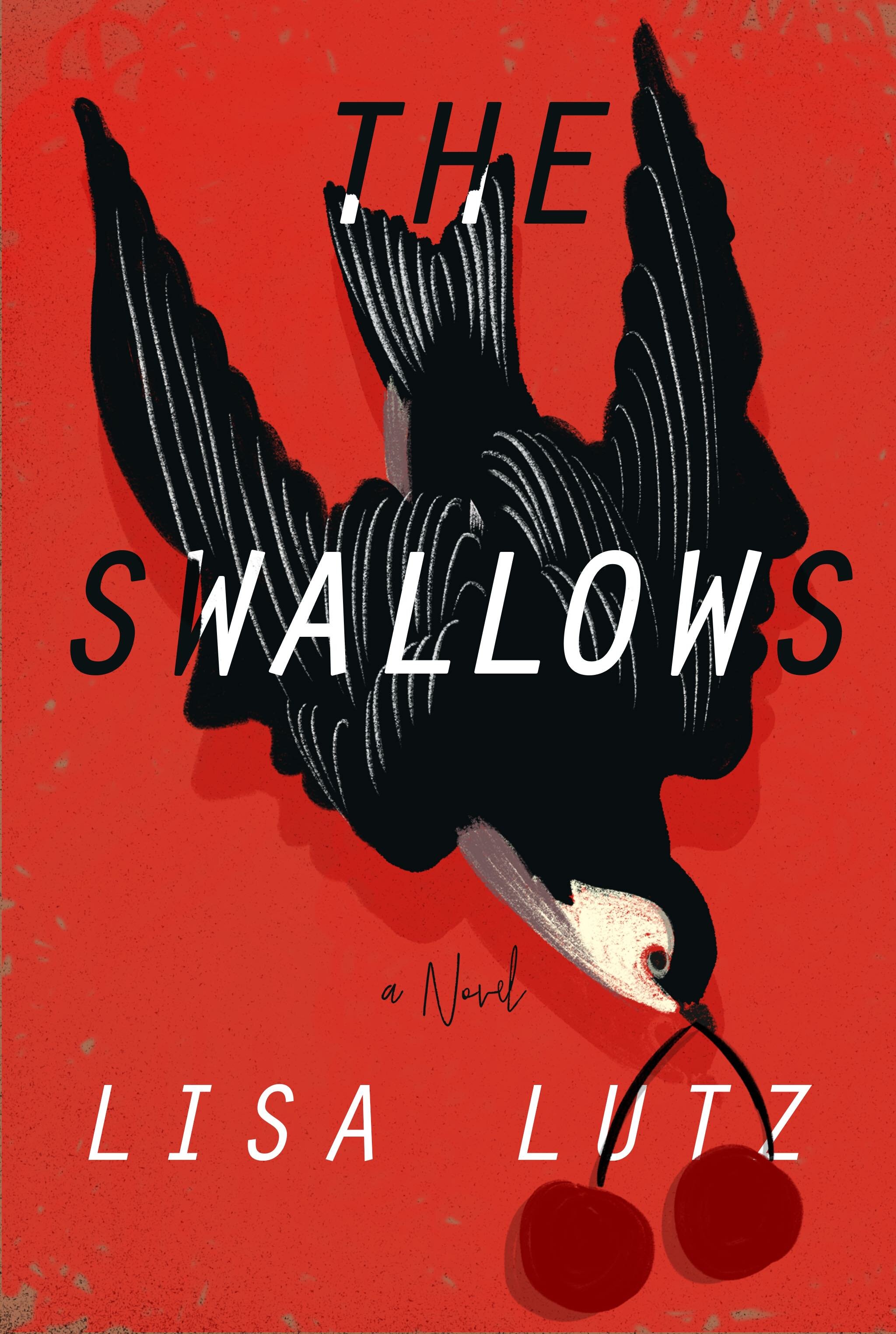
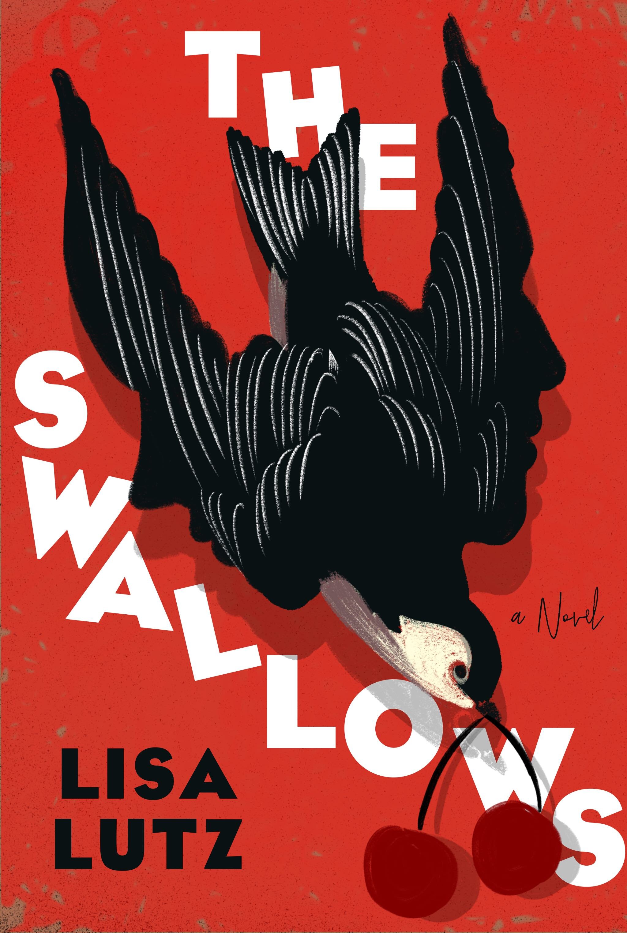
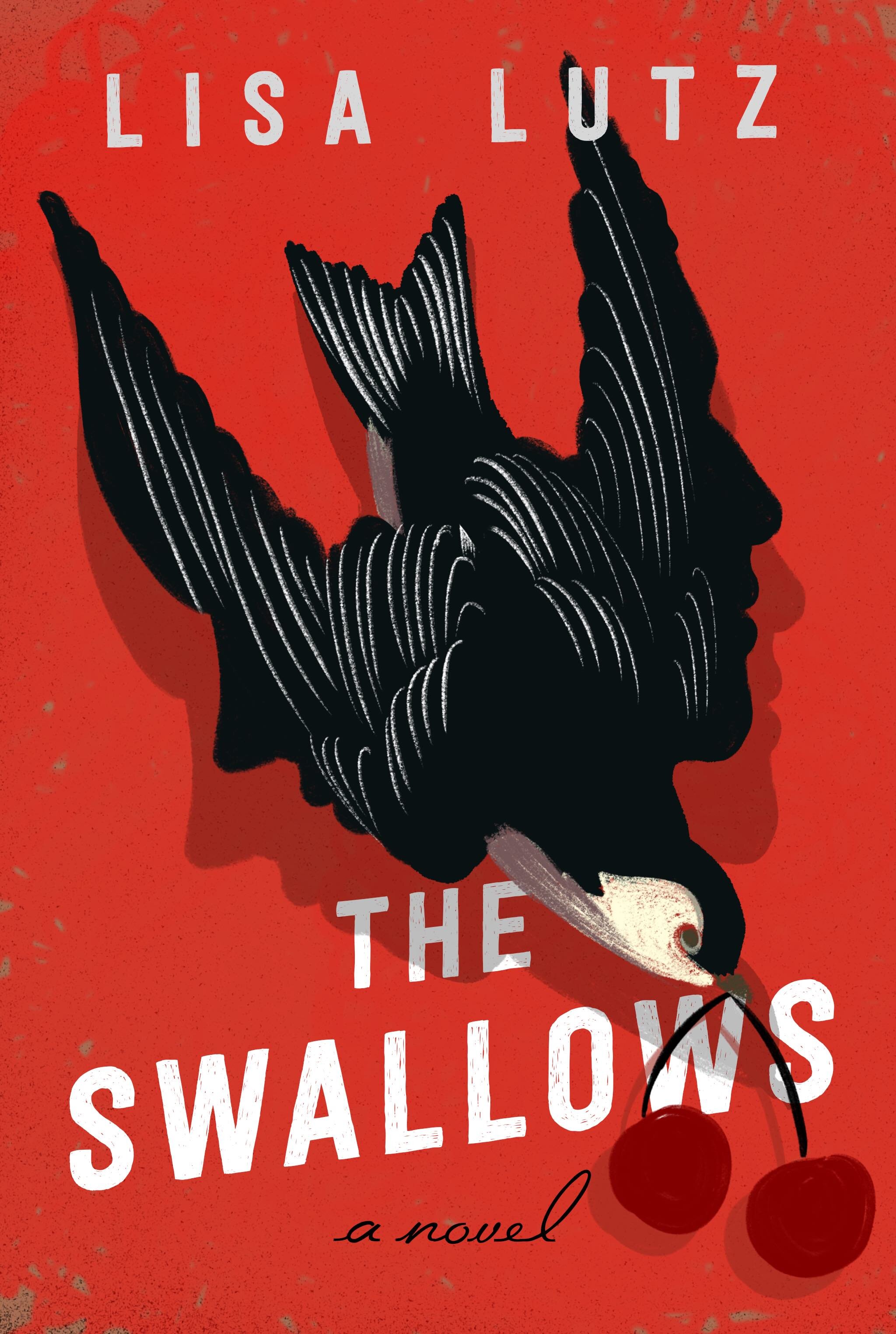
But, everyone kept going back to the original, distorted… falling letters, so that’s what won in the end.
Most people I’ve talked to about this cover don’t see the faces in the wings - or the shadow. I debated a long time if it would be better to only have the faces in the shadows, or if there should be more, or leave the wings alone. But hearing that people saw them only about half the time, I decided to include them, and let it be a nice surprise.
This book was a delight to work on. Thank you to everyone at Ballantine books, and Spine, for this opportunity.
Final cover
Editor, artworker and lifelong bibliophile.