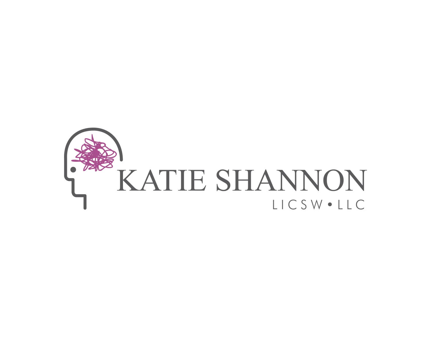
5 Tips for Designing a Better Logo
Creating a unique and memorable logo may sound easy, but there are so many things to take into consideration when trying to create the most important aspect of your branding and professional image. Your logo is the first thing that people see and could either result in them jumping into your sales funnel or disregarding you as a legitimate business. That’s why it’s SO important to have a professional logo design to represent how amazing you and your business are! Whether you’re doing it yourself or considering hiring a designer, these tips are helpful to create the best logo possible!

DON’T look at your competitors’ logos and try to copy what they're doing.
INSTEAD: Research your industry and competition to see how you can stand apart from them and prove that you do it better. It’s alright to gather inspiration from other logos that express the feeling or message that you want your logo to convey. However, copying another logo is never going to set you above the rest.

DON’T include a crazy amount of small details.
INSTEAD: Boil down your ideas to one simple and concise idea that will make a bold statement. Strong logos aren’t overly complex and that’s why they’re so memorable! Also, it’s important to remember that your logo needs to be versatile enough to be shrunk down to the size of a pen as well as blown up for a billboard.
DON’T add as many colors as humanly possible.
INSTEAD: Figure out the emotional response that you want to evoke in your target audience and choose a handful of complementary colors to represent your brand. Think about the psychology behind the colors that you choose and make sure your colors are saying the right thing about your core values. It’s also a great idea to make sure your logo will look great whether it is displayed in full color AND in all black or one color.


DON’T use a photograph or image you found on the internet in your logo.
INSTEAD: Make sure that your logo is created in a vector based program to ensure that it will always look great. When a logo is vector that means it has been set up so it can be scaled to any size without compromising quality. That way when you put it on that billboard, it will still look amazing.

The image on the right is a vector based image. The image on the left is not - see the difference?
DON’T box yourself in by having a logo that only fits in a specific size or shape.
INSTEAD: Make sure that you have a few different logo variations so that you can use your logo ANYWHERE! If you have a more horizontal logo, be sure to also create a stacked version. Maybe you even create a special submark from your logo that can be used as a supporting element where your full logo doesn’t fit or isn’t needed. Versatility is key, my friends!


One of the best pieces of advice that I remind myself of all the time is to just KEEP IT SIMPLE. Some of the most memorable + striking logos are incredibly simple and usually the best ideas are just that. In the words of Dwight K. Schrute:
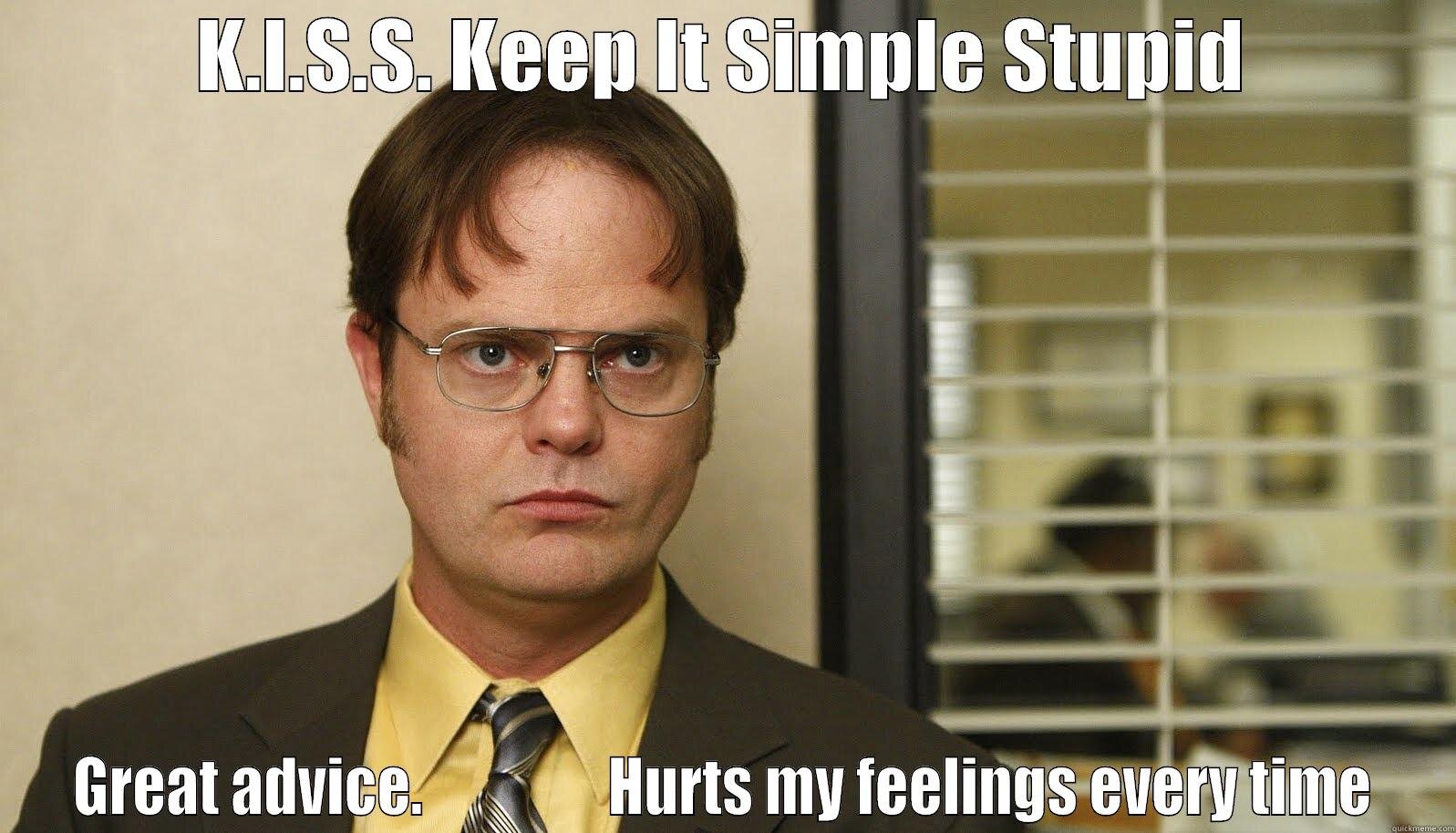
“Michael always says "K-I-S-S. Keep it simple, stupid." Great advice. Hurts my feelings every time.”
- Dwight Kurt Schrute